
Promova. A black page, white type, and a vivid lemon swatch that says 'press here'.
- Brand
- Dark theme
- 8 colors
- 2 typefaces
Promova is a midnight-magazine language learning surface: near-black canvas, white type, a single electric yellow (#fff050) used as functional punctuation for the primary action and icon highlights. Headlines are set in Nekst, a custom display face used exclusively at oversized scales (40–140px) — never as UI text — giving every screen a confident editorial weight. Body and interface type run on Manrope from 200 to 700, with weight 200 doing the work most sites assign to 300. The system is ruthlessly monochromatic (1% colorfulness) and the visual rhythm comes from oversized type, generous 30px corner radii, and the yellow accent appearing only where action or attention is required. Components feel like magazine spreads rather than dashboard widgets: flat, rounded, low-elevation, with cards that read as paper inserts against the black page.
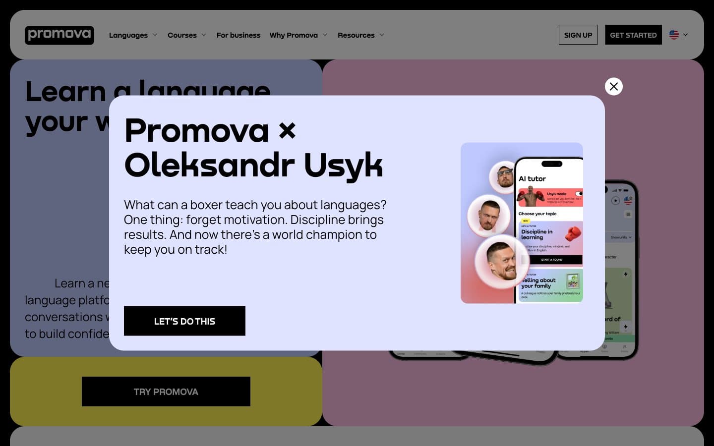
Promova design system

Brand1
Yellow supporting accent for decorative details and low-frequency emphasis. Do not promote it to the primary CTA color
Accent2
Soft accent surface, tinted card backgrounds, decorative wash behind phone mockups
Decorative illustration tint, secondary surface accent, cool shadow for hero imagery
Neutrals5
Dark supporting neutral for text, icons, and strong contrast. Do not promote it to the primary CTA color
Muted helper text, secondary captions, subdued metadata
Hairline borders, low-emphasis dividers, card outlines on dark backgrounds
Light surface variant for inverted sections, light card fills against the dark page
Primary text on dark canvas, inverted button surface, logo, nav foreground
Try a pairing
Pick any two colors from the palette to check whether text stays readable on top.
Aa
Jet Black on Highlighter Yellow
17.83 : 1 contrast
- Body textPasses AA 4.5
- Large textPasses AA 3
- StrictPasses AAA 7
More DESIGN.md files. Same web, different personalities.

21 TSI
Brand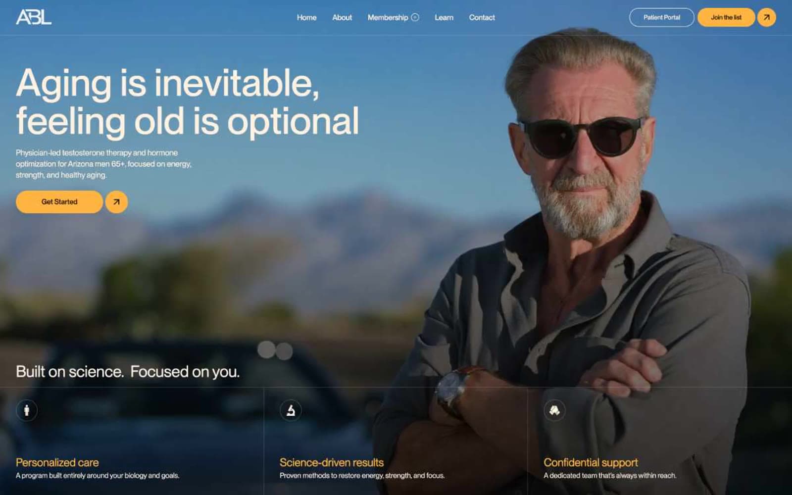
Abetterlou
Brand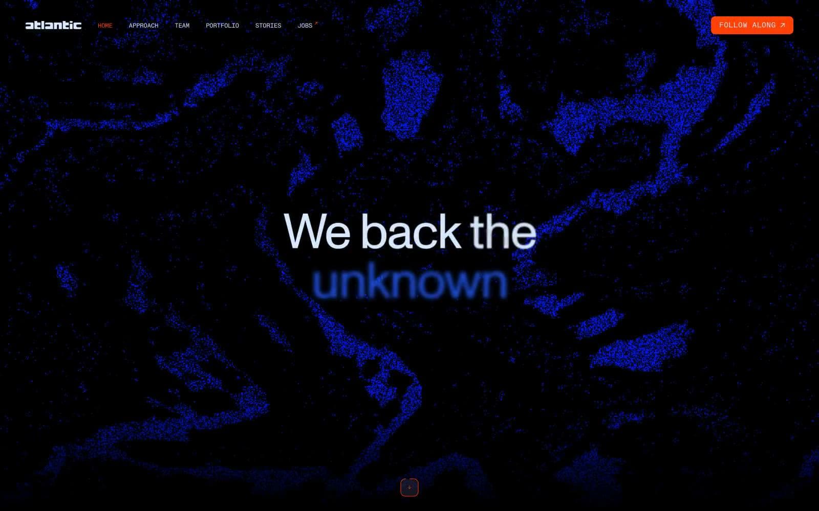
Atlantic.vc
Brand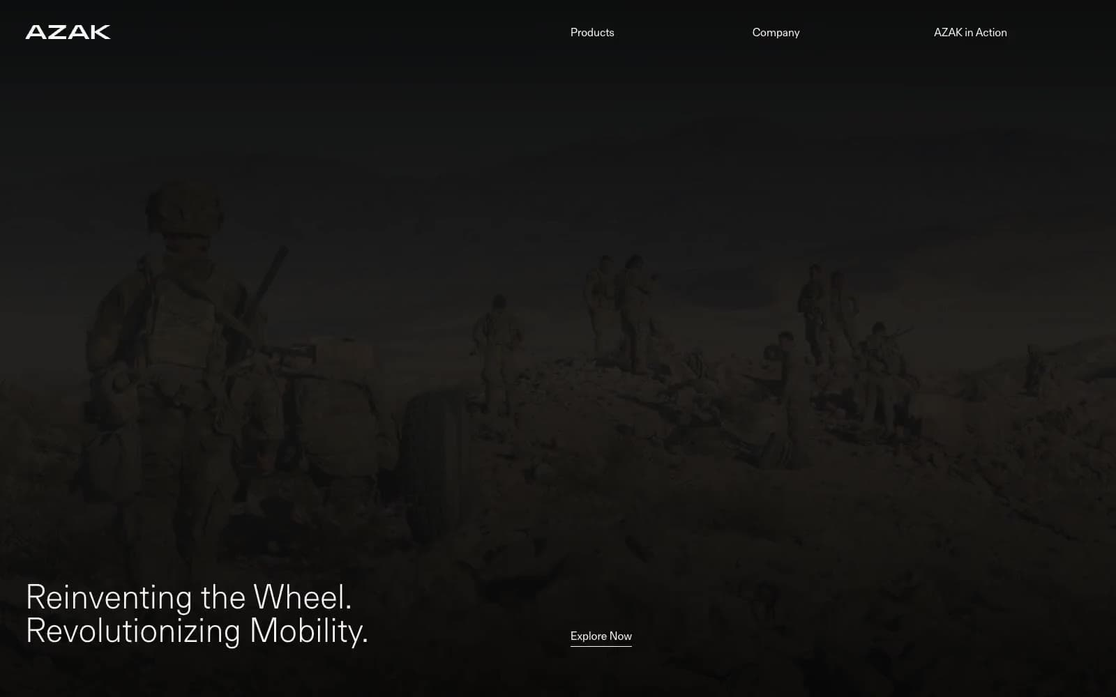
AZAK
Brand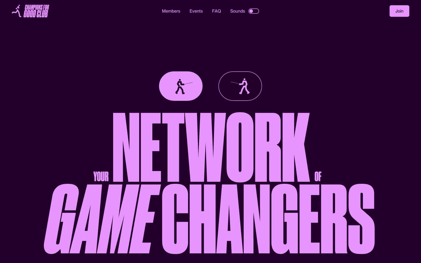
Champions4good
Brand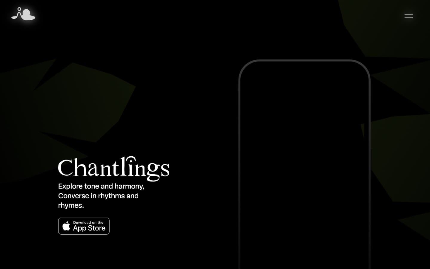
Chantlings
Brand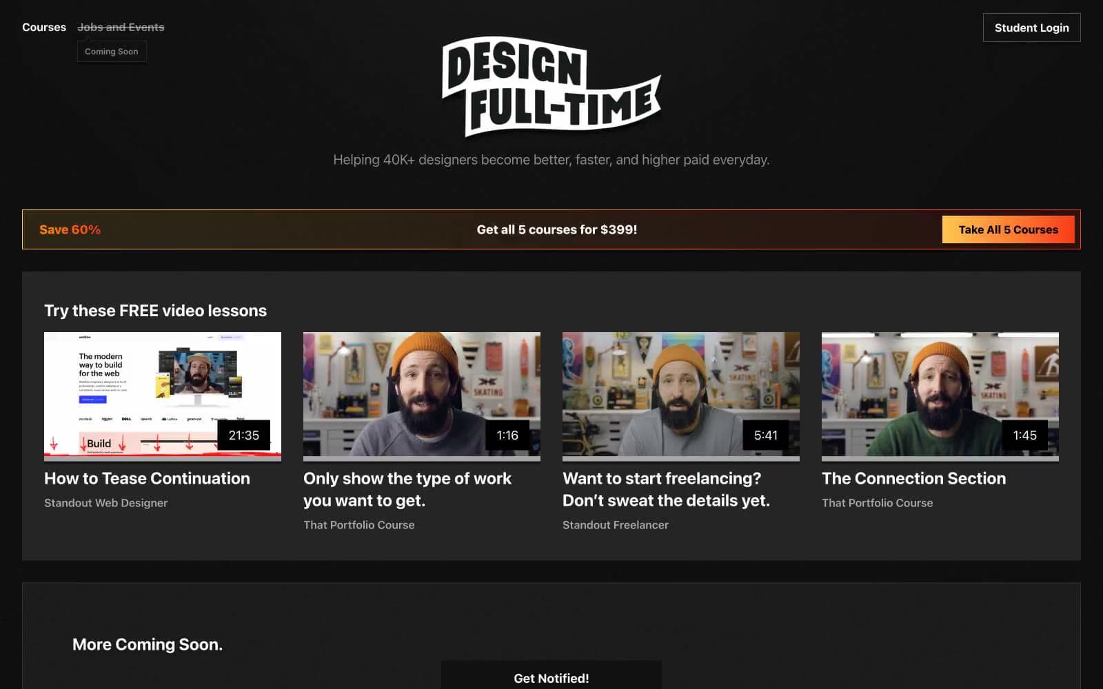
Design Full-Time
Brand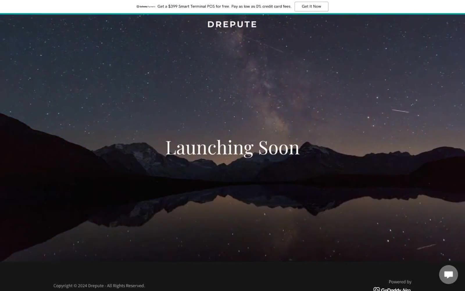
Drepute
Brand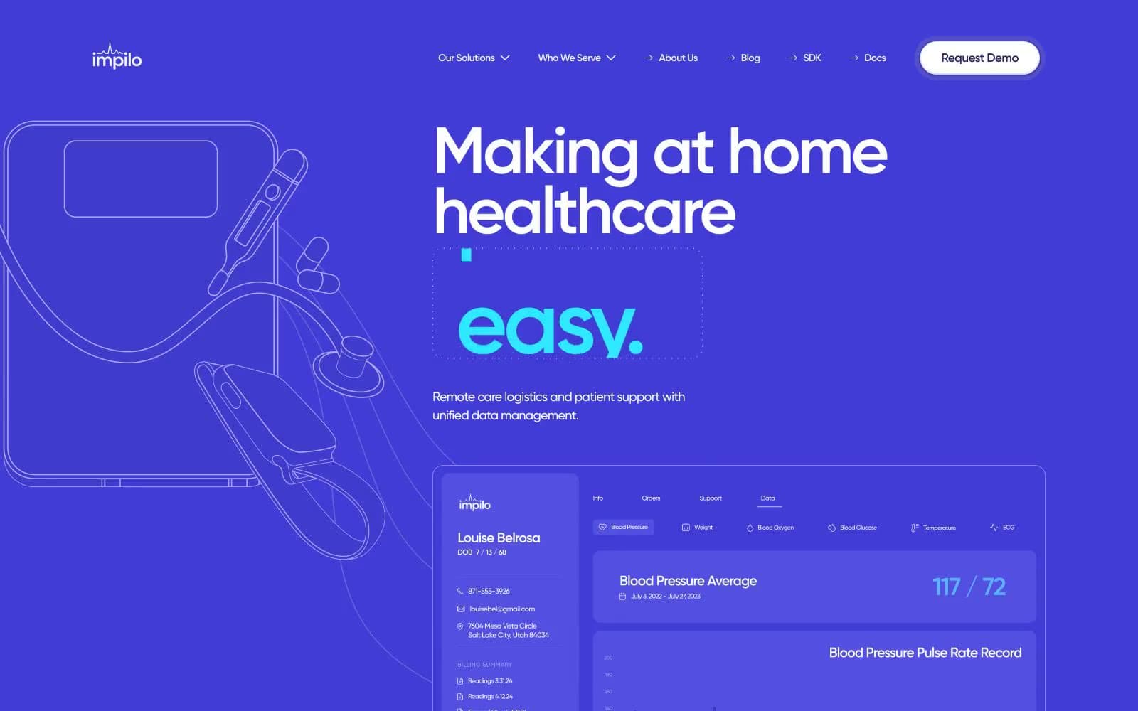
Impilo
Brand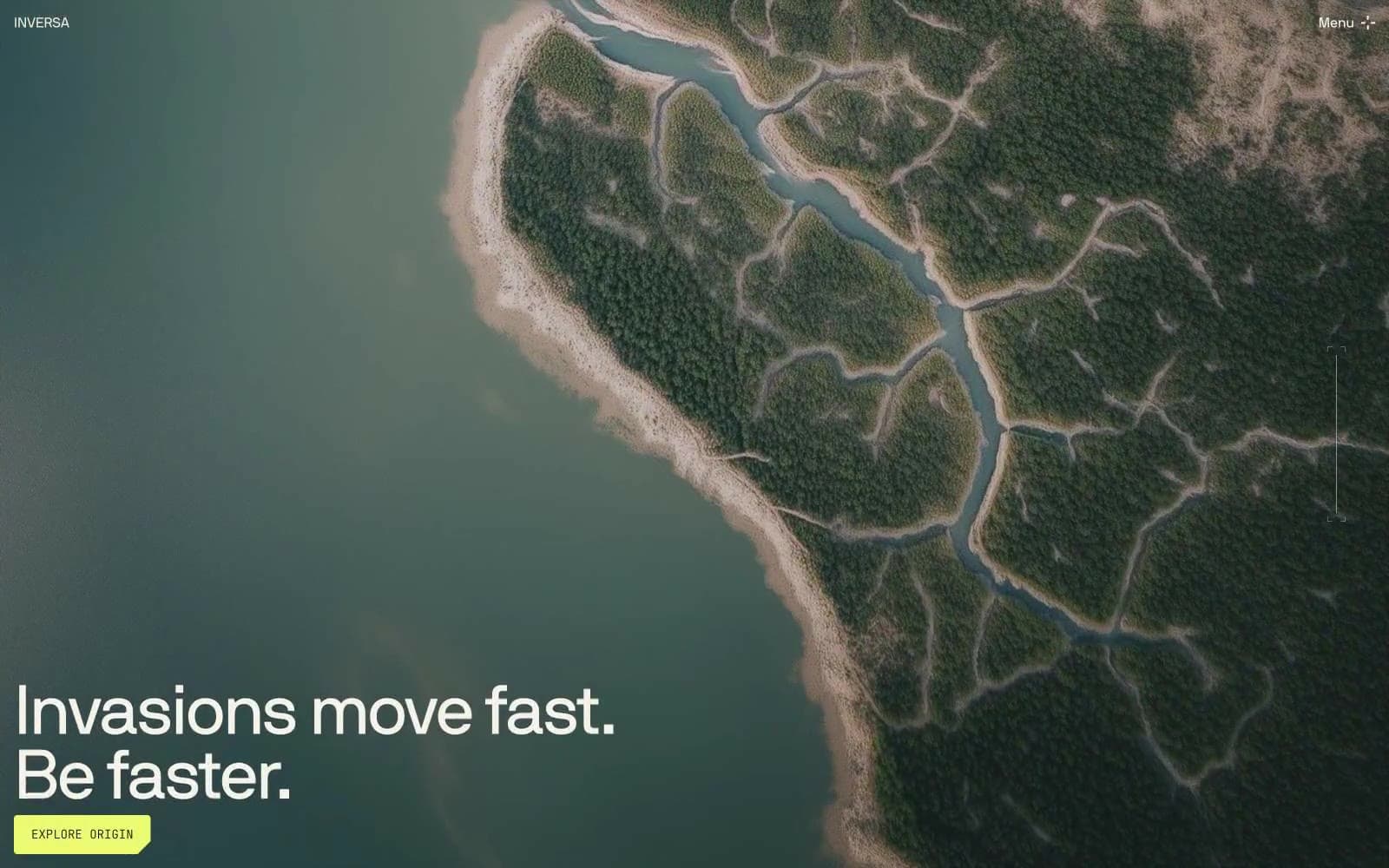
INVERSA
Brand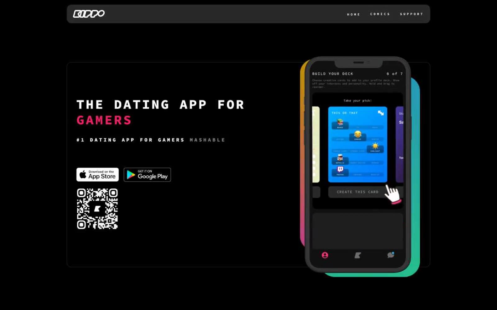
Kippo
Brand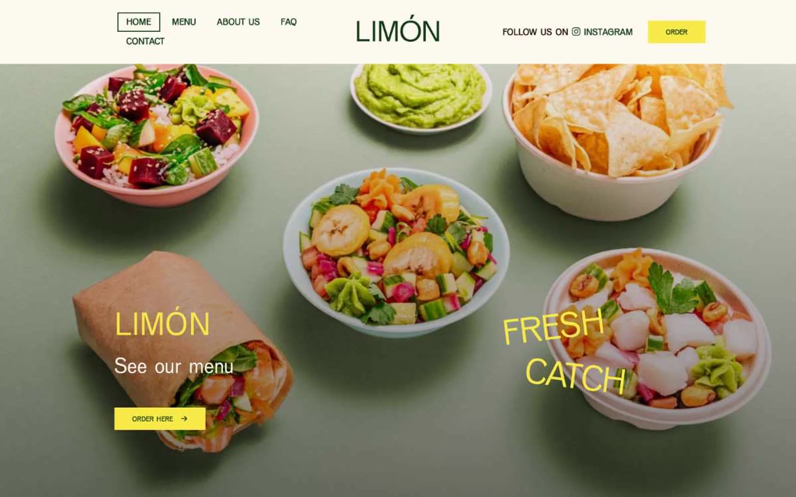
Limón
Brand


