
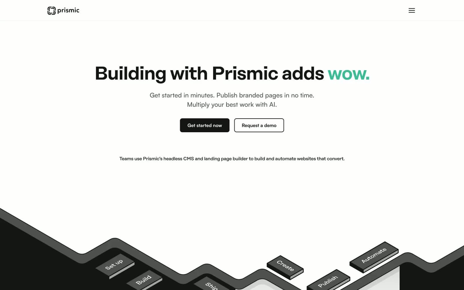
Prismic. A clean editorial canvas where vivid 3D devices float beside pastel mood-board cards and one charcoal workshop band anchors the floor.
- Developer tools
- Light theme
- 18 colors
- 4 typefaces
Prismic uses an editorial developer-tool language: white paper canvas interrupted by a charcoal workshop section, accented by vivid violet, sky blue, and mint green that read as creative-tools energy rather than enterprise software. Pastel-tinted cards (lavender, sky, peach, mint) carry testimonials and feature highlights like a designer's mood board, each card defined by a thin chromatic border rather than a filled background. Headlines whisper at 56px with tight -0.025em tracking for a confident editorial cadence, while the 500-weight body copy stays at 16-18px for calm readability. Buttons are weighted — solid graphite for primary action, ghost outlines in violet or blue for secondary — and isometric 3D illustrations of devices, sliders, and building blocks frame content as if a workshop were unfolding on the page.
Prismic design system

Brand1
Violet accent for outlined action borders, linked labels, and lightweight interactive emphasis. Do not promote it to the primary CTA color
Accent9
Secondary outlined actions, marketer-side accent headings, icon strokes — the cool counterweight to violet, always paired with dark text
Green decorative accent for icons, marks, and small graphic details
Testimonial card border, list highlight background — a pastel mood-board tint for social proof blocks
Lavender-tinted card surface, soft highlight wash — pairs with Lavender Wash border for layered mood-board cards
Testimonial card border, cool pastel accent — pairs with Prismic Blue for the marketer-side narrative
Warm testimonial card border — the third mood-board tint for testimonial rotation
Peach-tinted card surface — the warm counterpart to Lavender Cream
Testimonial card border — the fourth mood-board tint closing the pastel set
Mint-tinted card surface — pairs with Mint Wash border for cool-warm pastel balance
Neutrals8
Icon strokes, hairlines, and SVG illustration outlines — 21:1 contrast on white guarantees icon legibility at any size
Primary action fill, body text, dark workshop background — dense near-black with 18.3:1 contrast on white gives the wordmark and CTAs architectural weight
Dark workshop card surfaces and elevated dark-mode containers — one step lighter than graphite to read as a separate surface layer
Secondary text, muted nav borders, icon detail — 40-50% darker than fog for progressive disclosure
Tertiary text, placeholder, decorative strokes — the lightest voice in the type hierarchy
Hairline dividers, card borders, table separators — the quiet grid line that organizes without asserting itself
Subtle surface for inset cards and section backgrounds when white needs to recede
Page canvas, card surfaces, button text on graphite, reverse section background — the paper on which everything sits
Try a pairing
Pick any two colors from the palette to check whether text stays readable on top.
Aa
Pure White on Prismic Violet
5.01 : 1 contrast
- Body textPasses AA 4.5
- Large textPasses AA 3
- StrictFails AAA 7
More DESIGN.md files. Same web, different personalities.

Tailwind CSS
Developer tools
Atoms
Developer tools
Browserbase
Developer tools
Cursor
Developer tools
Deno
Developer tools
Drizzle ORM
Developer tools
Earlydog
Developer tools
Expo
Developer tools
Fingerprint
Developer tools
Flatfile
Developer tools
Flox
Developer tools
Fly.io
Developer tools


