
Prisma. Engineer's blueprint on frosted glass.
- Developer tools
- Light theme
- 10 colors
- 5 typefaces
Prisma uses a disciplined developer-workbench language: pure white canvas, hairline borders, and one quiet teal accent that signals action without shouting. Typography carries the brand — Mona Sans displays at 64px with 0.1em tracking create an engineered, almost blueprint-like authority, while Inter's character variants (cv01–cv10) give body text a custom-cut feel inside an otherwise standard sans. Surfaces are nearly weightless: no decorative gradients, no drop-shadow stacks, just a single 1px border at #e2e8f0 separating regions. Components are compact and functional — code blocks sit next to CTA buttons, terminal panels replace marketing illustrations, and brand color appears only when something should be clicked. The result is a page that feels like documentation and product wrapped in one surface: quiet, precise, and trusting that code speaks louder than decoration.
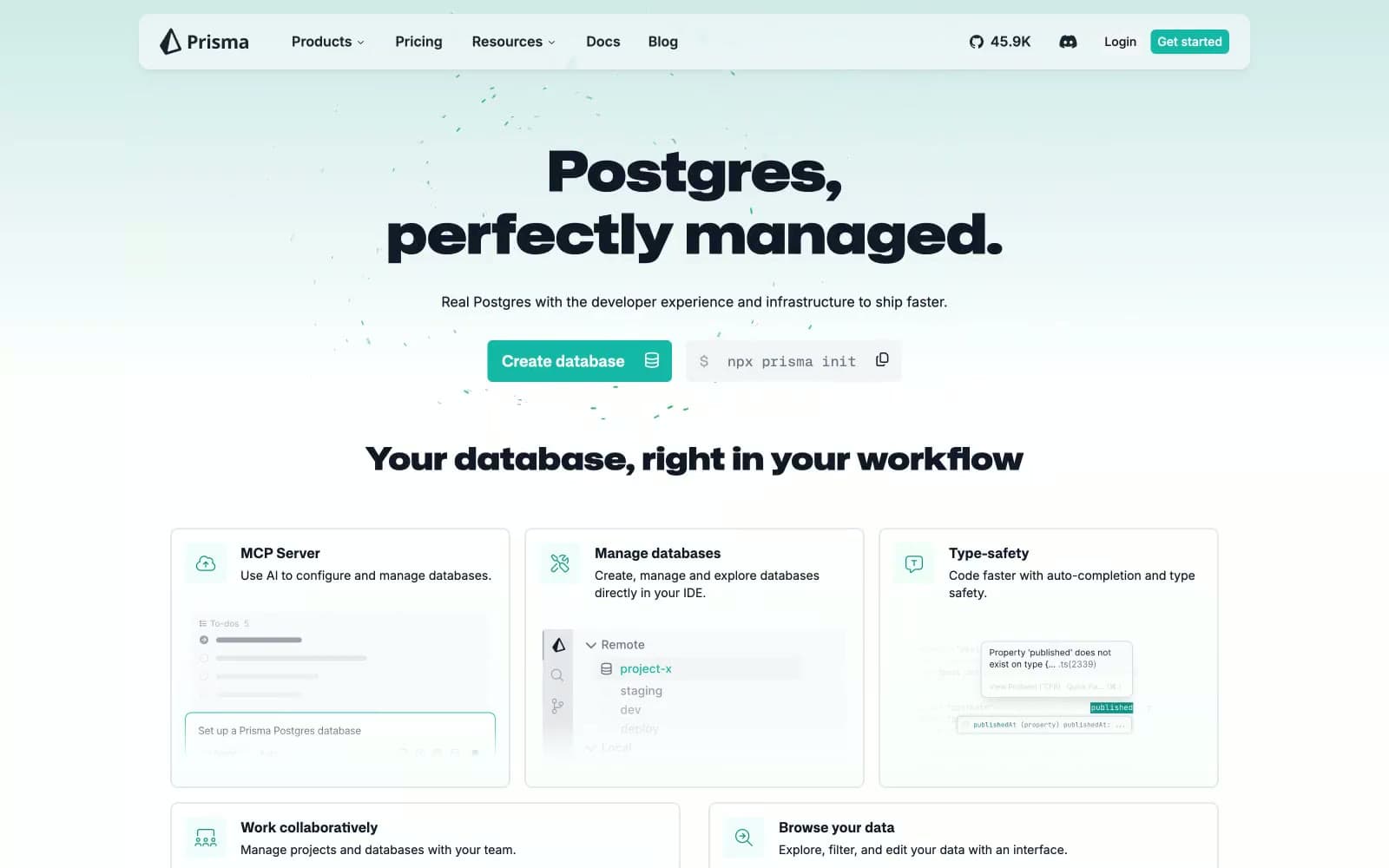
Prisma design system

Brand2
Teal supporting accent for decorative details and low-frequency emphasis. Do not promote it to the primary CTA color
Teal supporting accent for decorative details and low-frequency emphasis. Do not promote it to the primary CTA color; Top-to-bottom gradient from Deep Teal to white — used in the hero background as a subtle vertical wash
Neutrals8
Body text, button labels, dense content text — deeper than Carbon Ink, reserved for running copy and form values
Primary headings, nav text, logo mark, heavy body emphasis — near-black with a cool blue undertone that pairs with the teal accent
Secondary body text, helper copy, muted descriptions, footer meta — pulls text back without losing legibility
Tertiary text, disabled labels, icon strokes on neutral backgrounds — one step further back than Slate
Placeholder text, subtle icon fills, decorative dividers — present but recessive
Hairline borders, card edges, code-block frames, grid lines — the structural glue that separates surfaces without weight
Subtle surface lift, secondary card backgrounds, alternating section bands — barely visible, used to create quiet layering
Light supporting surface for subtle backgrounds and section separation. Do not promote it to the primary CTA color
Try a pairing
Pick any two colors from the palette to check whether text stays readable on top.
Aa
Graphite on Prism Teal
7.13 : 1 contrast
- Body textPasses AA 4.5
- Large textPasses AA 3
- StrictPasses AAA 7
More DESIGN.md files. Same web, different personalities.

Tailwind CSS
Developer tools
Atoms
Developer tools
Browserbase
Developer tools
Cursor
Developer tools
Deno
Developer tools
Drizzle ORM
Developer tools
Earlydog
Developer tools
Expo
Developer tools
Fingerprint
Developer tools
Flatfile
Developer tools
Flox
Developer tools
Fly.io
Developer tools


