
PostHog. A tactile beige workspace where every interface element is a printed artifact, not a floating panel.
- Developer tools
- Light theme
- 19 colors
- 4 typefaces
PostHog presents as a desktop operating system for product development — a warm, tactile workspace where the page itself is a file manager. A sandy beige canvas (#e1d7c2) sets the desk surface; white application windows with 1px hairline borders float on top, pinned like paper. Radii are aggressively small (4px almost everywhere) and shadows are nearly absent, giving the system a flat, printed, almost editorial feel rather than a glassmorphic SaaS one. Typography pairs Open Runde (geometric warmth, tracking-tight at -0.025em) with IBM Plex Sans Variable (developer-tool precision) and ui-monospace for code. Color is rationed: Signal Blue for live links and active states, Amber for the single primary action, Flame Orange for tags, Moss Green for confirmation. Elevation is achieved through the surface stack (beige → cream → white) and hairline borders, not depth — the whole system reads as paper pinned to a corkboard, not cards floating in space.
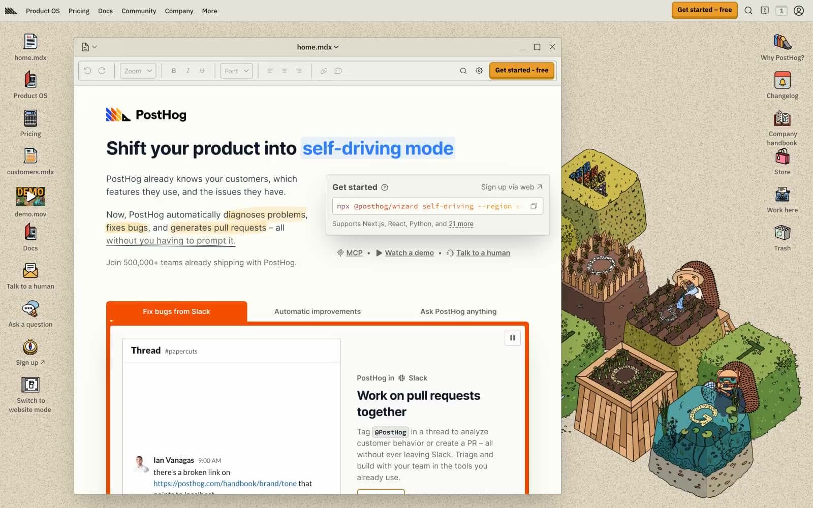
PostHog design system

Brand4
Blue action color for filled buttons, selected navigation states, and focused conversion moments.; Multi-stop brand gradient spanning blue → blue → orange-red → orange → amber → blue — used for the logo wordmark and occasional text-gradient decoration
Yellow action color for filled buttons, selected navigation states, and focused conversion moments.
CTA hover and active states, pressed link backgrounds — the deeper shade of Amber Glow
Outlined action borders and underline accents on links — the amber system uses this for ghost/outline variants
Accent3
Decorative illustration fills, icon accents, and the PostHog logo gradient mid-stop — not for UI controls
Orange wash for highlight backgrounds, decorative bands, and soft emphasis behind content
Green wash for highlight backgrounds, decorative bands, and soft emphasis behind content. Use as a supporting accent, not as a status color
Neutrals12
Icon fills, dark-mode text, and maximum-contrast glyphs
Primary text and heading color — near-black with a faint olive warmth, never pure #000
Body text, secondary icons, and SVG fills — the workhorse neutral that gives the system its slightly earthy character
Muted body text, inactive tab labels, and tertiary content — used when text must recede but remain legible
Disabled controls, placeholder text, and low-emphasis icon fills — the gray with just enough green to feel on-brand
Hairline borders and subtle dividers — slightly cool against the warm canvas
Primary hairline border color — the most frequent border in the system, warm enough to harmonize with the sandy canvas
Muted UI surface for disabled controls, low-emphasis panels, and placeholder blocks.
Quaternary surface for hover backgrounds, selected list items, and disabled states
Tertiary surface for nested cards, secondary buttons, and subtle washes — the middle stop in the surface stack
Slightly warm off-white for secondary card surfaces and hover states — bridges between the sandy desk and pure white windows
Application window and card surfaces — the primary elevated layer above the sandy desk, used for main content areas and popovers
Try a pairing
Pick any two colors from the palette to check whether text stays readable on top.
Aa
Pure Black on Amber Glow
9.39 : 1 contrast
- Body textPasses AA 4.5
- Large textPasses AA 3
- StrictPasses AAA 7
More DESIGN.md files. Same web, different personalities.

Tailwind CSS
Developer tools
Atoms
Developer tools
Browserbase
Developer tools
Cursor
Developer tools
Deno
Developer tools
Drizzle ORM
Developer tools
Earlydog
Developer tools
Expo
Developer tools
Fingerprint
Developer tools
Flatfile
Developer tools
Flox
Developer tools
Fly.io
Developer tools


