
PlanetScale. Terminal man-page in daylight.
- Developer tools
- Light theme
- 9 colors
- 1 typeface
PlanetScale's design system is a developer-first, terminal-flavored monospace UI: the entire interface speaks in fixed-width type, giving every screen the texture of a well-formatted README. The palette is overwhelmingly achromatic — deep charcoal text on near-white canvas, with a vivid orange as the sole action accent and a restrained blue for links. Surfaces are flat and borderless; hierarchy is built through type weight, spacing, and the occasional hairline rule rather than shadow or elevation. Components feel lightweight and utilitarian: pill-shaped buttons, plain text links, raw grid tables, and no decorative chrome. The result reads like a developer tool's reference page, not a marketing brochure — confidence comes from typographic discipline and generous whitespace, not from color or illustration.
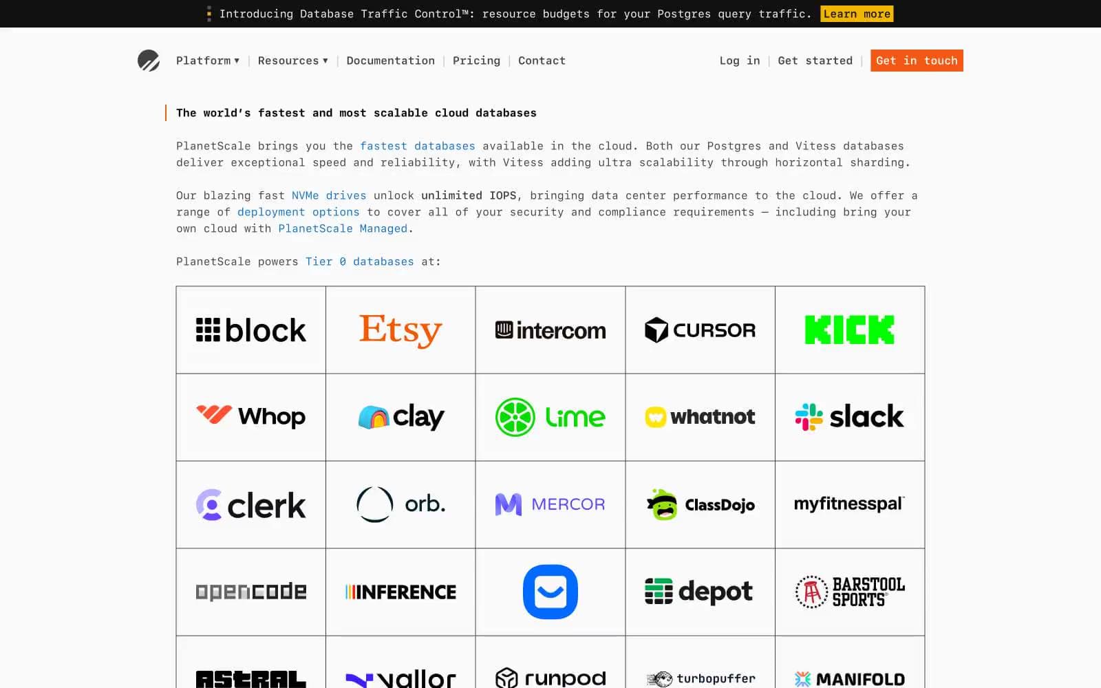
PlanetScale design system

Brand2
Orange supporting accent for decorative details and low-frequency emphasis. Do not promote it to the primary CTA color
Blue supporting accent for decorative details and low-frequency emphasis. Do not promote it to the primary CTA color
Accent1
Announcement banner highlight, feature tag accent, promotional inline marker
Neutrals6
Headings, strong emphasis, logo mark, maximum-contrast text
Dark supporting neutral for text, icons, and strong contrast. Do not promote it to the primary CTA color
Primary body text, icon strokes, footer copy, nav labels
Muted body text, captions, secondary metadata, image alt text
Hairline borders, table dividers, nav separators, disabled strokes
Page canvas, card surfaces, input backgrounds
Try a pairing
Pick any two colors from the palette to check whether text stays readable on top.
Aa
Ink Black on Ember
6.22 : 1 contrast
- Body textPasses AA 4.5
- Large textPasses AA 3
- StrictFails AAA 7
More DESIGN.md files. Same web, different personalities.

Tailwind CSS
Developer tools
Atoms
Developer tools
Browserbase
Developer tools
Cursor
Developer tools
Deno
Developer tools
Drizzle ORM
Developer tools
Earlydog
Developer tools
Expo
Developer tools
Fingerprint
Developer tools
Flatfile
Developer tools
Flox
Developer tools
Fly.io
Developer tools


