
Peppermint. A deep navy void where hand-drawn ribbons and geometric type dance above warm cream paper surfaces.
- Finance
- Dark theme
- 14 colors
- 2 typefaces
Peppermint runs on a midnight-canvas principle: a near-black indigo (#0a1d4b) saturates the page as both background and brand DNA, giving the site the feeling of a deep-ocean screen where bold illustrations and geometric type float free. Excon's display cuts — tightly tracked, geometric, editorial — are the visual signature, paired with Generalsans' humanist warmth for everything conversational. The system deliberately alternates between dark immersion bands and warm cream (#fcf6ea, #faedd2) paper-surfaces, so heavy content areas (FAQ, forms) feel grounded in tactile warmth rather than floating in the void. Hand-drawn illustrations with flowing ribbon strokes in pink, teal, and ice-blue do the heavy atmospheric lifting — there is no photography, no gradients, no decorative shadows. Components are confidently round (24px cards, 48–100px pill buttons) and sit on the canvas with color contrast alone rather than elevation.
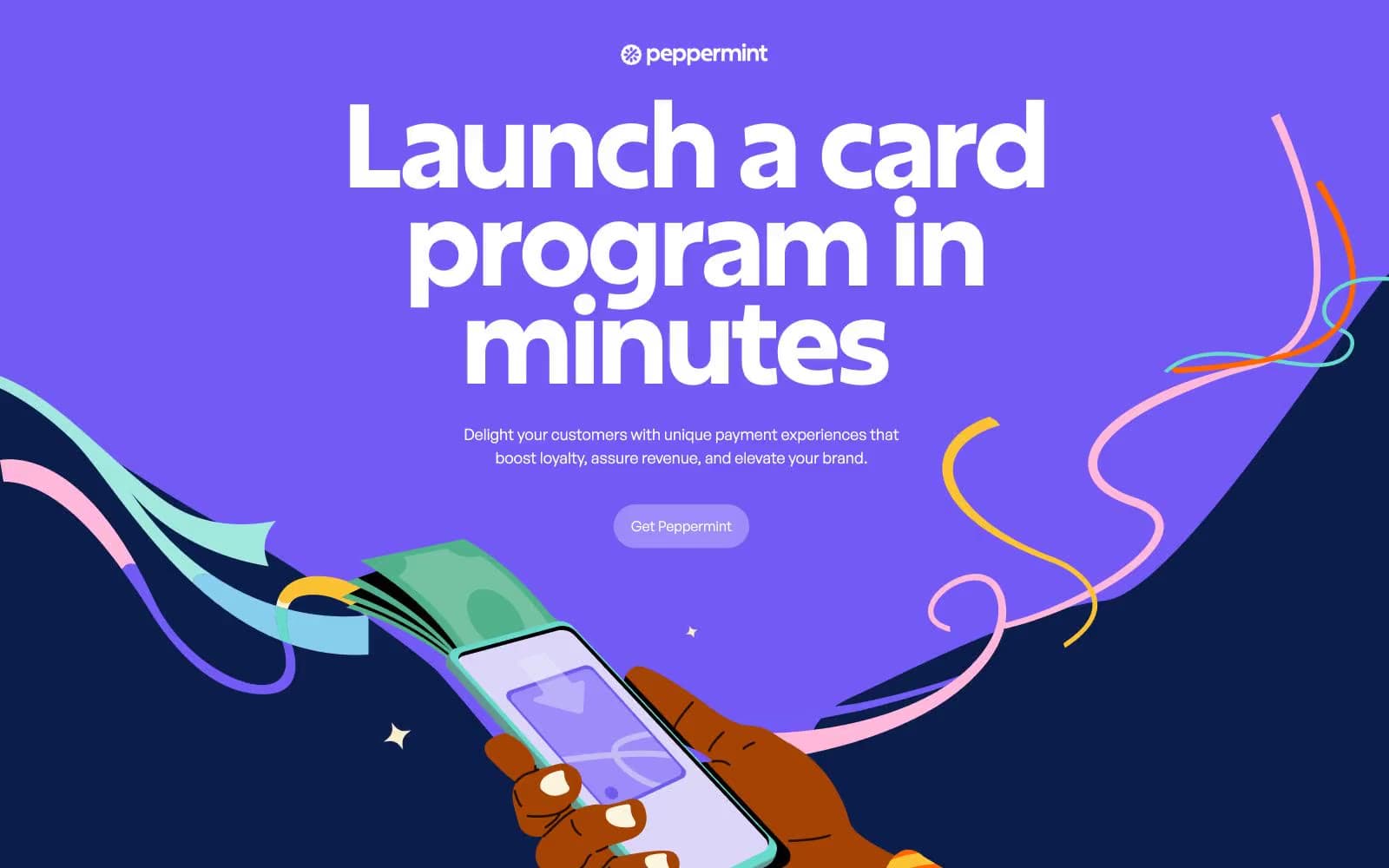
Peppermint design system

Brand2
Primary canvas for hero and feature bands, body text on cream surfaces, outlined action borders — the void that everything floats on
Rare accent fill for highlight buttons and emphasis moments — a vivid punctuation against the matte navy canvas
Accent7
Elevated card surface against the main canvas — one step lighter than Midnight Sapphire, used for nested feature cards
Muted text on dark sections, secondary borders and dividers — a desaturated companion to the primary navy
Illustrative ribbon strokes, decorative accent lines, hand-drawn highlights in feature illustrations
Illustrative ribbon strokes, teal accents in feature card backgrounds — the secondary illustrative color
Illustrative ribbon strokes, light blue decorative curves in hero and feature illustrations
Secondary illustrative teal — lighter ribbon strokes and soft decorative elements
Soft pink-tinted card surface — warm pink background for individual feature card variants
Neutrals5
Body text borders, form field borders, subtle dividers — cool gray that reads as neutral on both light and dark surfaces
Muted helper text, subtle borders, low-emphasis labels — a warm desaturated gray for tertiary information
FAQ section background, warm surface wash, decorative fills — slightly more saturated than Warm Cream to signal content zones
Hairline borders, dividers, input outlines, and card edges on light surfaces. Do not promote it to the primary CTA color
Primary text and icon color on dark sections, high-contrast borders — used sparingly for maximum readability
Try a pairing
Pick any two colors from the palette to check whether text stays readable on top.
Aa
Pure White on Midnight Sapphire
16.28 : 1 contrast
- Body textPasses AA 4.5
- Large textPasses AA 3
- StrictPasses AAA 7
More DESIGN.md files. Same web, different personalities.
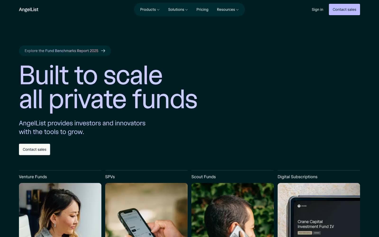
AngelList
Finance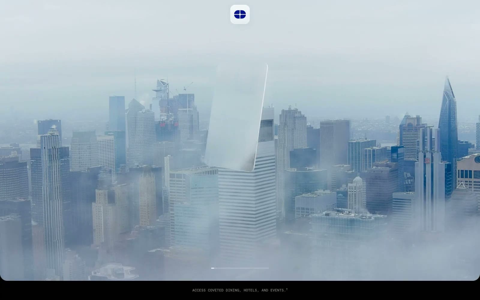
Atlas Card
Finance
Boostinsurance
Finance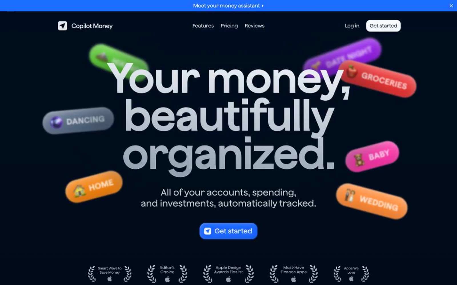
Copilot Money
Finance
Design
Finance
DNA
Finance
Fey
Finance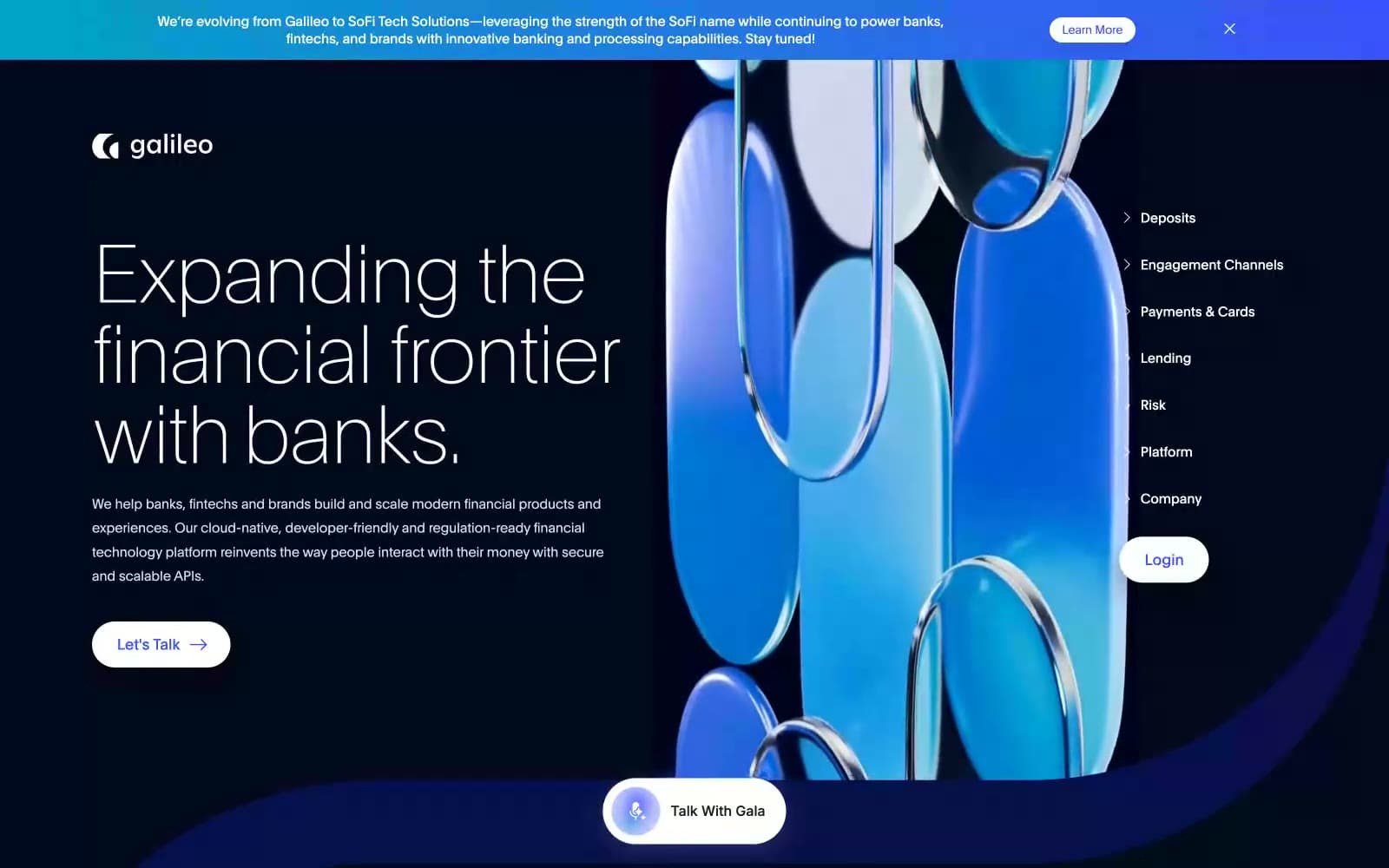
Galileo-ft
Finance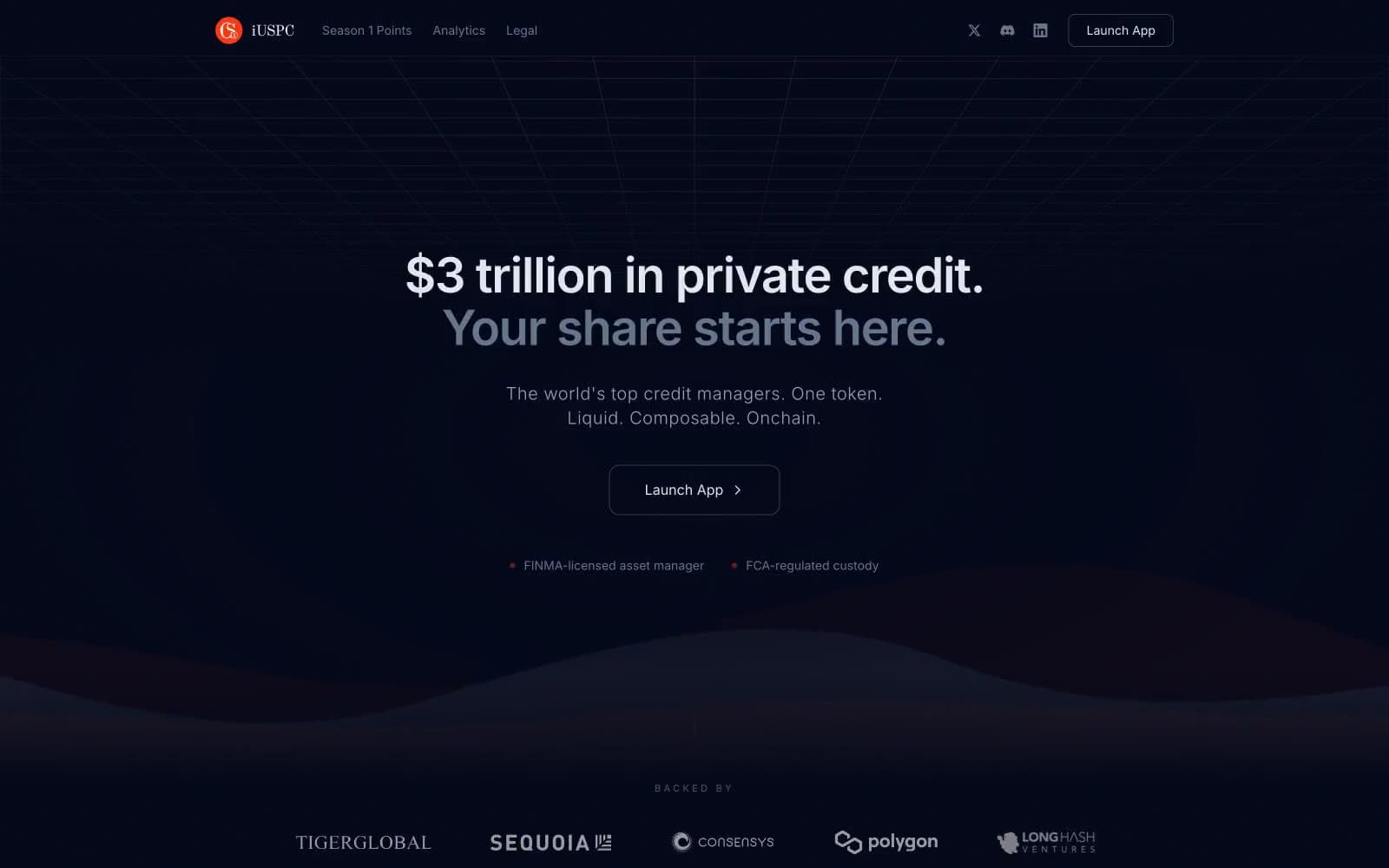
iUSPC by Coinshift
Finance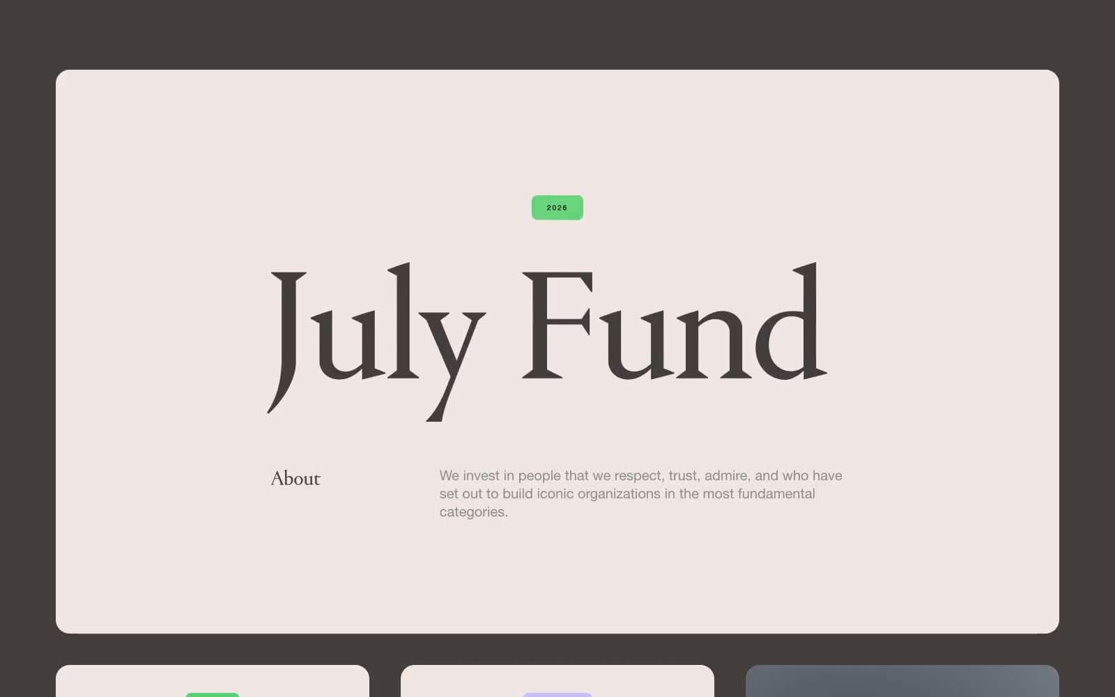
July Fund
Finance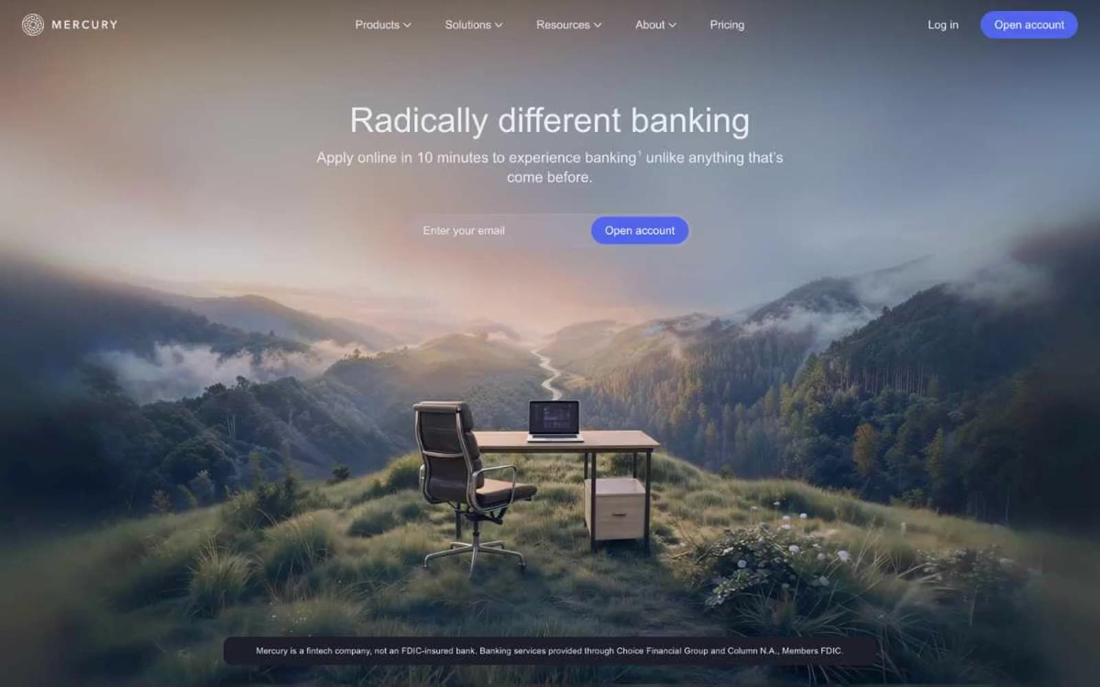
Mercury
Finance
Origin Financial
Finance


