
Opal Electronics. Prototypes on a glass table, a yellow button in the dark.
- Brand
- Mixed theme
- 15 colors
- 3 typefaces
Opal Electronics opens on a single letter set over film: an overhead 2160p loop of hands arranging cameras, circuit boards and prototypes on a table, with a 400px column of white Die Grotesk C running down its centre at 23.3px. The film falls away into Void #000000, where the last line, See you soon, is the one touch of Signal Yellow #ffdb01 and a pointer-lit dot-matrix wordmark fills the footer. Its other routes split in tone: Jobs stays black with #7c7c7c text and an 80px/700 title, while Composer and Dr. Opal go light, with glossy yellow 3D objects and bolted white instrument panels. Depth is reserved for those panels; the editorial pages are flat.
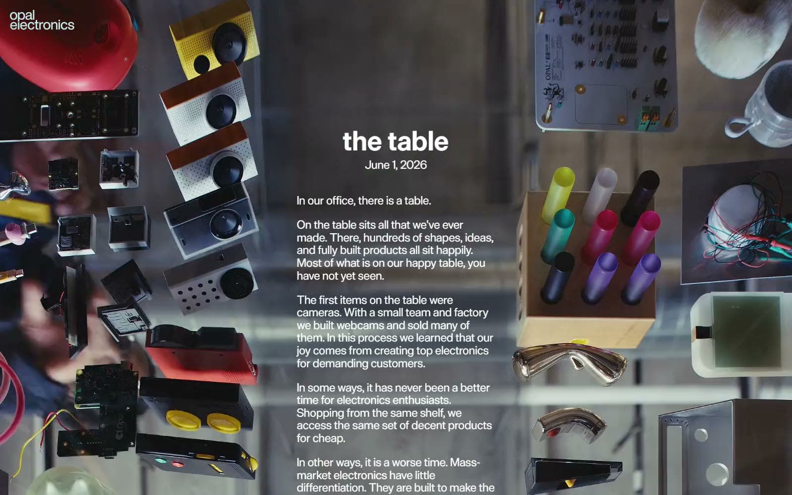
Opal Electronics design system

Brand1
The Allow Connection fill and the See you soon sign-off — the site's --color-opal-yellow-digital, used in tiny doses
Accent2
The 1px edge around the yellow Allow Connection button, which gives the fill a pressed-hardware rim
The 3px rule on Composer release-note notice blocks, a dulled echo of the yellow on white
Neutrals12
Footer, Jobs canvas, the fade under the table film, and Download button fills on light routes
Manifesto text on film, Apply button fill, and the Composer and Dr. Opal panels
Full-bleed canvas behind the Composer hero, the seamless backdrop for its glossy 3D objects
Instrument badges and the Copy button on Dr. Opal, one step off the white panel
Role and section headings on the black Jobs route, the job-listing-title token, softer than white
Body copy on the black Jobs page, deliberately low in contrast beneath its bright headings
Composer release-note items and the opal-grey2 token, used for almost all long-form text on white
The huge idle temperature digits on Dr. Opal, nearly white on white, like an unlit display segment
The 12px macOS requirement line under the Composer hero, one step darker than the release notes
All rights reserved in the footer and other fine print, the footer-subtle token
Composer dividers and the uppercase labels on inactive Dr. Opal instrument badges
The row of 8px sprocket squares on the Jobs page, barely visible against Void like tractor-feed paper
Try a pairing
Pick any two colors from the palette to check whether text stays readable on top.
Aa
Void on Signal Yellow
15.39 : 1 contrast
- Body textPasses AA 4.5
- Large textPasses AA 3
- StrictPasses AAA 7
More DESIGN.md files. Same web, different personalities.
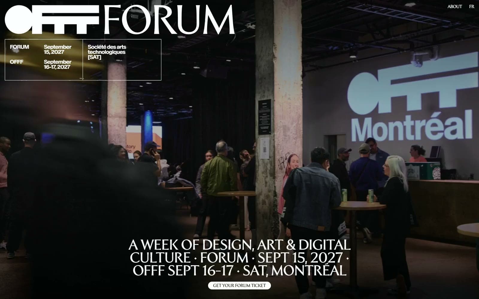
OFFF Forum
Brand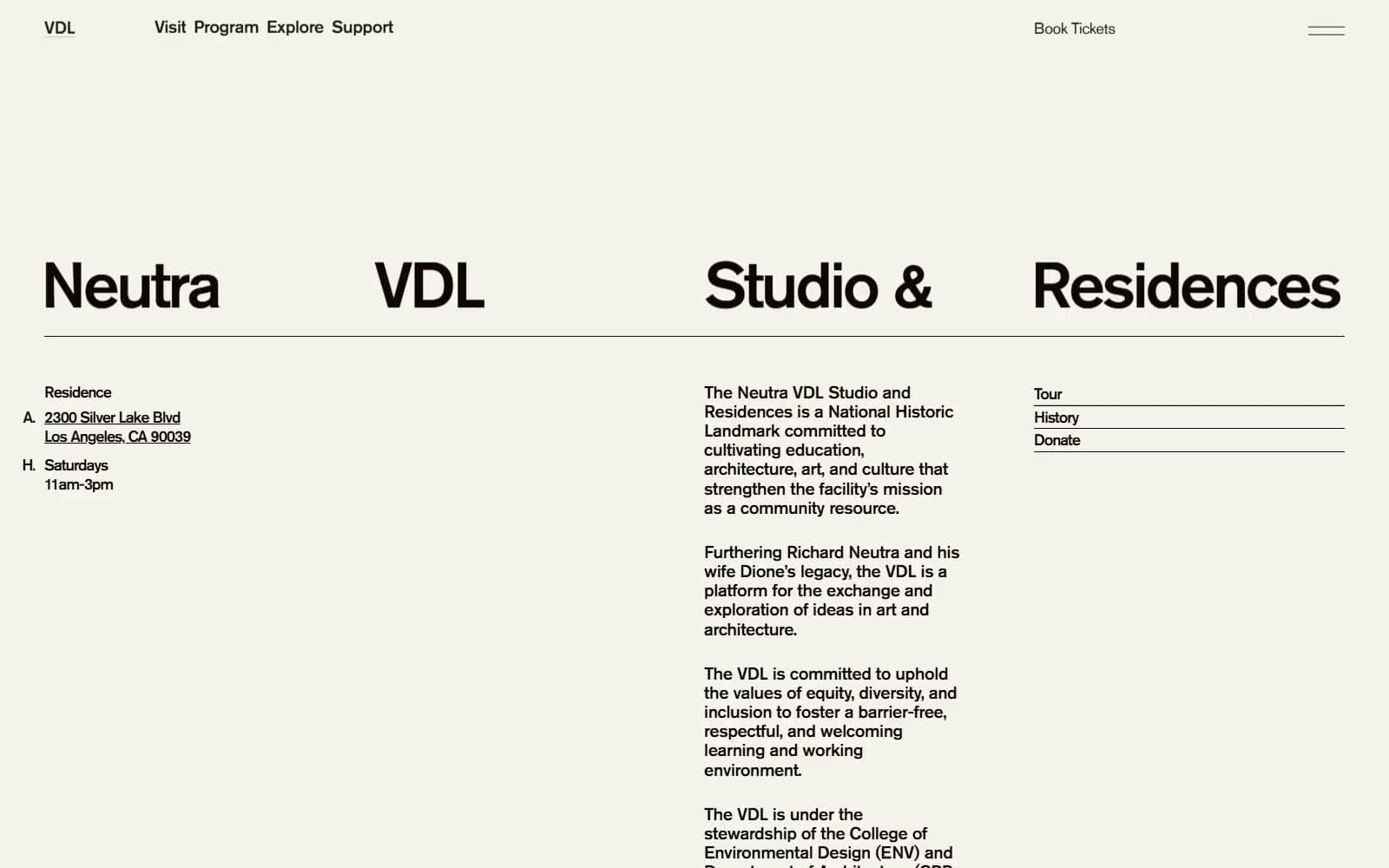
Neutra VDL
Brand
Oath Biome
Brand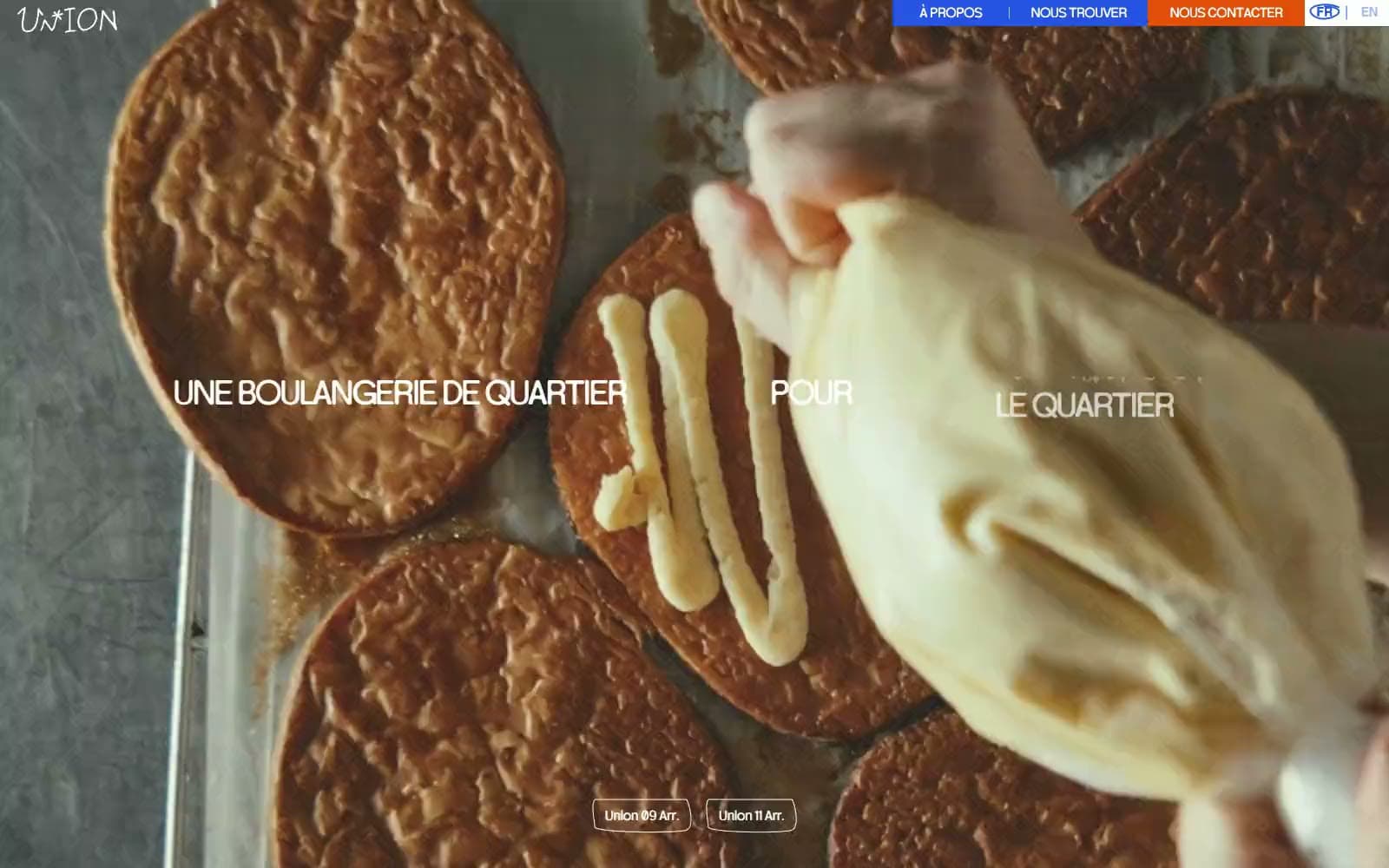
Union Boulangerie
Brand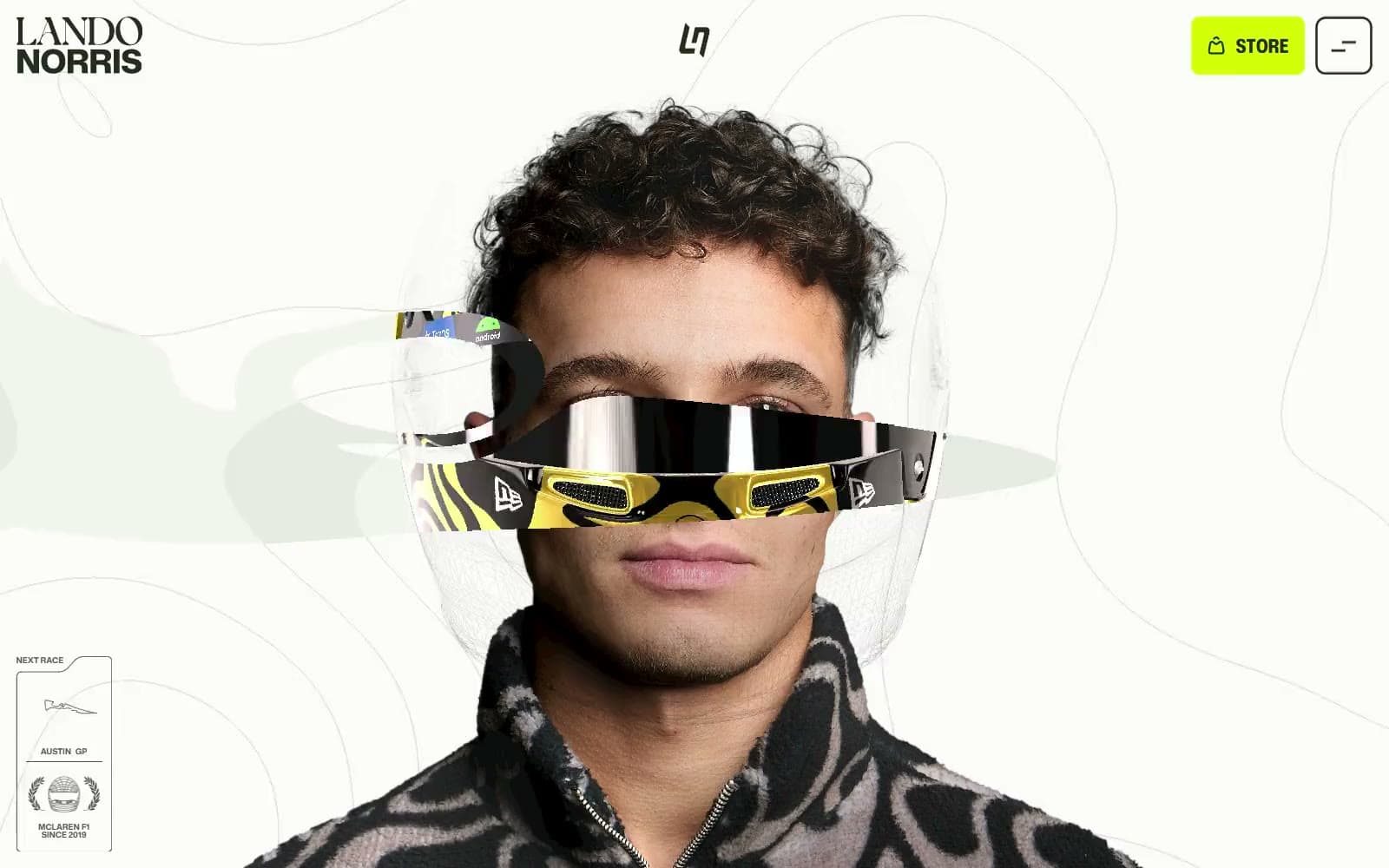
Lando Norris
Brand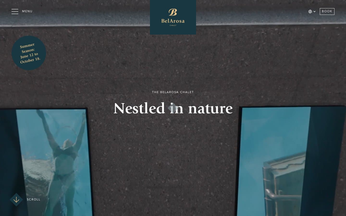
BelArosa Chalet
Brand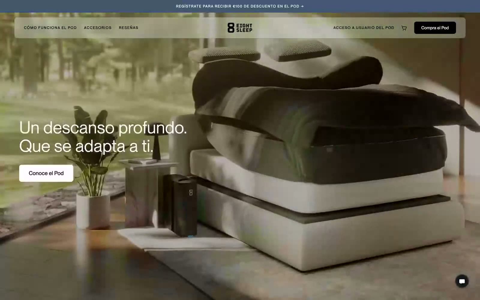
Eight Sleep
Brand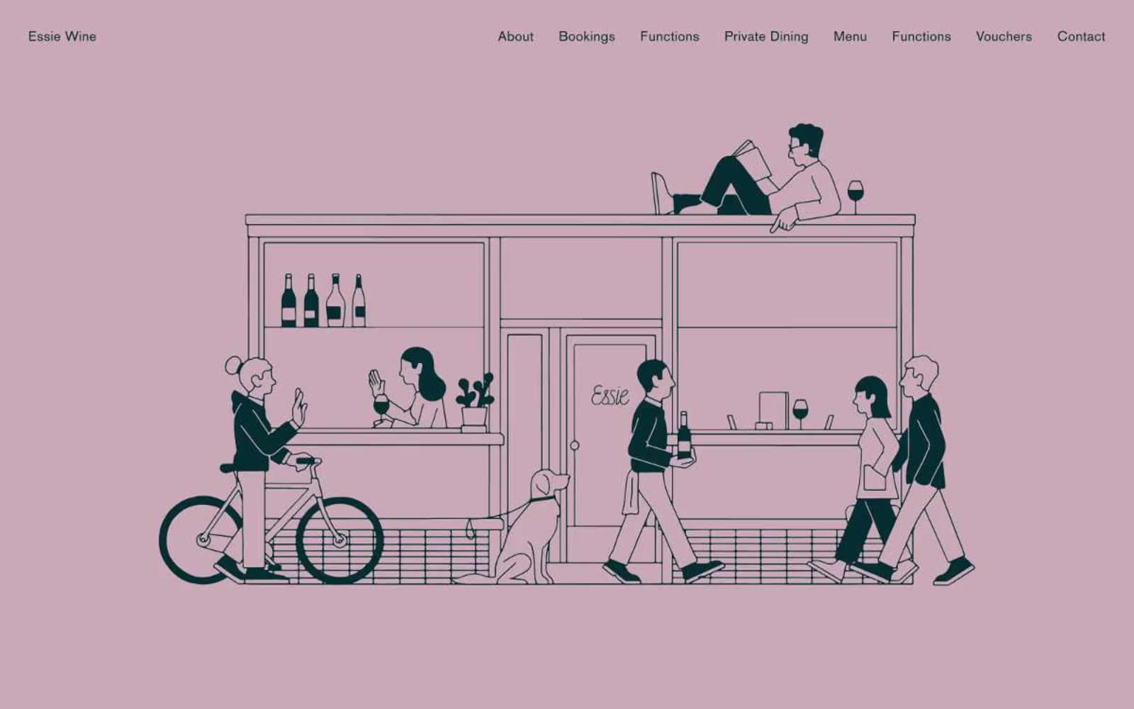
Essie Wine
Brand
Hyer Aviation
Brand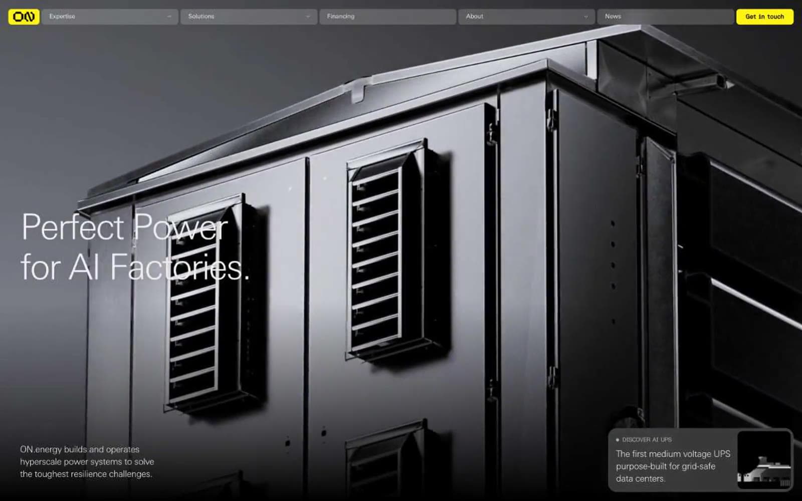
ON.energy
Brand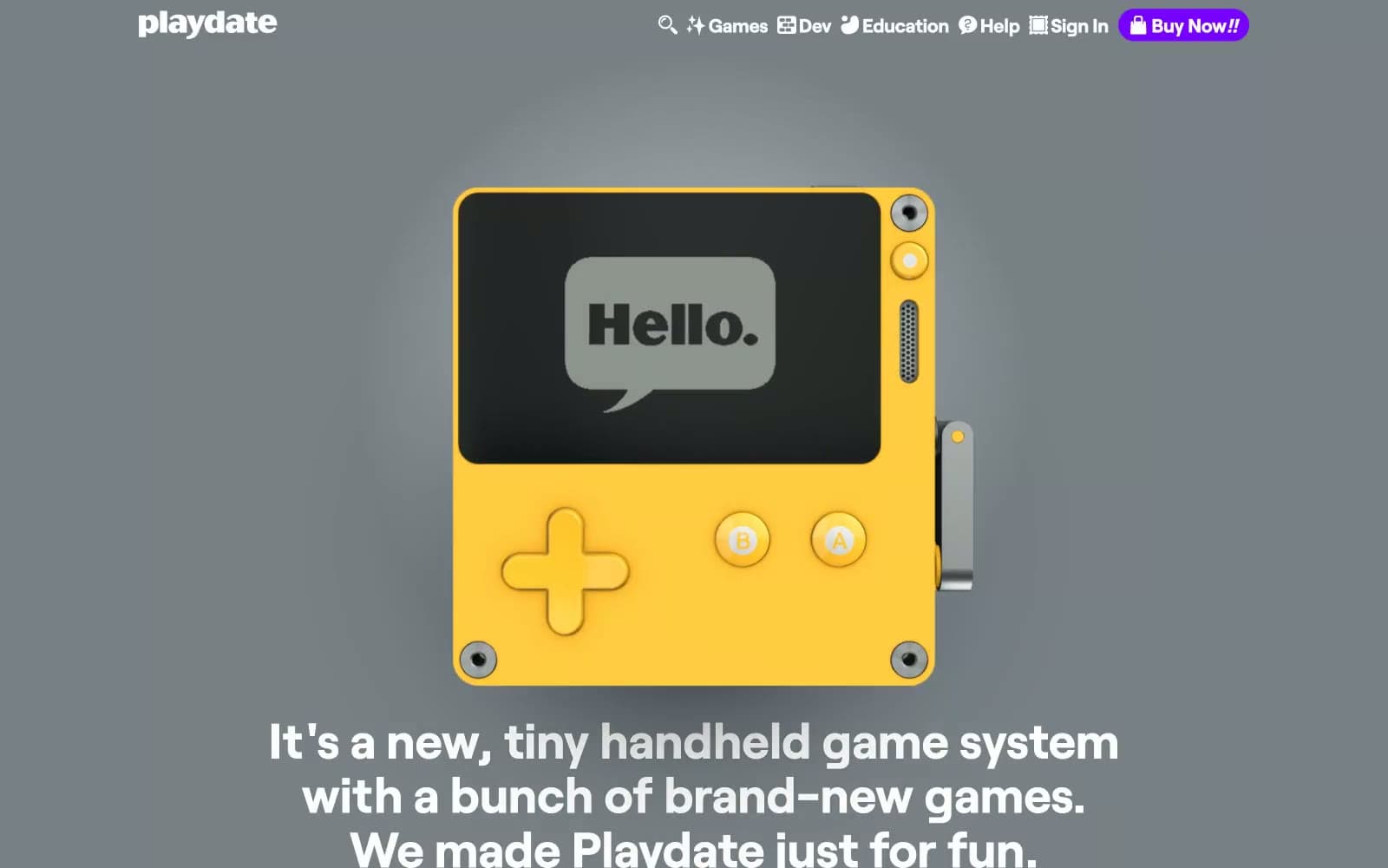
Playdate
Brand
Tech Barcelona
Brand


