
Essie Wine. Dusty rose chapbook with mustard chapter breaks.
- Brand
- Mixed theme
- 8 colors
- 3 typefaces
Essie Wine is an editorial neighborhood-wine-bar identity: three full-bleed color fields (dusty rose, warm white, mustard olive) stitched together by generous vertical breathing room and serif type that reads like a small magazine spread. Color is deployed as atmosphere, not accent — the entire page is the brand, and components are reduced to thin hairline rules, all-caps Elementa labels, and BasicCommercial serif body copy. The illustration in the hero is a single detailed line-art scene that does the storytelling work a SaaS site would delegate to feature cards and metrics. Interactions are quiet: ghost buttons, borderless inputs, no shadows, no gradients, no rounded corners — the only depth comes from section-to-section color shifts.
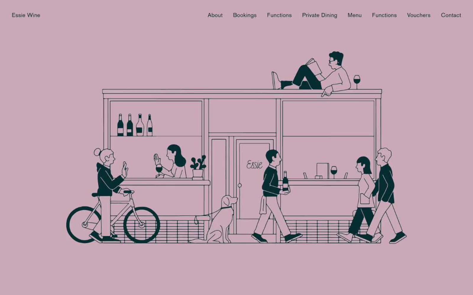
Essie Wine design system

Brand1
Primary type, illustration linework, nav wordmark, heading hairlines — the near-black that reads as warm ink rather than flat black, giving the serif type a hand-printed quality
Accent2
Hero section field — the signature chapter color. Used as a full-bleed canvas behind the line-art illustration to create the soft, sun-bleached, evening-light atmosphere
Booking and function-section field — the warm, earthy second chapter. Appears as a full-bleed background that pushes serif headings and form labels into high-contrast territory
Neutrals5
Maximum-contrast text, form labels, submit-button type — pure black is reserved for the moments that need to feel stamped or pressed
Secondary text, link borders, tertiary headings — a lighter wash of Ink Teal for passages that shouldn't compete with the primary wordmark
Input rule color — the single mid-gray used for form-field bottom borders, giving inputs a printed-on-paper feel rather than a digital-frame feel
Soft canvas variant, off-white surface, hairline divider tone — the off-white that warms the page between full-color sections
Default page canvas and the lightest of the three section fields. Provides the resting breath between the rose hero and the mustard form
Try a pairing
Pick any two colors from the palette to check whether text stays readable on top.
Aa
Paper White on Ink Teal
14.69 : 1 contrast
- Body textPasses AA 4.5
- Large textPasses AA 3
- StrictPasses AAA 7
More DESIGN.md files. Same web, different personalities.
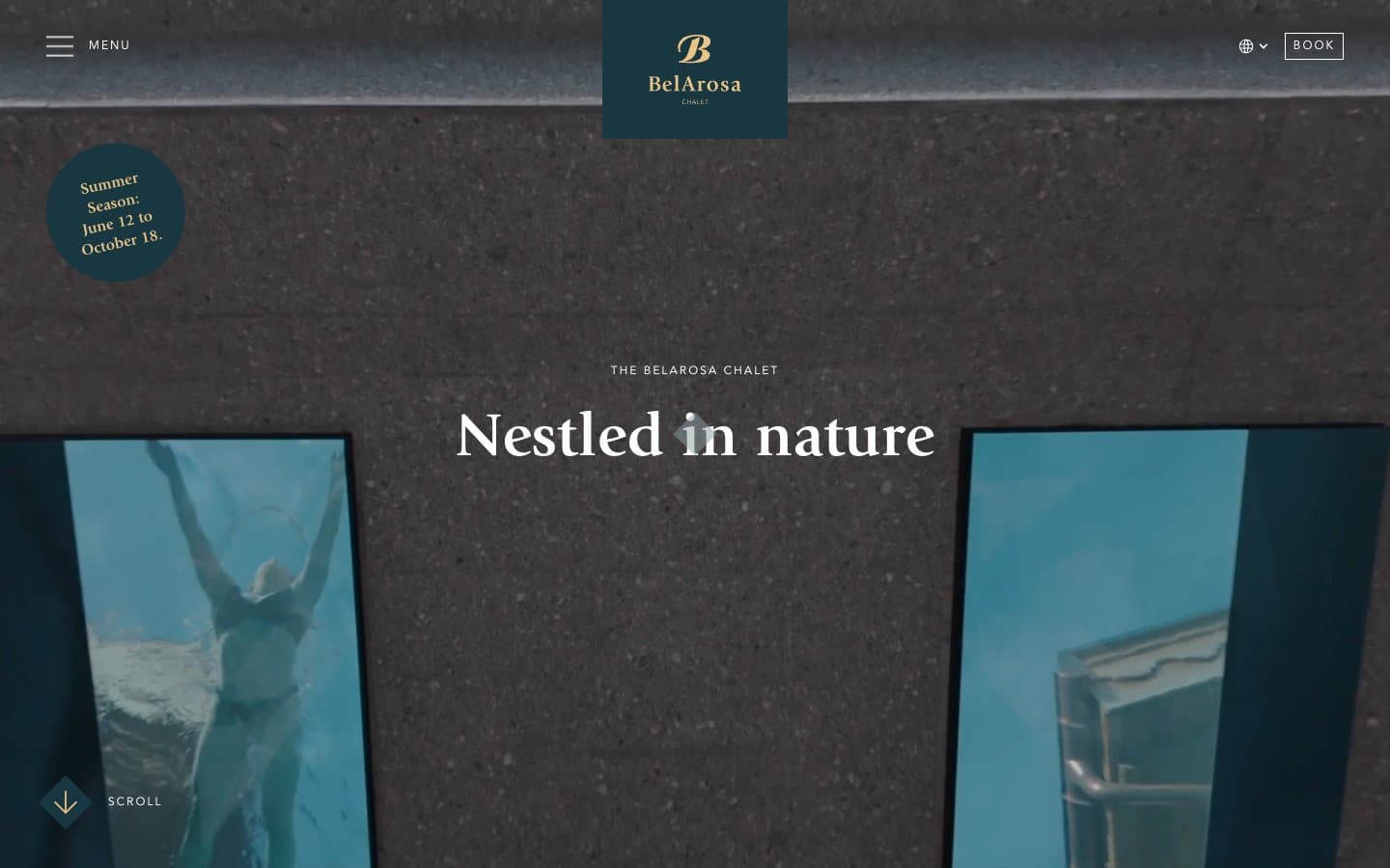
BelArosa Chalet
Brand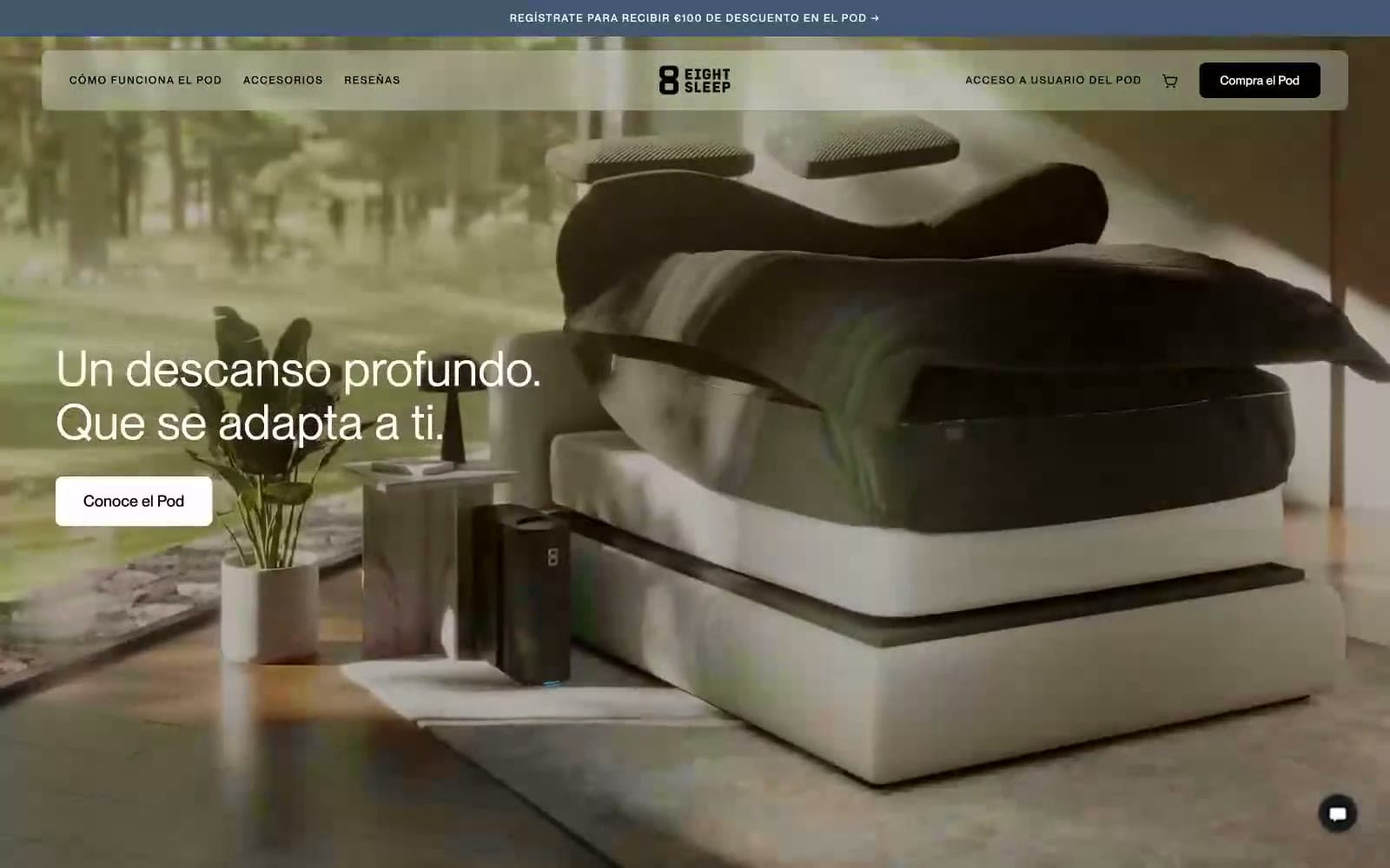
Eight Sleep
Brand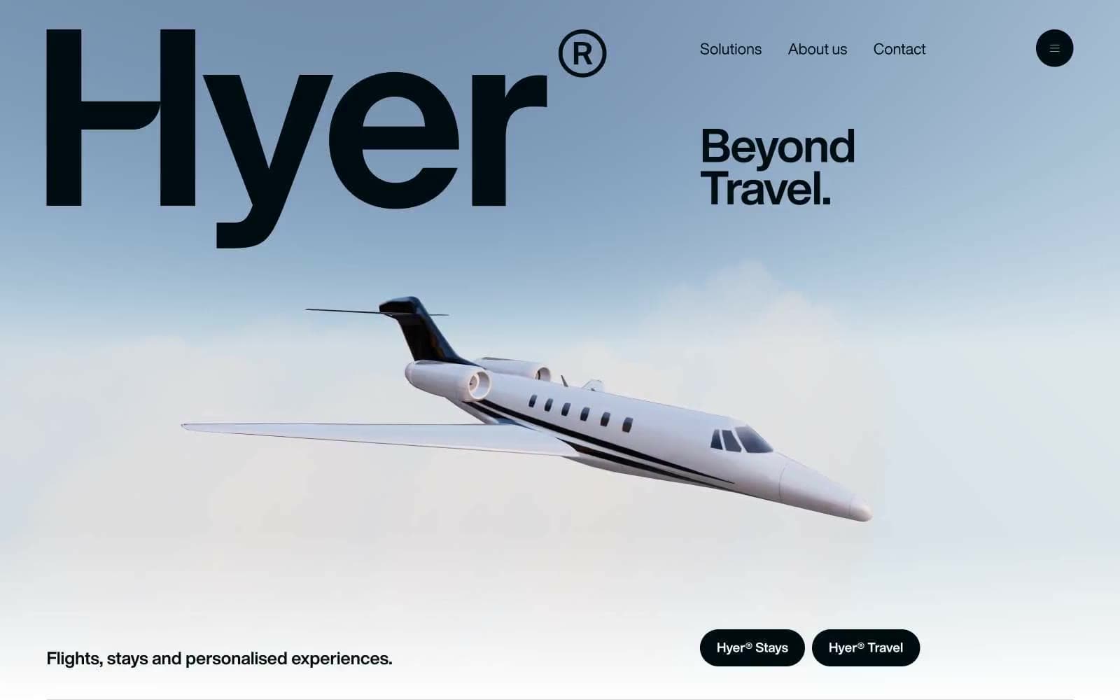
Hyer Aviation
Brand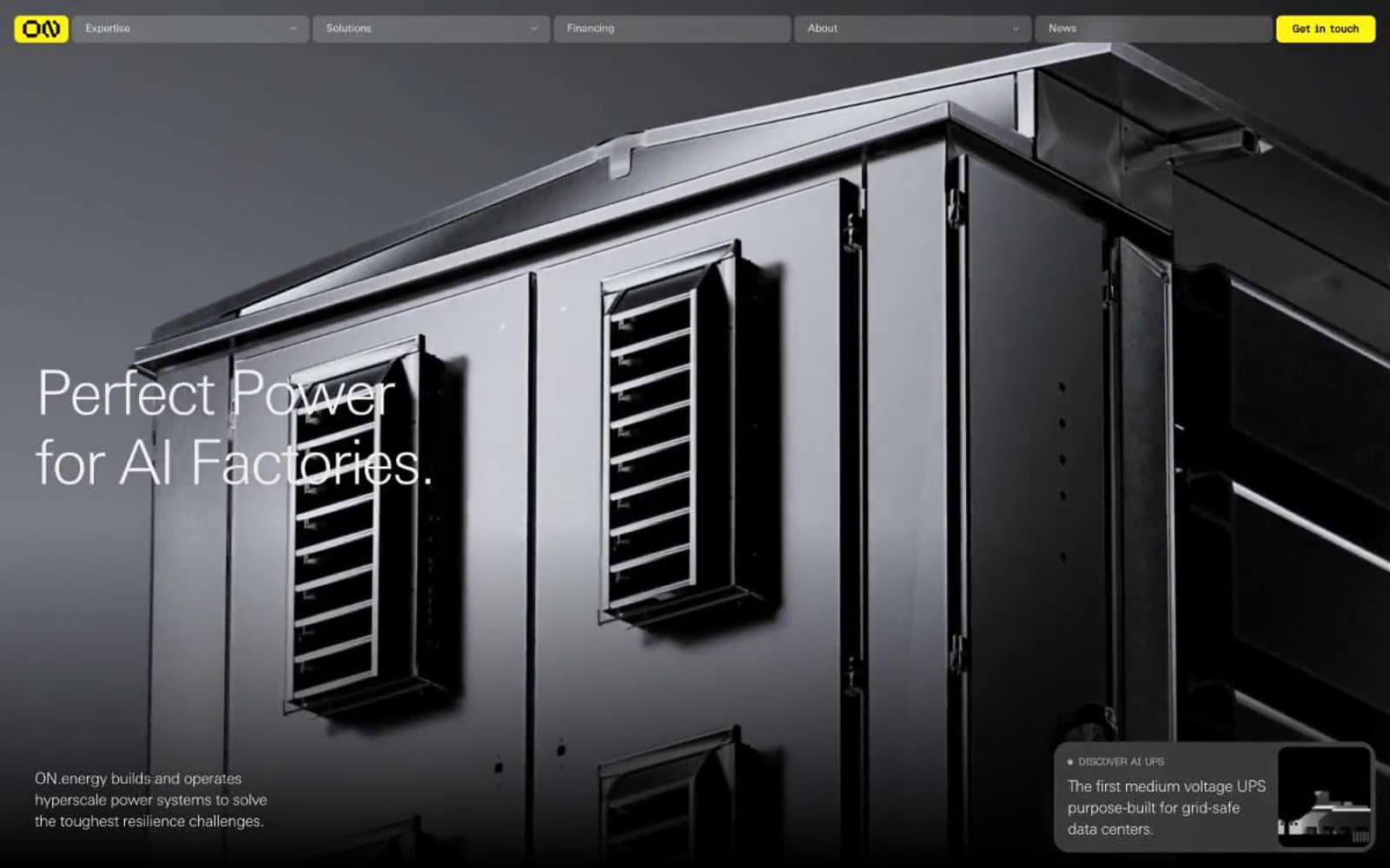
ON.energy
Brand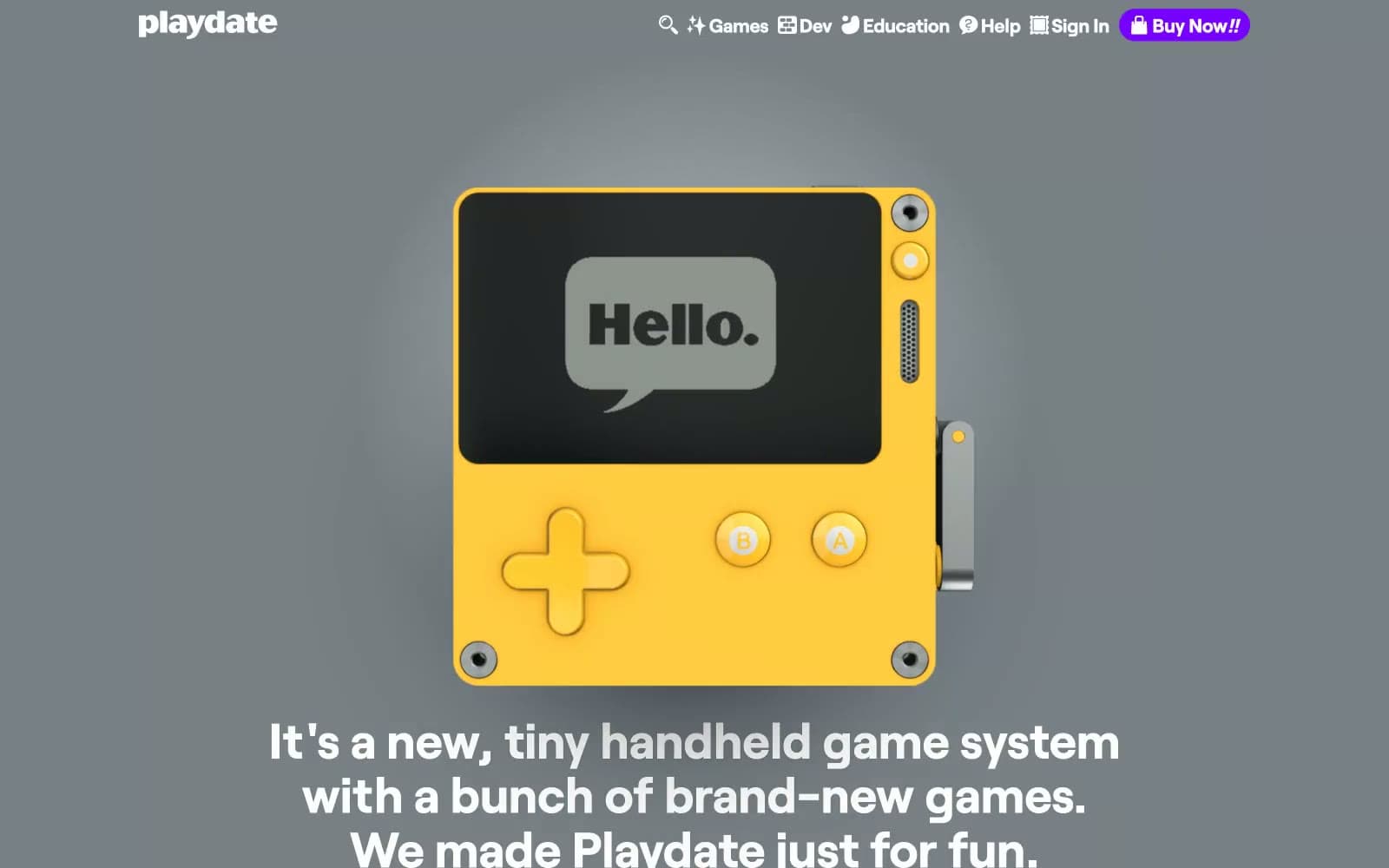
Playdate
Brand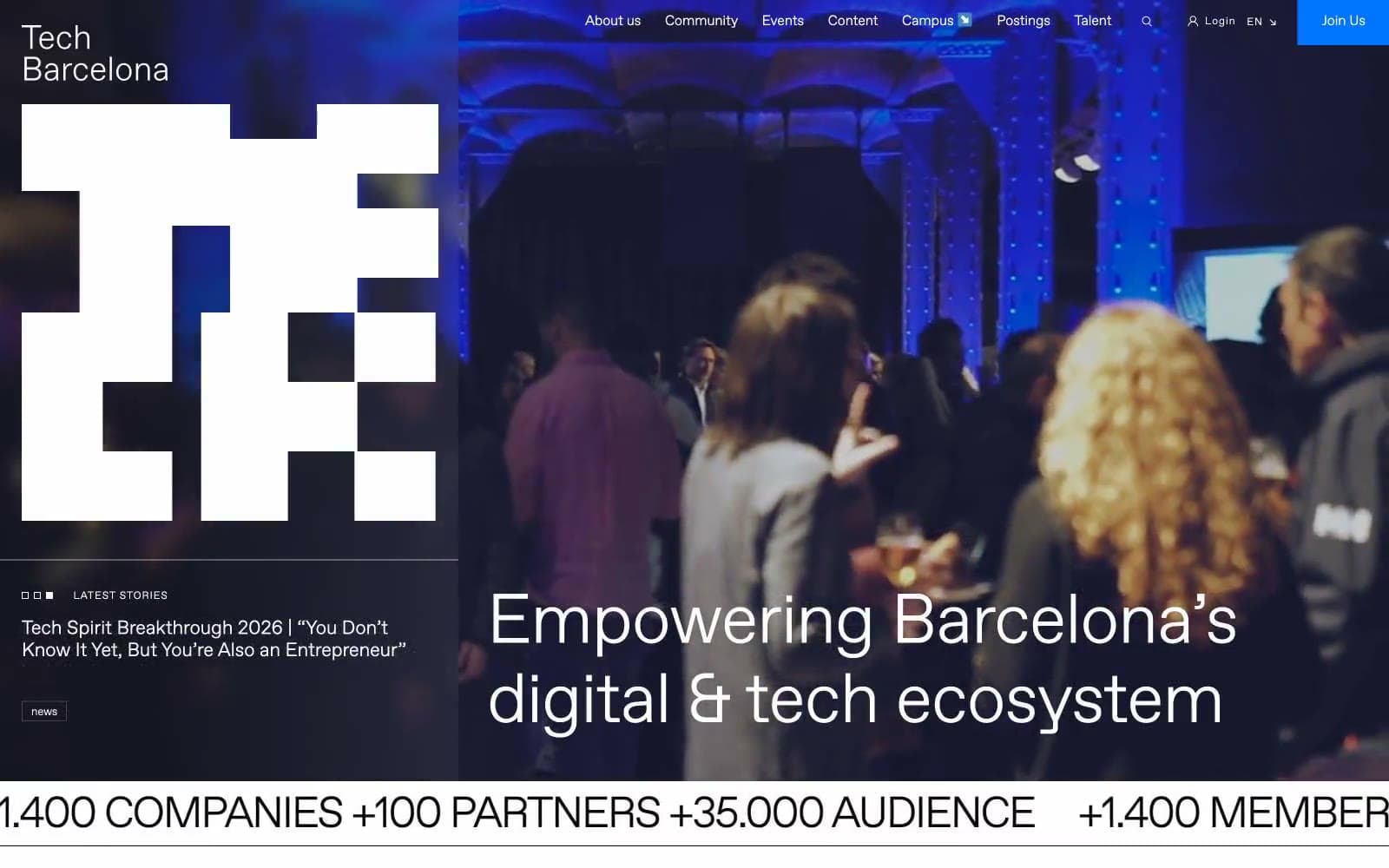
Tech Barcelona
Brand
Cuberto
Studio
Nothing
Commerce
Empower
Finance
10X HUB
Design tools
11x
AI
8returns
SaaS


