
BelArosa Chalet. Dusk on alpine vellum.
- Brand
- Mixed theme
- 8 colors
- 2 typefaces
The BelArosa Chalet system channels alpine luxury through a restrained two-color palette: deep mountain teal (#193741) dominates as the signature surface and structural border color, while warm honey gold (#eac486) appears only in the monogram and decorative accents, never as a functional fill. Typography pairs a humanist sans (Avenir) for all UI, navigation, and body text with a transitional serif (ITC Giovanni) exclusively for editorial headlines — this duality is the site's defining signature, creating an editorial-luxury identity where serif moments feel like pull quotes in a travel magazine. Layout alternates between full-bleed dark teal hero sections and warm parchment content bands, using 80px pill-radius outlined buttons and generous 64–80px section gaps to create a slow, breathing rhythm. The design is flat and architectural: no drop shadows, depth communicated entirely through color contrast and hairline borders. The colorfulness of just 5% is intentional — restraint is the luxury signal.
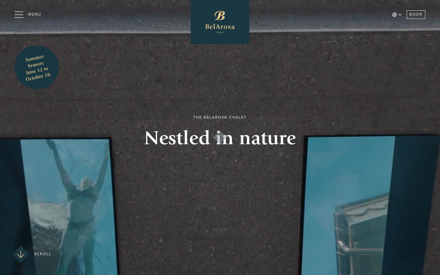
BelArosa Chalet design system

Brand2
Dominant structural color — hero backgrounds, dark section surfaces, primary text, navigation links, and the most-used border color in the system. The near-gray teal reads as atmospheric depth rather than saturated color
Slightly lifted variant of Mountain Slate for outlined action borders, hover states, and secondary dark surfaces. Provides subtle differentiation from the primary teal without introducing a new hue family
Accent1
Yellow decorative accent for icons, marks, and small graphic details. Do not promote it to the primary CTA color
Neutrals5
Input field borders, fine icon fills. Used sparingly as a true-black anchor
Rare dark accent for button text and select borders where pure black feels too harsh against the teal-and-cream system
Muted text, secondary borders, and subdued UI elements. A cool desaturated gray that sits comfortably between the warm cream and deep teal
Cream surface for content bands — sits between pure white and the dark teal sections to create a soft warm middle tone. Reads as aged paper or natural linen
Primary page canvas, navigation bar, light content section backgrounds, and ghost button text on dark surfaces
Try a pairing
Pick any two colors from the palette to check whether text stays readable on top.
Aa
Snow White on Mountain Slate
12.62 : 1 contrast
- Body textPasses AA 4.5
- Large textPasses AA 3
- StrictPasses AAA 7
More DESIGN.md files. Same web, different personalities.
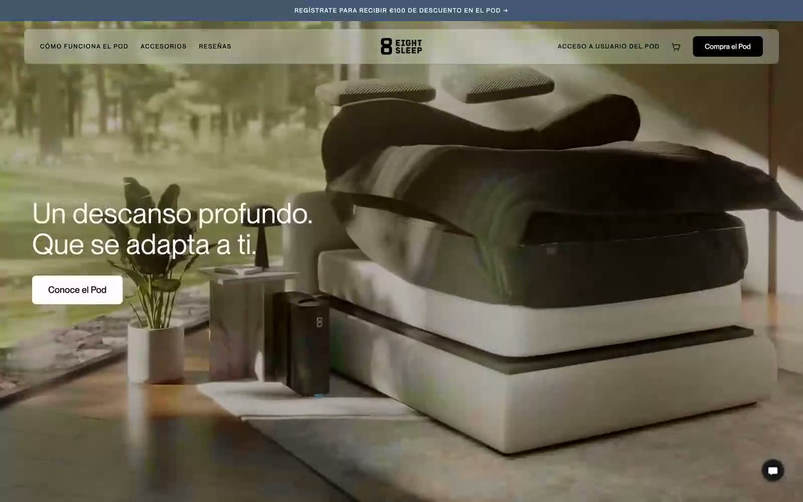
Eight Sleep
Brand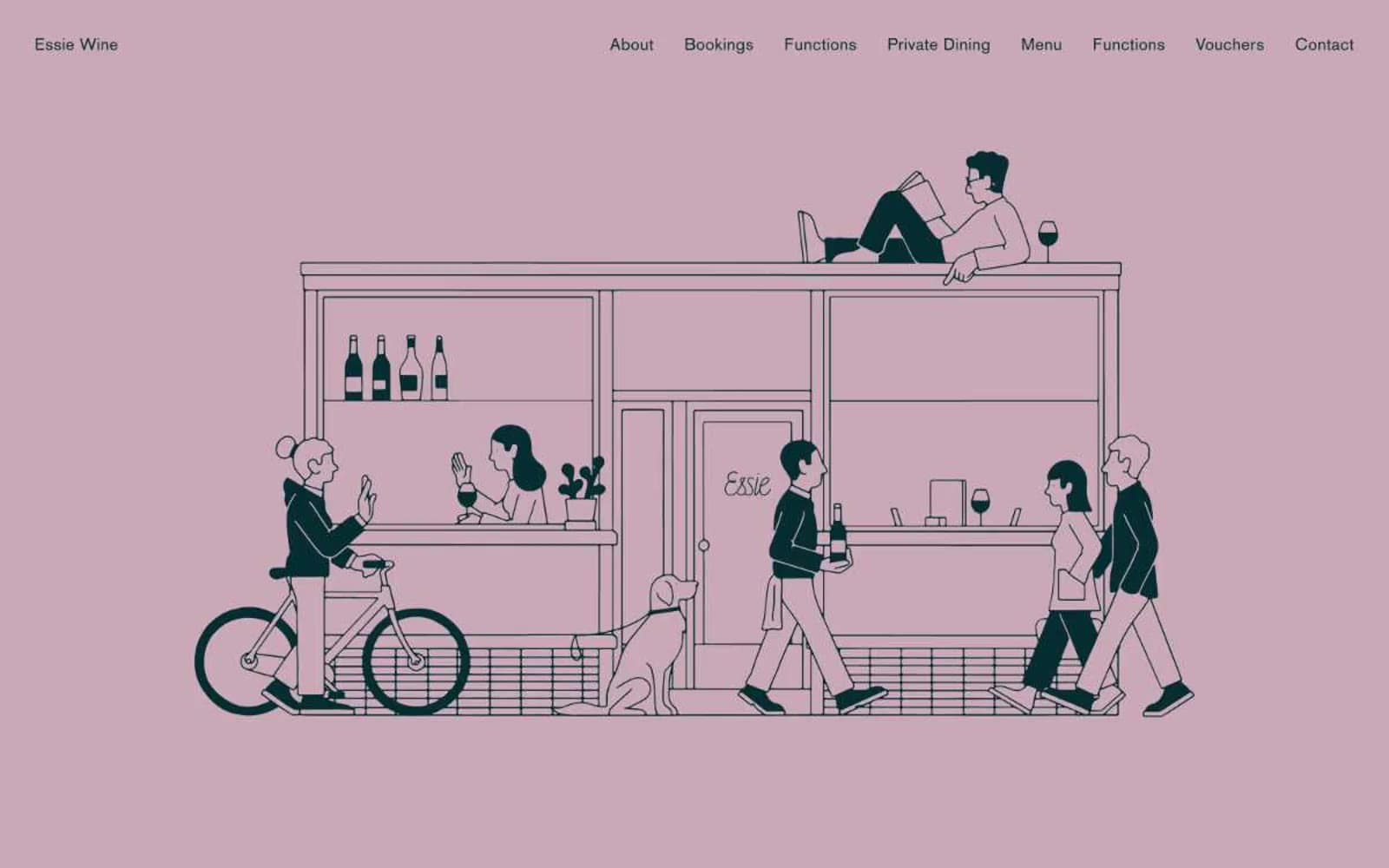
Essie Wine
Brand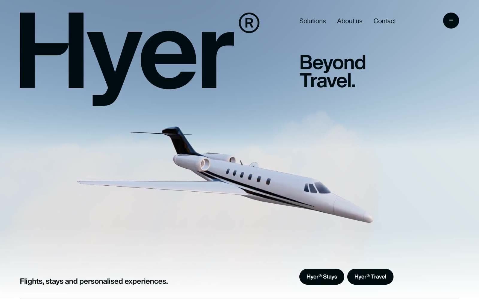
Hyer Aviation
Brand
ON.energy
Brand
Playdate
Brand
Tech Barcelona
Brand
Cuberto
Studio
Nothing
Commerce
Empower
Finance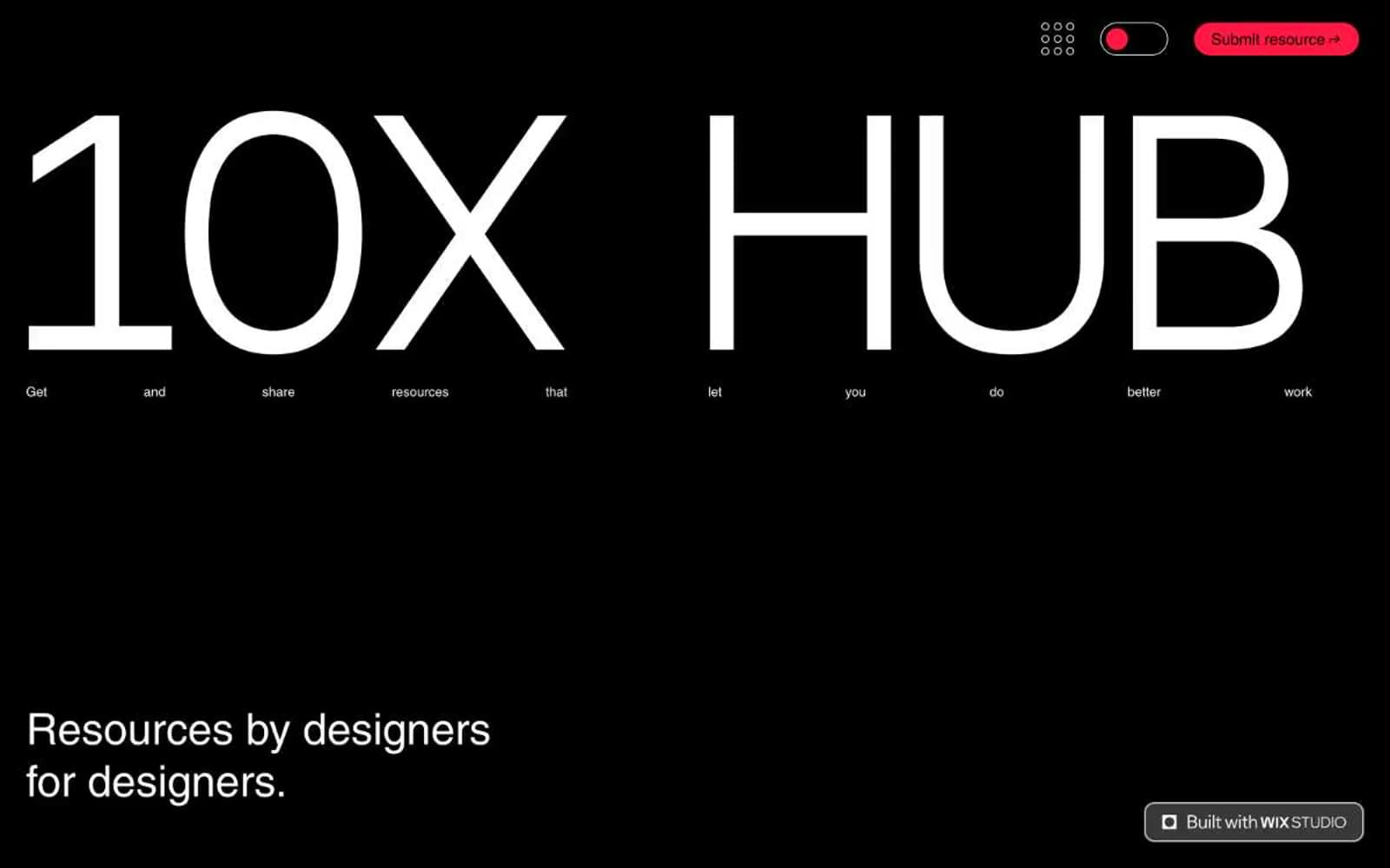
10X HUB
Design tools
11x
AI
8returns
SaaS


