
Eight Sleep. Midnight observatory with single neon pulse.
- Brand
- Mixed theme
- 12 colors
- 1 typeface
Eight Sleep communicates through nocturnal luxury: a stark dark hero stage gives way to warm off-white surfaces and one electric blue accent that functions like a pulse of light in a quiet room. Typography carries the entire brand voice — NeueMontreal at weight 300 at near-display sizes creates whispered authority, with letter-spacing tightening as scale grows. The palette is almost deliberately starved of color: pure black, warm cream (#f9f8f7) instead of clinical white, and a single vivid blue that earns attention by being absent everywhere else. Components are flat and architectural — pill buttons, 12px cards, hairline borders, and a single whisper-soft shadow. Visual rhythm alternates between full-bleed dark bands and light editorial sections, creating a sleep-cycle cadence across the page.
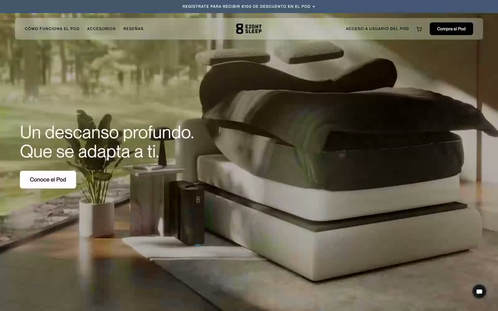
Eight Sleep design system

Brand1
Links, selected/active states, quiz option highlights, focus rings — the only chromatic accent, used sparingly as functional punctuation
Accent1
Secondary dark accent for hover states and subtle blue-tinted borders on dark sections
Neutrals10
Headlines, body text, full-bleed dark hero stage, nav text on light surfaces — the structural anchor of the system
Card borders on dark sections, divider lines in dark hero areas
Dark surface text, footer text, secondary dark-mode body copy
Secondary body text, card subtext, dimmed nav items
Muted helper text, secondary icon strokes, inactive button labels
Disabled button borders and text, tertiary iconography
Hairline dividers, selected option backgrounds in dropdowns
Nested card containers, subtle elevated surfaces, input field backgrounds
Hero panels, soft section backgrounds, card surfaces on light pages — replaces clinical white with a linen warmth
Light supporting surface for subtle backgrounds and section separation. Do not promote it to the primary CTA color
Try a pairing
Pick any two colors from the palette to check whether text stays readable on top.
Aa
Paper White on Pulse Blue
5.45 : 1 contrast
- Body textPasses AA 4.5
- Large textPasses AA 3
- StrictFails AAA 7
More DESIGN.md files. Same web, different personalities.
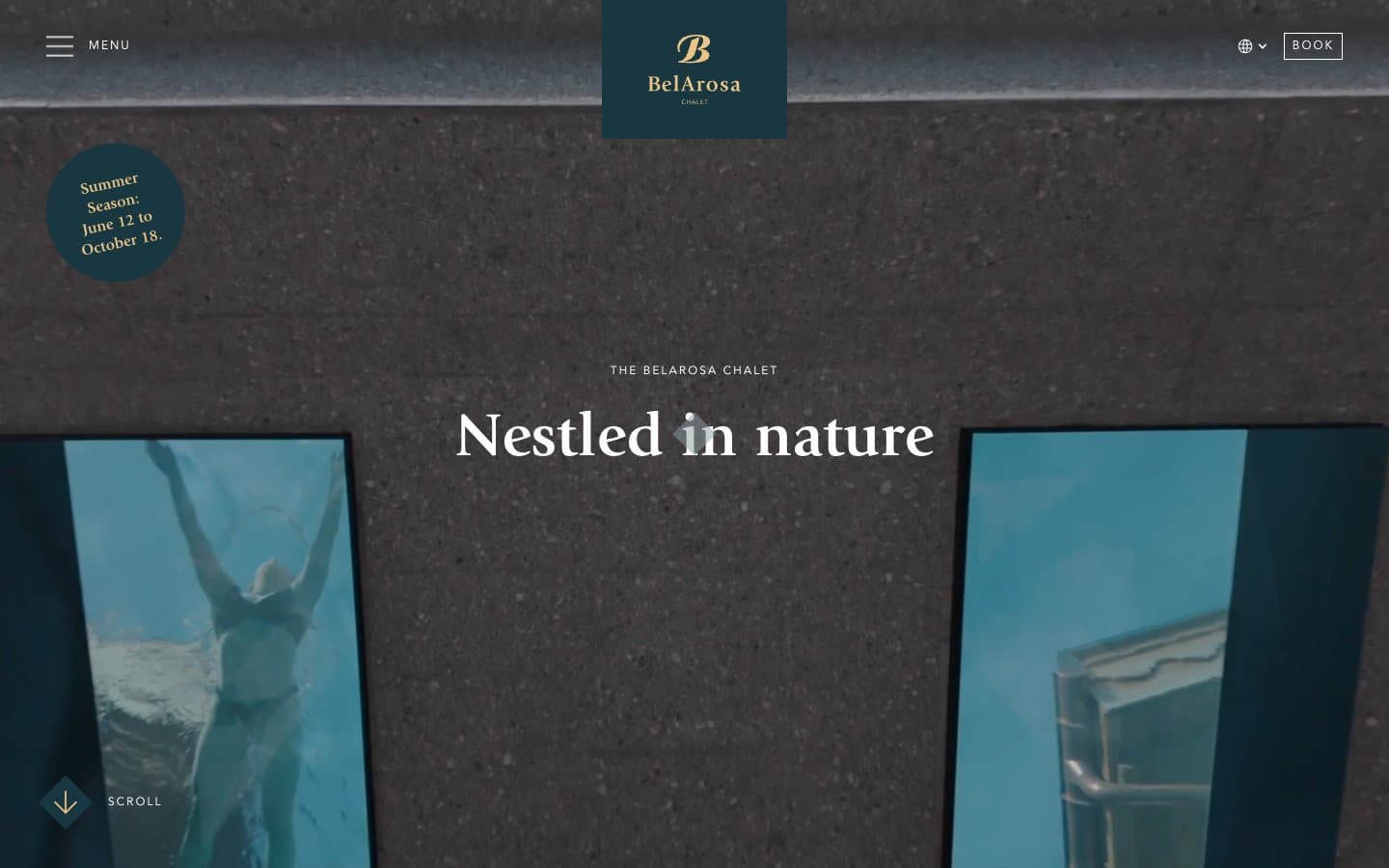
BelArosa Chalet
Brand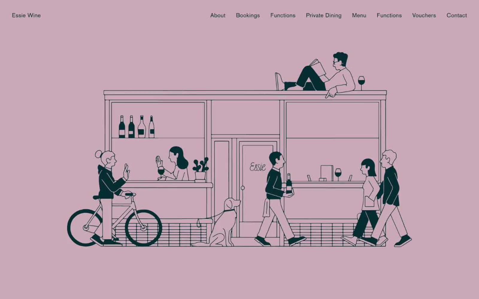
Essie Wine
Brand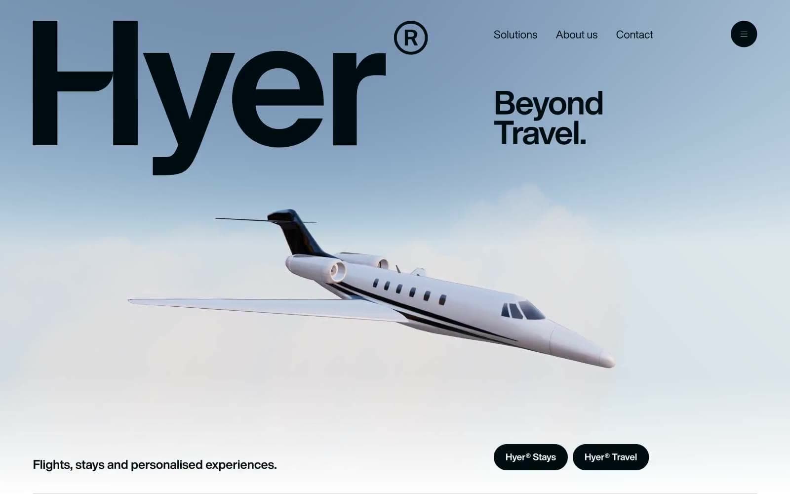
Hyer Aviation
Brand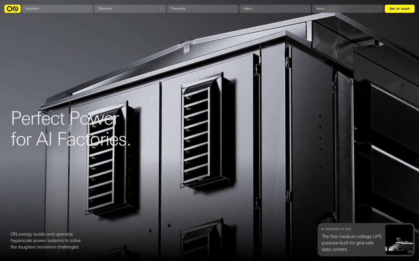
ON.energy
Brand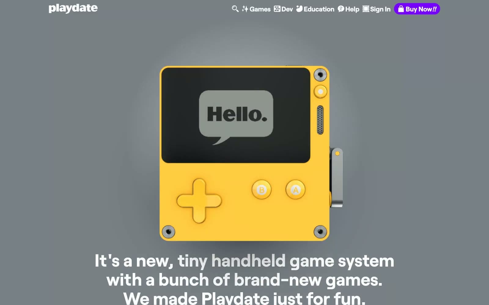
Playdate
Brand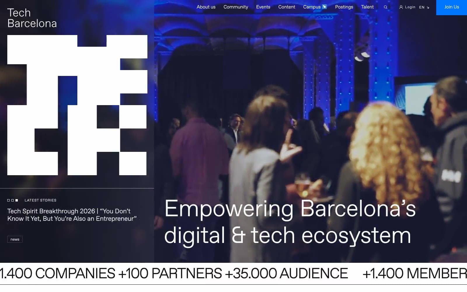
Tech Barcelona
Brand
Cuberto
Studio
Nothing
Commerce
Empower
Finance
10X HUB
Design tools
11x
AI
8returns
SaaS


