
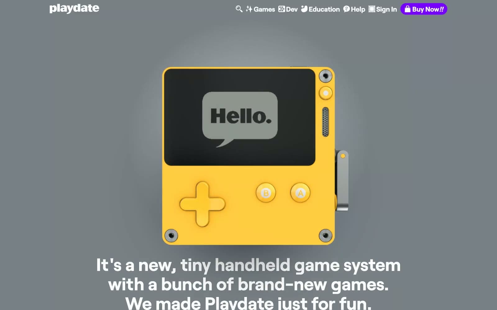
Playdate. A yellow Game Boy under museum lights.
- Brand
- Mixed theme
- 8 colors
- 1 typeface
Playdate reads like a sunlit toy-store catalog: saturated yellow bands alternate with cool gray and white sections, each one a stage for the bright handheld itself. A single violet accent does all the talking — buttons, links, the nav buy-pill — while the rest of the UI stays quiet on warm charcoal text and bone-white cards. Roobert carries the tone: an oversized lowercase wordmark in sunflower yellow is the brand's signature, body copy sits at a confident 22px in a humanist geometric, and line-height is generous enough to feel handmade. Components are intentionally weightless: 2.85px corners on game cards, no decorative borders, and CTAs that float as purple pills with soft drop-shadows. The rhythm is full-bleed sections stacked vertically, each one swapping palette so the page reads like a printed product brochure rather than a typical SaaS landing.
Playdate design system

Brand2
Section backgrounds, the product itself, display wordmarks — the page's primary brand canvas and the loudest single color in the system
Violet supporting accent for decorative details and low-frequency emphasis. Do not promote it to the primary CTA color
Neutrals6
Body text, heading text, icon strokes, form labels — a warm near-black chosen over pure #000 to sit comfortably against yellow and white without vibrating
Hero section background — a desaturated mid-gray that lets the yellow product pop without competing with it
Muted helper text, secondary borders, subdued metadata — the quietest visible neutral
Input backgrounds, callout bubbles, warm light surface — bridges between the cool neutrals and the yellow brand
Light alternate surface, input fill on white sections, subtle dividers
Card surfaces, text on violet buttons, text on dark bands — the default light surface
Try a pairing
Pick any two colors from the palette to check whether text stays readable on top.
Aa
Carbon on Sunbeam Yellow
8.45 : 1 contrast
- Body textPasses AA 4.5
- Large textPasses AA 3
- StrictPasses AAA 7
More DESIGN.md files. Same web, different personalities.
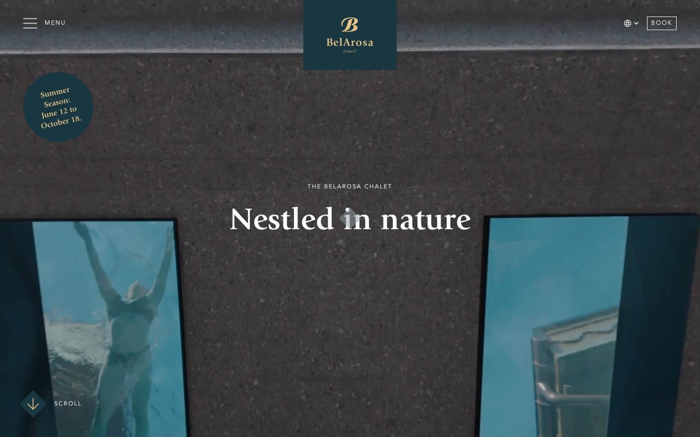
BelArosa Chalet
Brand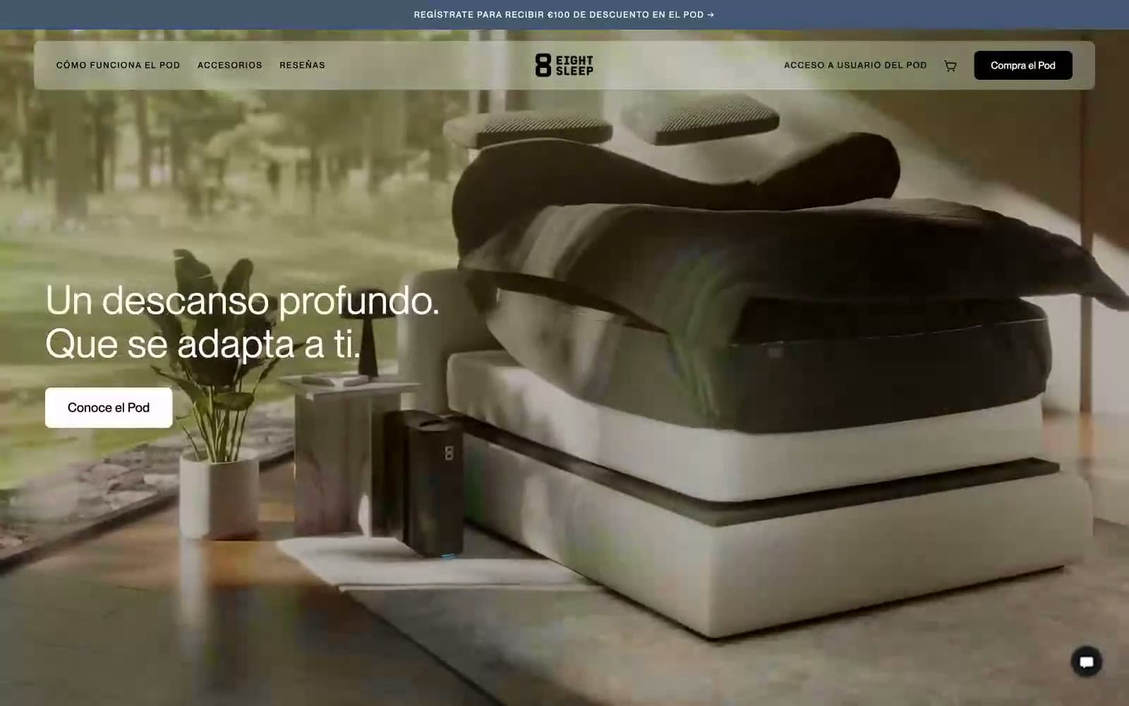
Eight Sleep
Brand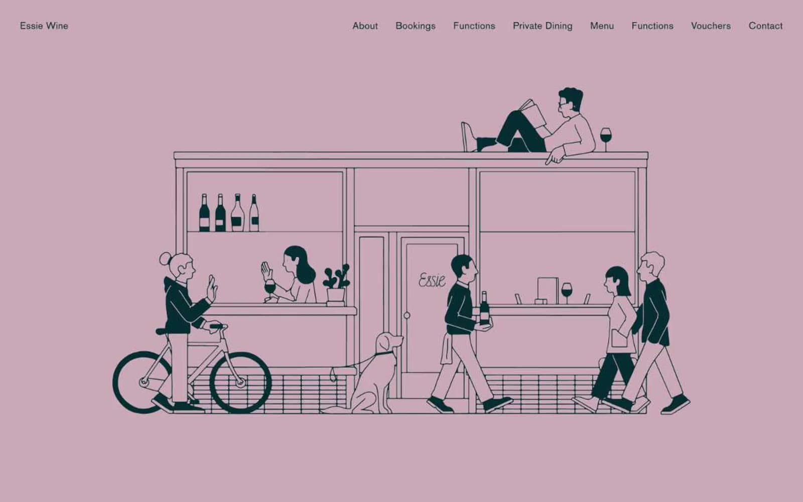
Essie Wine
Brand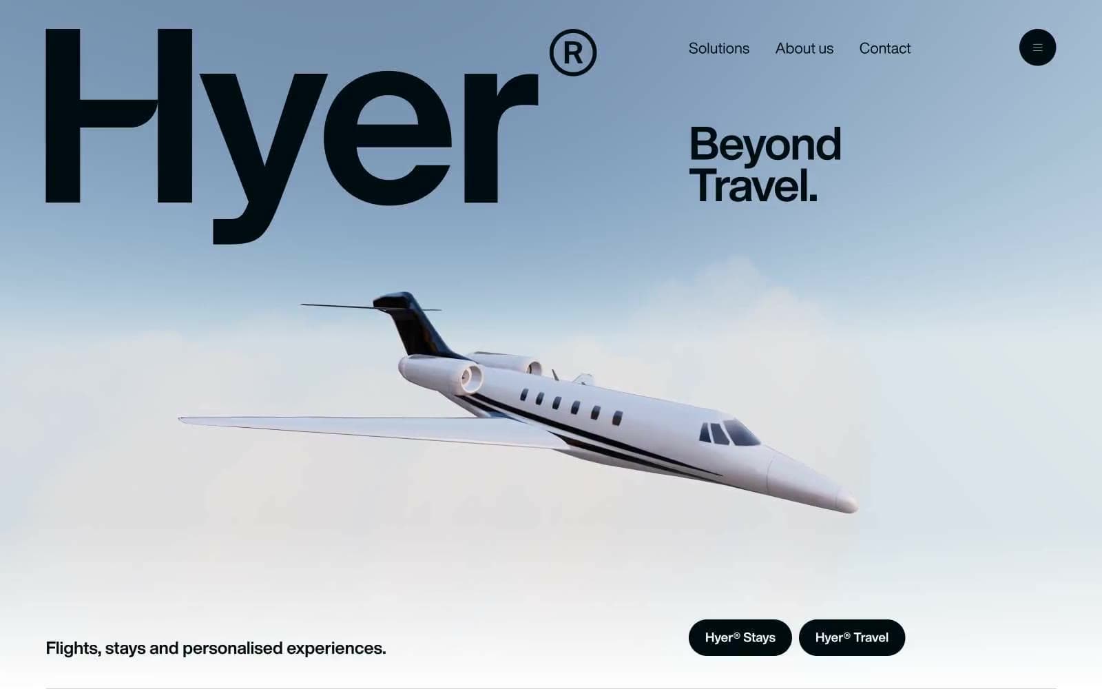
Hyer Aviation
Brand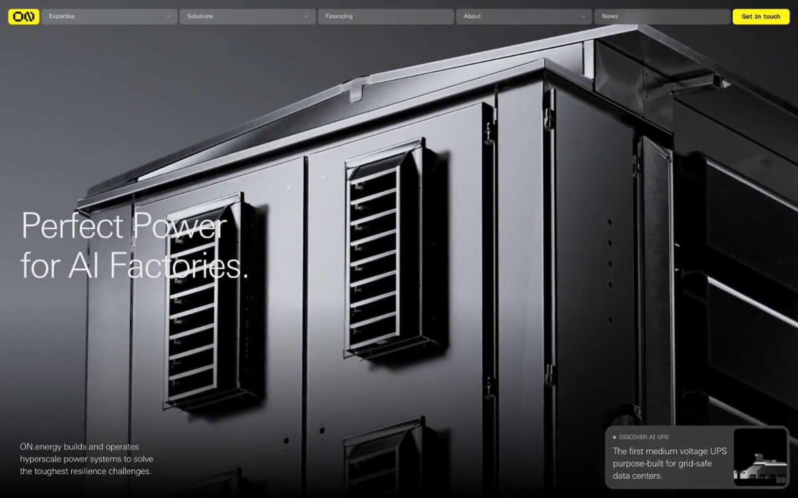
ON.energy
Brand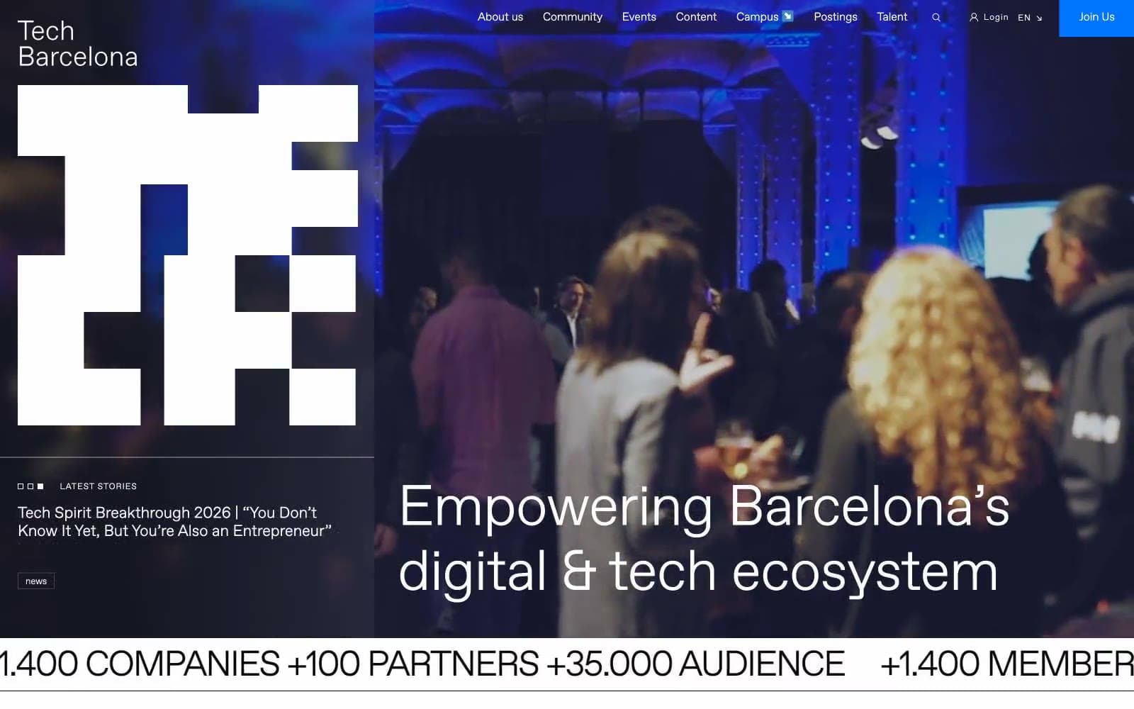
Tech Barcelona
Brand
Cuberto
Studio
Nothing
Commerce
Empower
Finance
10X HUB
Design tools
11x
AI
8returns
SaaS


