
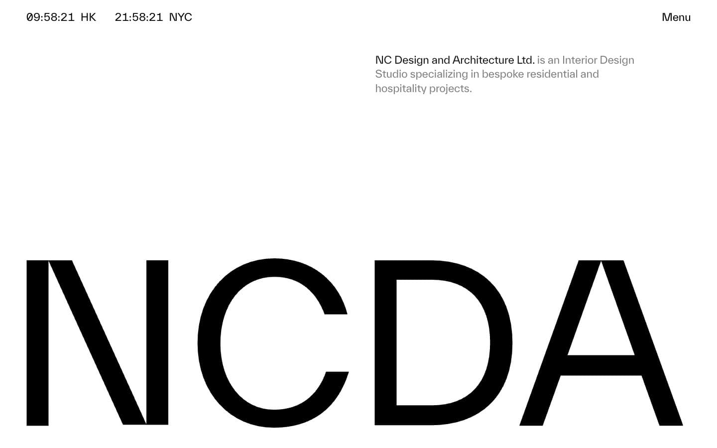
NCDA. Architectural monograph in negative space.
- Studio
- Mixed theme
- 4 colors
- 2 typefaces
NCDA operates as a printed monograph translated to the web: paper-white canvas, a single near-black ink, zero chromatic noise, and type that does the structural work that color usually does. The signature move is the wordmark itself — rendered at architectural scale and cropped by the viewport edge, it turns the brand mark into a layout device rather than a logo. Navigation is reduced to essentials: a live dual-city clock in the corner, a single 'Menu' trigger, and a tight gray description block. The system alternates between vast white negative space and occasional full-bleed black bands, creating an exhibition-catalogue rhythm. Components are sparse and unornamented — no shadows, no rounded corners, no buttons — just hairline rules, generous margins, and type that whispers through tight negative tracking at display sizes and slightly positive tracking at caption sizes.
NCDA design system

Neutrals4
Secondary text fills, deepest borders, and image overlays where maximum contrast against white is required
Primary text, hairline borders, full-bleed dark surface bands — the near-black ink of the system
Secondary descriptive text, muted link borders, subdued meta-information — the gray of footnotes and captions
Page canvas, surface backgrounds, inverse text on dark bands
Try a pairing
Pick any two colors from the palette to check whether text stays readable on top.
Aa
Paper on Pure Black
21.00 : 1 contrast
- Body textPasses AA 4.5
- Large textPasses AA 3
- StrictPasses AAA 7
More DESIGN.md files. Same web, different personalities.

Cuberto
Studio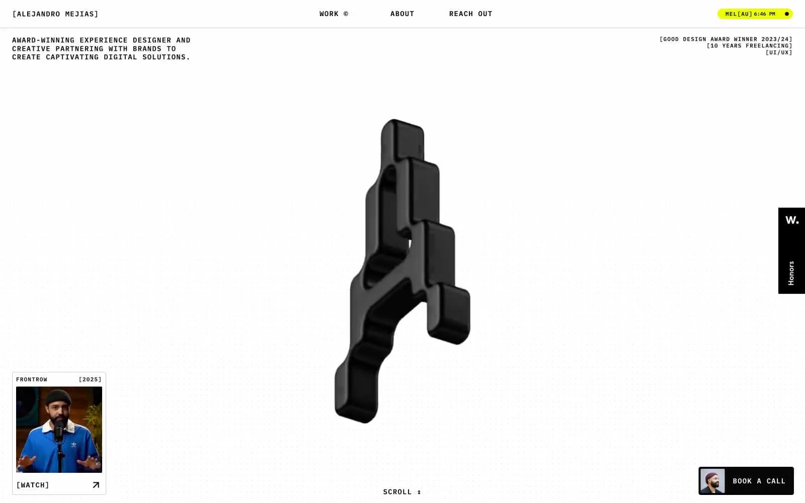
Alejandro Mejias
Studio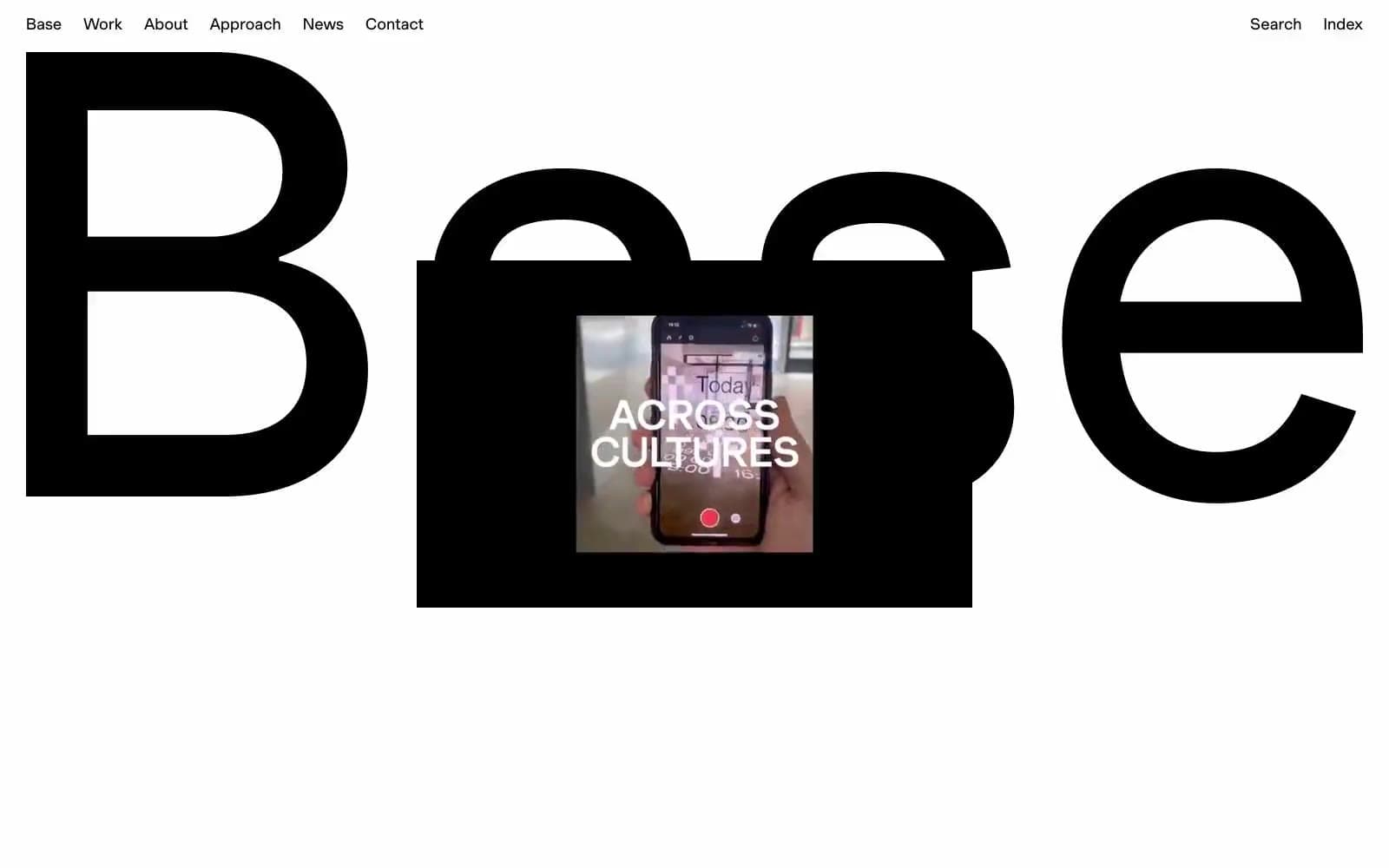
Base Design
Studio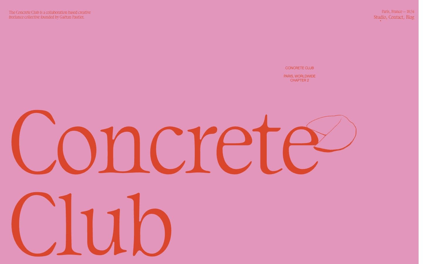
Concrete Club Studio
Studio
Daniellelevitt
Studio
DrawHistory
Studio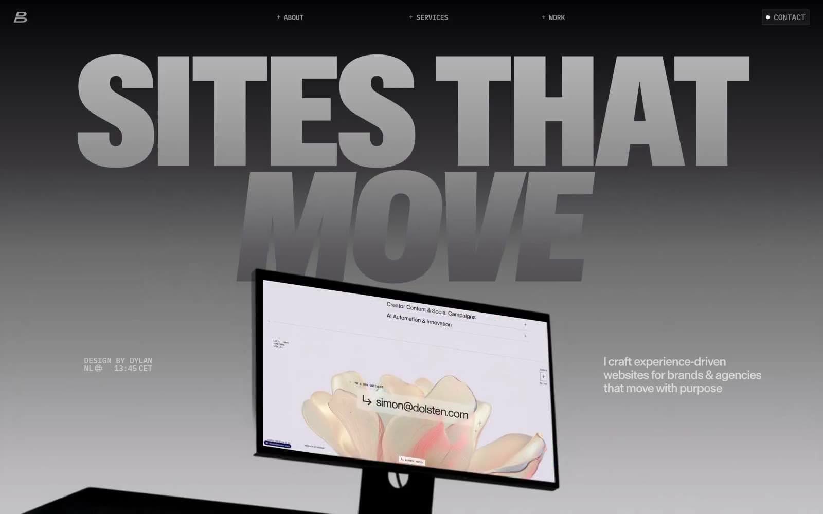
Dylanbrouwer
Studio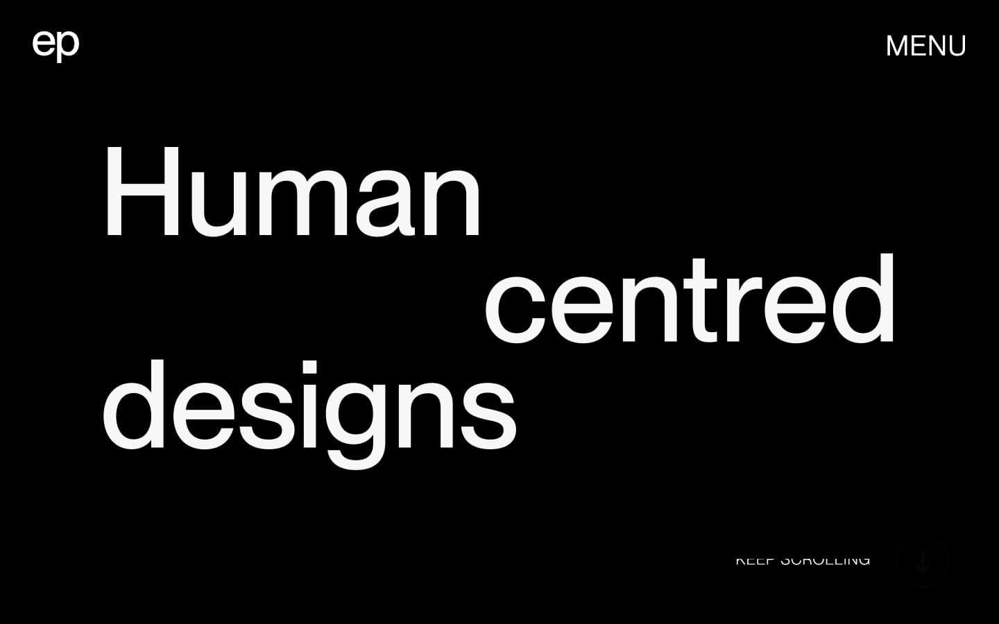
Elvina Prasad
Studio
Freytag Anderson
Studio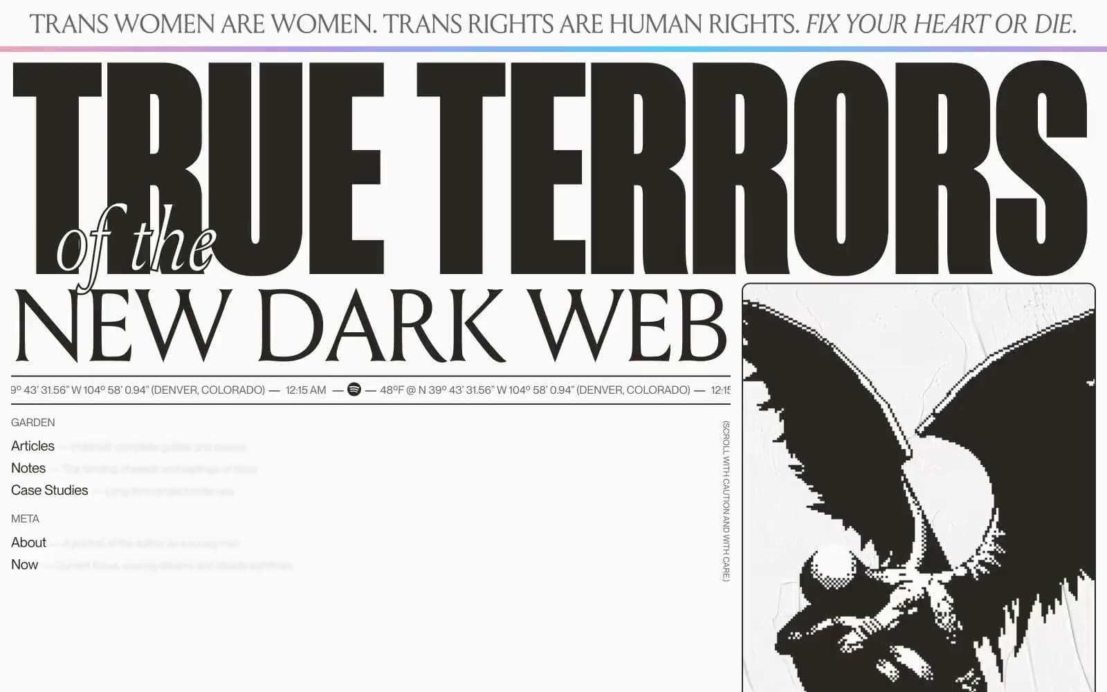
Henry
Studio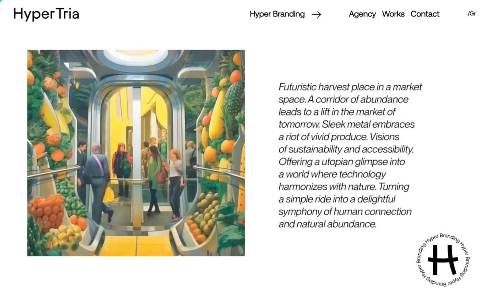
Hyper Tria
Studio
Maëlan Le Meur
Studio


