
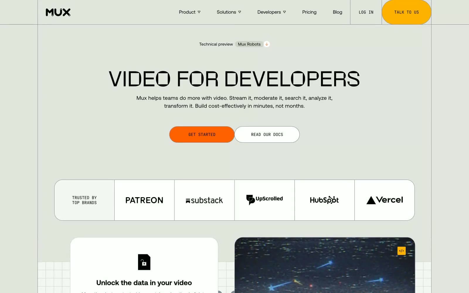
Mux. Warm sage canvas with crisp white cards, orange CTAs, and a chunky display headline that feels hand-lettered.
- Developer tools
- Light theme
- 14 colors
- 3 typefaces
Mux is a sunlit engineering workshop rendered in warm olive paper: a light, spacious developer-tool surface where the canvas itself (#e2e4dd, a warm sage-gray) feels like a drafting table, and crisp white cards sit on top like printed spec sheets. The system is deliberately low-chroma — the background, borders, and text carry the visual weight, while two warm accents (vivid orange #ff6100 and vivid yellow #ffb200) arrive as small functional punctuation: filled CTAs, hairline section dividers, and tiny AI labels. Typography is dual: a geometric neo-grotesque (Aeonik) for nearly everything, and a chunky display face (Rotonto) reserved for the biggest hero headlines, giving each page a clear two-register rhythm. Components are rounded generously — 28px card radii, 112–9999px pill buttons — making the interface feel hand-built and approachable rather than enterprise-precise. Dark product surfaces (#242628) appear as inset panels (transcript viewers, video player chrome) so the rest of the page stays calm and warm.
Mux design system

Brand1
Orange outline accent for tags, dividers, and focused UI edges. Do not promote it to the primary CTA color
Accent4
Hairline section dividers, feature underlines, AI badges, small punctuation strokes — a warm goldenrod that runs through the page like a highlighter mark
Darker amber tone used for emphasized amber strokes and secondary accent borders
Inline text links, interactive link underlines — the only cool chromatic accent, reserved exclusively for hyperlink treatment
Green wash for highlight backgrounds, decorative bands, and soft emphasis behind content. Use as a supporting accent, not as a status color
Neutrals9
Primary text, heading strokes, nav text, icon strokes — maximum contrast on light surfaces, always pure black
Dark inset surfaces — product mockups, transcript panels, video player chrome, footer; provides the only dark layer in the system
Secondary text on light surfaces, helper copy, metadata labels
Muted text, secondary button borders, disabled states, low-emphasis borders
Outlined button borders, subtle outlines on tags and chips, medium-weight hairlines
Hairline section dividers, card borders, warm gray rules that separate content bands
Page canvas, hero backgrounds, the warm sage paper that everything sits on — the dominant surface tone of the entire site
Subtle secondary surface, quiet dividers between sections, gentle wash backgrounds
Card surfaces, navigation bar, elevated panels — the only surface that floats above the olive canvas
Try a pairing
Pick any two colors from the palette to check whether text stays readable on top.
Aa
Inkstone on Ember Orange
6.96 : 1 contrast
- Body textPasses AA 4.5
- Large textPasses AA 3
- StrictFails AAA 7
More DESIGN.md files. Same web, different personalities.

Tailwind CSS
Developer tools
Atoms
Developer tools
Browserbase
Developer tools
Cursor
Developer tools
Deno
Developer tools
Drizzle ORM
Developer tools
Earlydog
Developer tools
Expo
Developer tools
Fingerprint
Developer tools
Flatfile
Developer tools
Flox
Developer tools
Fly.io
Developer tools


