
MotherDuck. Crayon-coded terminal on cream paper.
- Developer tools
- Light theme
- 22 colors
- 2 typefaces
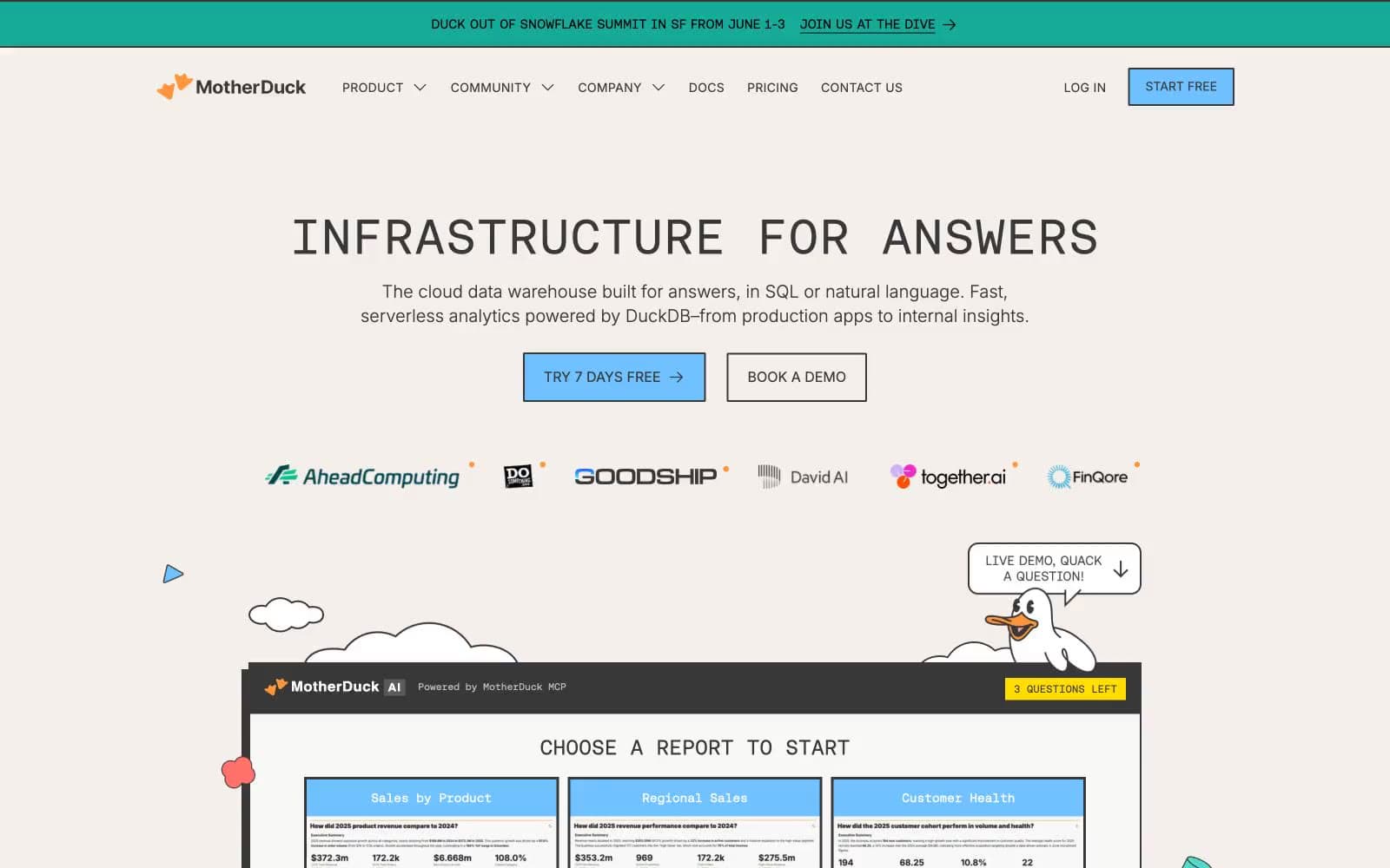
MotherDuck operates in a neo-brutalist technical-playful register: a warm cream canvas hosts monospace-first typography (Aeonik Mono) that treats every UI surface as if it were a terminal readout, and then subverts that seriousness with hand-drawn duck mascots, clouds, and crayon-bright accents. The interaction language is flat and offset — hard 2px corners, zero-blur drop shadows pushed -6px right and +6px down in #383838, and chromatic button borders that cycle through a full rainbow palette like colored pencils in a cup. Color is sparse and intentional: a sky-blue (#6fc2ff) carries all primary action weight, while saturated yellow and orange belong to illustration and marquee rhythm. The effect is a developer tool that refuses to dress like one — data infrastructure rendered as a children's notebook sketch.
MotherDuck design system

Brand1
Primary action fills, nav accents, and the dominant chromatic surface — the only color loud enough to carry CTAs
Accent11
Yellow wash for highlight backgrounds, decorative bands, and soft emphasis behind content.
Orange wash for highlight backgrounds, decorative bands, and soft emphasis behind content. Do not promote it to the primary CTA color
Outlined button border variant — one slot in the rotating rainbow button-border system
Outlined button border variant
Outlined button border variant
Outlined button border variant
Outlined button border variant
Outlined button border variant
Outlined button border variant
Outlined button border variant
Decorative illustration stroke — water/sky blue outlines in duck and cloud drawings
Neutrals10
Primary text, all borders, icon strokes, and the offset shadow color — the universal line color, never pure black
Tertiary borders and dividers, low-emphasis UI rules
Muted helper text, secondary borders, and disabled-state outlines
Icon strokes and low-contrast border accents on illustration-adjacent elements
Soft warm tint for illustrated section backgrounds, never a UI control fill
Page canvas and section backgrounds — the entire site sits on this warm off-white like a notebook page
Tinted blue-white for soft button hovers and highlight washes adjacent to the primary blue
Secondary surface for body backgrounds and subtle borders — barely-there differentiation from white
Faint yellow-green tint used on selected/tagged surfaces for the play accent
Card surfaces, nav bar, input fields, and overlay panels — clean white layered on the cream canvas
Try a pairing
Pick any two colors from the palette to check whether text stays readable on top.
Aa
Charcoal Ink on Sky Crayon
6.05 : 1 contrast
- Body textPasses AA 4.5
- Large textPasses AA 3
- StrictFails AAA 7
More DESIGN.md files. Same web, different personalities.

Tailwind CSS
Developer tools
Atoms
Developer tools
Browserbase
Developer tools
Cursor
Developer tools
Deno
Developer tools
Drizzle ORM
Developer tools
Earlydog
Developer tools
Expo
Developer tools
Fingerprint
Developer tools
Flatfile
Developer tools
Flox
Developer tools
Fly.io
Developer tools


