
Mezmo. Observatory at dawn.
- Developer tools
- Light theme
- 22 colors
- 2 typefaces
Mezmo uses a quiet observatory language: warm off-white canvases, generous whitespace, and a single confident violet as the sole chromatic voice. The interface is typographically driven — thin weight 300 Onest headlines, compact monospace for telemetry values — with color appearing sparingly as semantic punctuation (violet for emphasis, muted teal for primary action, amber/green for data states). Components are flat and border-defined rather than elevated; 5–8px radii and 1px hairline borders create a low-noise, instrument-panel feel. Density is compact but the overall rhythm is unhurried, with wide section gaps and an emphasis on data density within calm containers.
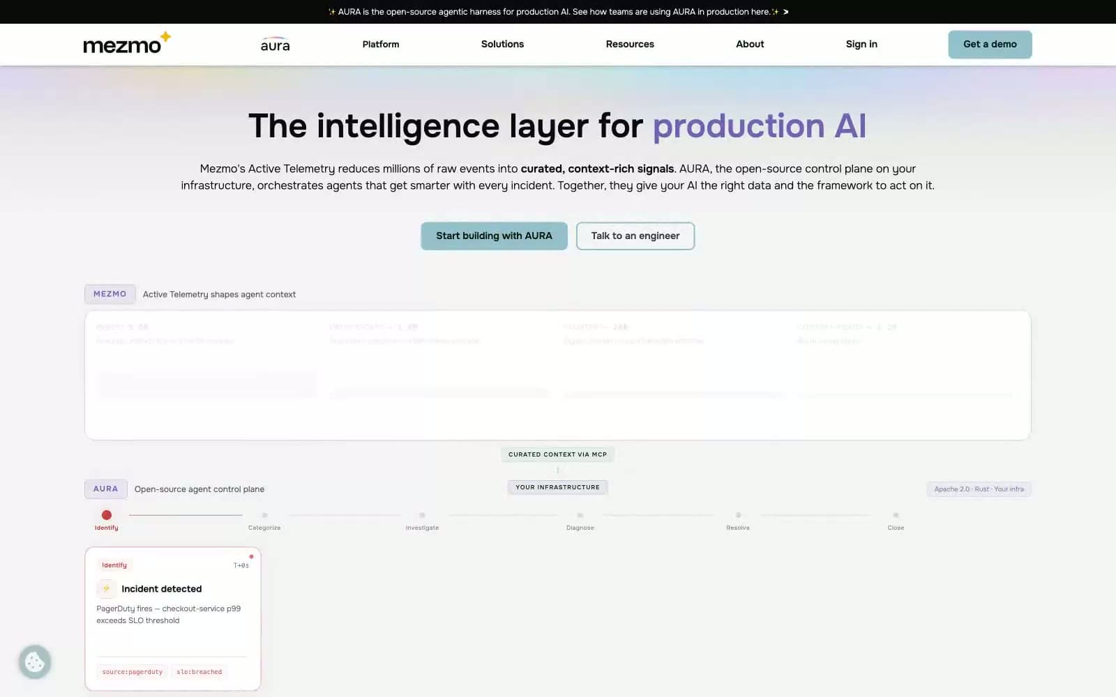
Mezmo design system

Brand2
Signature emphasis color — hero word highlights, key callouts, brand accents — the only saturated chromatic voice in the system
Gray action color for filled buttons, selected navigation states, and focused conversion moments
Accent8
Decorative borders, icon strokes, secondary blue accents
Yellow outline accent for tags, dividers, and focused UI edges
Green outline accent for tags, dividers, and focused UI edges
Tinted card borders, violet-tinted shadow glows
Cool surface wash, hover state for primary buttons
Warm neutral surface, decorative section tint
Muted border tone, low-contrast decorative strokes
Dark violet text — used for emphasis on light surfaces
Neutrals12
Primary text, card borders, list dividers, nav labels
Secondary text, heavy borders, code-adjacent content
Dark mode accents, badge fills, strong contrast borders
Dark badges, dense contrast text on tinted chips
Dark borders and separators for elevated surfaces and inverted UI. Do not promote it to the primary CTA color
Body secondary text, disabled labels
Body borders at 1px, low-priority dividers
Muted helper text, inactive borders
Card borders on elevated surfaces, input frames
Page canvas, outer section backgrounds
Subtle surface fill, decorative washes
Card surfaces, button text, elevated content blocks
Try a pairing
Pick any two colors from the palette to check whether text stays readable on top.
Aa
Paper White on Iris
5.12 : 1 contrast
- Body textPasses AA 4.5
- Large textPasses AA 3
- StrictFails AAA 7
More DESIGN.md files. Same web, different personalities.

Tailwind CSS
Developer tools
Atoms
Developer tools
Browserbase
Developer tools
Cursor
Developer tools
Deno
Developer tools
Drizzle ORM
Developer tools
Earlydog
Developer tools
Expo
Developer tools
Fingerprint
Developer tools
Flatfile
Developer tools
Flox
Developer tools
Fly.io
Developer tools


