
Incident. Technical broadsheet on concrete.
- Developer tools
- Light theme
- 10 colors
- 2 typefaces
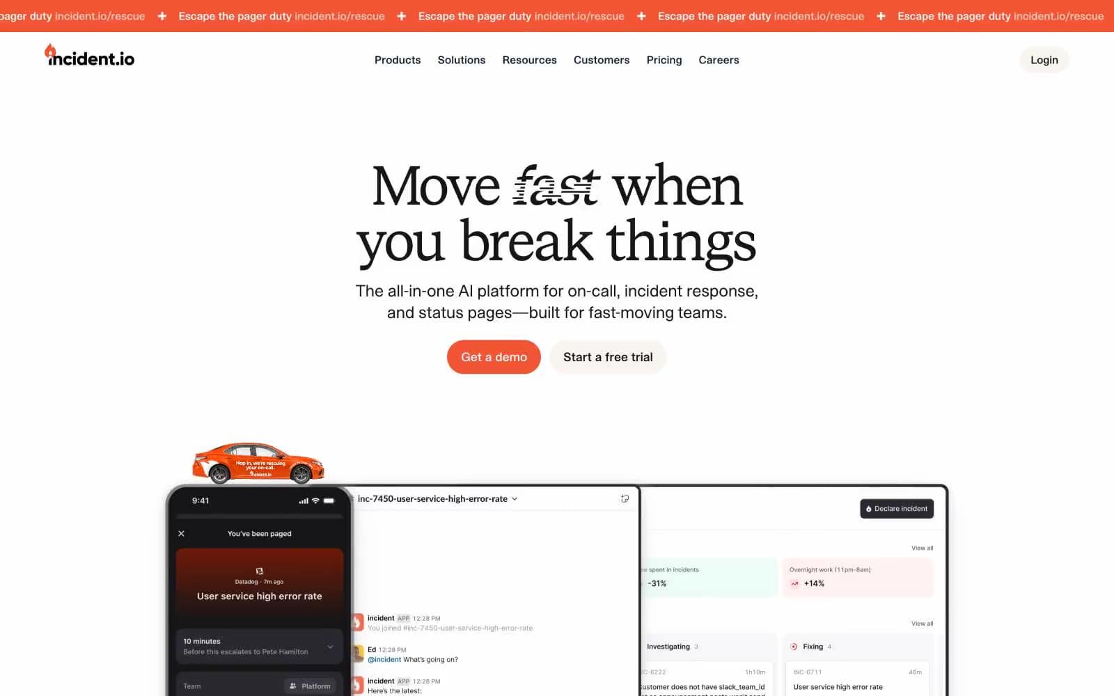
Incident treats the status page like an editorial publication: a Times-serif typeface on a concrete-gray canvas, hairlines of pure black, and one warm signal-orange that acts as a flare against the monochrome. The discipline is extreme — chromatic color is rationed, appearing only as brand accent fills, logo marks, and decorative file-type illustrations, never as button backgrounds or action fills. Surfaces are flat and paper-like; depth comes from soft 2-layer shadows on imagery rather than elevation stacking. The result reads as a trusted technical broadsheet rather than a typical dashboard — authority through typographic restraint, not color volume.
Incident design system

Brand1
Brand accent, logo mark, decorative SVG fills, nav emphasis — the single warm chromatic note that cuts through the monochrome system
Accent2
Orange decorative accent for icons, marks, and small graphic details. Use as a supporting accent, not as a status color
Orange outline accent for tags, dividers, and focused UI edges. Use as a supporting accent, not as a status color
Neutrals7
Primary text, hairline borders (920+ uses), button outlines — pure black carries all structural line work
Near-black for nav strokes, emphasis text, and the tinted shadow base — softer than pure ink for layered elements
Secondary shadow tone, decorative image edge tint
Subtle drop-shadow tone, decorative image edge tint
Warm cream decorative surface — near-gray but carries a beige cast that ties to the orange family
Page canvas, button background — the dominant surface tone that gives the system its paper-like warmth
Card surfaces, nav fills — the white layer that sits on top of the concrete canvas
Try a pairing
Pick any two colors from the palette to check whether text stays readable on top.
Aa
Ink on Signal Orange
6.12 : 1 contrast
- Body textPasses AA 4.5
- Large textPasses AA 3
- StrictFails AAA 7
More DESIGN.md files. Same web, different personalities.

Tailwind CSS
Developer tools
Atoms
Developer tools
Browserbase
Developer tools
Cursor
Developer tools
Deno
Developer tools
Drizzle ORM
Developer tools
Earlydog
Developer tools
Expo
Developer tools
Fingerprint
Developer tools
Flatfile
Developer tools
Flox
Developer tools
Fly.io
Developer tools


