
Hashnode. A clean monochrome feed where one electric blue accent carries all the energy.
- Developer tools
- Light theme
- 9 colors
- 5 typefaces
Hashnode presents an editorial newsroom aesthetic: a near-monochrome canvas of warm-cool grays where the only chromatic element is a single electric blueprint blue that does all the talking. Typography is uniformly Suisse Intl, a humanist grotesque with tight negative tracking, giving headlines a confident, typeset-in-a-publication feel rather than a dashboard utilitarian one. Surfaces are flat with hairline borders instead of shadows — the interface trusts typography and whitespace to create hierarchy, not elevation. Components feel like cards laid out on a magazine spread: rounded but not pillowy, compact but breathable, with a two-column card grid that reads like a homepage feed. Color appears sparingly as functional punctuation — links, a single CTA fill, badges — never as decoration.
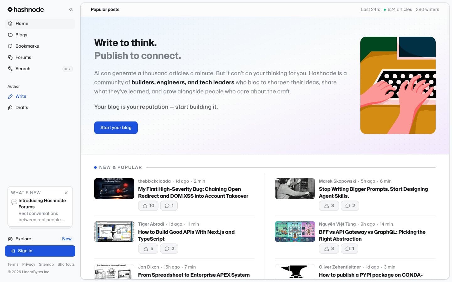
Hashnode design system

Brand1
Violet supporting accent for decorative details and low-frequency emphasis. Do not promote it to the primary CTA color
Accent1
Green supporting accent for decorative details and low-frequency emphasis
Neutrals7
Primary body text, headings, icon strokes — the dominant ink
Secondary heading text and high-emphasis icon fills where a subtle warmth is desired over pure ink
Muted metadata, helper text, placeholder text, secondary icons, timestamps, vote/comment counts
Hairline borders, card outlines, dividers, subtle separator strokes — the structural gray that defines every card edge
Mid-surface layer for inset panels and elevated cards between Paper and Fog
Subtle surface tint behind nested elements, hover states, and tag/chip backgrounds
Page background, primary card surface — the base on which everything sits
Try a pairing
Pick any two colors from the palette to check whether text stays readable on top.
Aa
Canvas on Blueprint Blue
6.06 : 1 contrast
- Body textPasses AA 4.5
- Large textPasses AA 3
- StrictFails AAA 7
More DESIGN.md files. Same web, different personalities.

Tailwind CSS
Developer tools
Atoms
Developer tools
Browserbase
Developer tools
Cursor
Developer tools
Deno
Developer tools
Drizzle ORM
Developer tools
Earlydog
Developer tools
Expo
Developer tools
Fingerprint
Developer tools
Flatfile
Developer tools
Flox
Developer tools
Fly.io
Developer tools


