
Feeld. Velvet midnight, neon confession.
- Brand
- Dark theme
- 16 colors
- 4 typefaces
Feeld is a near-black, after-dark dating site set on a Midnight Canvas #090516 that never lightens, with intimate full-bleed film footage and phone mock-ups carrying all the warmth. Headlines are huge and whisper-thin: FEELD Edge at 111px and 56px in its Regular Rounded cut, tracked slightly tight, with small magenta #e72abd line icons dropped between words. Colour arrives in saturated blocks rather than washes: plum, cobalt, clover and oxblood testimonial cards with one square corner, a periwinkle #b1baff pill, an acid-lime #e5ff4a stat. ABC Diatype keeps body and interface copy plain and quiet, and every action is a 9999px pill with no shadow.
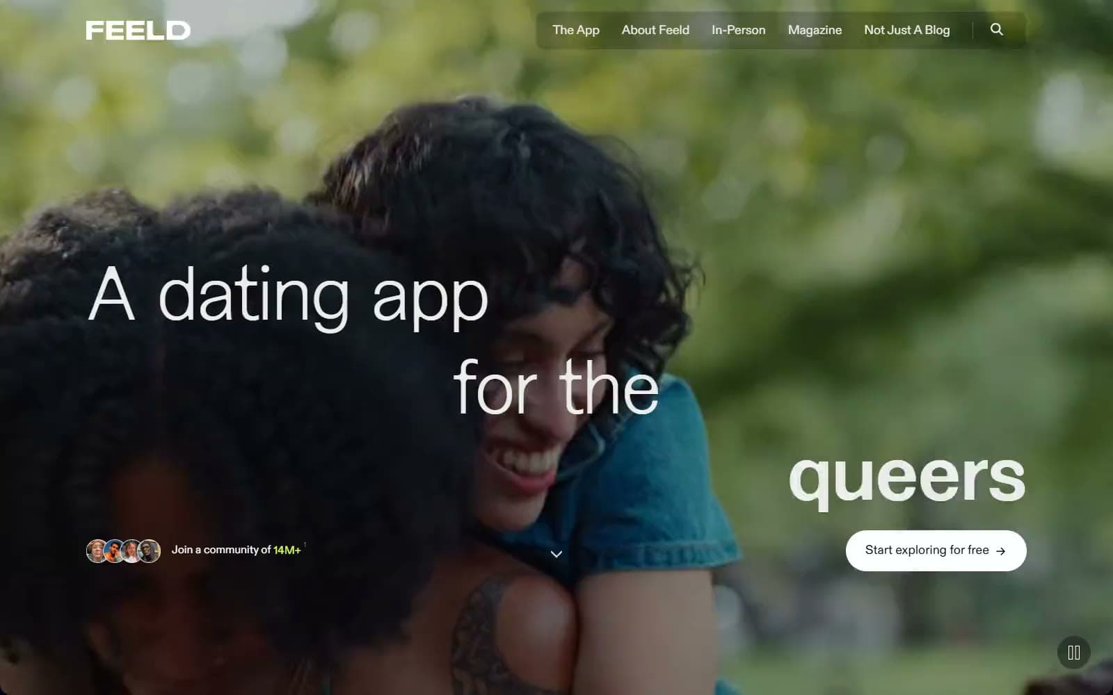
Feeld design system

Brand1
Inline headline glyph icons, the closing sign-up pill and the footer wordmark — a hot pink that reads as nightlife signage against the dark canvas
Accent8
Secondary pill buttons such as Explore together and Read our story — a soft lilac that sits one step below the Paper pill
The 14M+ community figure in the hero badge, footer badge and community headline; never used for fills
The active-tab underline in the features tab strip; the only place this pink-violet appears
Testimonial card fill and the features-panel backdrop behind the interests demo
Testimonial card fill and the blue app-screen panels in the explore-alongside feature cards
Testimonial card fill and the verified-profile screen; echoes the green verification check
Testimonial card fill; the darkest of the four card colours, kept for long quotes
The full-width magazine promo banner, the one light block on the page — reads as printed paper
Neutrals7
Body, every section and the footer — a violet-tinged black that makes the footage and saturated cards glow
Fill of the marquee desire-tag pills, one tonal step above the canvas
1px tag borders, tab baselines and the rules between safety-list rows
Headlines, navigation, body copy and footer links — slightly off-white so large thin type does not glare
Secondary paragraphs, card metadata, event dates and inactive tab labels
Primary pill buttons, app-store pills and the white glyphs of the wordmark
Labels on Paper and Periwinkle pills, the magazine Read now button and the profile-card photo fade
Try a pairing
Pick any two colors from the palette to check whether text stays readable on top.
Aa
Midnight Canvas on Feeld Magenta
5.23 : 1 contrast
- Body textPasses AA 4.5
- Large textPasses AA 3
- StrictFails AAA 7
More DESIGN.md files. Same web, different personalities.

21 TSI
Brand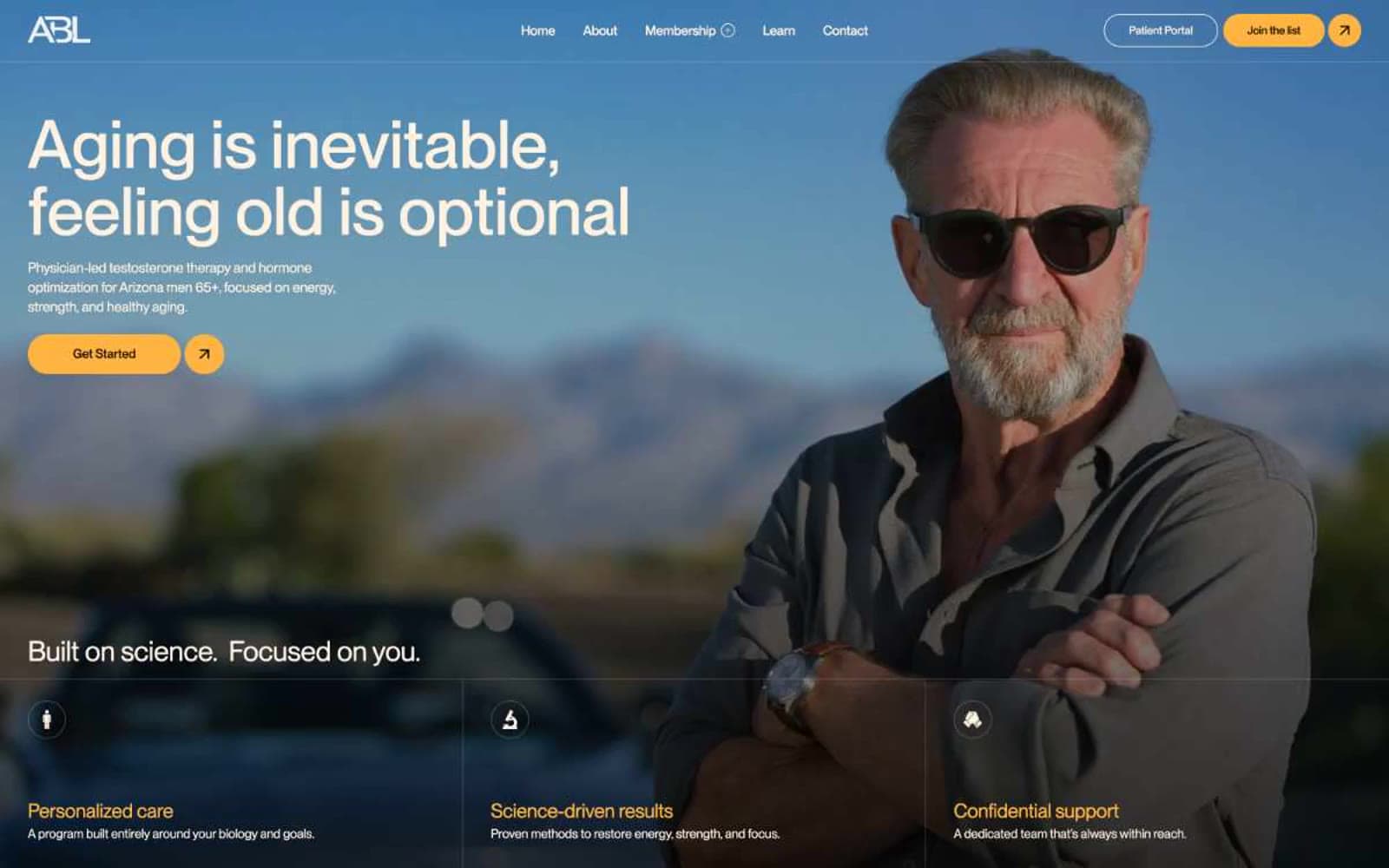
Abetterlou
Brand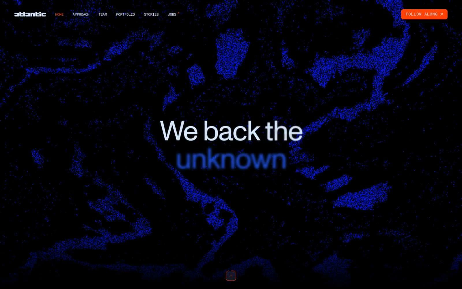
Atlantic.vc
Brand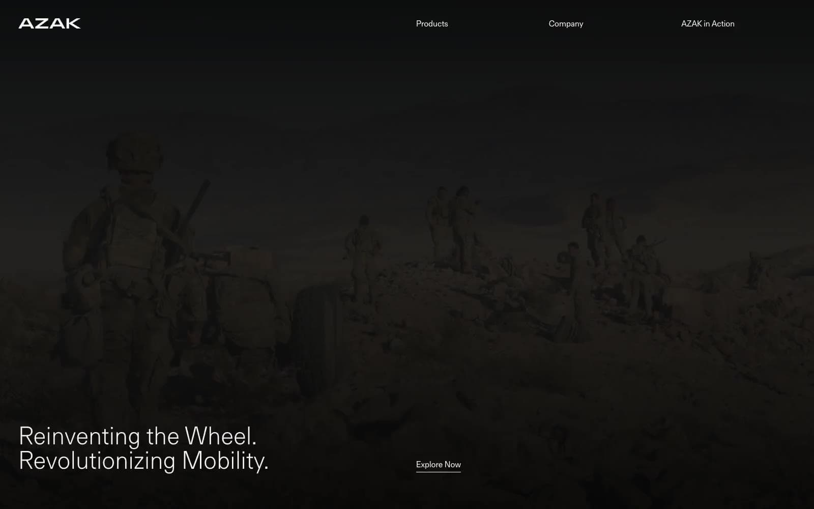
AZAK
Brand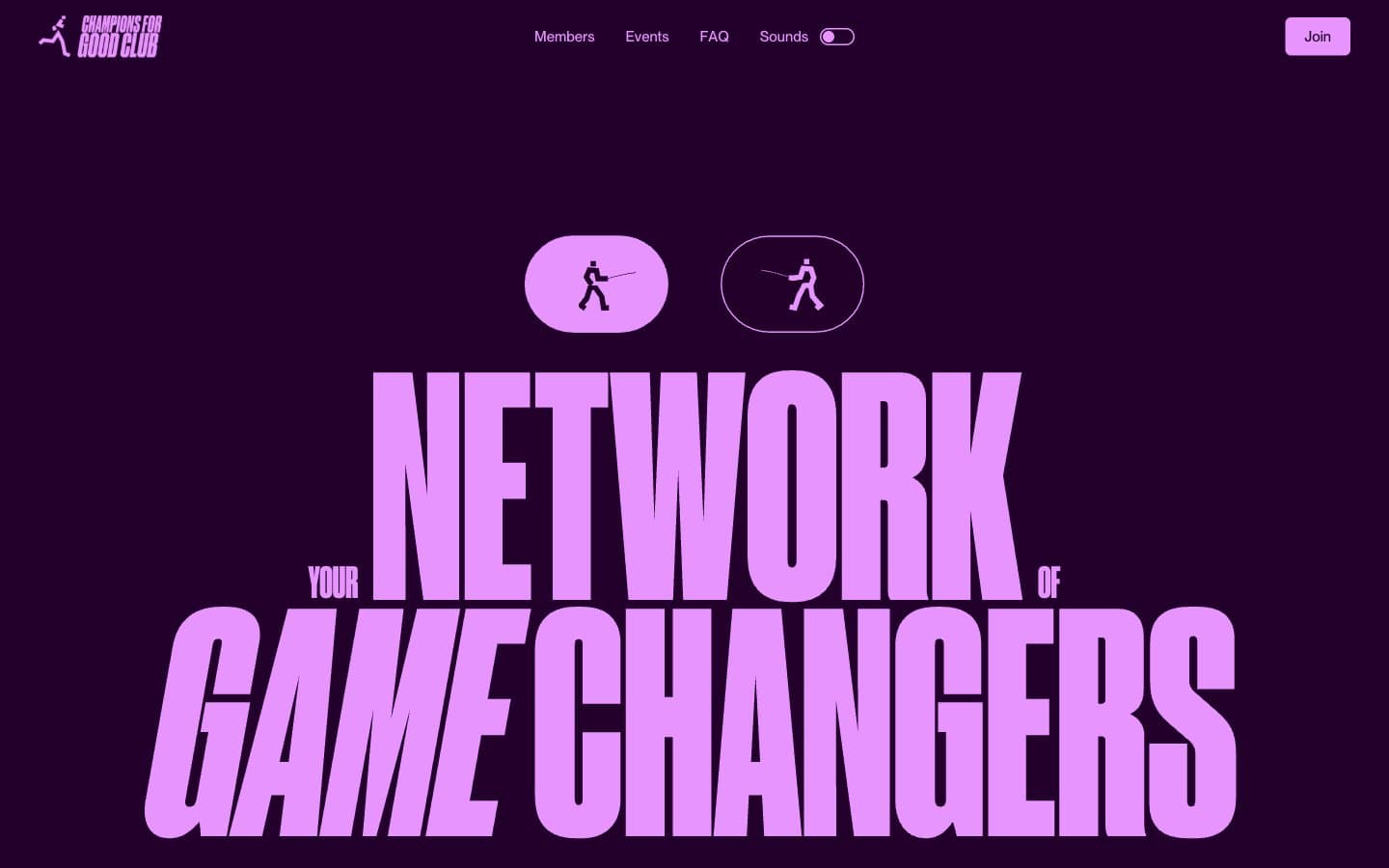
Champions4good
Brand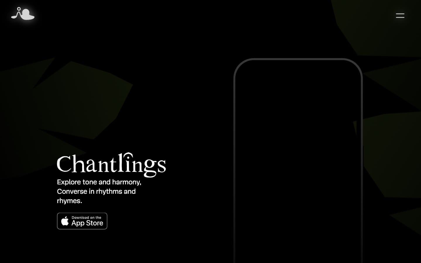
Chantlings
Brand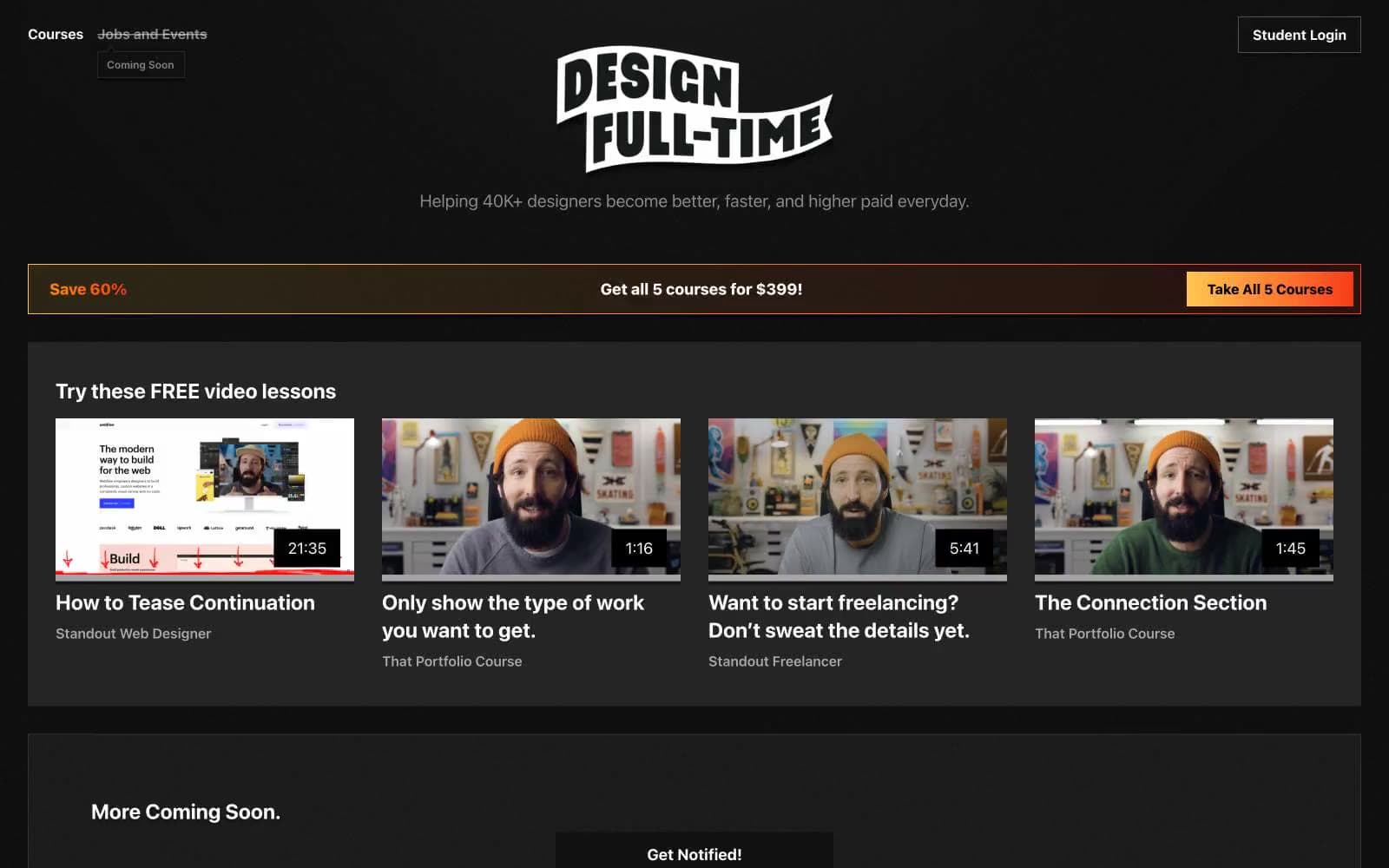
Design Full-Time
Brand
Drepute
Brand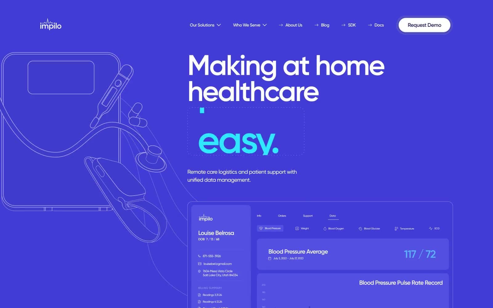
Impilo
Brand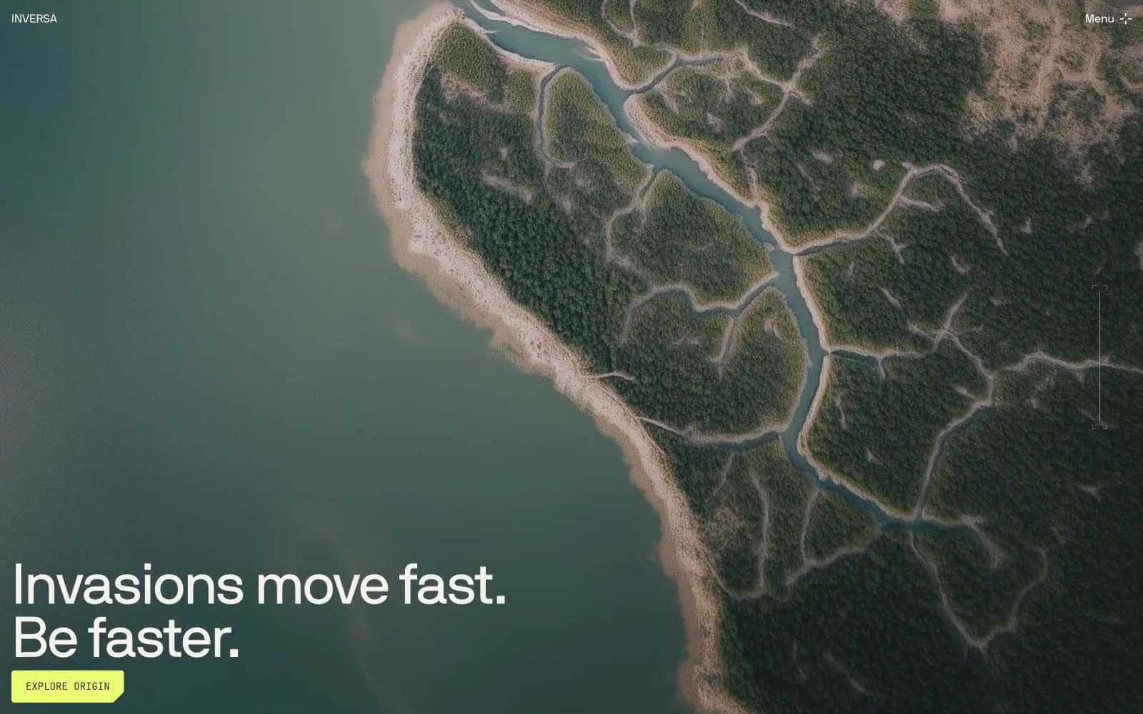
INVERSA
Brand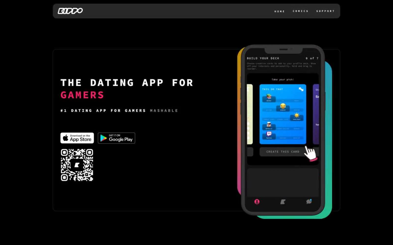
Kippo
Brand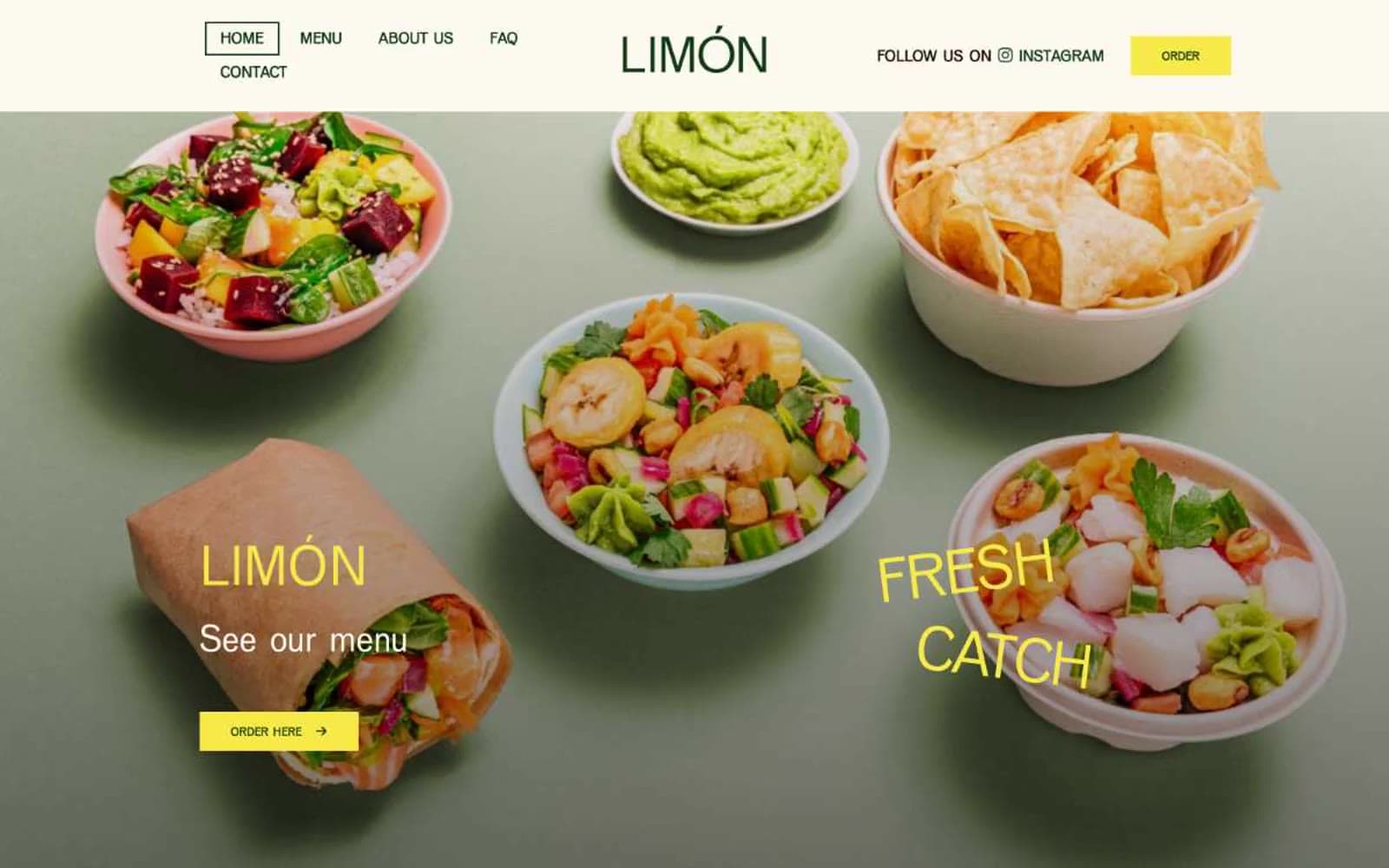
Limón
Brand


