
Wizz. Like a single fluorescent mark on a fashion magazine spread.
- Brand
- Light theme
- 7 colors
- 5 typefaces
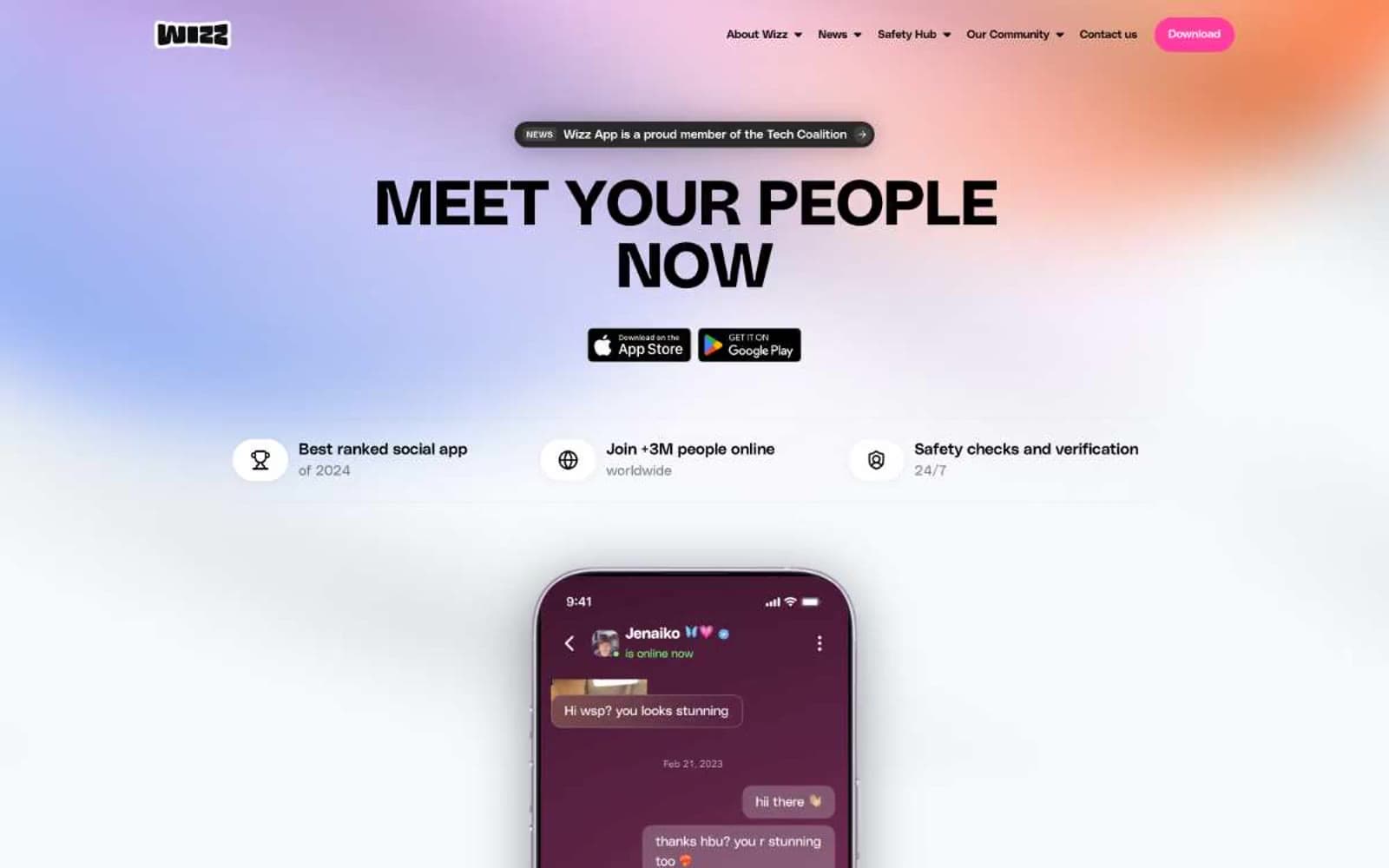
Wizz operates on a high-contrast social-app language: saturated black-and-white structure shot through with one electric hot-pink accent that functions as the only chromatic signal in the system. The hero is deliberately loud — a full-bleed multi-hue gradient (lavender, coral, sky, amber) supporting massive compressed black type — while every section below retreats to white space and lets pink do the work as a single, recurring punctuation mark. Typography is geometric and architectural: PolySans Bulky at display sizes, PolySans Median for headings and nav, PolySans Neutral for body — each weight stepping down in confidence rather than warmth. Components are rounded, pill-heavy, and flat; the only depth comes from a very faint black shadow on raised buttons. The navigation bar is a floating black pill that hovers above the page, setting the visual rhythm of dark-on-light framing devices.
Wizz design system

Brand1
Primary action buttons, section labels, active states, cookie accept — the sole chromatic brand color, carrying 100% of the accent weight in the interface
Neutrals6
Page text, floating navigation bar, bold display headlines, cookie banner surface, icon fills
Secondary button backgrounds, elevated surface tone
Input borders, secondary surface fills, muted UI elements
Hairline borders, card inset rings, subtle dividers, secondary text on light backgrounds
Input field backgrounds, subtle fill surfaces
Page canvas, section backgrounds, text on dark surfaces, card surfaces in light sections
Try a pairing
Pick any two colors from the palette to check whether text stays readable on top.
Aa
Obsidian on Volt Pink
6.41 : 1 contrast
- Body textPasses AA 4.5
- Large textPasses AA 3
- StrictFails AAA 7
More DESIGN.md files. Same web, different personalities.

Airbnb
Brand
Aker
Brand
Alison Roman
Brand
Alpine Bio
Brand
Alveos One
Brand
Amrit Palace
Brand
André Cândido
Brand
Anna Jóna
Brand
Apollo
Brand
Apple
Brand
Arva
Brand
Ashton Bespoke
Brand


