
Alveos One. A still, cream-lit meditation room where a single graphite object rests in a pool of soft amber light.
- Brand
- Light theme
- 16 colors
- 5 typefaces
Alveos One uses a warm, achromatic wellness language: every surface is a tone of cream, ivory, graphite, or near-black, and the product itself is the only spotlit object on the page. Composition is centered and unhurried — a radial cream-to-clay gradient frames the hero device like a stage spotlight, and downstream sections alternate between warm cream and bright white with large rounded-corner lifestyle photography carrying dark gradient overlays and white type. Typography is restrained through Hanken Grotesk at its native weights with a whisper-wide 0.4440em tracking on small all-caps labels, creating editorial calm rather than urgency. Primary actions are near-black filled buttons — not a chromatic brand color — which keeps the system feeling like a premium health product, not a SaaS tool. Corners are soft (25px dominates), shadows are nearly imperceptible, and the only gradient in the system is the warm spotlit hero.
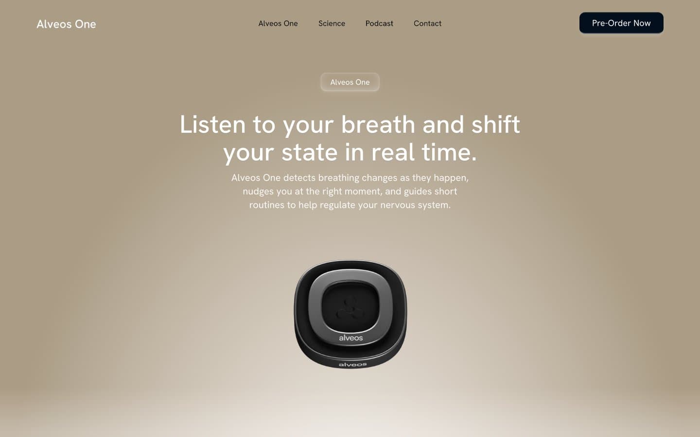
Alveos One design system

Neutrals16
Primary text, dominant border color across cards and sections — the system's typographic anchor
Primary action button fill, footer background — near-black with a faint cool undertone
Alternate dark surface, nav background — indistinguishable from Nightshade but carries a subtle navy tilt
Nav text, body borders — the darkest readable neutral after Nightshade
Body borders, secondary surfaces, image card borders — slightly softer than pure black
Icon strokes, heading borders, secondary fills — mid-dark neutral for iconography
Muted body text, default body border — the primary mid-grey for paragraph copy and dividers
Helper text, icon strokes, link borders — lighter mid-grey for secondary metadata
Subtle body borders, low-emphasis copy — barely-there dividers
Hero radial gradient terminus — warm clay tone that pools beneath the product like stage light fading into a linen floor
Faint body text and dividers — used sparingly for ultra-low emphasis
Button border, icon fill, disabled-state borders — the lightest mid-tone
Soft shadow color, card box-shadows, subtle background fills — warm-tinted shadow grey that matches the canvas
Subtle card borders, low-contrast dividers — the cool counterpoint to Clay Shadow
Page background, hero gradient origin — warm cream base that absorbs the entire site into a unified off-white
Card surfaces, section backgrounds, raised panels against the linen canvas
Try a pairing
Pick any two colors from the palette to check whether text stays readable on top.
Aa
Bone White on Graphite Ink
21.00 : 1 contrast
- Body textPasses AA 4.5
- Large textPasses AA 3
- StrictPasses AAA 7
More DESIGN.md files. Same web, different personalities.
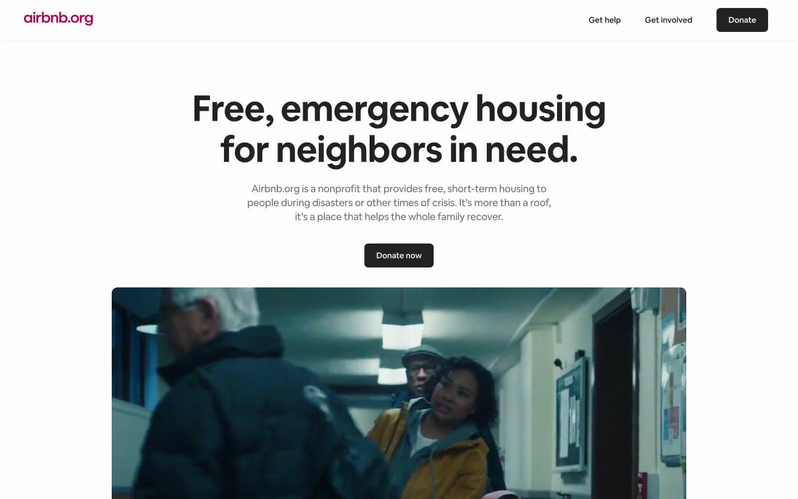
Airbnb
Brand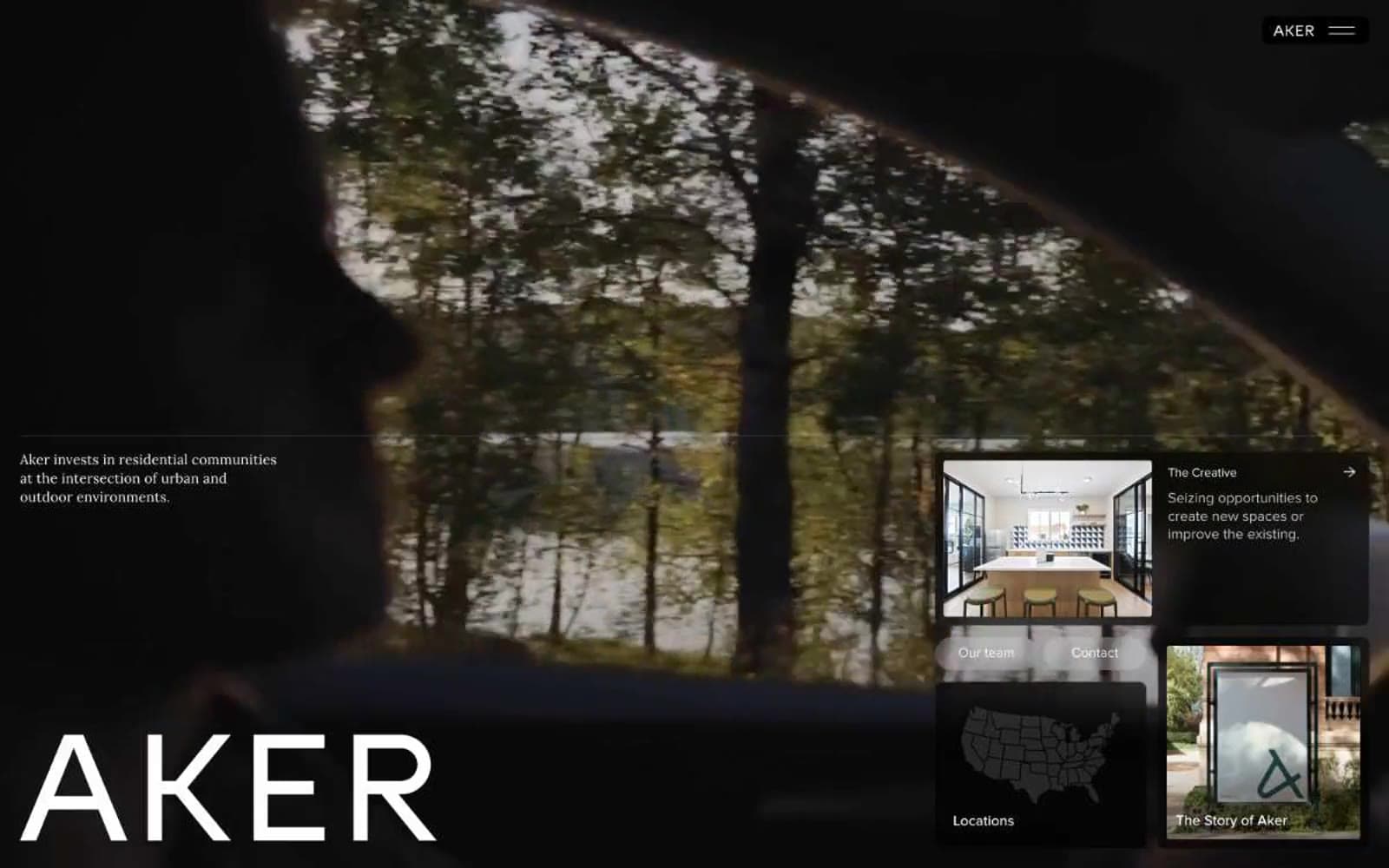
Aker
Brand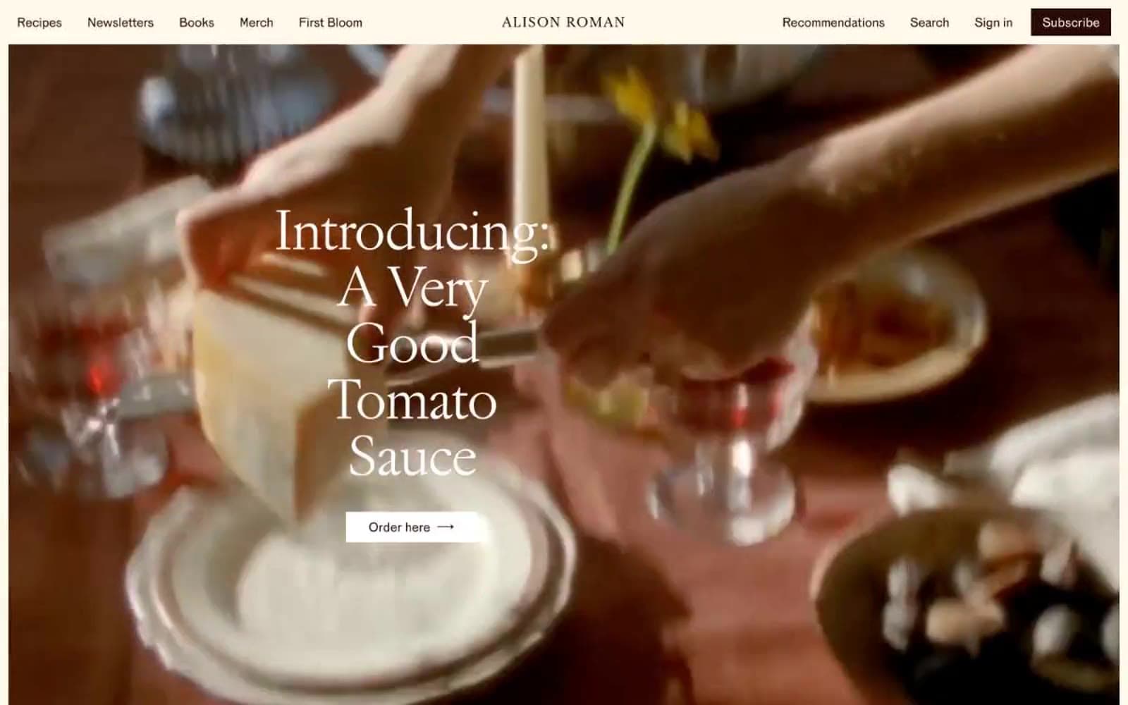
Alison Roman
Brand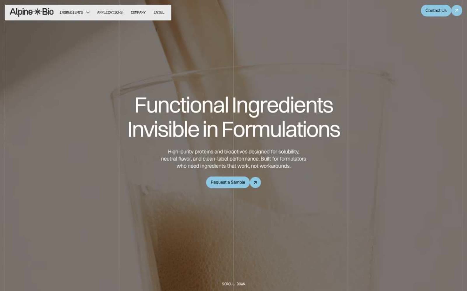
Alpine Bio
Brand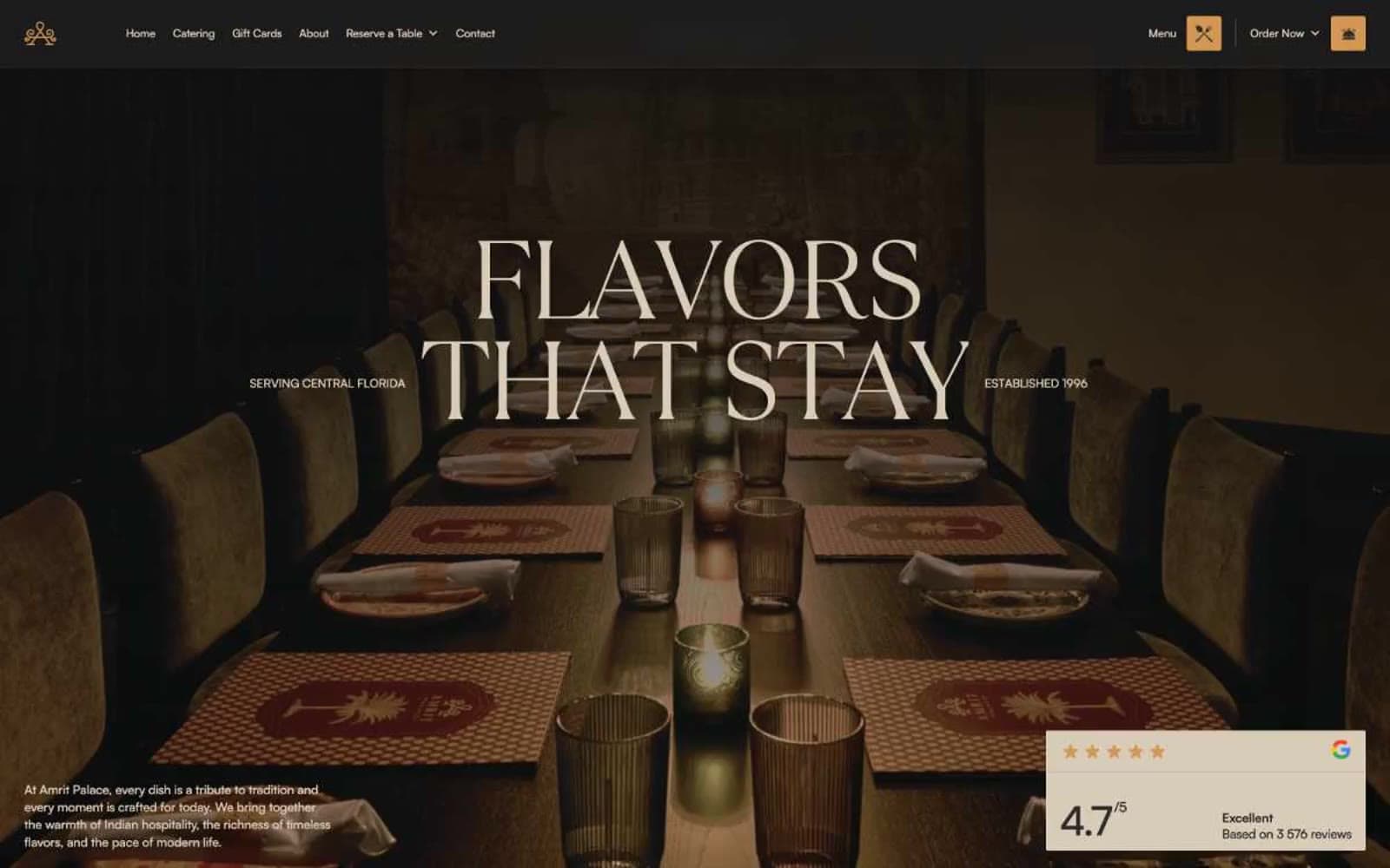
Amrit Palace
Brand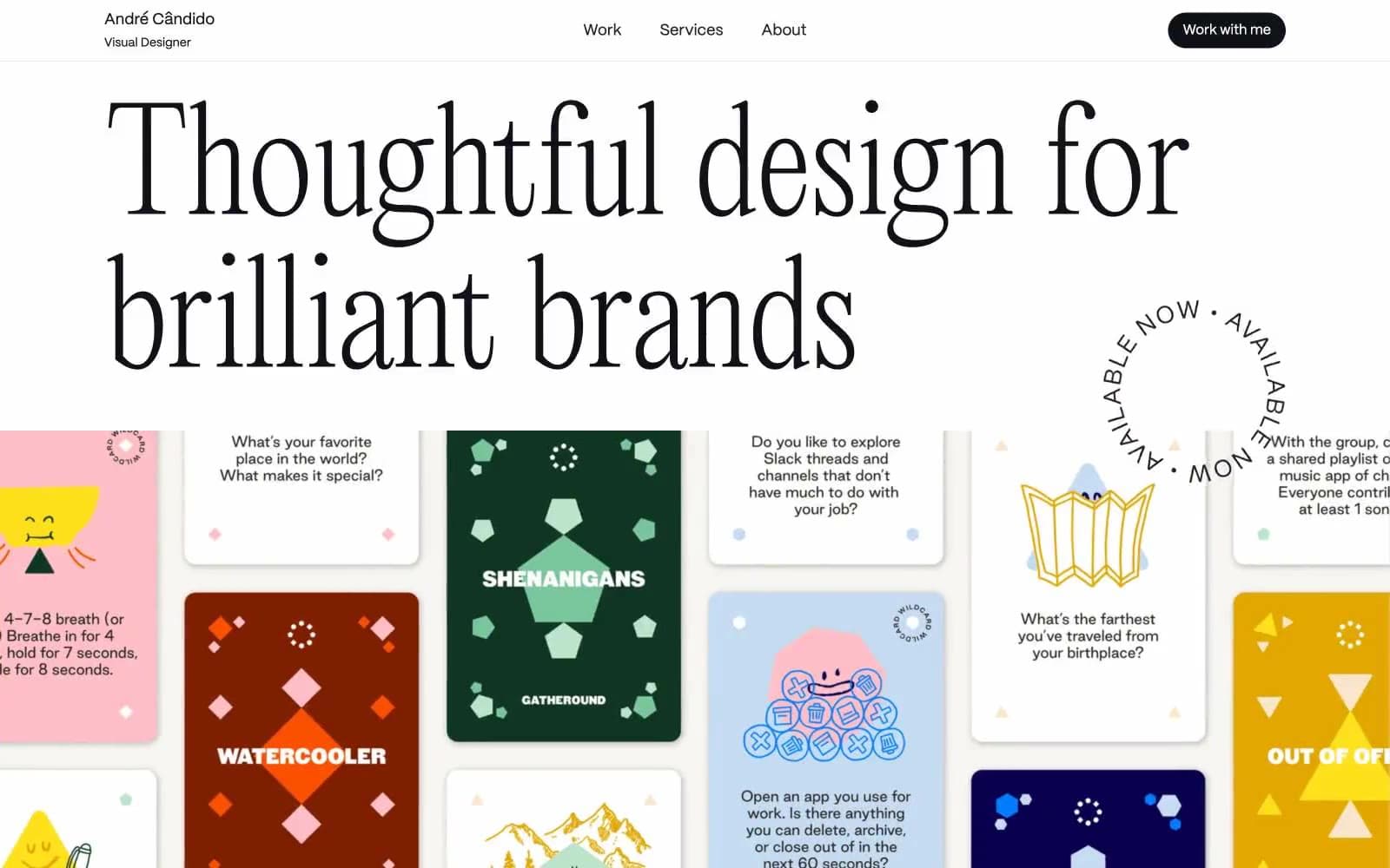
André Cândido
Brand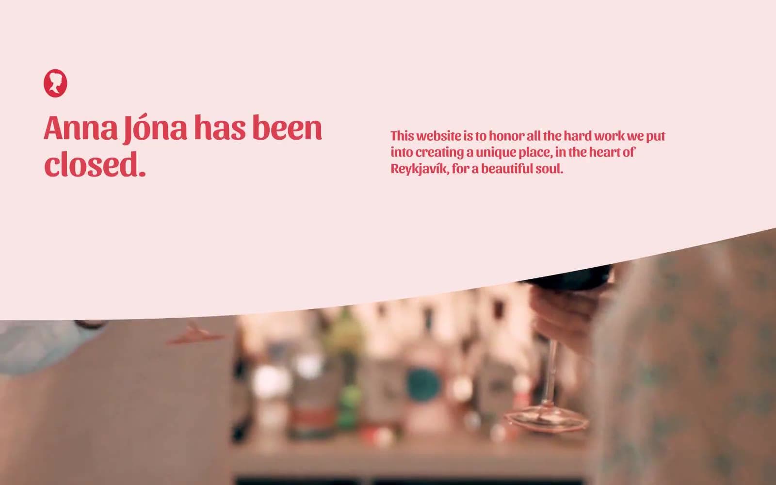
Anna Jóna
Brand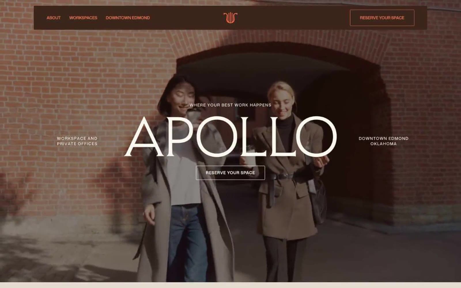
Apollo
Brand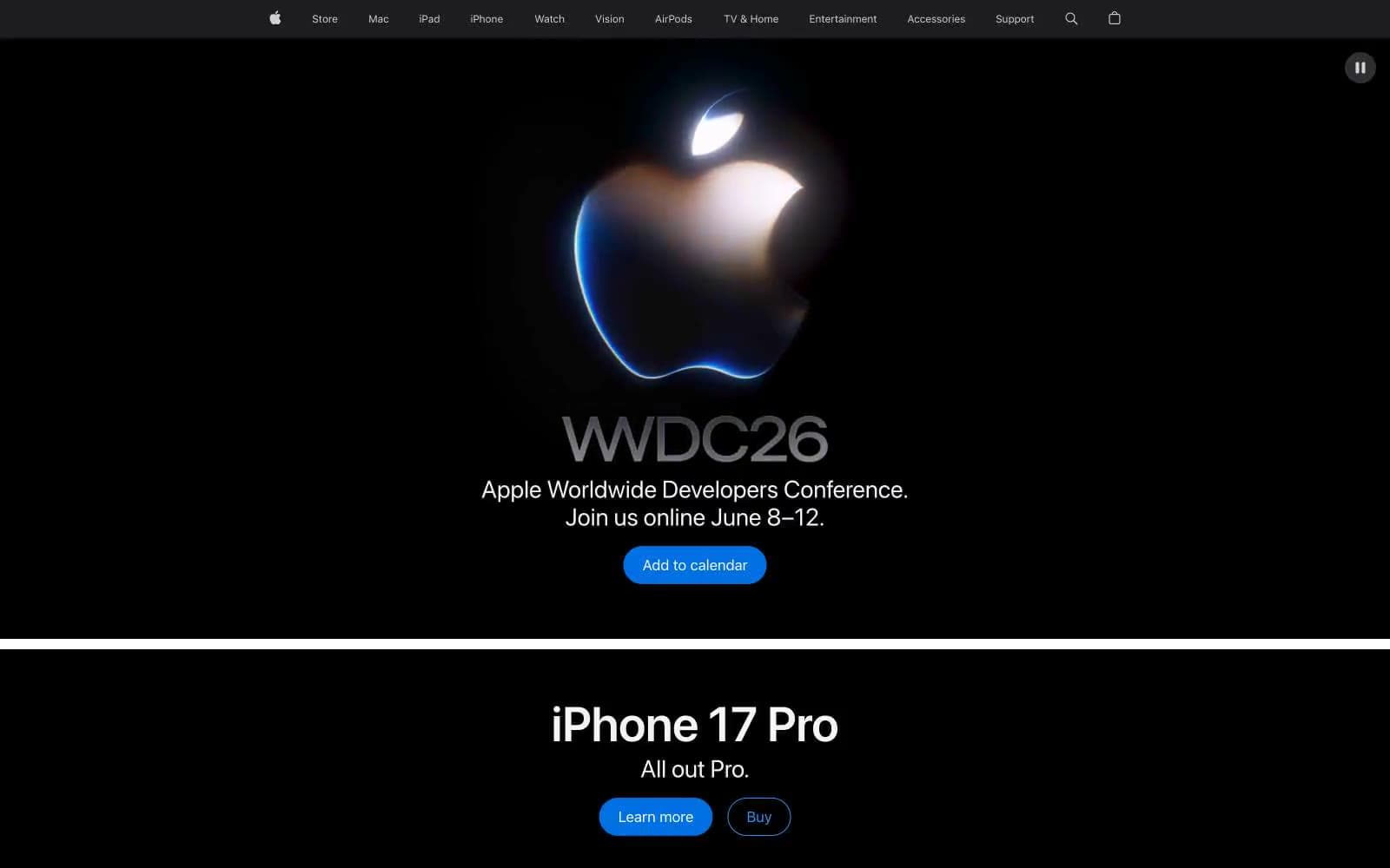
Apple
Brand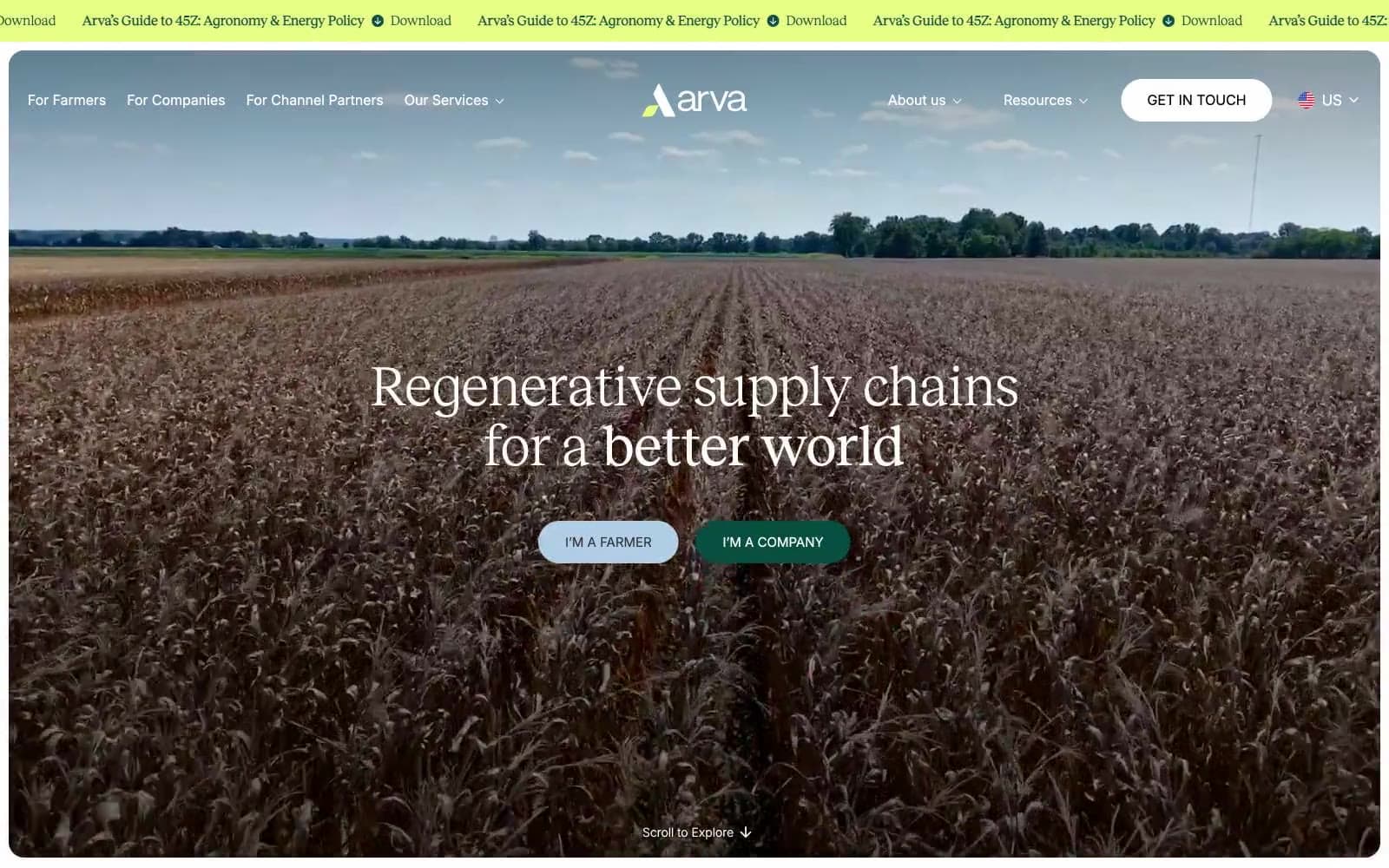
Arva
Brand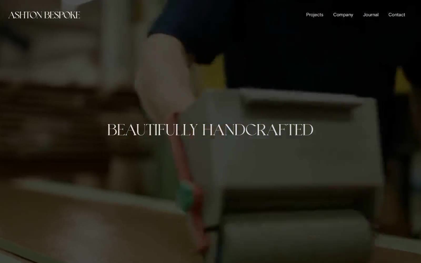
Ashton Bespoke
Brand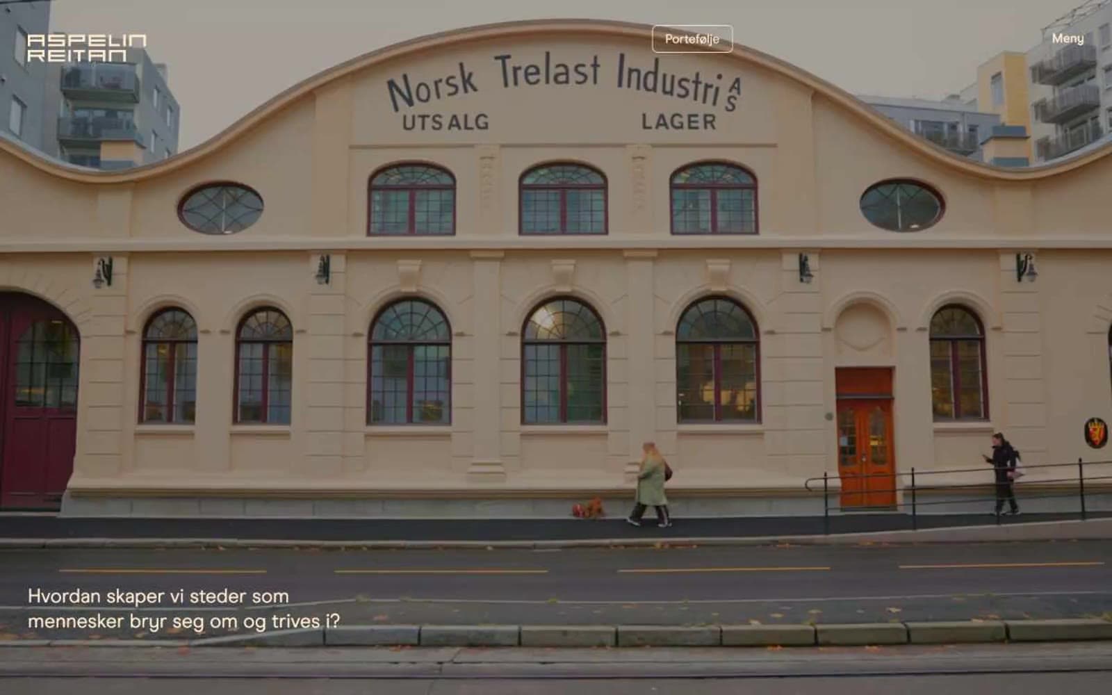
Aspelin Reitan
Brand


