
Apollo. Warm brick atelier at golden hour.
- Brand
- Light theme
- 9 colors
- 2 typefaces
Apollo reads like a printed membership brochure for a curated physical workspace: warm cream canvas, hairline ash-gray rules, and a whisper-thin display serif that gives every page an editorial weight. A single terracotta accent is rationed across actions and one or two decorative headings, while deep espresso brown replaces black as the structural dark — the palette feels sunlit rather than backlit. The 3px corner radius rejects SaaS pill-button softness in favor of print-publication crispness, and uppercase labels with wide tracking read like section dividers in a magazine. Color rarely speaks, and when it does, it speaks in one confident orange.

Apollo design system

Brand3
Primary text, navigation background, structural borders — a warm near-black that anchors every screen without the harshness of pure #000000
Primary action borders, active nav state, decorative accents — rationed to moments of intent, never used as a large surface fill
Decorative display headings, logo monogram stroke — a vivid violet that breaks the warm palette for brand-voice headlines only
Accent1
Subtle highlight washes, eyebrow label backgrounds, warm text tint — a muted yellow that warms the cream canvas without competing with terracotta
Neutrals5
True black used sparingly for image fills and footer text — Espresso Bark handles all structural dark needs
Hairline borders, dividers, card edges — the most-used color on the site (1,300+ occurrences), creates the cool rule-lines that structure every layout
Cool surface accent for secondary panels — a lavender-tinted gray that introduces gentle contrast against the warm cream
Warm tinted surface for hover states and soft callout blocks — a peach wash that warms the cream canvas
Page canvas, content section backgrounds — the dominant surface, never pure white, always slightly cream
Try a pairing
Pick any two colors from the palette to check whether text stays readable on top.
Aa
Warm Linen on Espresso Bark
13.26 : 1 contrast
- Body textPasses AA 4.5
- Large textPasses AA 3
- StrictPasses AAA 7
More DESIGN.md files. Same web, different personalities.

Airbnb
Brand
Aker
Brand
Alison Roman
Brand
Alpine Bio
Brand
Alveos One
Brand
Amrit Palace
Brand
André Cândido
Brand
Anna Jóna
Brand
Apple
Brand
Arva
Brand
Ashton Bespoke
Brand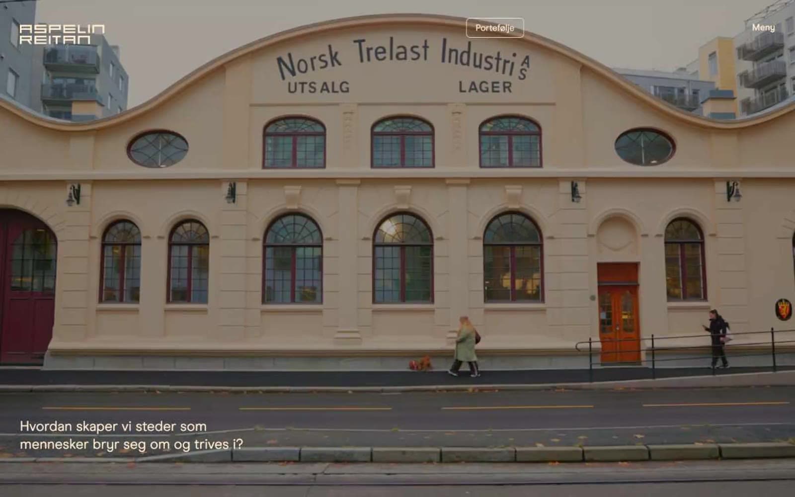
Aspelin Reitan
Brand


