
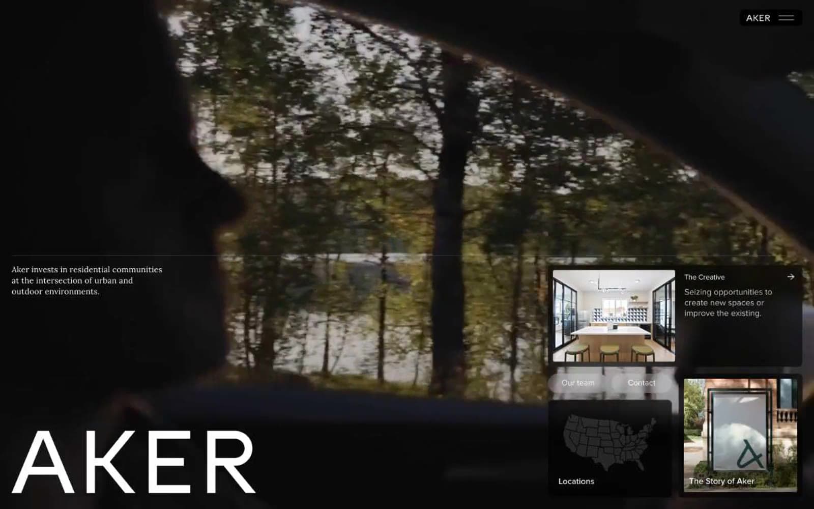
Aker. White walls, warm terracotta spotlights, everything else recedes.
- Brand
- Light theme
- 16 colors
- 2 typefaces
Aker speaks in the visual vocabulary of a premium real-estate developer: dramatic full-bleed photography anchoring each section, a single warm terracotta accent cutting through near-monochrome layouts, and typography that oscillates between whisper-light and monumental. The interface trusts white space and dark imagery to do the heavy lifting — chrome is minimal, borders are hairlines, and interactive elements are reduced to text-and-arrow pairs or subtly filled dark pills. The single most distinctive choice is the contrast between the 168px Proxima Nova at weight 300 for the brand mark and the 15–18px body copy at the same family — the same typeface carries both the shouting and the whispering, which makes the voice feel unified rather than hybrid.
Aker design system

Brand3
Link text, brand accent, warm highlight on muted cards — single chromatic accent that warms an otherwise neutral system
Dark green surface for feature cards and link backgrounds on light
Deep teal-dark surface for link and card backgrounds, complements Pine in the cool brand register
Accent3
Decorative stroke and fill for illustrations and icon-line work, soft cool gray with depth
Warm brown card surface, earth-toned card variant
Warm-pink card surface, used as an occasional warm-tinted card variant
Neutrals10
Primary text, hairline borders, icon strokes, link text on light surfaces
Deepest surface for dark feature cards and modal backgrounds
Dark surface panels, navigation pill background, elevated dark cards
Mid-dark panel surface, secondary dark backgrounds behind photography
Cool-tinted dark surface, used for subtle contrast against warmer darks
Neutral button treatment for secondary actions and selected controls. Use as the primary filled action background
Secondary body text, body-emphasis borders
Muted helper text, secondary borders, inactive metadata
Light card surfaces, hairline borders on white, image overlay tints
Page canvas, card surfaces, text on dark photography and dark surfaces
Try a pairing
Pick any two colors from the palette to check whether text stays readable on top.
Aa
Paper on Ember
4.69 : 1 contrast
- Body textPasses AA 4.5
- Large textPasses AA 3
- StrictFails AAA 7
More DESIGN.md files. Same web, different personalities.
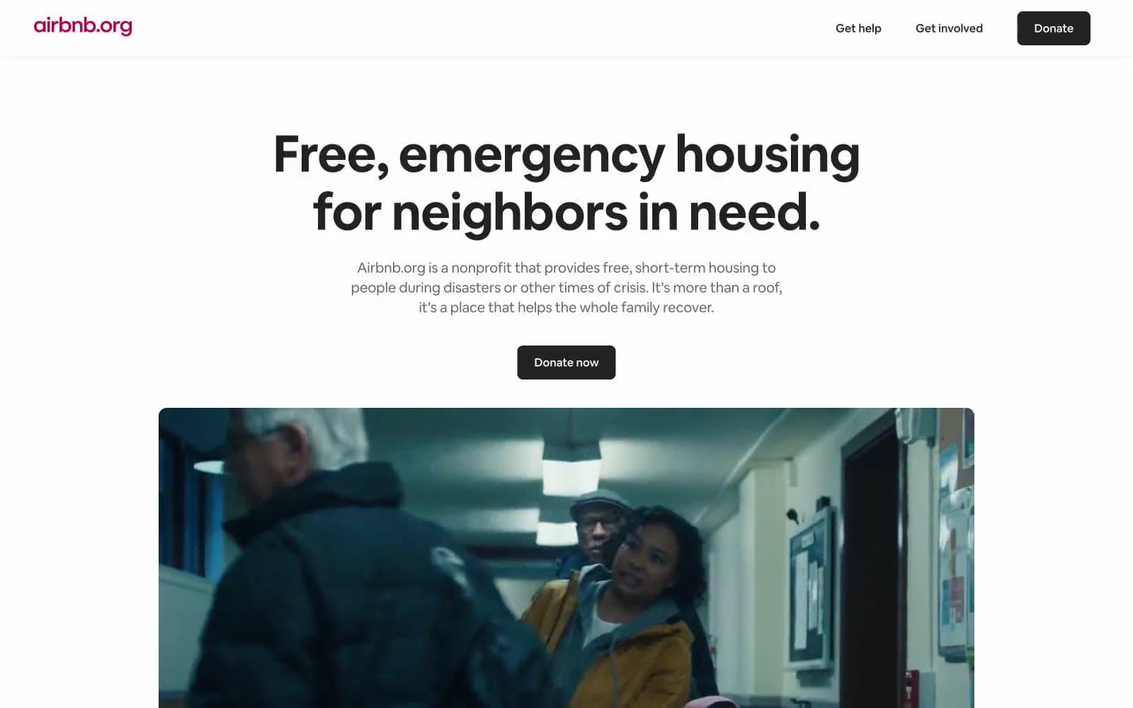
Airbnb
Brand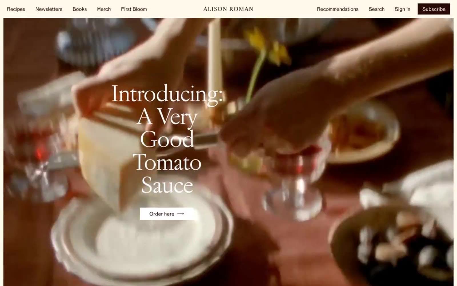
Alison Roman
Brand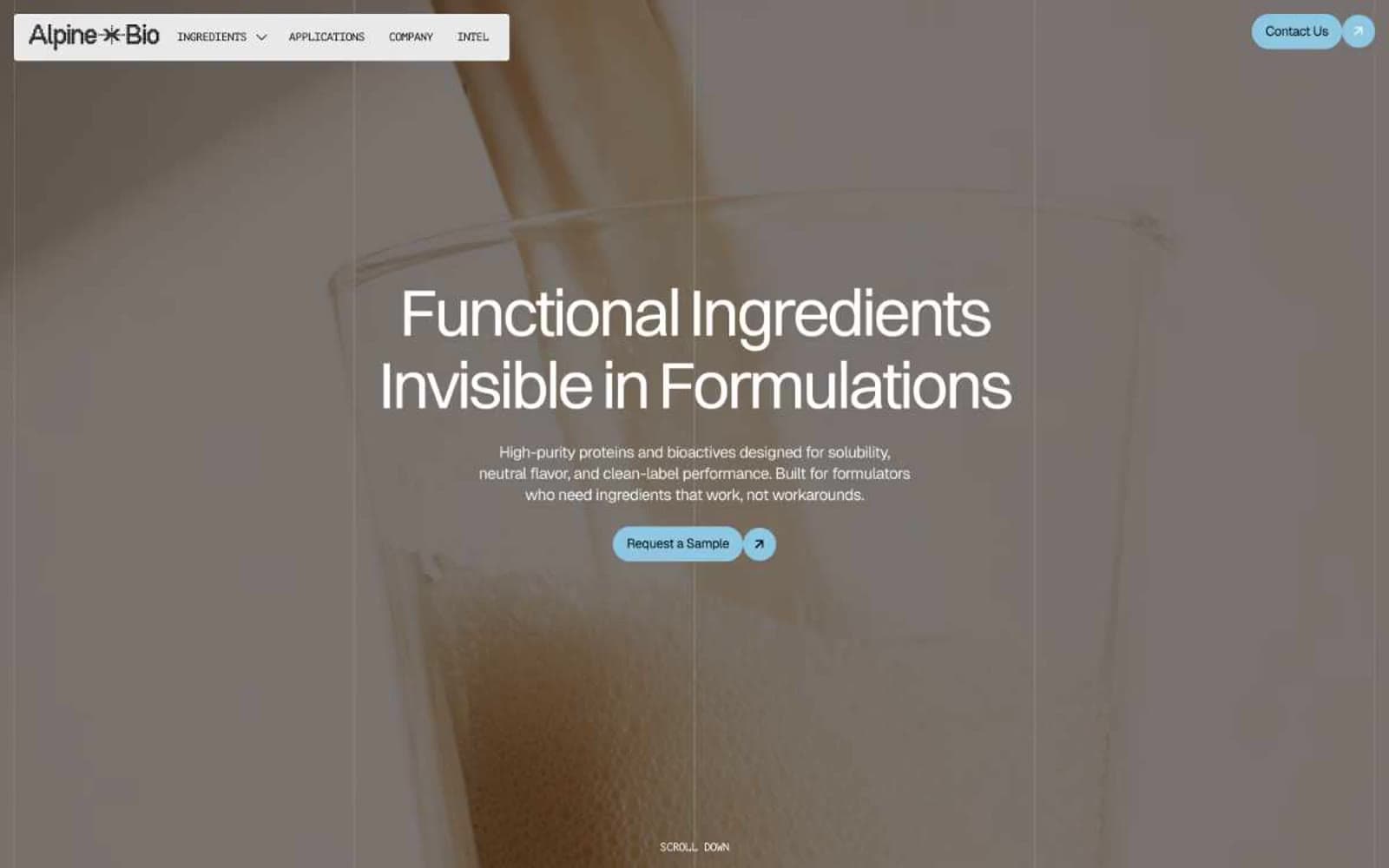
Alpine Bio
Brand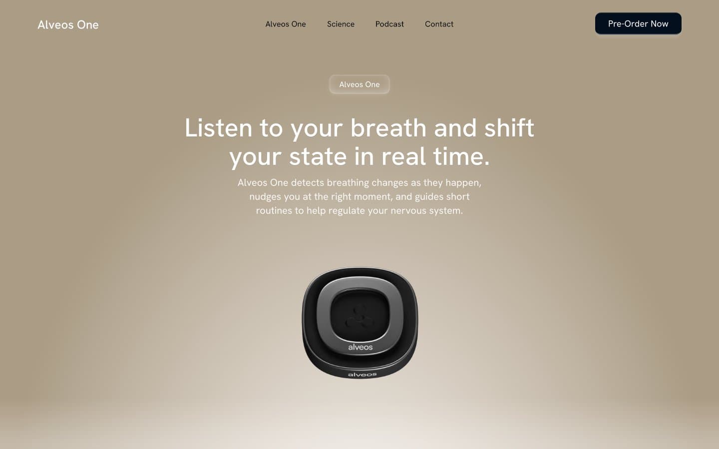
Alveos One
Brand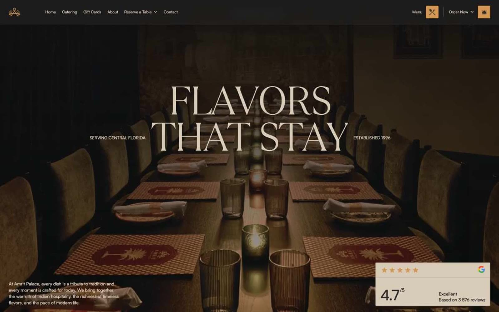
Amrit Palace
Brand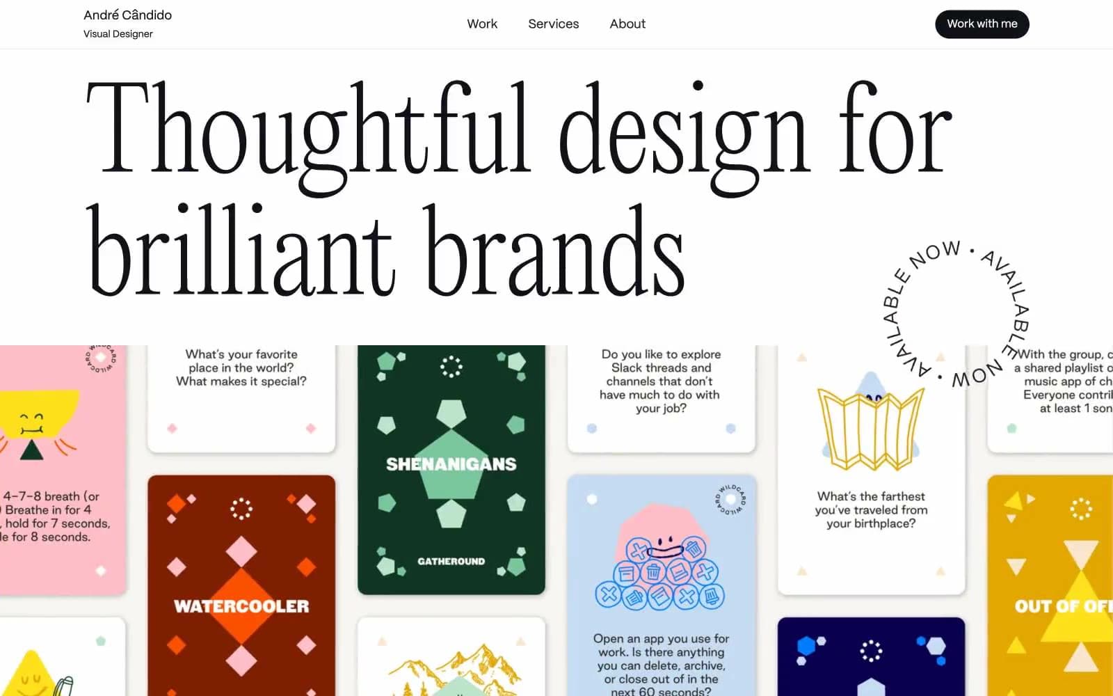
André Cândido
Brand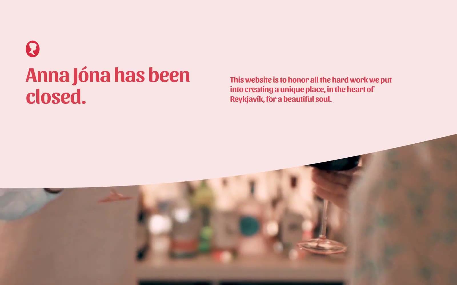
Anna Jóna
Brand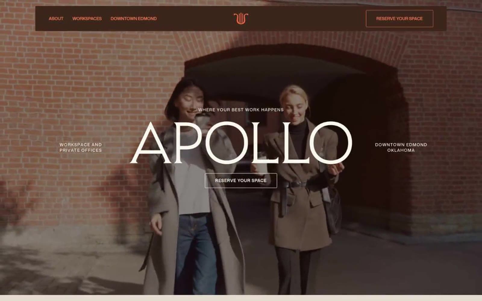
Apollo
Brand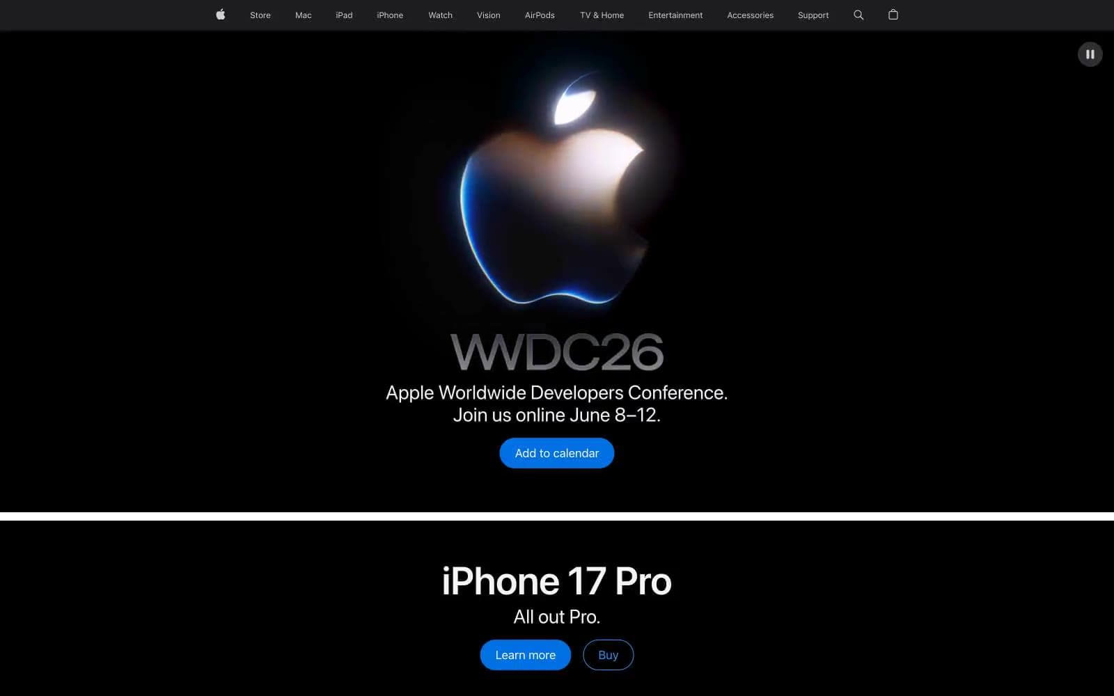
Apple
Brand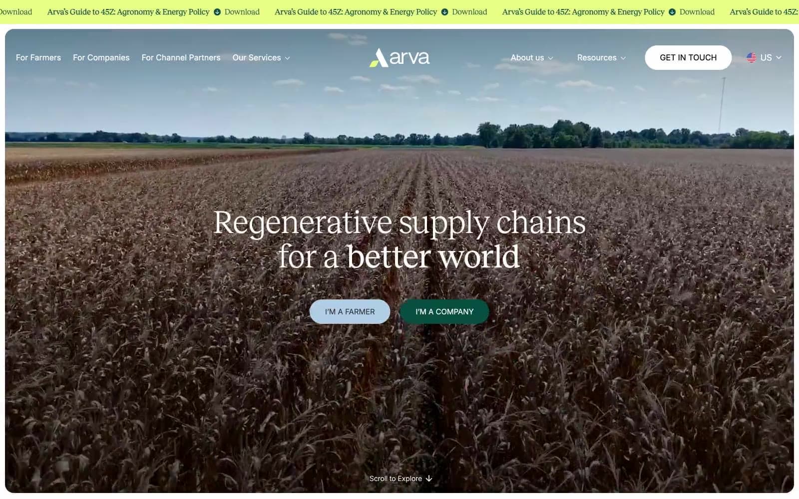
Arva
Brand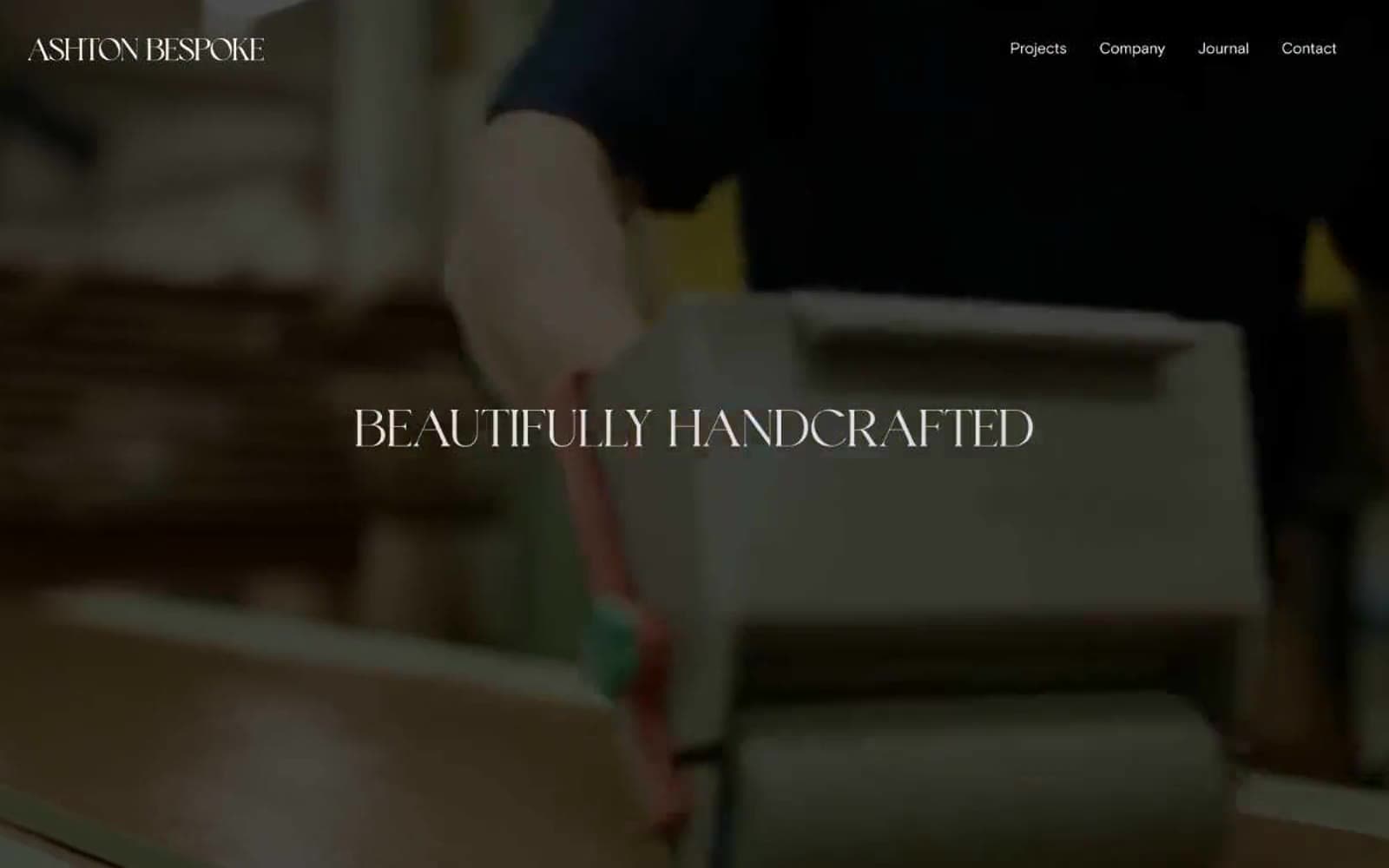
Ashton Bespoke
Brand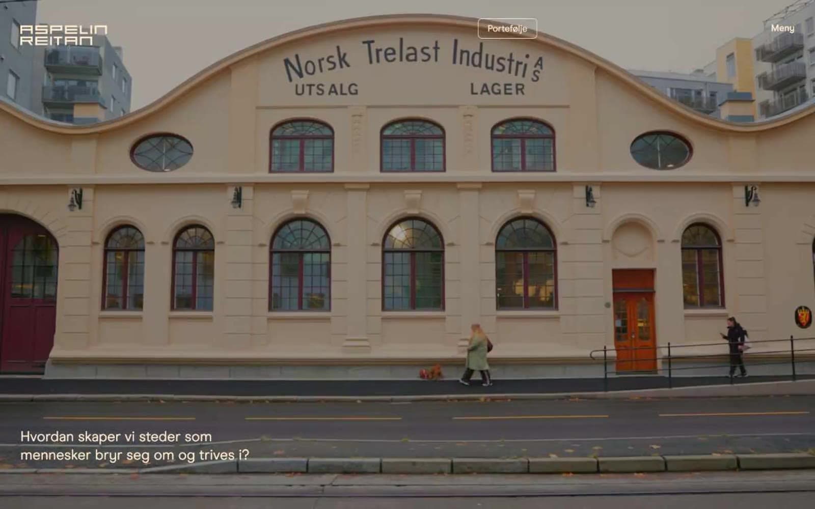
Aspelin Reitan
Brand


