
Apple. White room with a single blue switch.
- Brand
- Light theme
- 12 colors
- 2 typefaces
Apple's design language is a study in restraint: near-white canvas, generous breathing room, and one vivid blue accent that makes every action feel deliberate. Typography is the primary voice — SF Pro set with negative tracking that tightens as size grows, giving headlines architectural clarity without weight. The product IS the design: large product photography and lifestyle imagery dominate, while chrome recedes into thin borders, ghost navigation, and hairline rules. Sections alternate on a light gray canvas with full-bleed color washes for promotional blocks, creating rhythm through scale shifts rather than decoration.
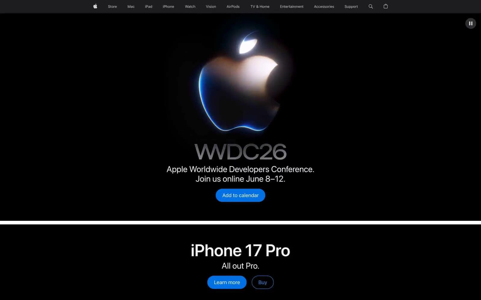
Apple design system

Brand3
Filled action buttons, selected states — the only chromatic interactive color, used sparingly so each appearance carries weight
Outlined action borders, inline links — deeper saturation than Apple Blue, used where a filled pill would be too loud
Decorative borders, image outlines, icon strokes — the lightest blue in the system, used for atmospheric emphasis rather than interaction
Neutrals9
Heading borders, nav borders, dark image backgrounds — true black for maximum contrast in promotional and heading contexts
Primary text, heading borders, nav rules, card borders — the dominant ink color, near-black with a whisper of warmth
Secondary text, nav fills, button borders — the workhorse neutral for borders and icons that need more presence than mid-gray
Nav text, nav borders, link borders — sits between Carbon and Smoke for tertiary hierarchy
Footer text, list borders, nav borders, muted body text — the mid-gray for content that should be present but quiet
Body borders, icon strokes, button borders — the lightest functional gray, for hairline rules on light surfaces
Button background fills, disabled surfaces — the only near-white surface that is deliberately grayer than the canvas
Page canvas, body backgrounds, footer surface — the signature Apple light gray, slightly cooler than pure white
Elevated surface washes, subtle fills, button text on dark backgrounds — barely-blue tint that lifts a section without declaring it
Try a pairing
Pick any two colors from the palette to check whether text stays readable on top.
Aa
#fafafa on Apple Blue
4.50 : 1 contrast
- Body textFails AA 4.5
- Large textPasses AA 3
- StrictFails AAA 7
More DESIGN.md files. Same web, different personalities.
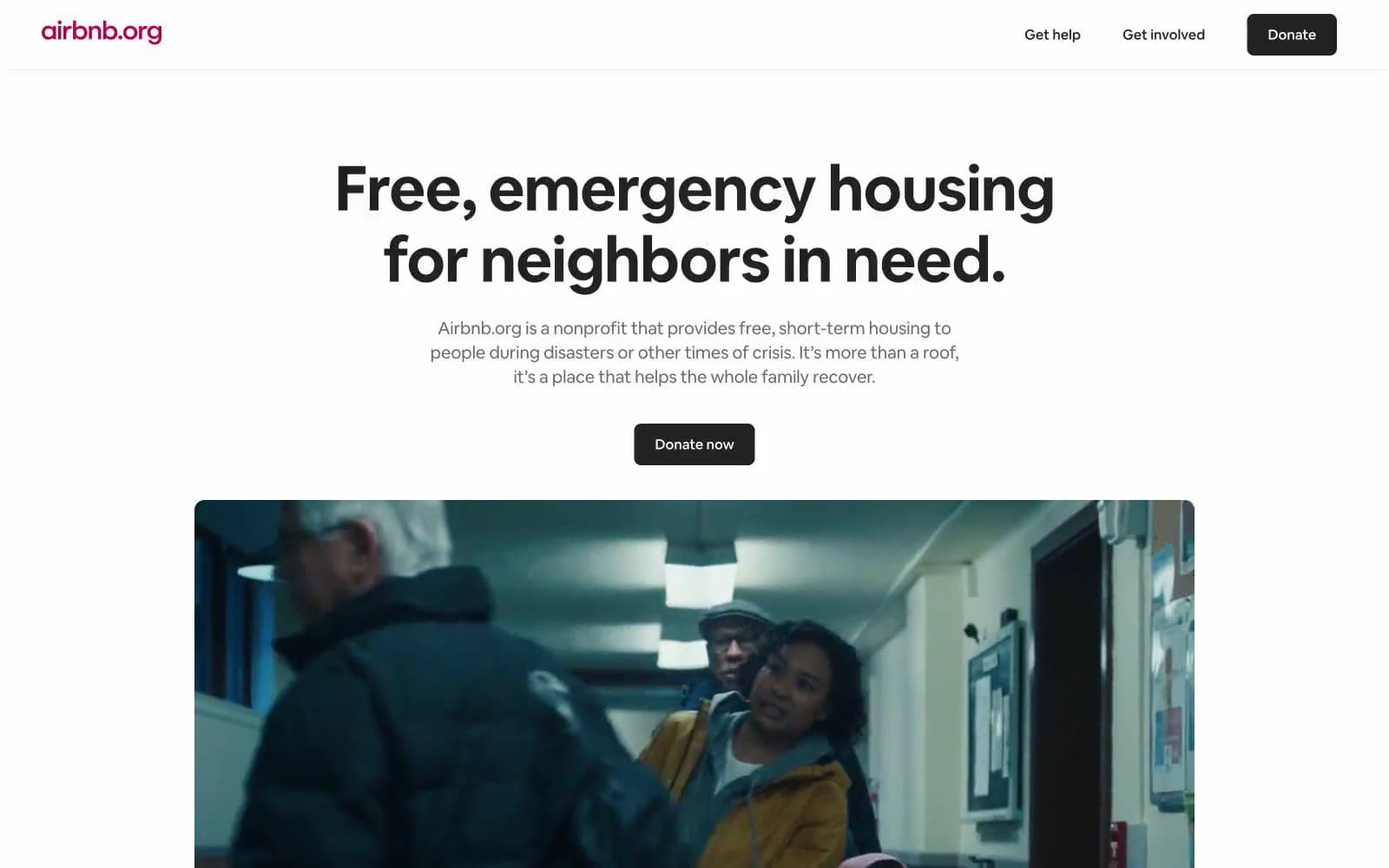
Airbnb
Brand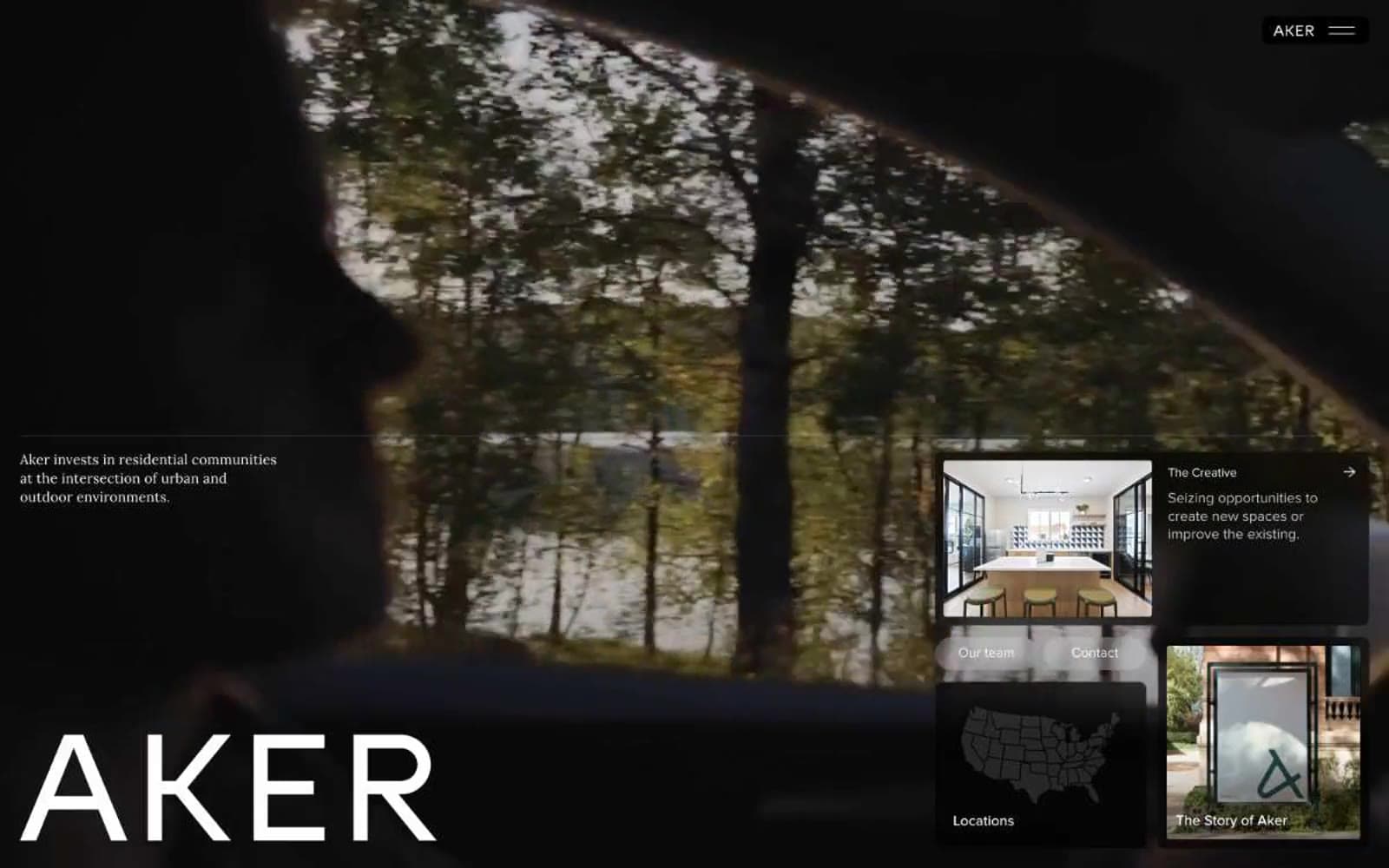
Aker
Brand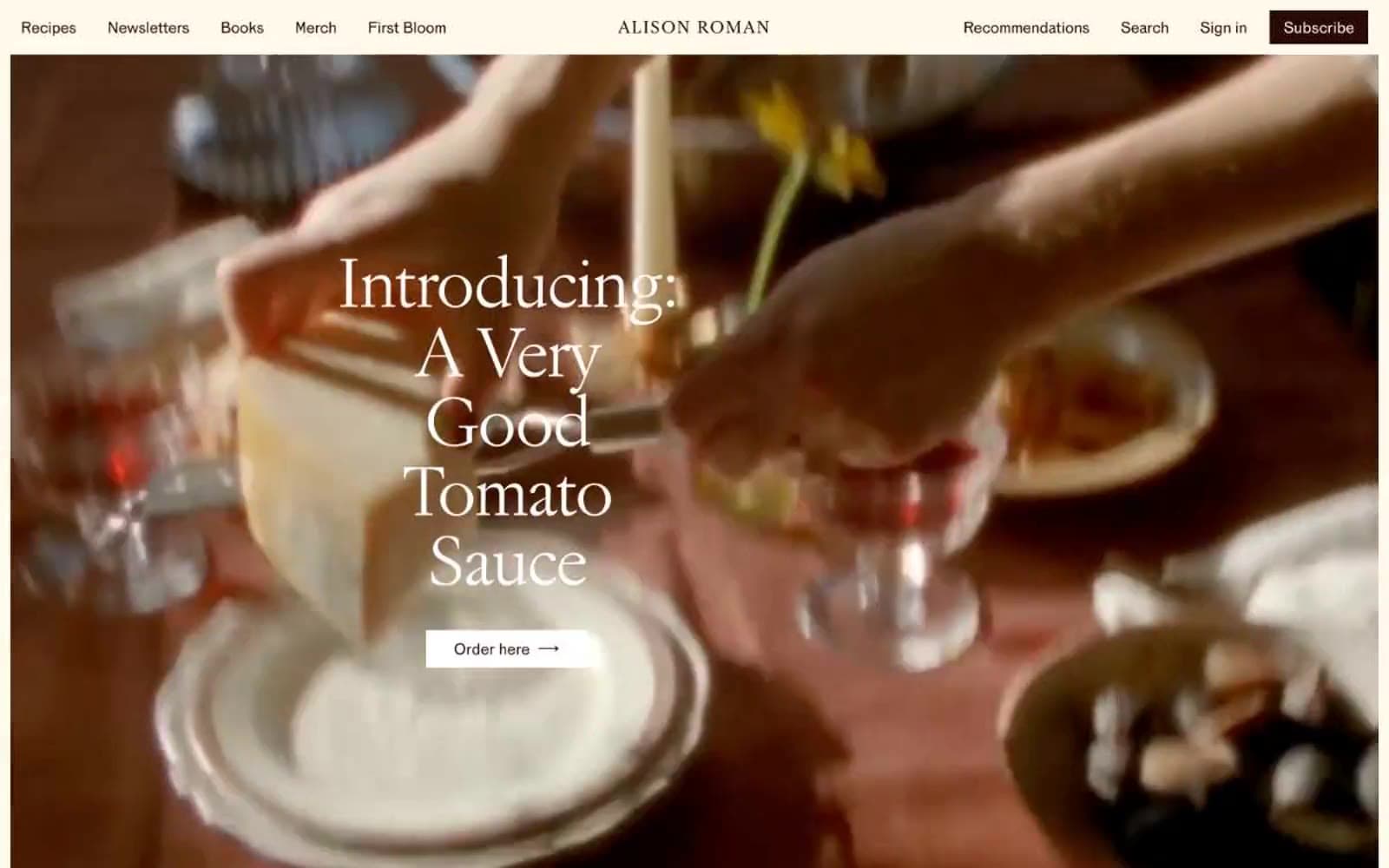
Alison Roman
Brand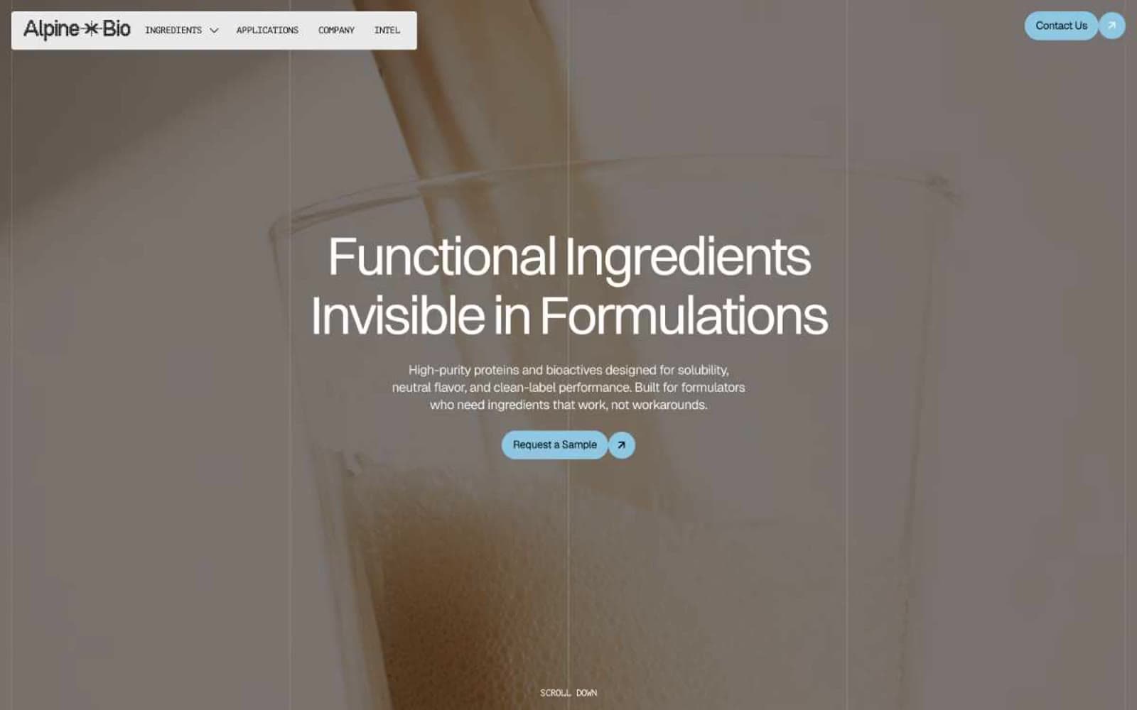
Alpine Bio
Brand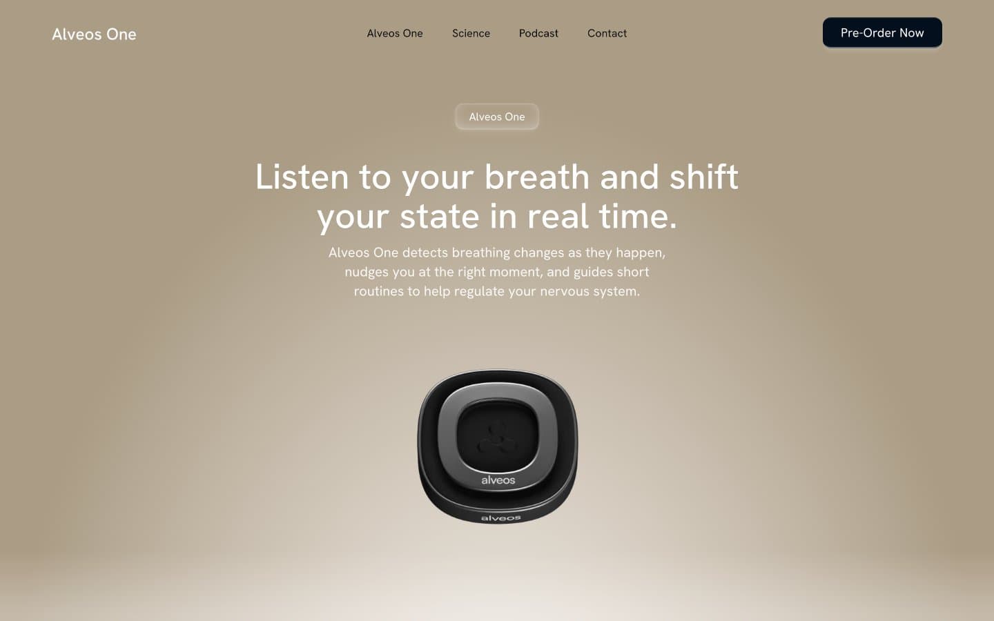
Alveos One
Brand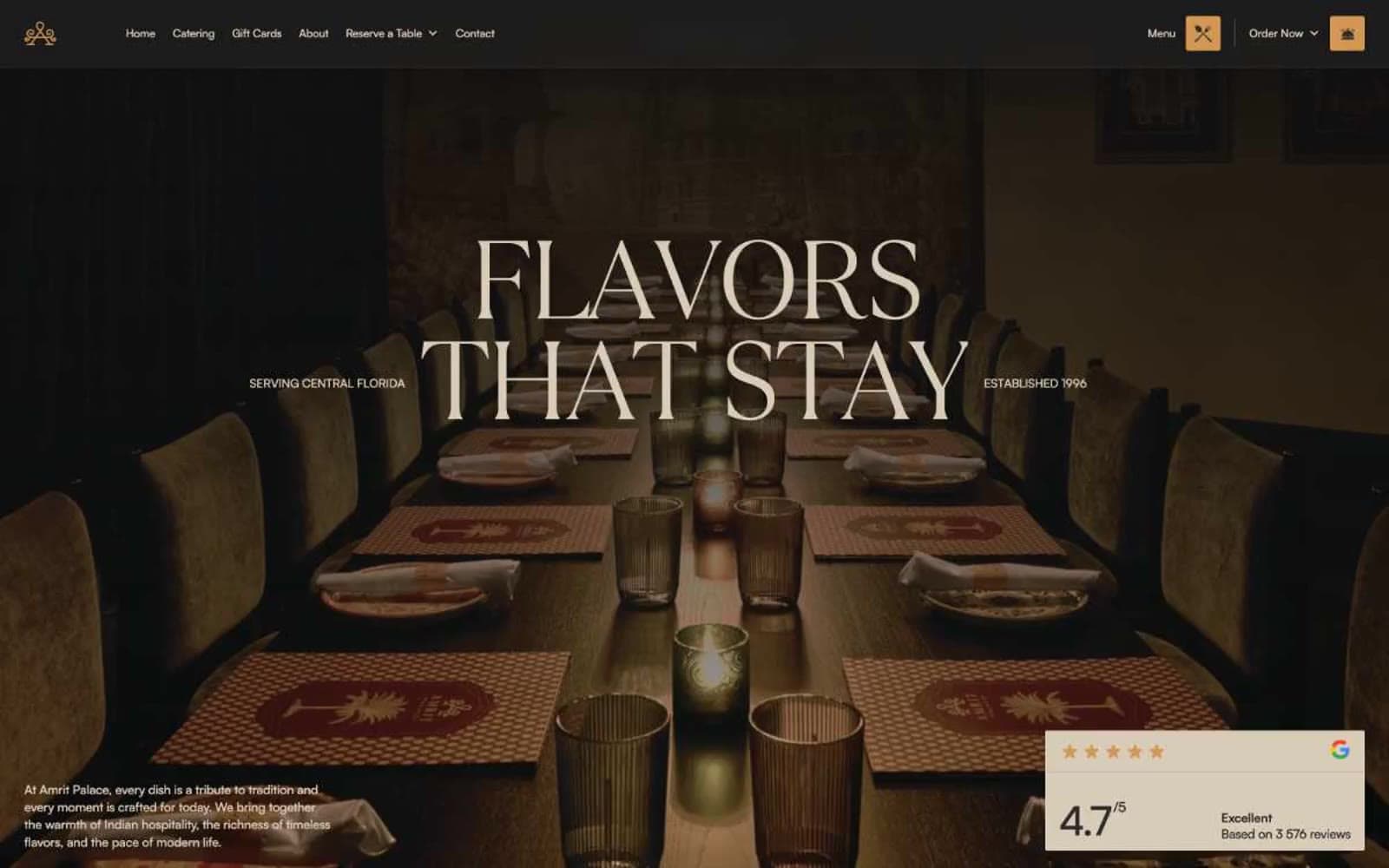
Amrit Palace
Brand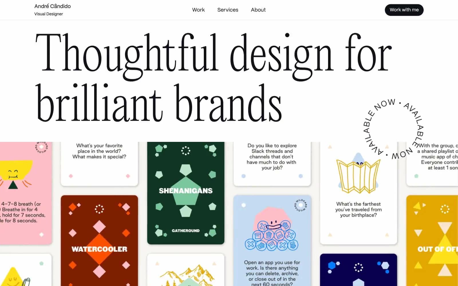
André Cândido
Brand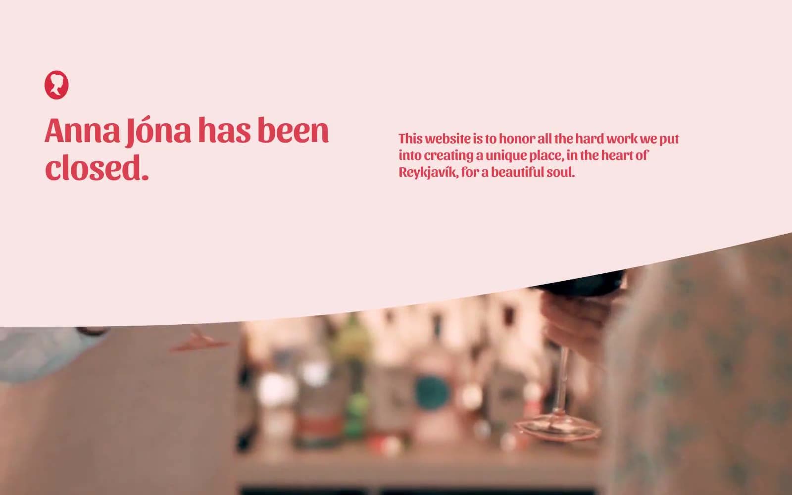
Anna Jóna
Brand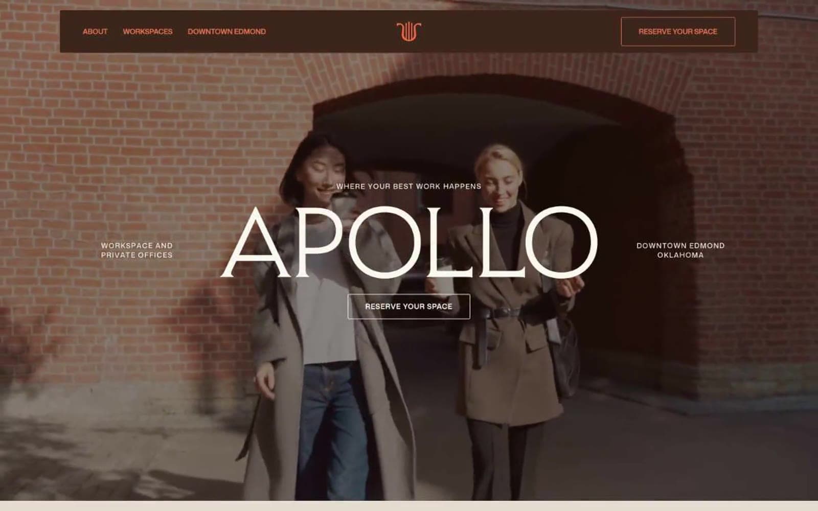
Apollo
Brand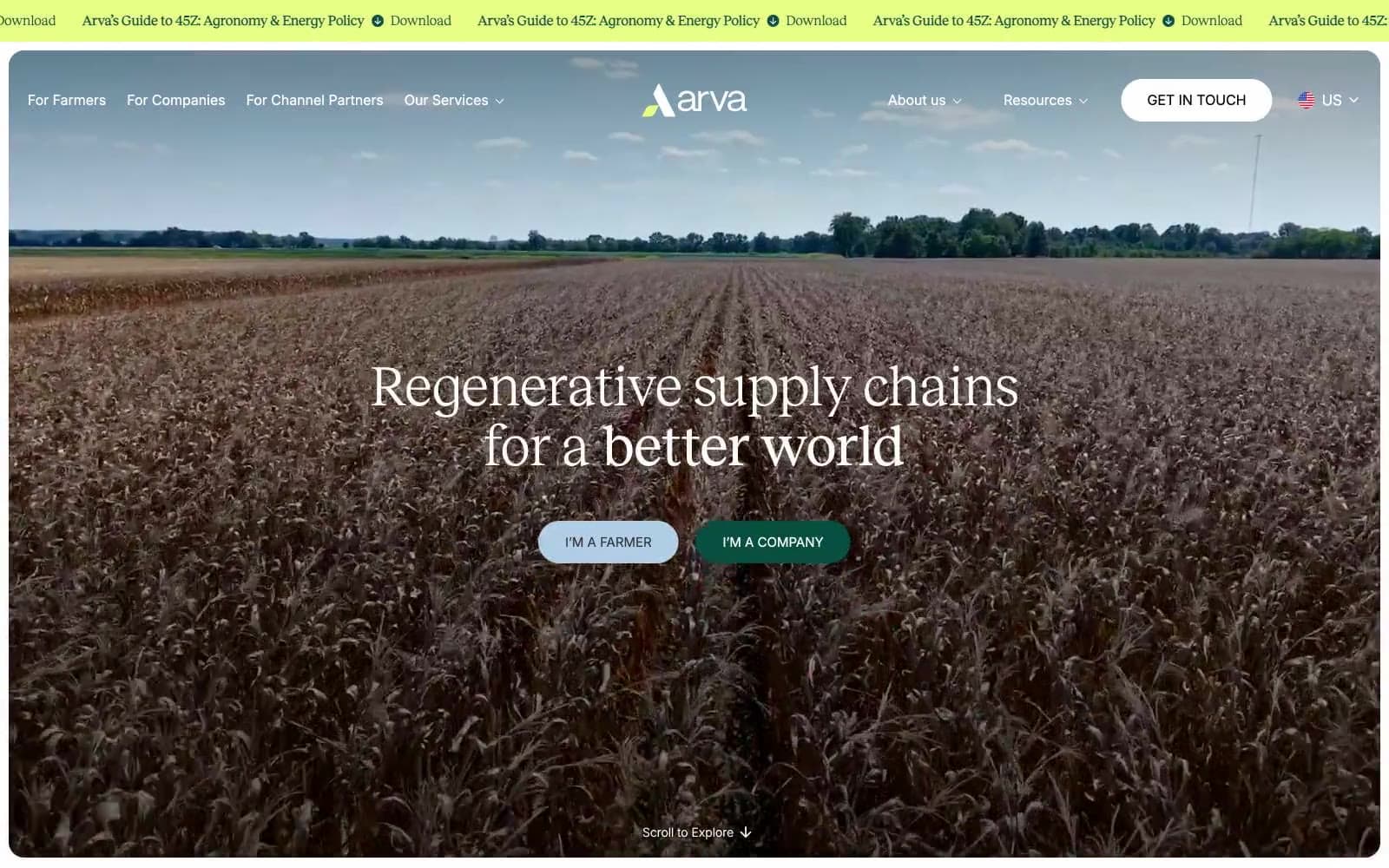
Arva
Brand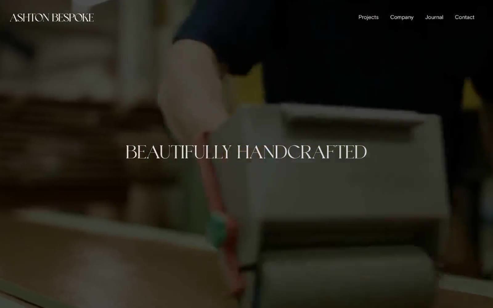
Ashton Bespoke
Brand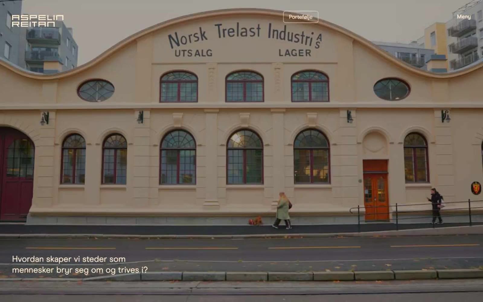
Aspelin Reitan
Brand


