
Arva. Pastoral editorial magazine spread on a cream field.
- Brand
- Light theme
- 12 colors
- 5 typefaces
Arva uses a pastoral editorial language: warm cream canvas replaces pure white, deep forest green anchors the brand, and quilted pastel surfaces (sky blue, peach, sage, bone) tile across content sections like fields seen from altitude. Typography pairs a refined editorial serif (Reckless) with a neutral sans (Inter), giving the site a printed-magazine feel over a typical SaaS chrome. Buttons are dramatically pill-shaped (100–110px radius), photography dominates above the fold at full-bleed, and the only saturated color besides the brand green appears as a vivid lime marquee strip — a single high-energy accent against an otherwise quiet, earth-toned system.

Arva design system

Brand2
Primary brand color, header background, nav bar fill, section dividers, footer — deep teal-green against warm cream creates agricultural gravitas
Promotional marquee strip, highlight announcement bars, occasional link hover wash — the only high-energy accent in the palette
Accent4
Decorative card surface — one of the quilted pastel tiles used for partner testimonials and category blocks
Decorative card surface — warm pastel tile alternating with sky and sage cards
Decorative card surface — soft green pastel tile for agrarian category blocks
Subtle borders, input outlines, decorative dividers within body content
Neutrals6
Primary body text, headings on light, icon strokes — near-black for high contrast on cream
Secondary text, link borders, button borders, subdued UI outlines
Muted helper text, tertiary button text and borders
Page canvas, base background — warm off-white replacing pure white to feel organic and printed
Secondary card surface, subtle section dividers
Card surfaces, input fills, button text, icon backgrounds — the bright counterpoint against bone canvas
Try a pairing
Pick any two colors from the palette to check whether text stays readable on top.
Aa
Pure White on Forest Ink
9.42 : 1 contrast
- Body textPasses AA 4.5
- Large textPasses AA 3
- StrictPasses AAA 7
More DESIGN.md files. Same web, different personalities.

Airbnb
Brand
Aker
Brand
Alison Roman
Brand
Alpine Bio
Brand
Alveos One
Brand
Amrit Palace
Brand
André Cândido
Brand
Anna Jóna
Brand
Apollo
Brand
Apple
Brand
Ashton Bespoke
Brand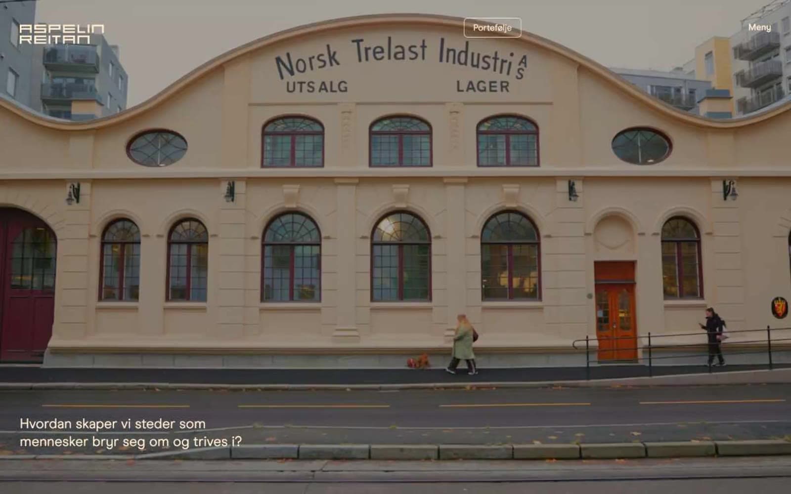
Aspelin Reitan
Brand


