
Alison Roman. A printed spread from an artisan food memoir, translated to screen with zero loss of tactility.
- Brand
- Light theme
- 7 colors
- 3 typefaces
Alison Roman's site is a warm, editorial cookbook author's atelier — cream-paper canvas, elegant serif typography, and a single near-black warm-brown that carries every text and action. The palette is almost entirely tonal: three creams layered from canvas to card, a whisper-pale yellow for link underlines, and a burgundy flash reserved for book-cover backgrounds. Layout is generous, magazine-paced, and asymmetric — book covers on the left, descriptive copy on the right, with the dark-brown filled 'Order' button as the sole structural punctuation. No shadows, no gradients, no decorative borders; hierarchy is built through type scale, generous whitespace, and the contrast between warm cream and warm black. The design reads like a printed cookbook spread translated faithfully to the web: confident, restrained, and food-warm without ever resorting to food clichés.

Alison Roman design system

Brand1
Primary text, headings, filled action buttons, footer text — the warm near-black that anchors every screen; it is the only chromatic dark in the system and the only acceptable fill for primary actions
Accent2
Orange wash for highlight backgrounds, decorative bands, and soft emphasis behind content.
Link text and selected heading accent — a pale custard yellow used sparingly to mark hyperlinks and tiny editorial highlights, sitting at AAA contrast on the ink
Neutrals4
All borders and dividers throughout the system; used on cards, body blocks, links, and structural dividers — the single hairline color of the site
Page background — the dominant warm cream that defines the entire site mood; every screen sits on this surface
Card surfaces, list-item backgrounds, subtle elevated zones — a step lighter than the canvas, the only card treatment in the system
Button borders, reverse text on dark fills, and the lightest possible surface lift; the only true white in the palette
Try a pairing
Pick any two colors from the palette to check whether text stays readable on top.
Aa
Paper White on Aubergine Ink
18.40 : 1 contrast
- Body textPasses AA 4.5
- Large textPasses AA 3
- StrictPasses AAA 7
More DESIGN.md files. Same web, different personalities.

Airbnb
Brand
Aker
Brand
Alpine Bio
Brand
Alveos One
Brand
Amrit Palace
Brand
André Cândido
Brand
Anna Jóna
Brand
Apollo
Brand
Apple
Brand
Arva
Brand
Ashton Bespoke
Brand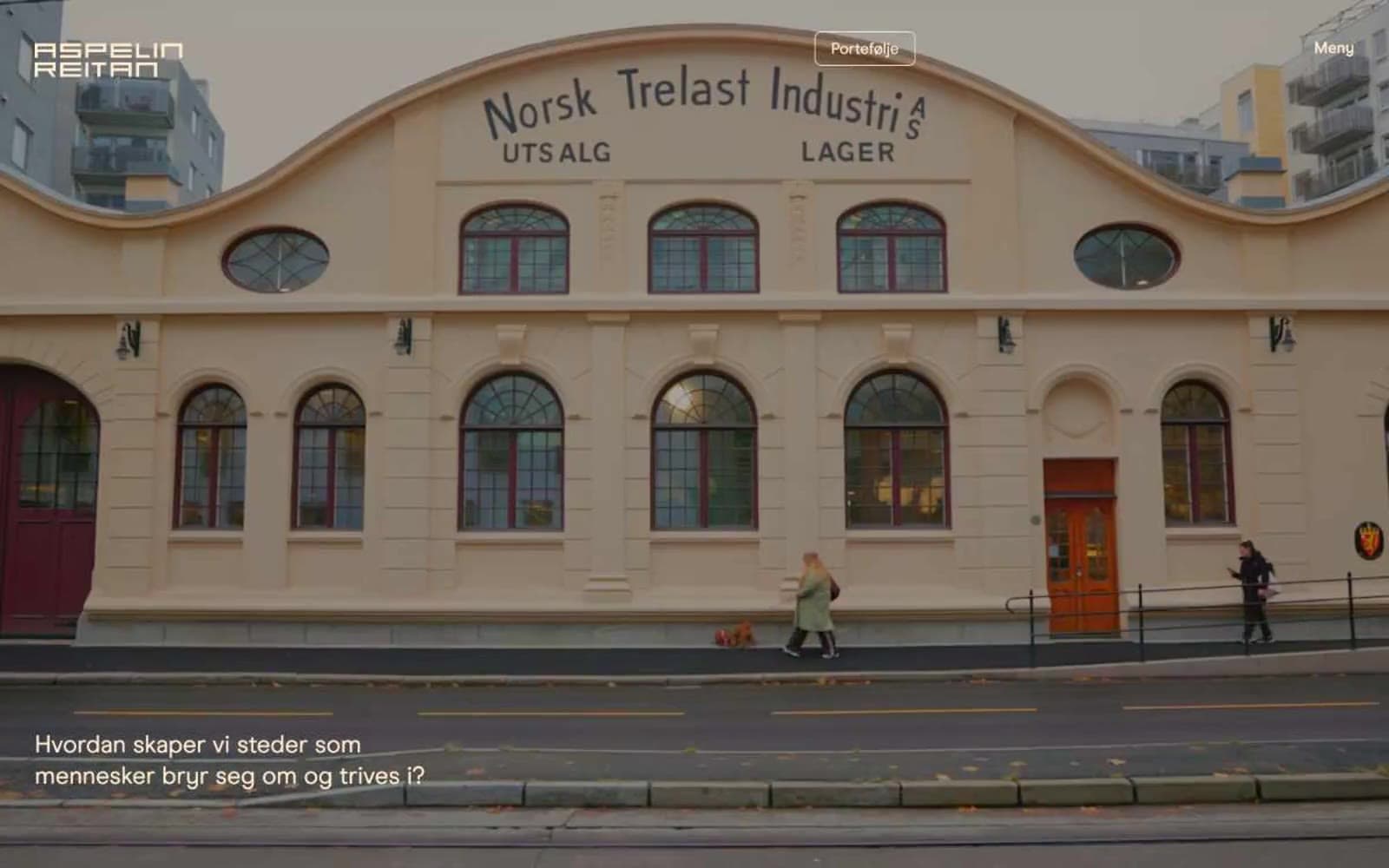
Aspelin Reitan
Brand


