
Wise. Deep moss with lime voltage.
- Finance
- Light theme
- 12 colors
- 3 typefaces
Wise speaks in a confident, slightly loud voice: a deep forest green (#163300) carries most of the surface area — text, nav, dark sections, icons — while a single electric lime (#9fe870) acts as functional punctuation on CTAs, active tabs, and key highlights. The display type is almost aggressive: Wise Sans at weight 900, tightly tracked, shouted across the hero in 100px+ block letters. The rest of the system stays restrained on a near-white canvas with soft gray surfaces (#e8ebe6). Components are pill-shaped by default — buttons, nav segments, flag thumbnails, image masks — with gentle 10px radii reserved for cards and inputs. Color rarely gradients; instead, the lime–forest pairing inverts cleanly when sections go dark, creating rhythm without decoration.
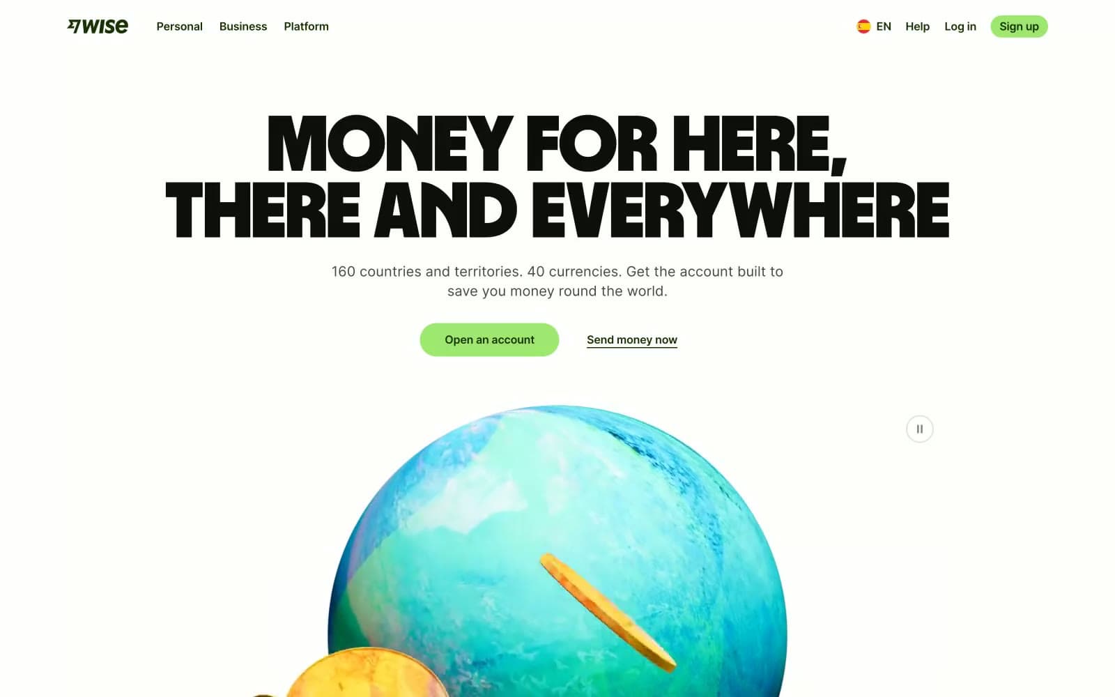
Wise design system

Brand3
Dominant brand dark — nav text, dark section backgrounds, primary copy on light surfaces, icon strokes, filled navigation pills. This is the brand's gravity: wherever you need weight or authority, you reach for Forest Ink
Green supporting accent for decorative details and low-frequency emphasis. Do not promote it to the primary CTA color
Secondary dark green for card surfaces, supporting iconography, and tonal depth on dark sections where Forest Ink is too heavy
Accent3
Pale green wash for soft highlight surfaces, tinted card backgrounds, nav hover states. A whisper of the brand green for low-emphasis containers
Blue supporting accent for decorative details and low-frequency emphasis
Red supporting accent for decorative details and low-frequency emphasis. Use as a supporting accent, not as a status color
Neutrals6
Display headlines, high-contrast headings, pure-black moments in nav and hero. Slightly green-tinted black, not neutral gray
Primary text, body copy, dense UI — slightly warm black that feels softer than pure #000 against white
Supporting body text, helper labels, subdued iconography. One step darker than Pebble for slightly more emphasis
Muted secondary text, placeholder copy, icon strokes, input borders. The mid-gray that recedes
Card surfaces, section dividers, subtle panel backgrounds on the white canvas. Green-tinted off-white, not pure neutral
Page canvas, inverted card surfaces, button text on lime fill
Try a pairing
Pick any two colors from the palette to check whether text stays readable on top.
Aa
Paper on Forest Ink
13.93 : 1 contrast
- Body textPasses AA 4.5
- Large textPasses AA 3
- StrictPasses AAA 7
More DESIGN.md files. Same web, different personalities.
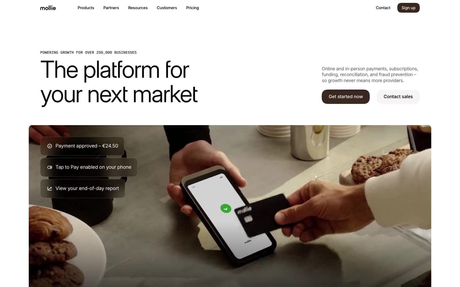
Mollie
Finance
a16z speedrun
Finance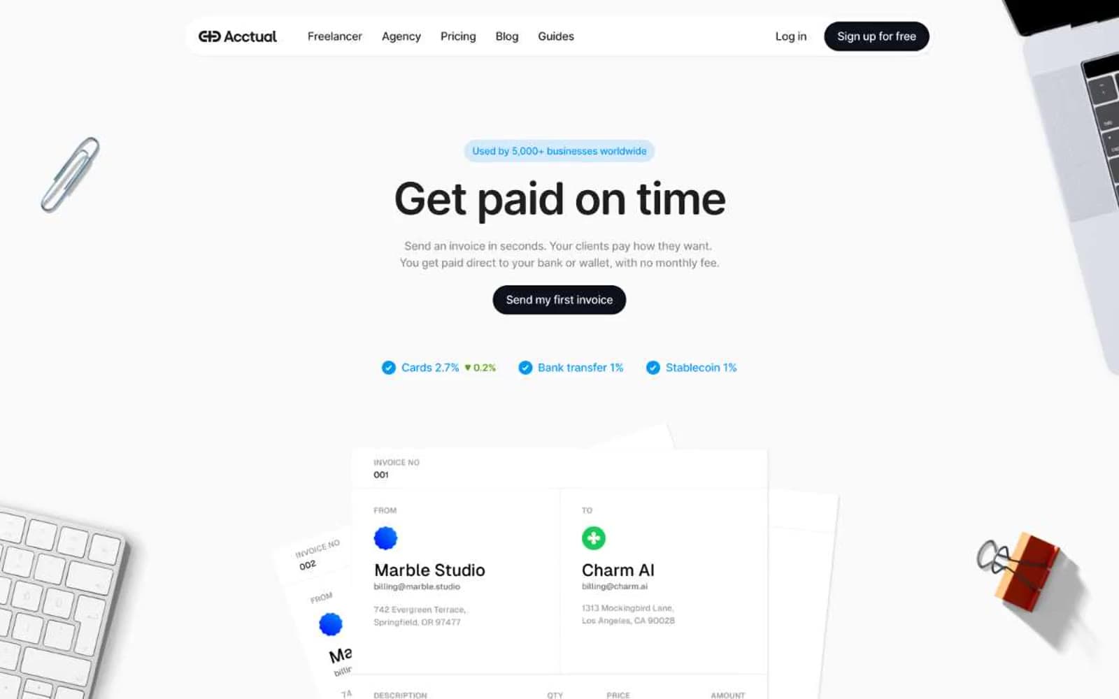
Acctual
Finance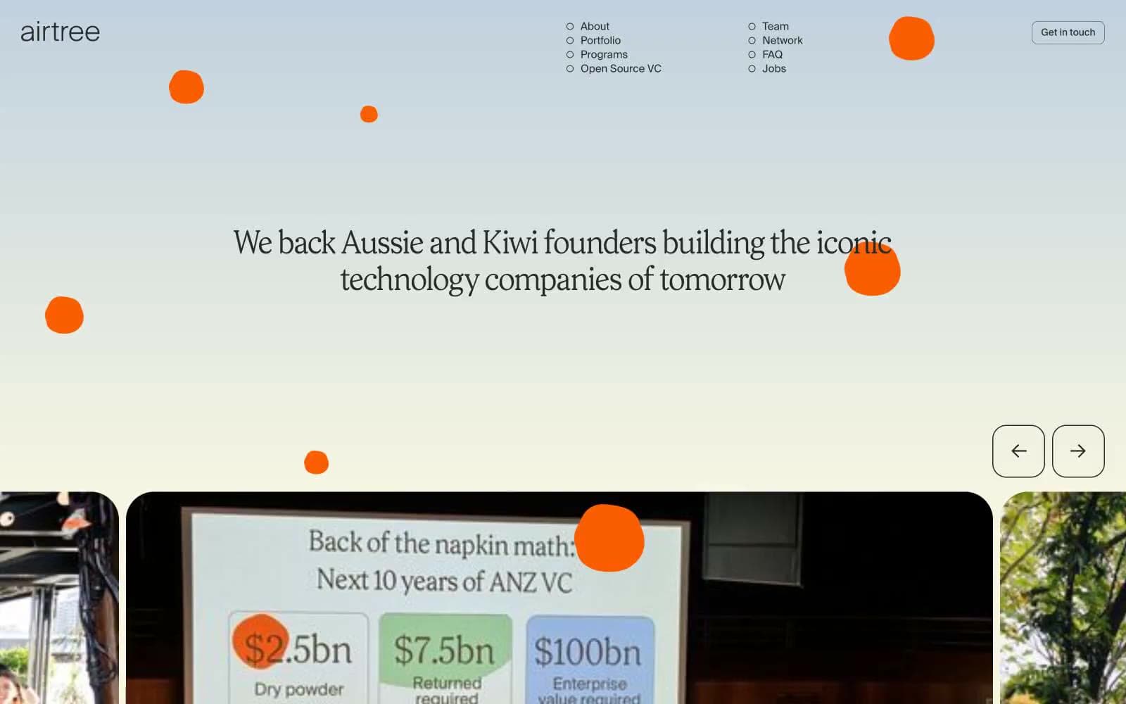
Airtree
Finance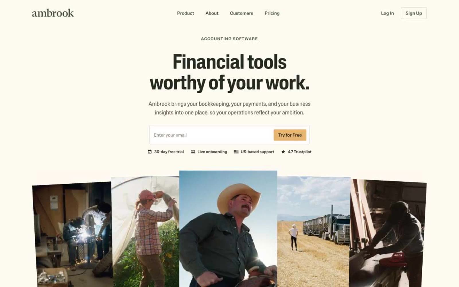
Ambrook
Finance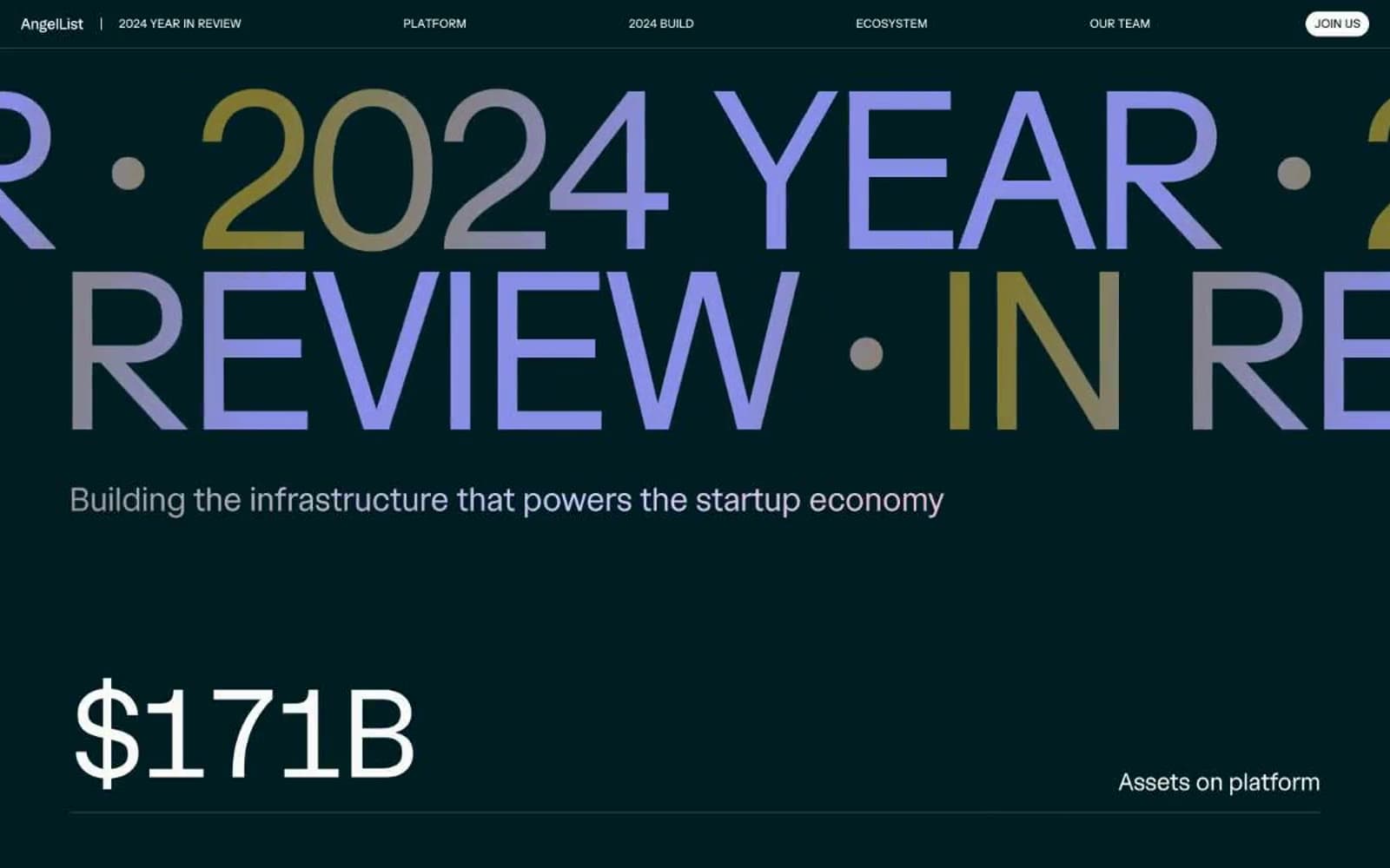
Angellist 2024
Finance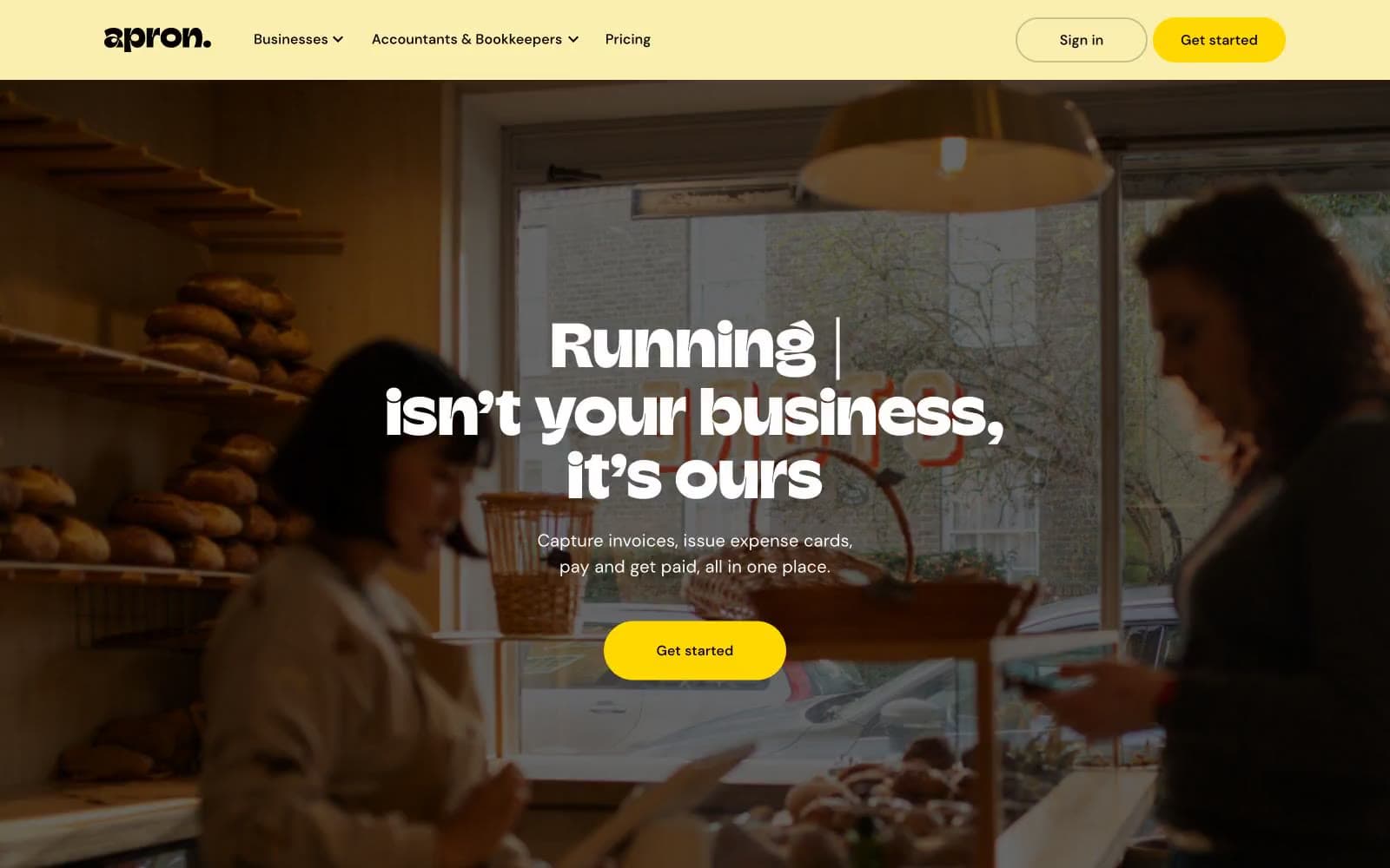
Apron
Finance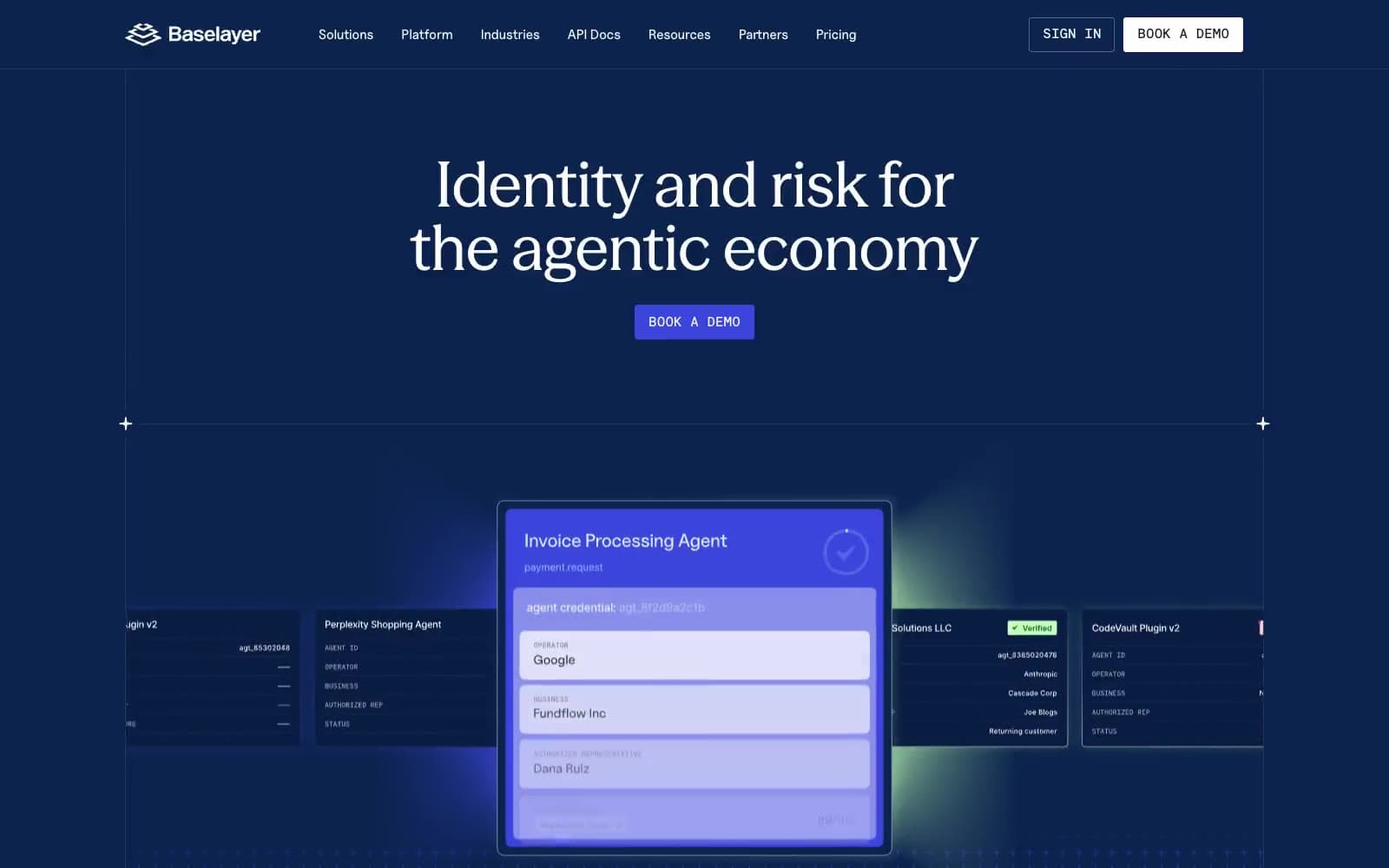
Baselayer
Finance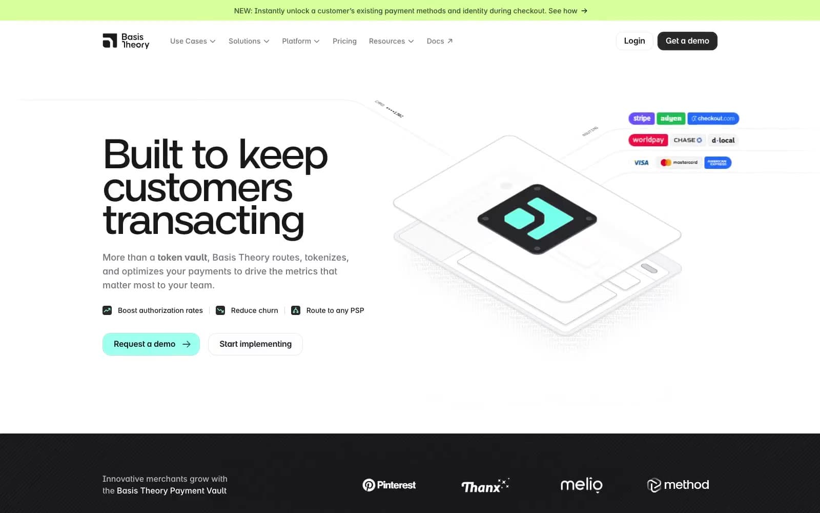
Basis Theory
Finance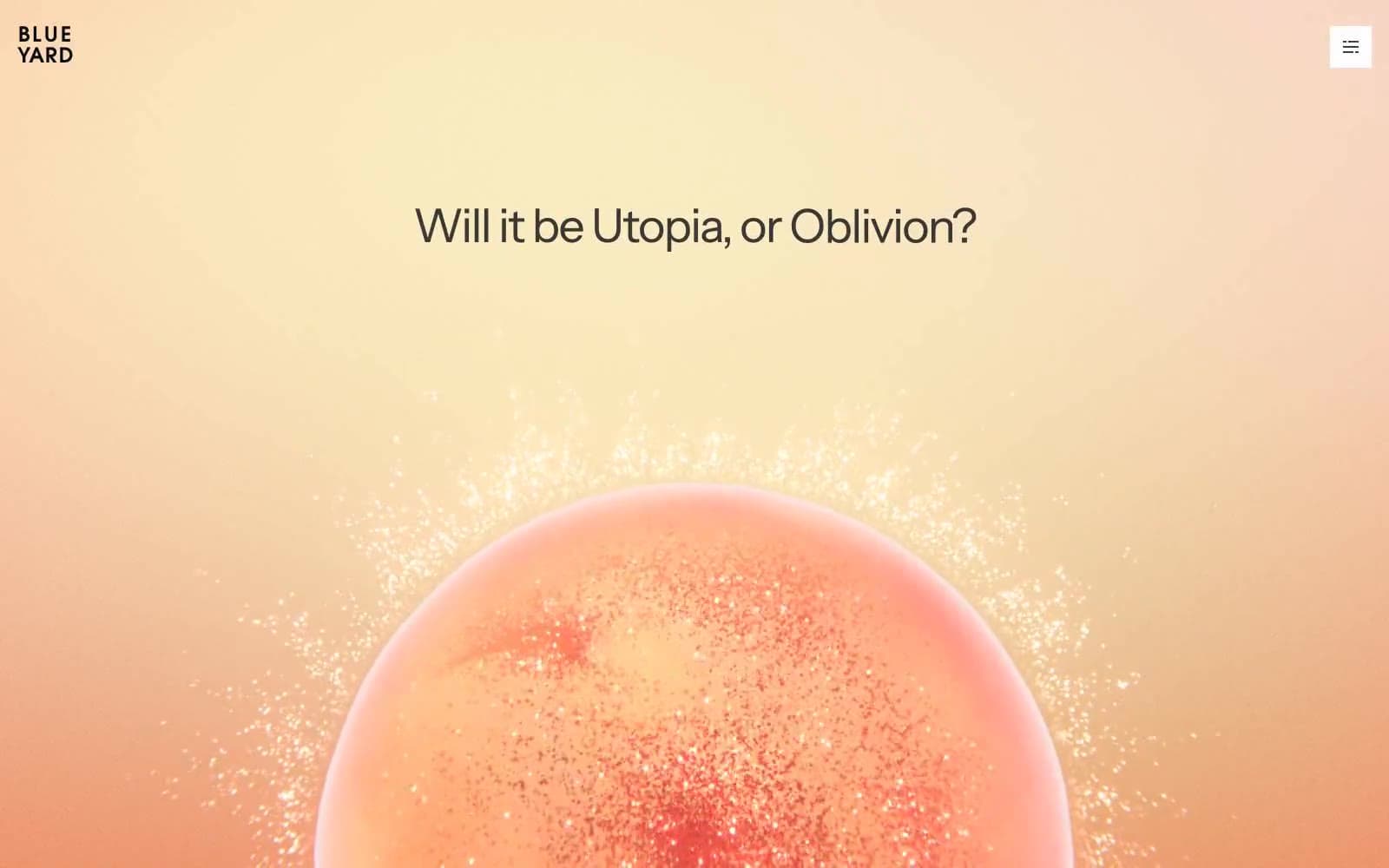
BlueYard Capital
Finance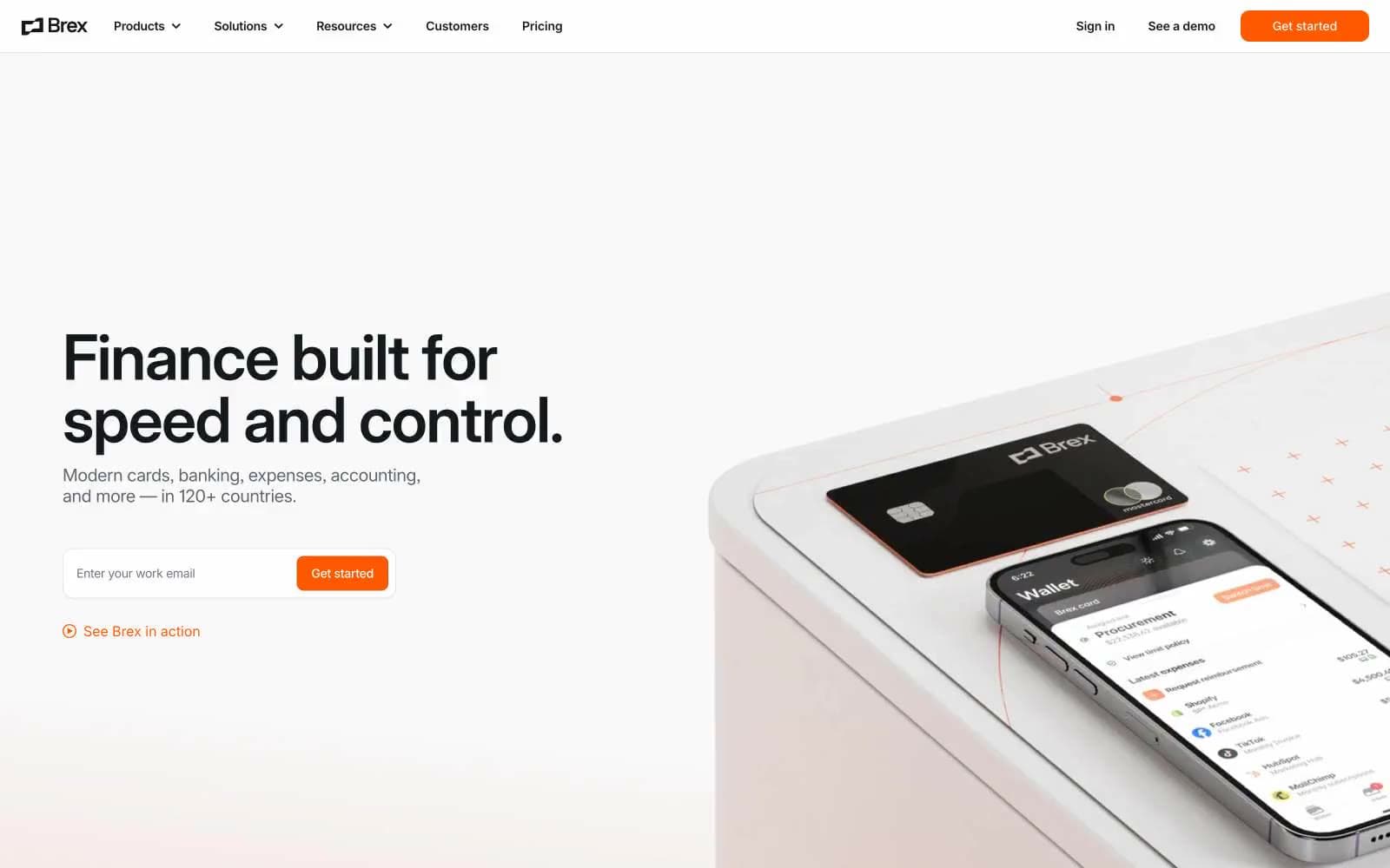
Brex
Finance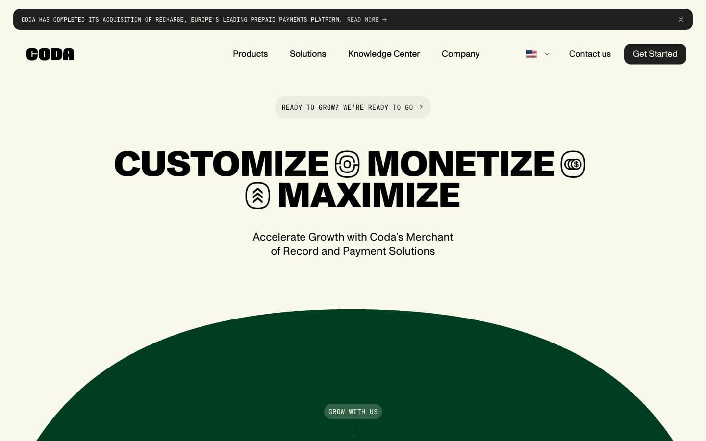
Coda
Finance


