
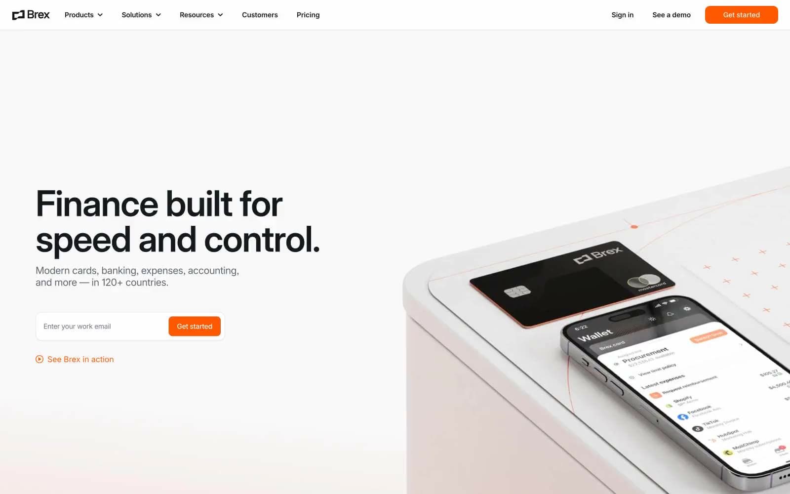
Brex. A clinical financial instrument where one orange spark does all the talking.
- Finance
- Light theme
- 10 colors
- 2 typefaces
Brex is a white concrete financial workbench lit by a single orange ember. The interface lives on a near-pure white canvas with tight, almost compressed Inter type and a custom Flecha display face, and the only chromatic voice in the system is #ff5900 — a vivid ember that marks every primary action, link, and tab indicator without ever becoming decorative. Dark surfaces (#000710 footer, #15191 announcement bar) frame the bright body, creating a hard light/dark bookend that makes the white sections feel taller. Components are flat with a 12px radius, minimal shadows, hairline borders, and generous 48px section gaps — the system is designed to feel like a precision instrument for finance teams, not a marketing site.
Brex design system

Brand1
Orange supporting accent for decorative details and low-frequency emphasis; Orange supporting accent for decorative details and low-frequency emphasis.
Neutrals9
Primary headings, body text, heavy borders — the dominant text color across light surfaces
Footer background, deepest dark surface — a near-black with a barely-perceptible blue cast that distinguishes it from pure black at section transitions
Announcement bar, dark mode headers, elevated dark surfaces — softer than Abyss, used where dark needs to feel like product chrome rather than footer
Secondary body text, subhead descriptions, muted link text — the workhorse gray for any paragraph that isn't a heading
Tertiary body text, caption-level labels, helper text — a step between Steel and Graphite for mid-importance copy
Muted icon strokes, placeholder text, secondary nav text — the mid-gray for chrome that shouldn't compete with content
Hairline borders, dividers, disabled states — the structural gray that keeps cards and inputs defined without visual weight
Secondary surface, input field backgrounds, subtle section dividers — the only off-white that creates layered card stacks on the Paper canvas
Page background, card surfaces, button text on dark fills — the primary canvas
Try a pairing
Pick any two colors from the palette to check whether text stays readable on top.
Aa
Ink on Ember
6.68 : 1 contrast
- Body textPasses AA 4.5
- Large textPasses AA 3
- StrictFails AAA 7
More DESIGN.md files. Same web, different personalities.
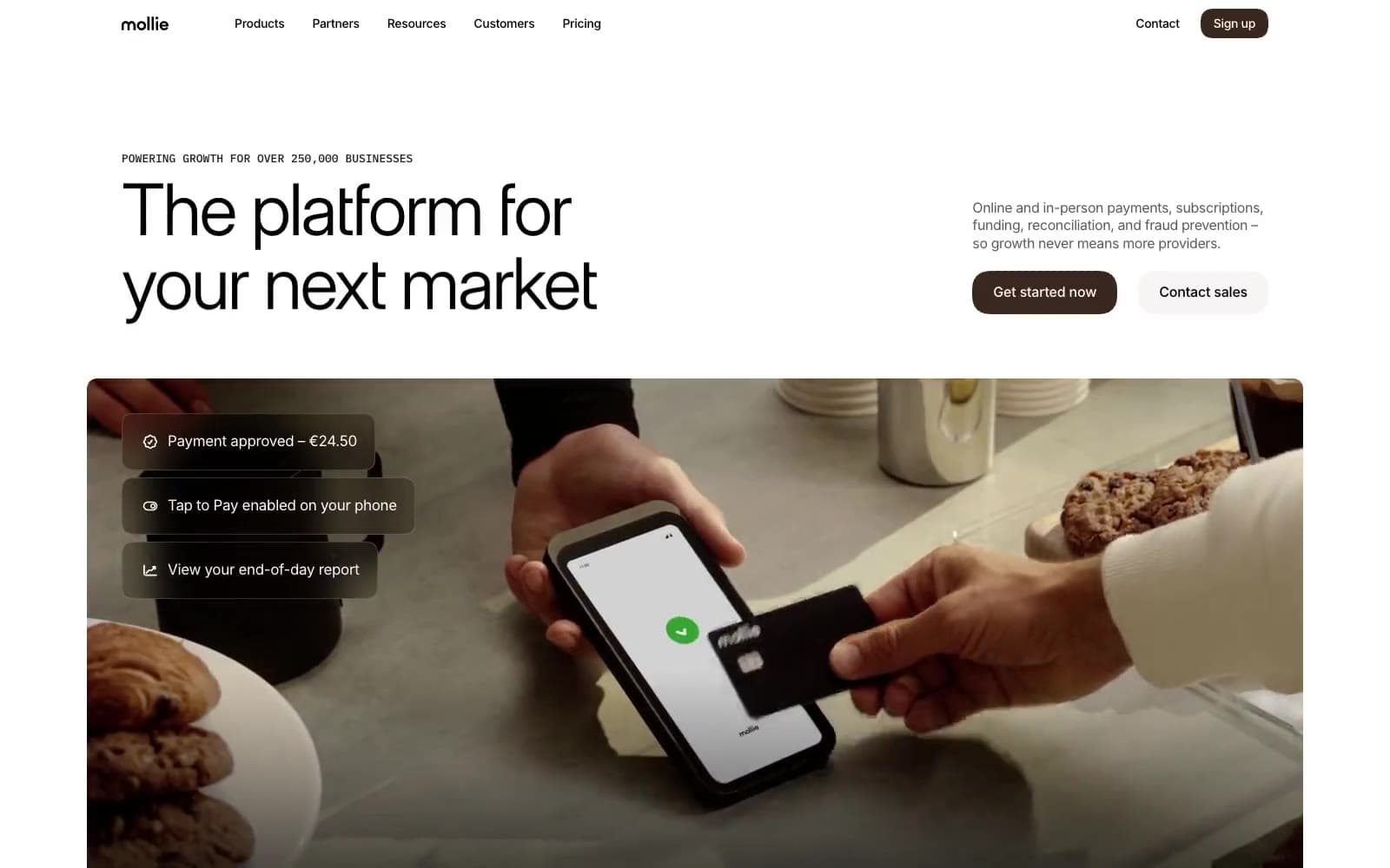
Mollie
Finance
a16z speedrun
Finance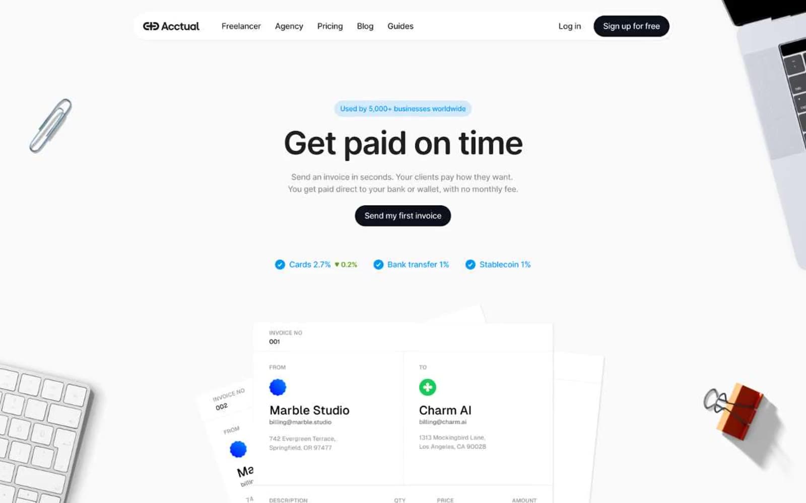
Acctual
Finance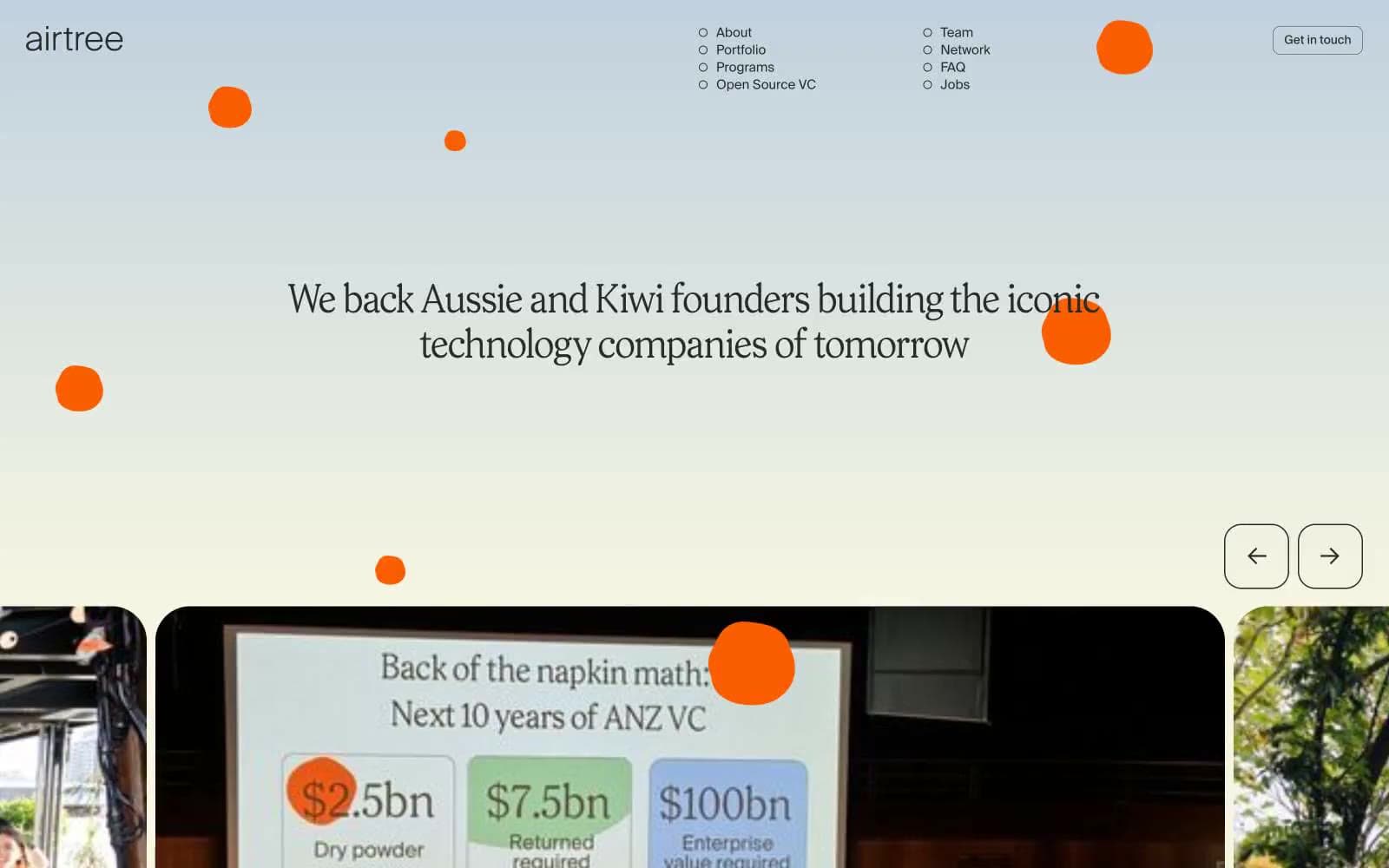
Airtree
Finance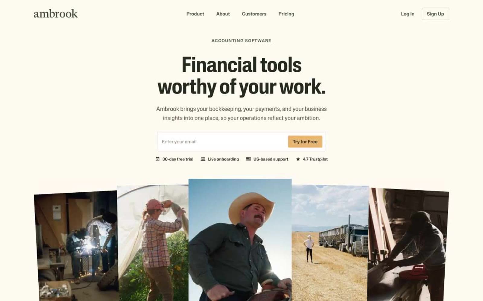
Ambrook
Finance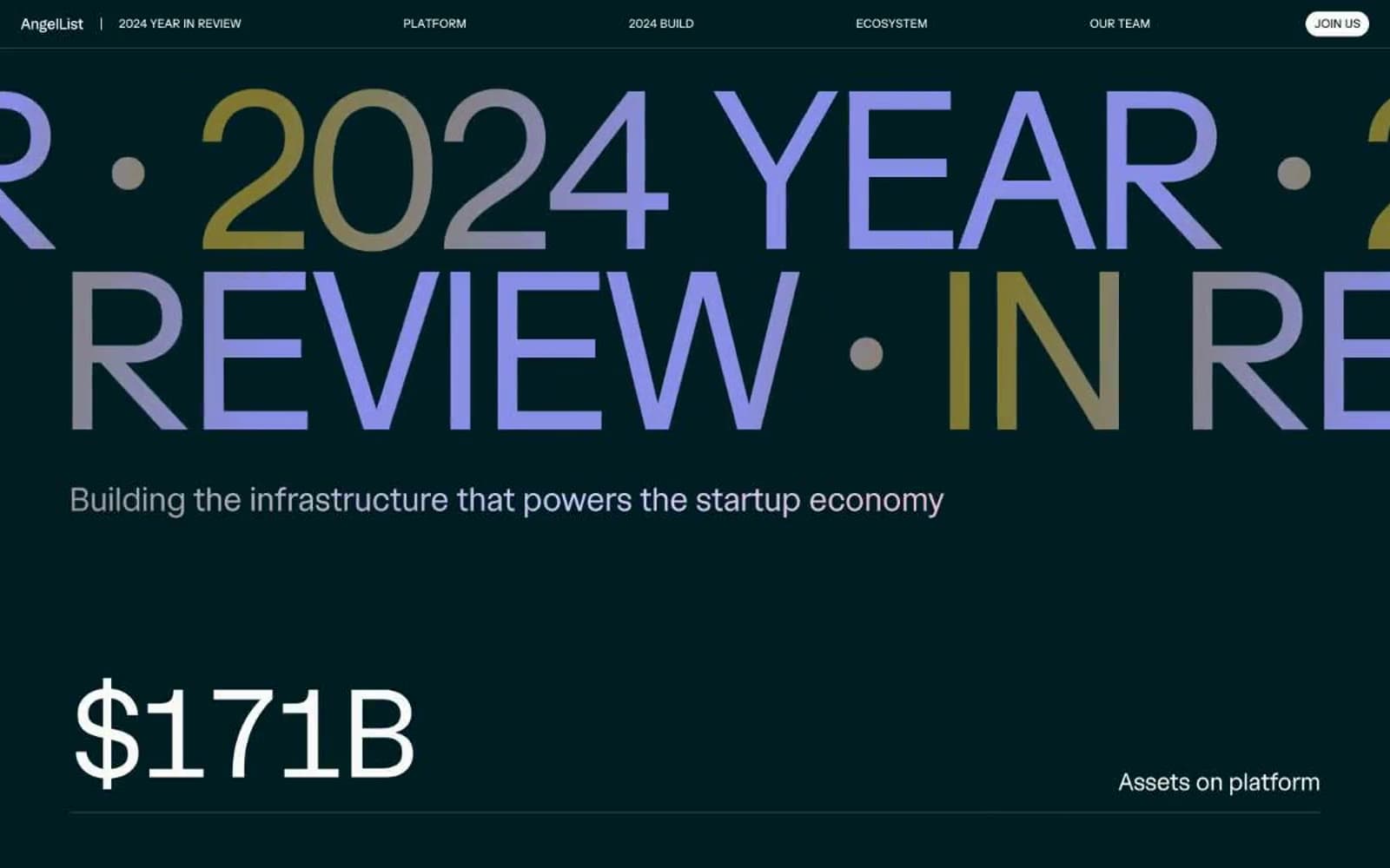
Angellist 2024
Finance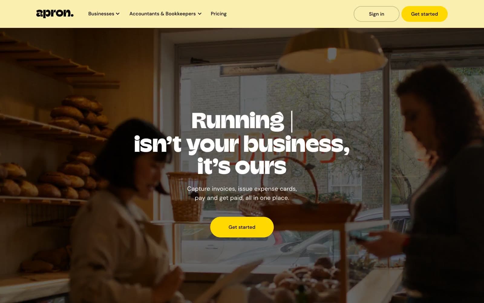
Apron
Finance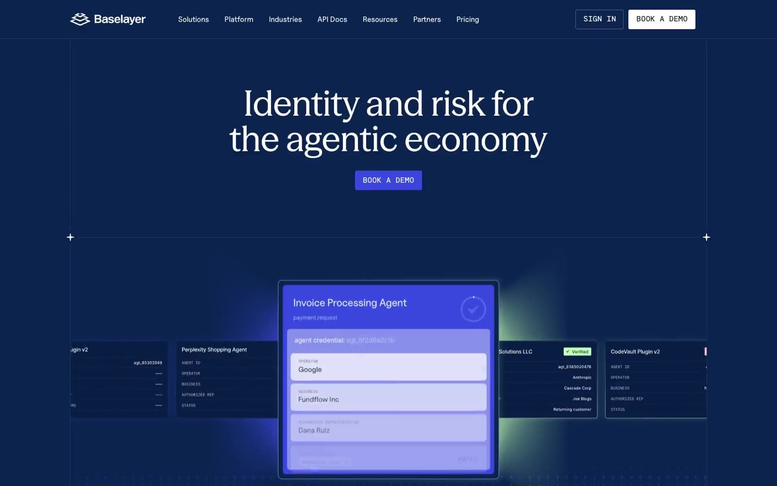
Baselayer
Finance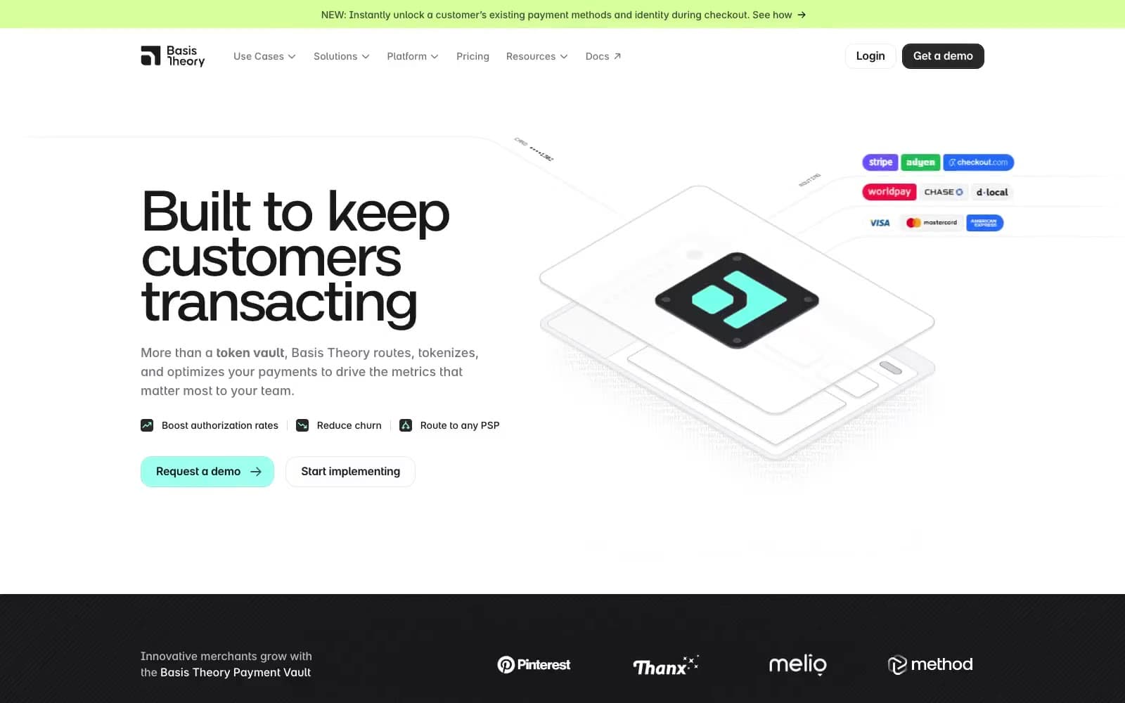
Basis Theory
Finance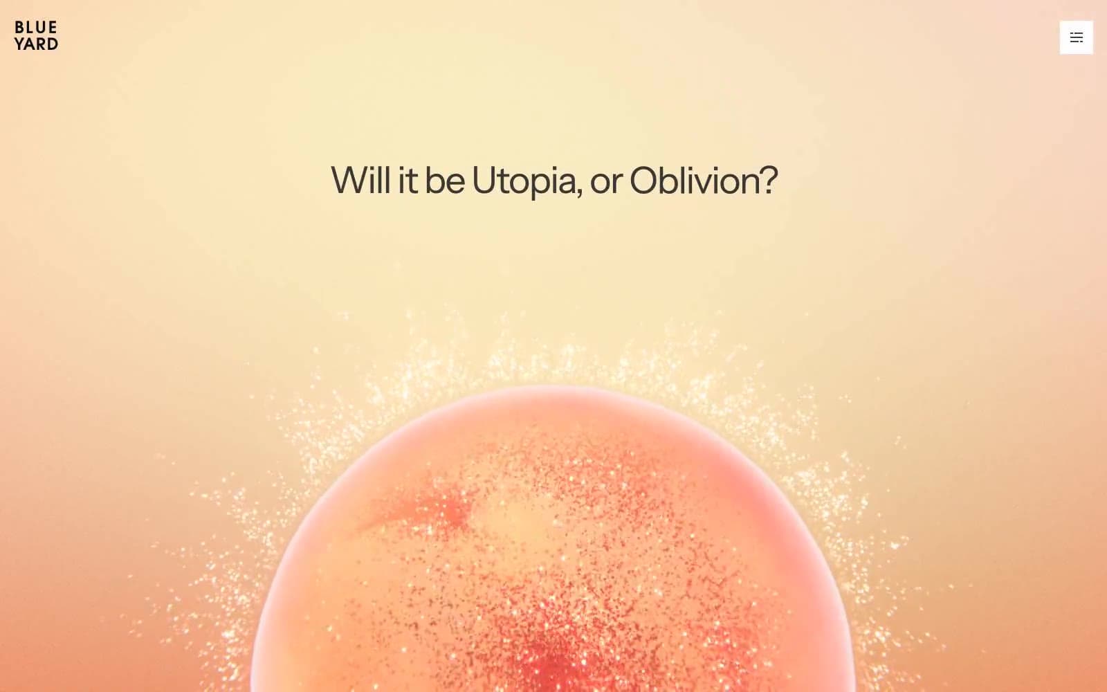
BlueYard Capital
Finance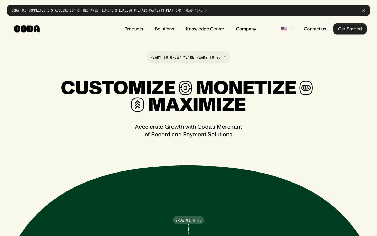
Coda
Finance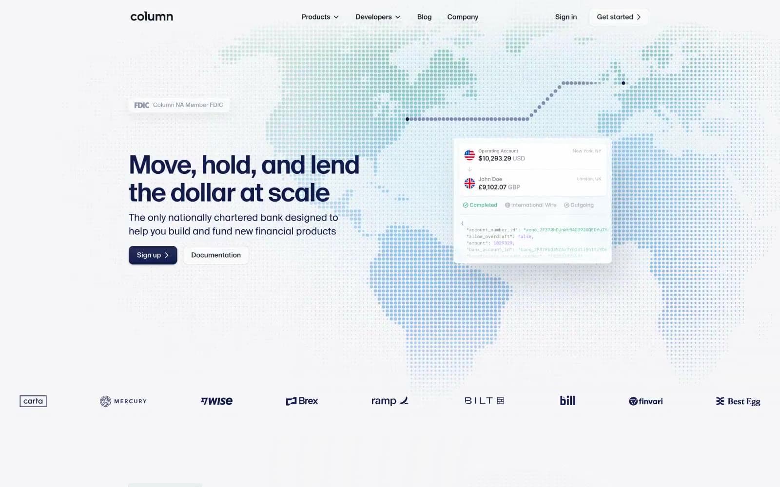
Column
Finance


