
Ambrook. Harvest ledger on butcher paper.
- Finance
- Light theme
- 12 colors
- 3 typefaces
Ambrook speaks in the visual dialect of American heartland: warm parchment canvas, ink-dark type, and a single harvest-amber accent that warms every primary action. The palette is deliberately desaturated — olive greens, wheat tans, bark browns — as if the interface itself were printed on recycled butcher paper and stamped with soy ink. Headlines use a custom display face with quiet authority (weight 500, not the expected 700), and every section opens with a small uppercase eyebrow that breathes across the page on wide tracking. Photography is documentary, not aspirational — welders, ranchers, truckers, unposed and full-sun. The result is an interface that feels rooted, not glossy: trustworthy through warmth rather than through chrome.
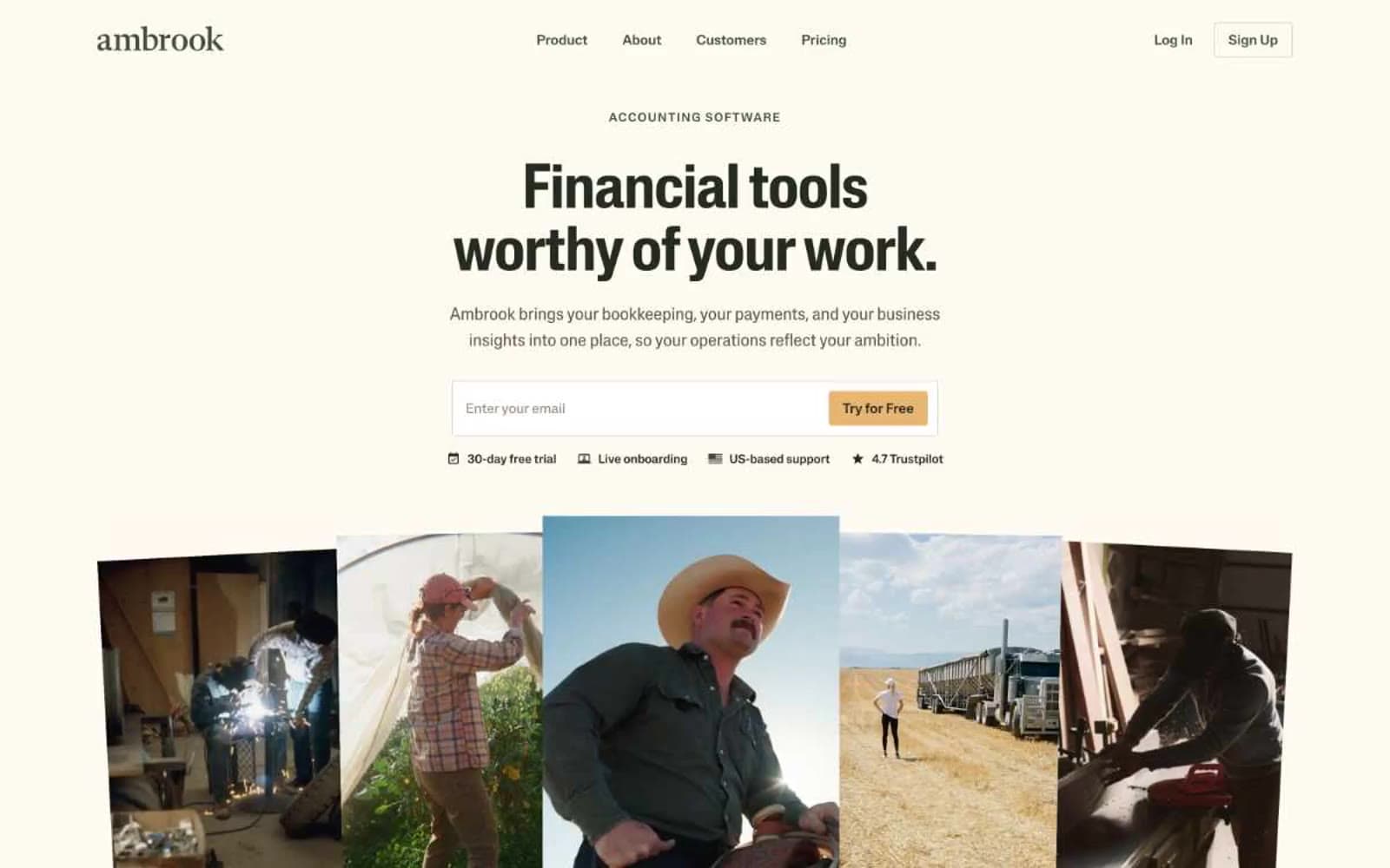
Ambrook design system

Brand2
Navigation borders, icon strokes, and the most-used neutral divider in the system — a moss-toned dark that reads as organic rather than industrial
Primary action button fill — the system's singular chromatic accent for CTAs, earning attention through warmth rather than saturation
Accent2
Green accent for outlined action borders, linked labels, and lightweight interactive emphasis. Do not promote it to the primary CTA color
Lighter amber used for heading borders, icon accents, and subtle decorative strokes where honey would be too heavy
Neutrals8
Primary text, heading strokes, and the dominant border color across the system. Warm near-black with a hint of umber keeps the interface from feeling clinical
Dark mode–style panels, product UI containers, and high-emphasis icon fills — used when a section needs to invert the warm page into something product-focused
Secondary body text and subdued icon fills — a warm brown-gray that recedes without disappearing
Muted helper text, metadata, and supporting labels where a softer voice is needed than primary body copy
Subtle dividers, card edges, and low-emphasis borders between the canvas and content blocks
Secondary surface for footer, soft sections, and hairline borders that need separation from the parchment canvas without harsh contrast
Page canvas and card surfaces — warm off-white replaces pure #ffffff to keep the system grounded in an agricultural, paper-like register
Elevated card and product-mockup surface — used sparingly to lift specific panels (like the Ledger screenshot) above the parchment base
Try a pairing
Pick any two colors from the palette to check whether text stays readable on top.
Aa
Pure White on Deep Olive
8.64 : 1 contrast
- Body textPasses AA 4.5
- Large textPasses AA 3
- StrictPasses AAA 7
More DESIGN.md files. Same web, different personalities.
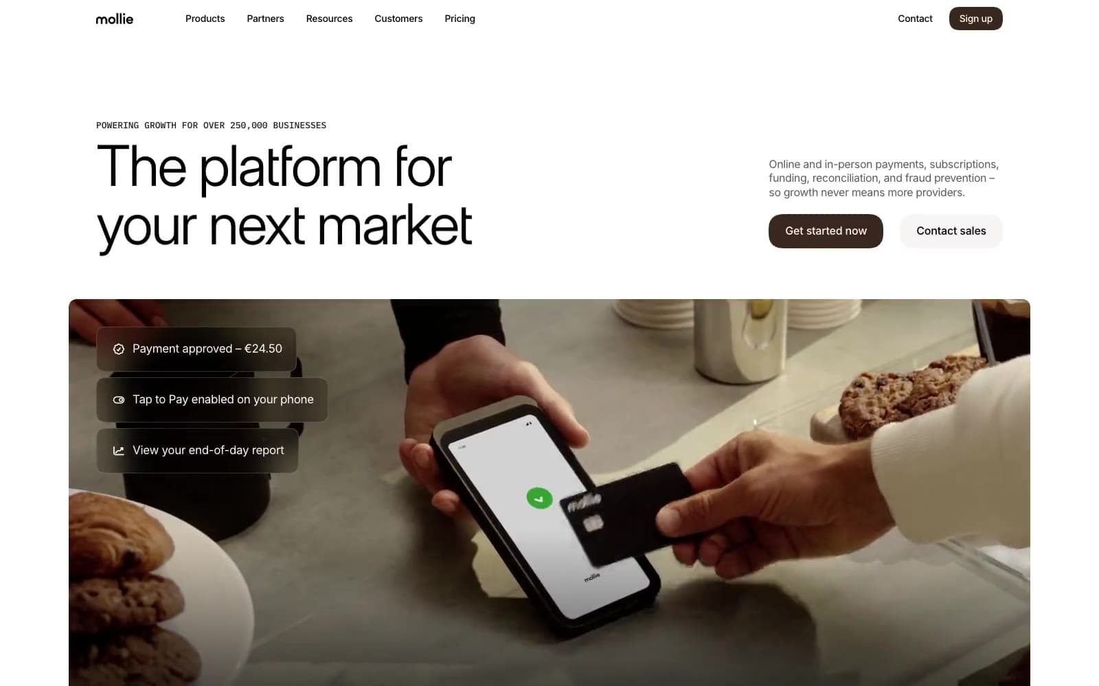
Mollie
Finance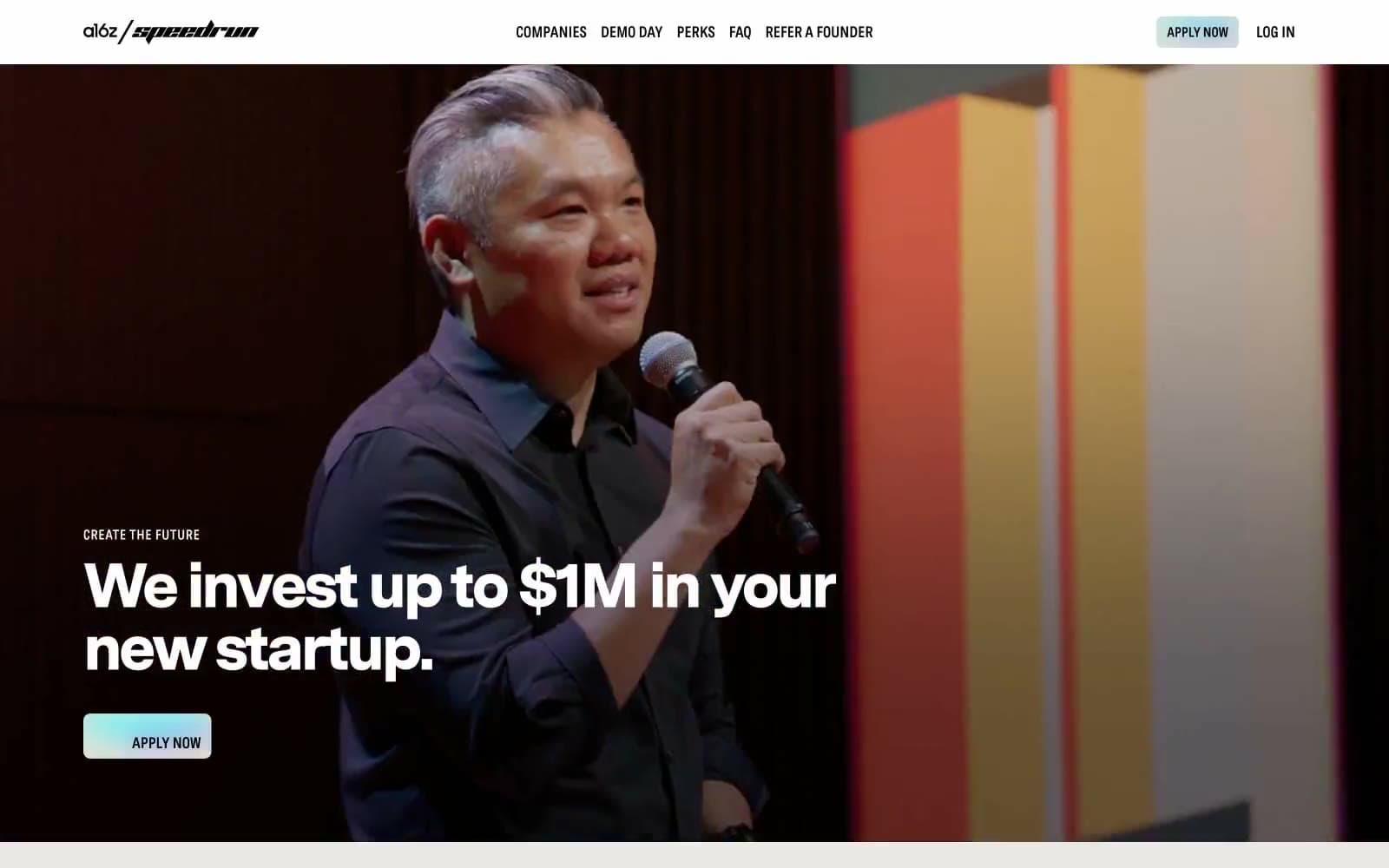
a16z speedrun
Finance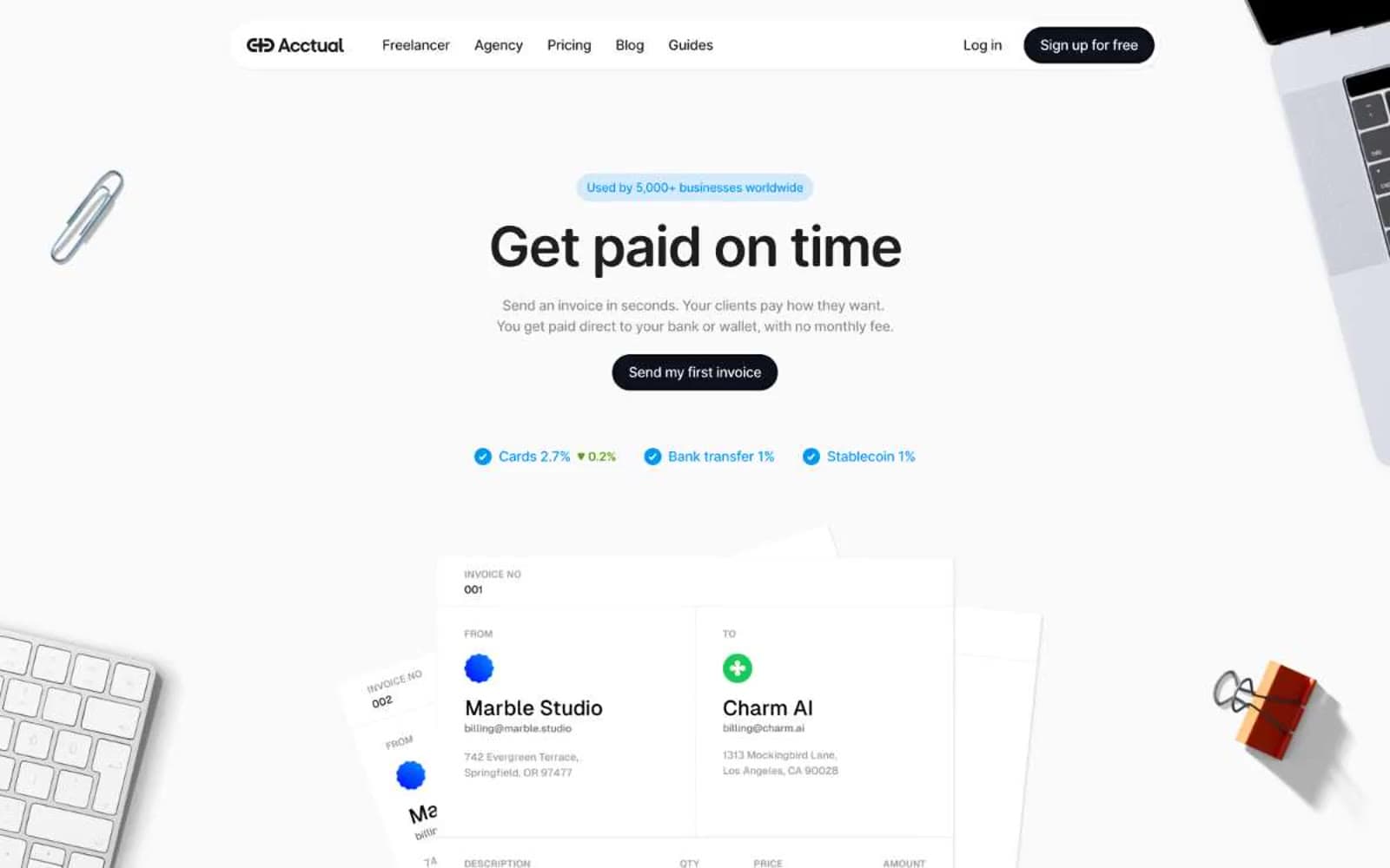
Acctual
Finance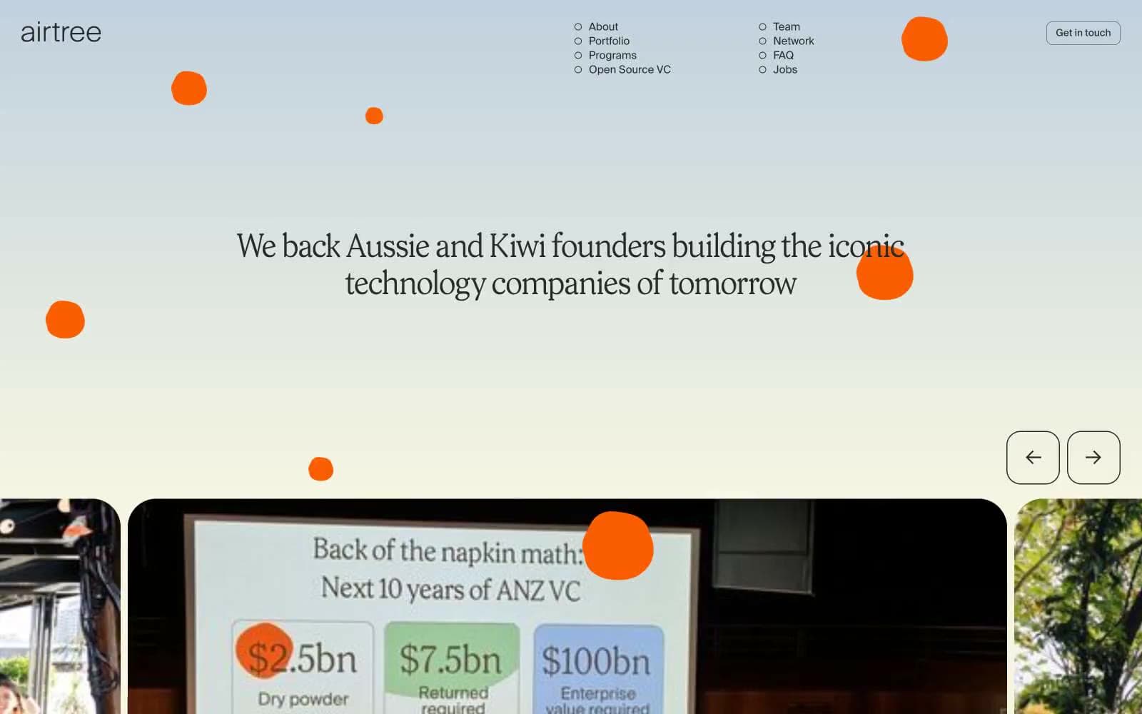
Airtree
Finance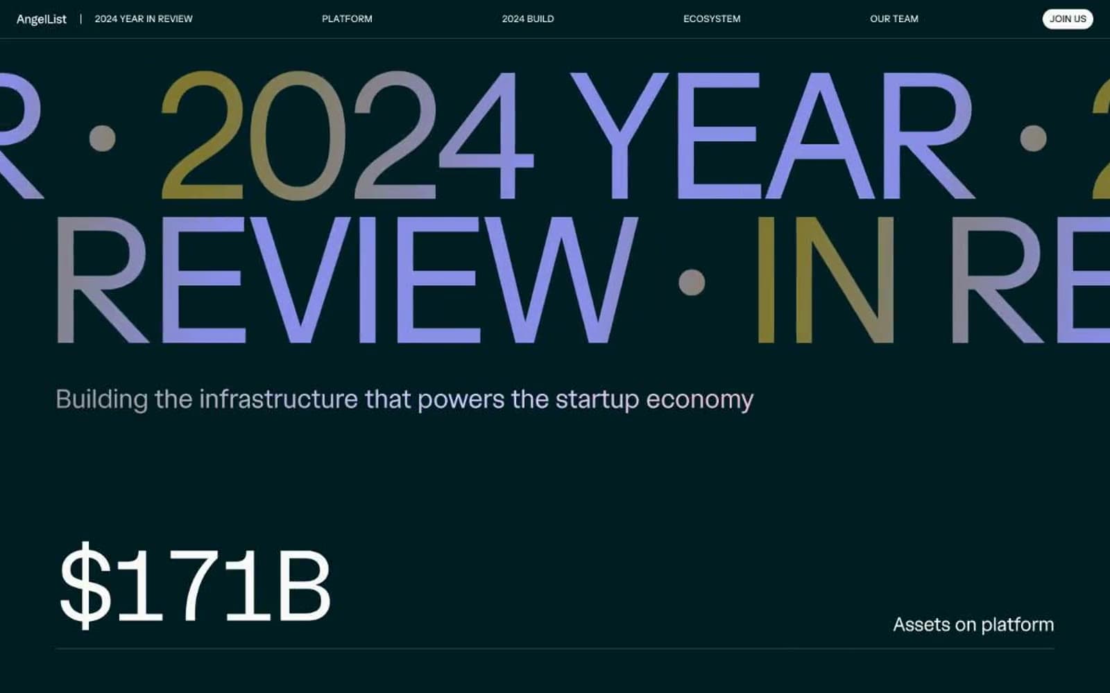
Angellist 2024
Finance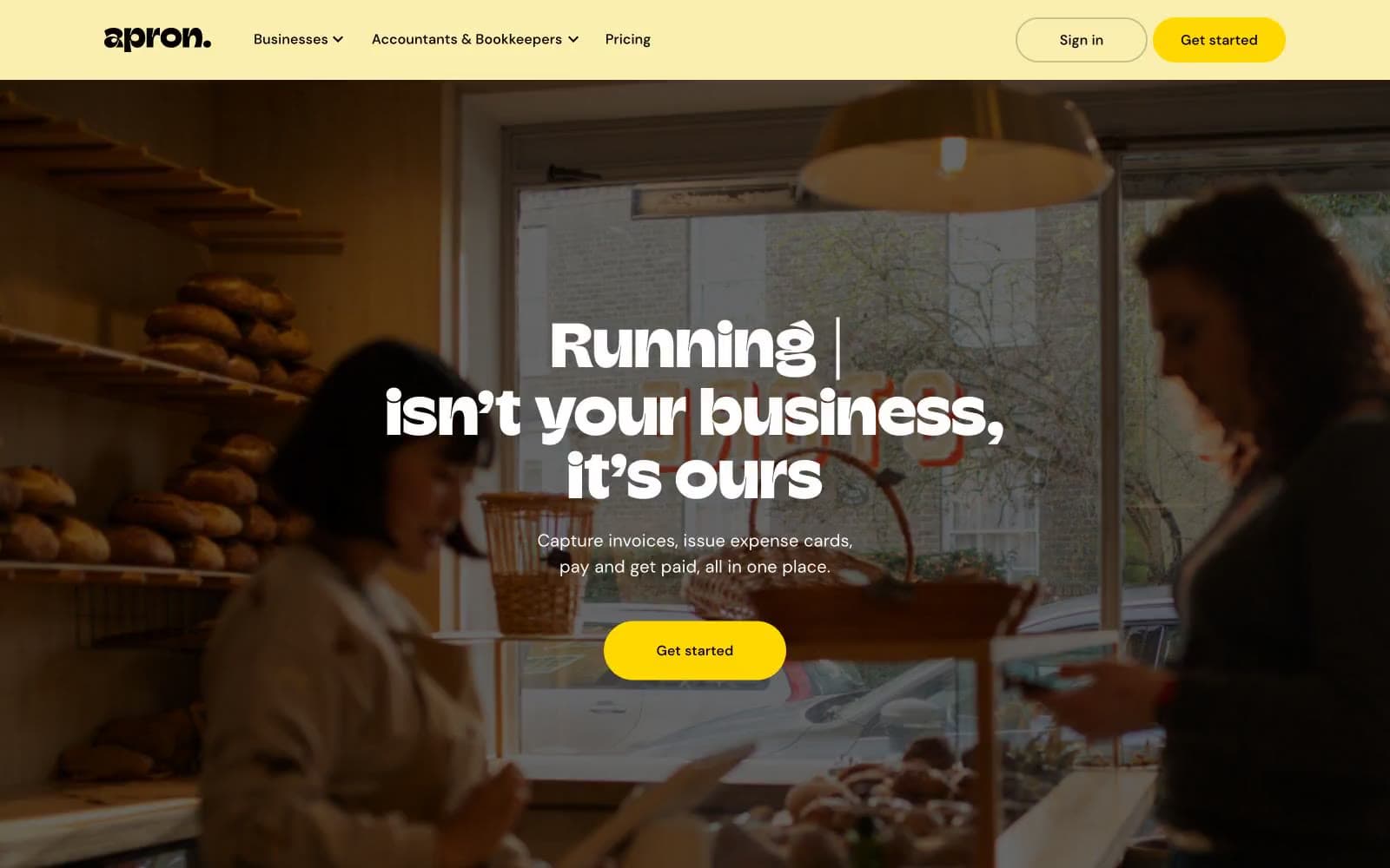
Apron
Finance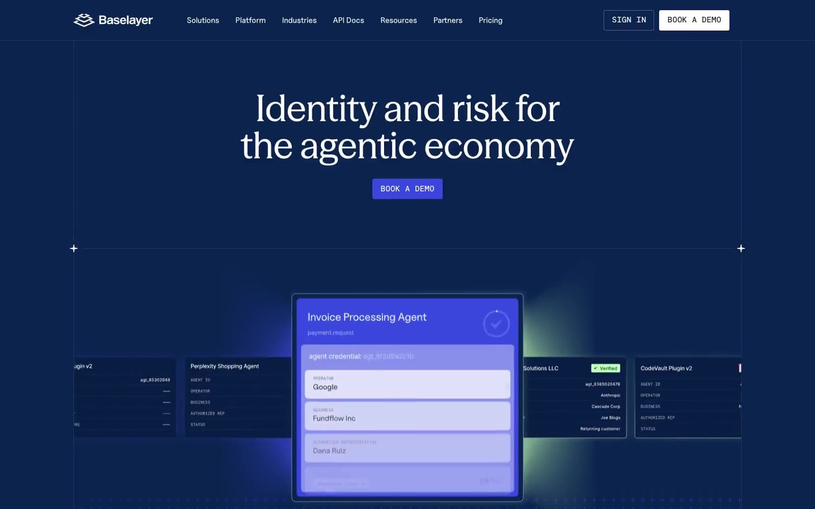
Baselayer
Finance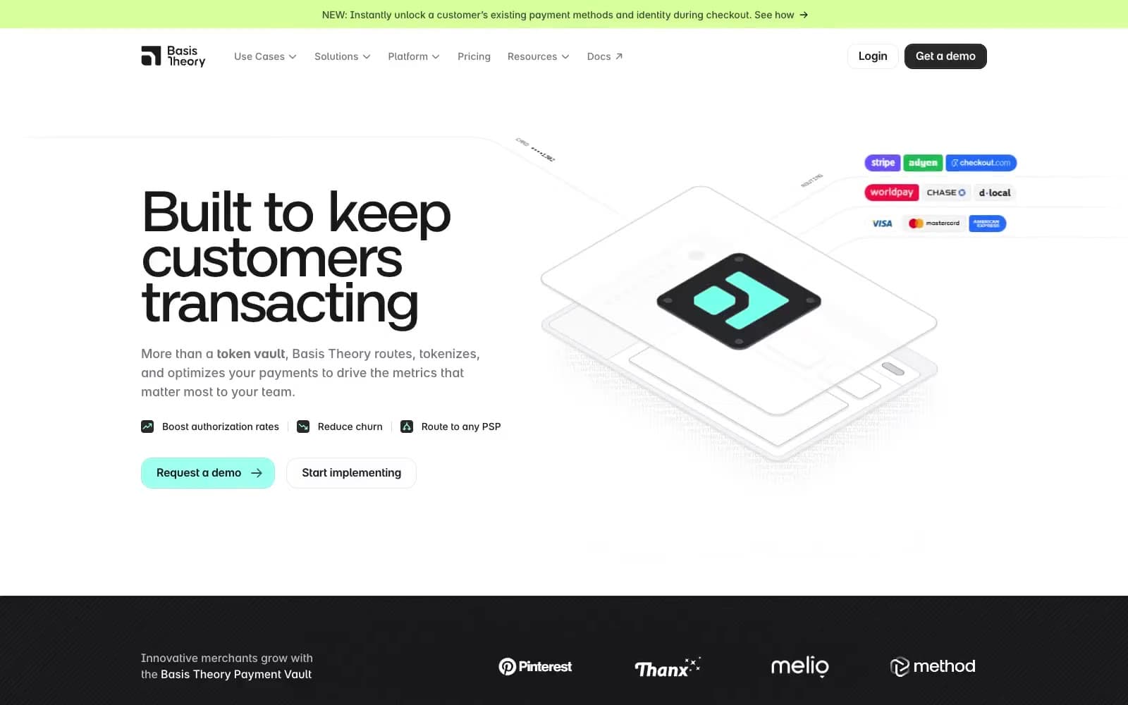
Basis Theory
Finance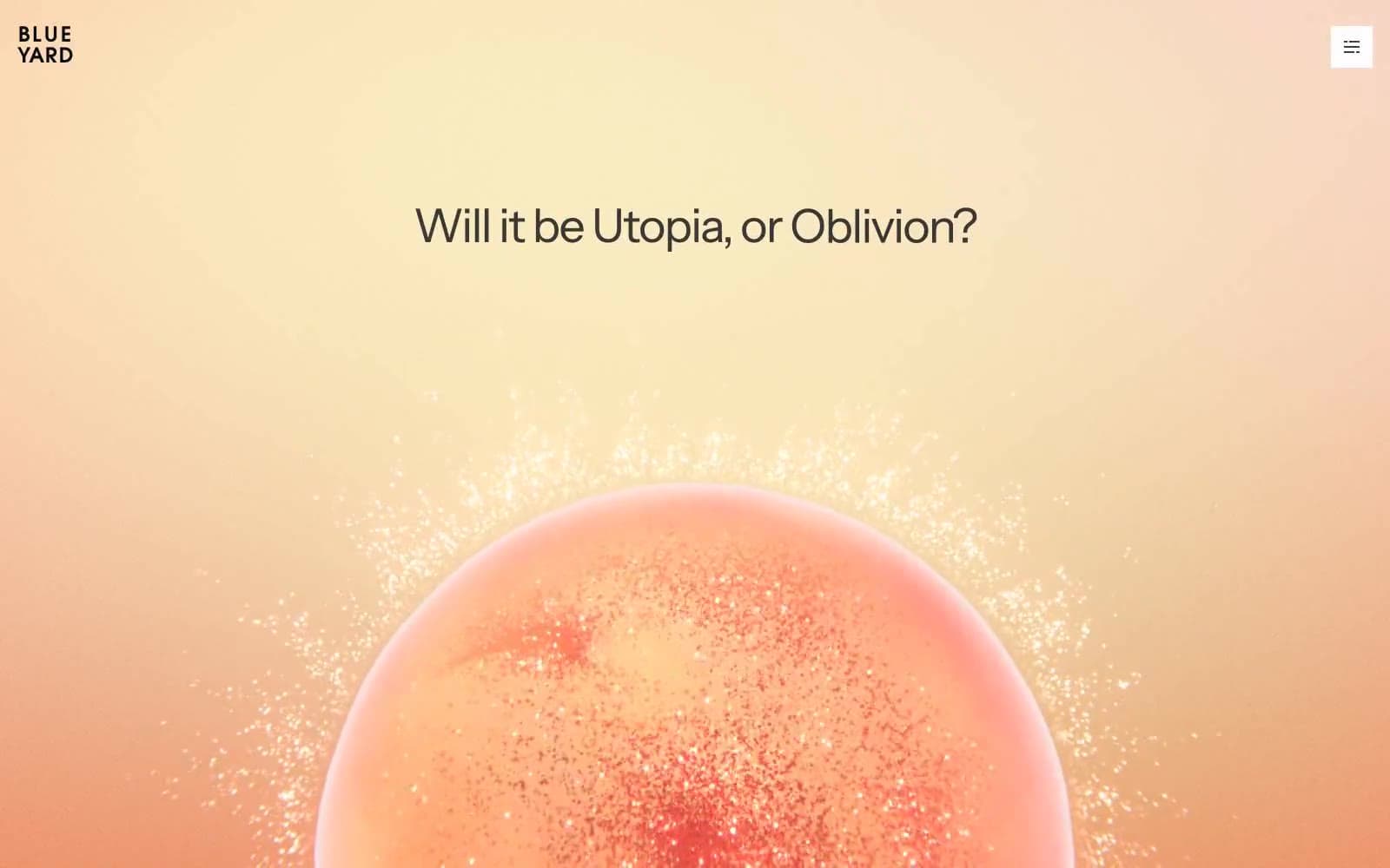
BlueYard Capital
Finance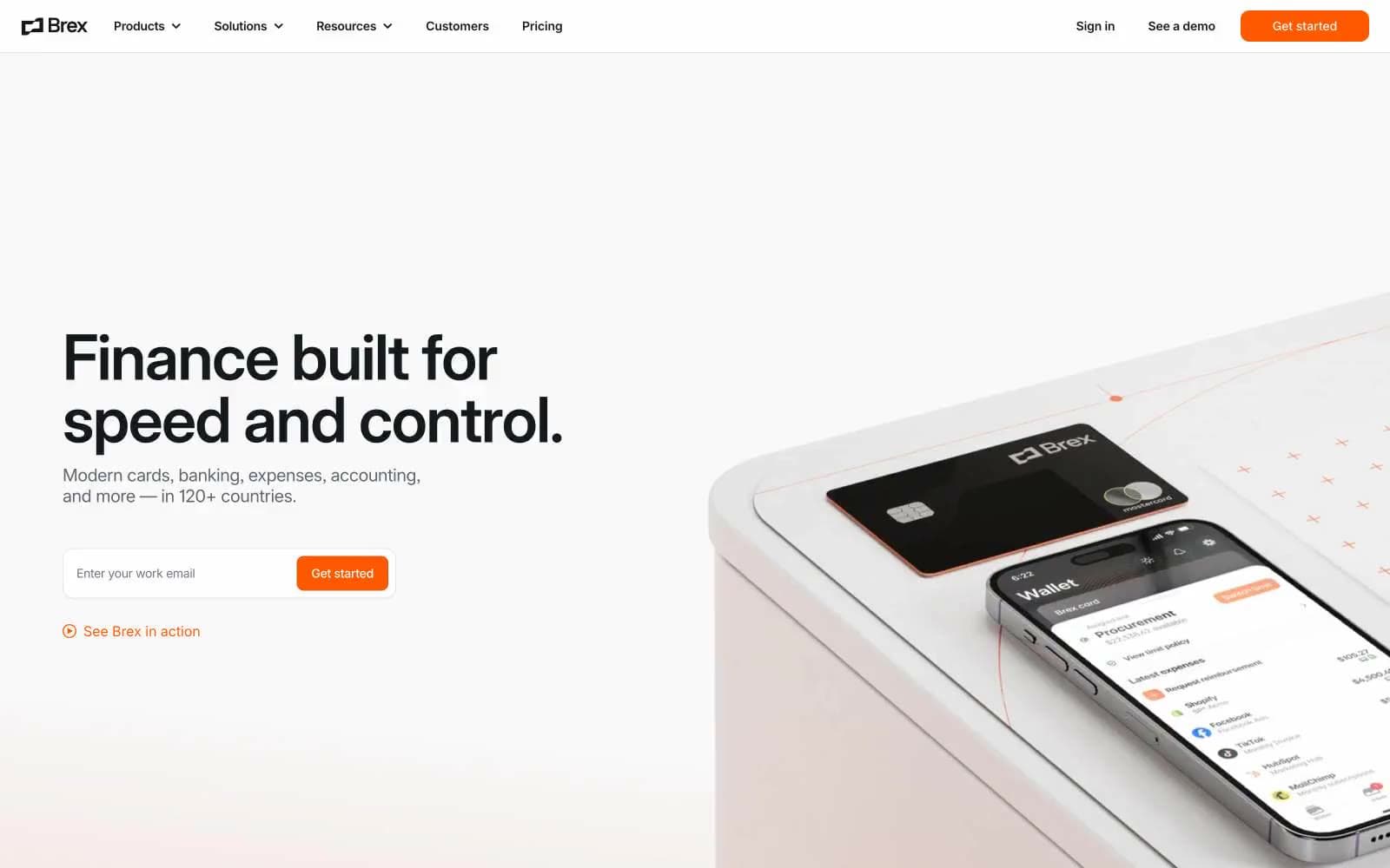
Brex
Finance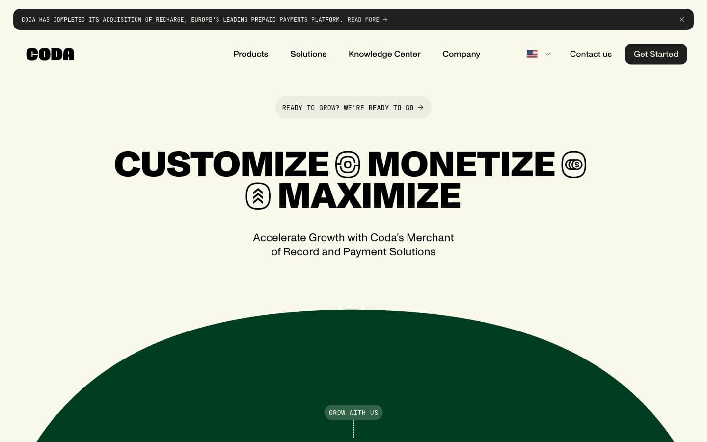
Coda
Finance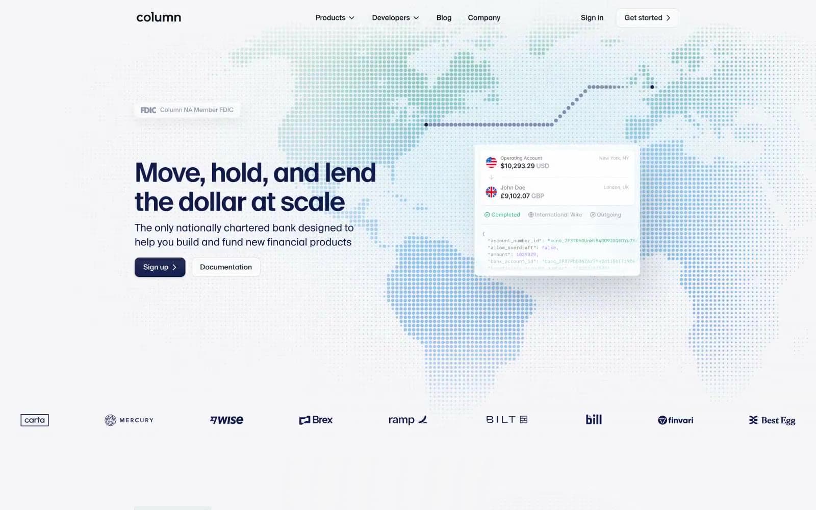
Column
Finance


