
BlueYard Capital. Sunset editorial observatory.
- Finance
- Light theme
- 8 colors
- 1 typeface
BlueYard Capital reads as a printed editorial object disguised as a venture capital homepage: a vast white canvas anchored by one warm peach atmospheric wash, a single oversized Instrument Sans headline, and a rendered spherical artwork that behaves like a magazine cover image. The palette is 98% achromatic — a warm near-black (#3a3a3e) does all the textual heavy lifting against pure white — with three pale chromatic tints (peach, lavender, pink) appearing only as card backgrounds and hairlines, never as functional buttons. Cards are flat, borderless or hairline-bordered, and float on whitespace rather than sitting in shadow wells. Navigation is barely there: a tiny two-line wordmark and a hamburger square. The whole site earns attention through restraint and scale, not chrome.

BlueYard Capital design system

Accent4
Card backgrounds and borders — the dominant chromatic accent, used as a warm fill or hairline outline on featured cards
Card backgrounds and borders — cool lavender counterpoint to Apricot Wash, pairs with peach on portfolio or feature cards
Card backgrounds — a vivid pink fill, the most saturated color in the system, appears as a solid block rather than a border
Soft surface tint — pale sky blue used as a rare secondary card or section background, cooling the warm peach/lavender/pink palette
Neutrals4
Accent text, nav strokes, strong card borders — slightly cooler and harder than Graphite Ink, reserved for moments of maximum contrast
Primary text, link color, icon strokes, hairline borders, ghost button borders — a warm near-black that carries 97% of all typographic weight
Muted body backgrounds, soft borders — a warm gray used for secondary surface bands beneath the main canvas
Page background, card surfaces, ghost button fill — the primary stage everything else sits on
Try a pairing
Pick any two colors from the palette to check whether text stays readable on top.
Aa
Deep Carbon on Apricot Wash
13.74 : 1 contrast
- Body textPasses AA 4.5
- Large textPasses AA 3
- StrictPasses AAA 7
More DESIGN.md files. Same web, different personalities.

Mollie
Finance
a16z speedrun
Finance
Acctual
Finance
Airtree
Finance
Ambrook
Finance
Angellist 2024
Finance
Apron
Finance
Baselayer
Finance
Basis Theory
Finance
Brex
Finance
Coda
Finance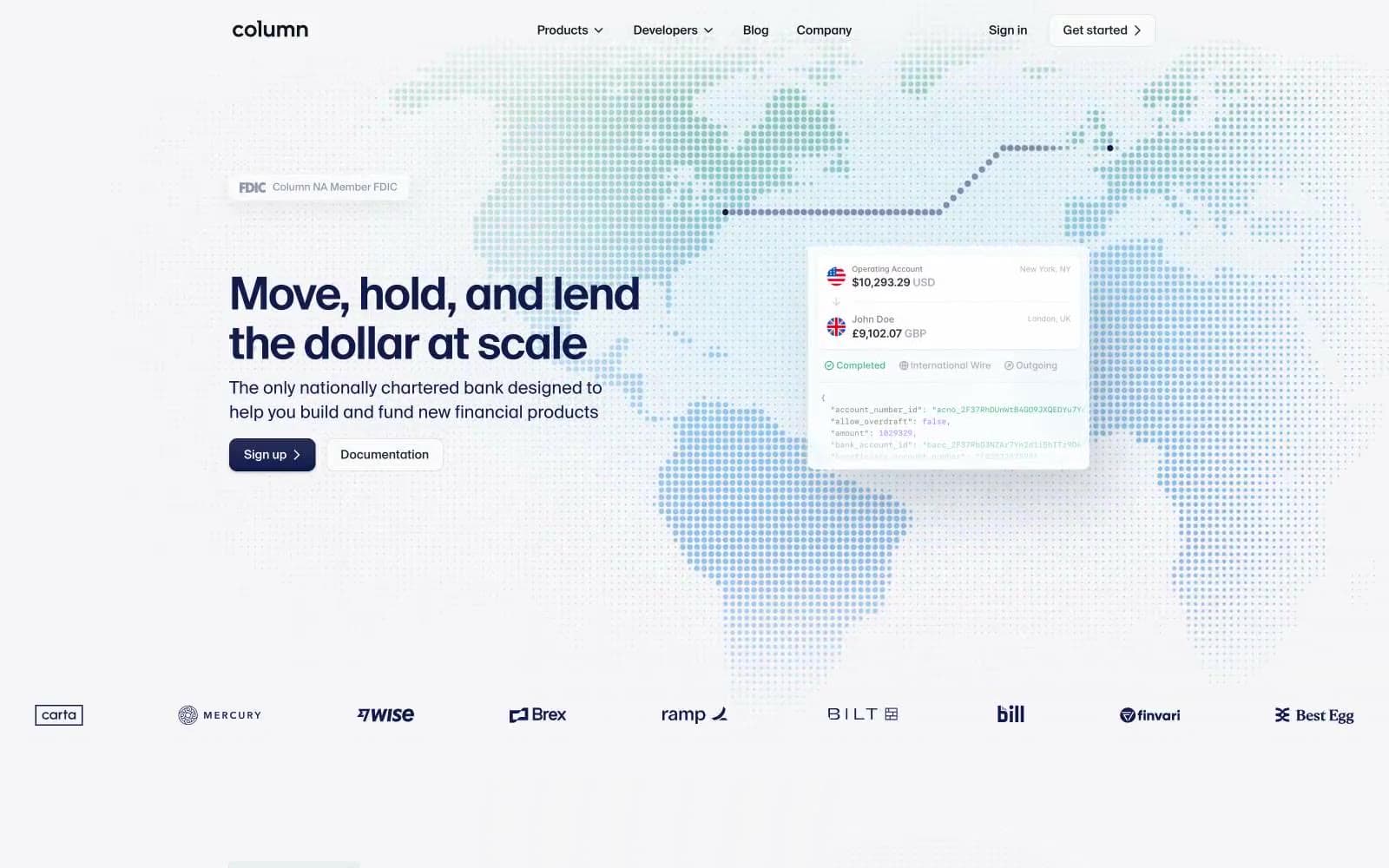
Column
Finance


