
Airtree. The design rests on a cream page where ink-black type and a single electric yellow accent do all the talking.
- Finance
- Light theme
- 3 colors
- 3 typefaces
Airtree's design language reads as a sunlit editorial spread on warm parchment: a cream canvas (#f7f6e3) carries confident charcoal type, with a single electric yellow accent that punctuates rather than decorates. Prody's oversized display serif at 131px is the brand's loudest voice — everything else is deliberate whitespace and a clean grotesque. Components stay light and paper-like: 37px-rounded cards, outlined ghost controls, pill-shaped yellow CTAs, and hairline borders that define structure without weight. The system avoids heavy elevation, gradients, or saturated color fields; it relies on generous spacing, large radii, and a calm two-tone palette to let photography and quoted founders carry the emotional weight. Color is rationed: a cream page, ink-black type, and one jolt of yellow — no decorative gradients, no multi-hue branding.

Airtree design system

Brand1
Filled CTA buttons, active states, standout badges — a single saturated yellow that breaks the cream/ink calm to signal action; the ratio against #262d29 is 13.2:1 AAA
Neutrals2
Primary text, navigation, body copy, card borders, icon strokes — the only structural color, used for hairline definition and all readable content
Page canvas, card surfaces, bordered containers — near-gray cream that warms the entire interface and gives the whole site its paper-like calm; Outlined/ghost action borders, pill outlines, and interactive rings that echo the canvas tone — only visible against darker overlays
Try a pairing
Pick any two colors from the palette to check whether text stays readable on top.
Aa
Ink Black on Electric Lemon
13.19 : 1 contrast
- Body textPasses AA 4.5
- Large textPasses AA 3
- StrictPasses AAA 7
More DESIGN.md files. Same web, different personalities.

Mollie
Finance
a16z speedrun
Finance
Acctual
Finance
Ambrook
Finance
Angellist 2024
Finance
Apron
Finance
Baselayer
Finance
Basis Theory
Finance
BlueYard Capital
Finance
Brex
Finance
Coda
Finance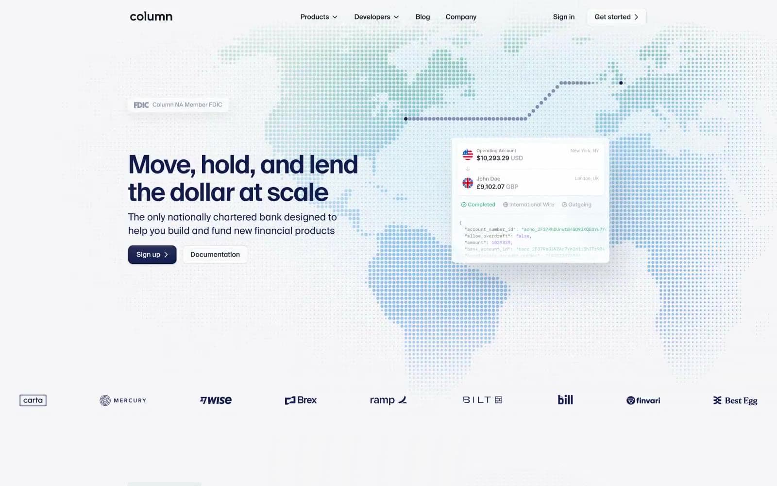
Column
Finance


