
Acctual. Paper invoice on frosted glass.
- Finance
- Light theme
- 18 colors
- 4 typefaces
Acctual runs a white-canvas invoicing product on a near-monochrome foundation: paper-white surfaces, dense near-black text, and a single electric blue (#0098f2) used as functional punctuation for checkmarks, rates, and inline highlights. The brand voice is geometric and confident — pill-shaped controls, generous 16px card radii, and rounded invoice mockups floating against pure white. Color is deployed sparingly: most screens stay achromatic so the blue, violet, and pink decorative chips read as deliberate accents rather than noise. Typography is built on Open Runde at weight 600, with tight -0.03em tracking on display sizes that gives headlines a compressed, almost monolinear feel, paired with handwritten Caveat signatures for testimonial contrast.

Acctual design system

Brand1
Brand accent — checkmark icons, payment rate callouts, inline highlights, the single most prominent chromatic color across the page
Accent7
Decorative accent and illustration fill — violet chip on invoice cards, secondary brand signal
Decorative accent and illustration fill — pink chip on invoice cards, tertiary brand signal
Green text accent for links, tags, and emphasized short phrases. Use as a supporting accent, not as a status color
Red decorative accent for icons, marks, and small graphic details. Use as a supporting accent, not as a status color
Tinted surface wash — light blue card backgrounds for highlight sections, soft accent backgrounds
Tinted surface wash — light violet card backgrounds for feature blocks
Tinted surface wash — light pink card backgrounds, decorative highlight blocks
Neutrals10
Body text and secondary headings — deeper than Ink, used where maximum contrast against white surfaces is needed
Primary action buttons (filled) — dark navy-black instead of pure black, giving CTAs a subtle blue undertone that harmonizes with the electric blue accent
Headings and primary body text — near-black with a slight cool cast reads as authoritative without the harshness of pure #000
Secondary body text, helper copy, muted descriptions under headlines
Tertiary text, nav links, subdued metadata — the lightest readable neutral before borders take over
Disabled state text, placeholder text, low-priority labels
Muted surface fills, inactive chip backgrounds — sits between border and surface in the neutral stack
Hairline borders, input outlines, divider lines — cool blue-gray instead of pure gray so dividers feel on-brand
Subtle section backgrounds, alternating bands — barely warmer than Paper, creates gentle visual rhythm without darkening the page
Page canvas, card surfaces, hero background — the dominant surface, occupying the majority of every viewport
Try a pairing
Pick any two colors from the palette to check whether text stays readable on top.
Aa
Carbon on Electric Blue
6.18 : 1 contrast
- Body textPasses AA 4.5
- Large textPasses AA 3
- StrictFails AAA 7
More DESIGN.md files. Same web, different personalities.

Mollie
Finance
a16z speedrun
Finance
Airtree
Finance
Ambrook
Finance
Angellist 2024
Finance
Apron
Finance
Baselayer
Finance
Basis Theory
Finance
BlueYard Capital
Finance
Brex
Finance
Coda
Finance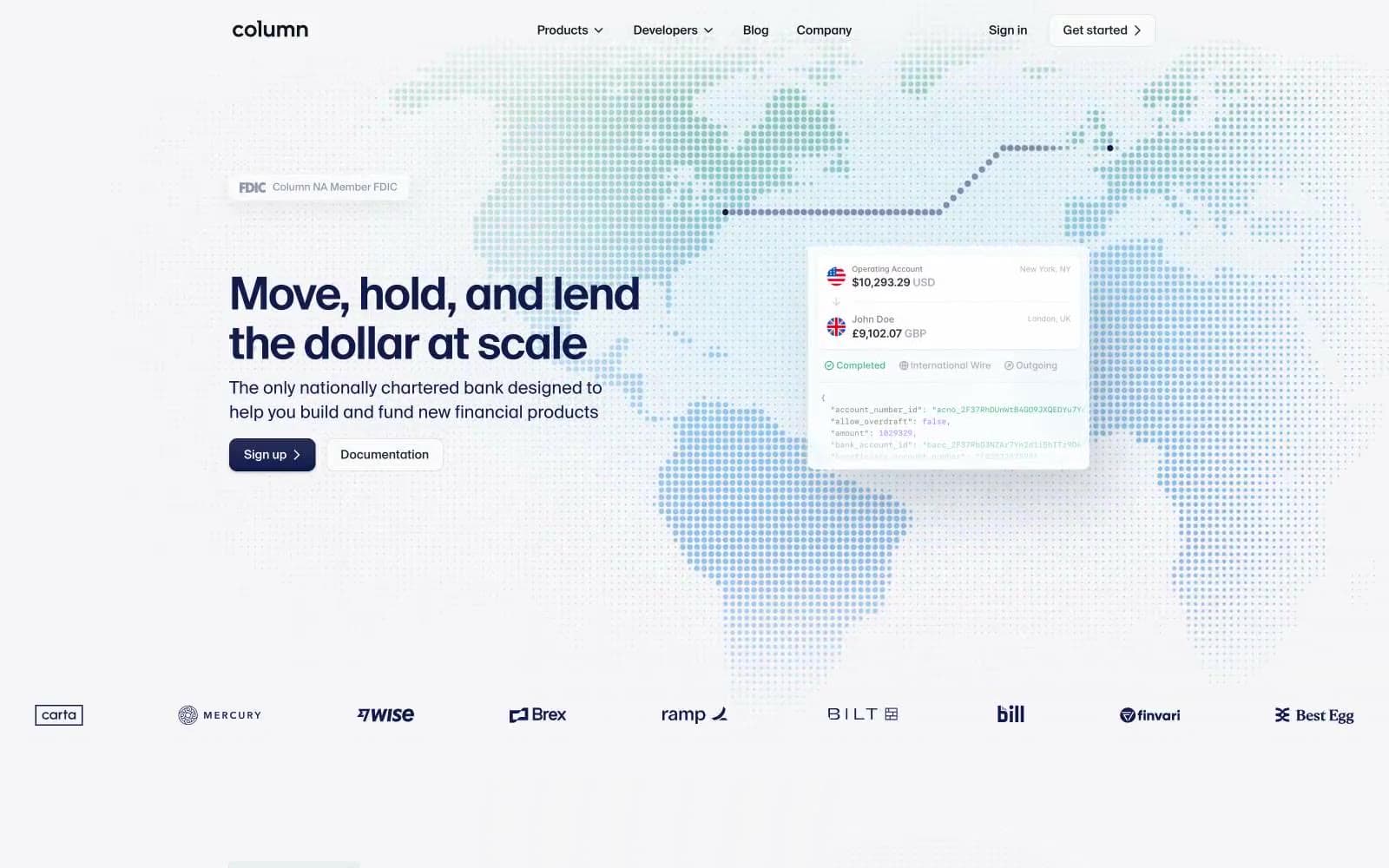
Column
Finance


