
Coda. Coda reads like a hand-set marketplace poster, not a SaaS dashboard.
- Finance
- Light theme
- 16 colors
- 4 typefaces
Coda's visual language is a confident, almost architectural marketplace identity built on a warm cream canvas (#f8f9eb) rather than stark white. The defining signature is monumental display type — a custom geometric grotesque (Monument Grotesk) set extremely tight (line-height 0.90) at sizes up to 134px, making headlines feel like carved signage rather than web copy. Every surface is bordered, not shadowed: hairline charcoal outlines on cream create a blueprint-like precision that pairs with pill-shaped tags, small rounded buttons (~13px radius), and one deep forest-green section that breaks the monochrome rhythm with organic blob shapes. Color is used as deliberate, sparse punctuation — a mint card here, a lilac or rose card there — while the structural palette stays earthy and achromatic. The effect is half editorial brutalism, half boutique storefront: warm, tactile, and emphatically physical rather than digital-glass.
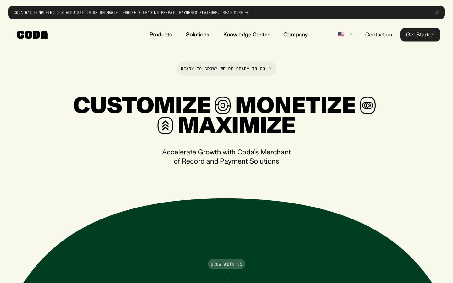
Coda design system

Brand2
Hero feature section background, brand-defining dark band, bold UI surface
Light green card surface, heading accent stroke, lively pastel fill
Accent6
Decorative icon fill, deep accent stroke, secondary brand hue
Decorative icon fill, deep accent stroke, tertiary brand hue
Decorative icon fill, deep accent stroke, warm accent hue
Soft purple card surface, pastel feature tile
Soft teal card surface, pastel feature tile
Soft pink card surface, pastel feature tile
Neutrals8
Hairline borders, primary text, outline strokes, dark surface dividers
Filled button background, dark elevated surfaces, secondary text on cream
Secondary and meta text, subdued captions, lower-emphasis copy
Tertiary text, caption labels, subdued helper copy on cream
Muted borders, icon strokes, secondary text, soft dividers between sections
Subtle button border, faint hover surface, near-canvas divider
Page canvas, primary background, nav and body surface
Elevated card surfaces, icon fills inside outlined containers, text on dark buttons
Try a pairing
Pick any two colors from the palette to check whether text stays readable on top.
Aa
Pure White on Forest Depths
12.43 : 1 contrast
- Body textPasses AA 4.5
- Large textPasses AA 3
- StrictPasses AAA 7
More DESIGN.md files. Same web, different personalities.
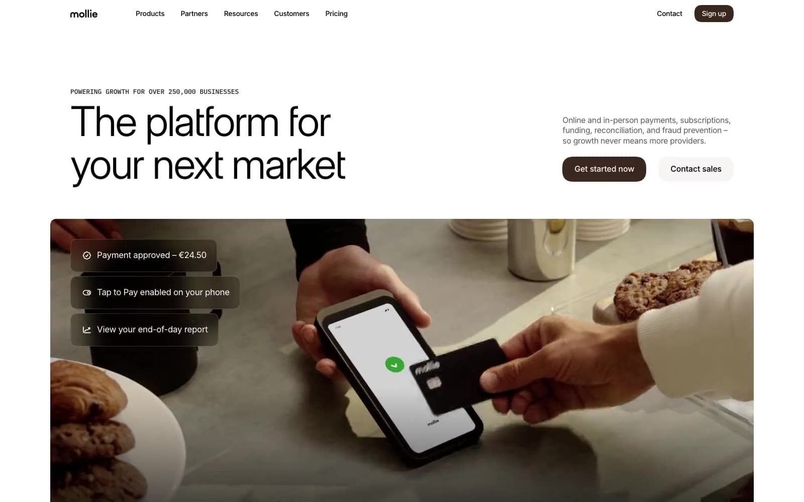
Mollie
Finance
a16z speedrun
Finance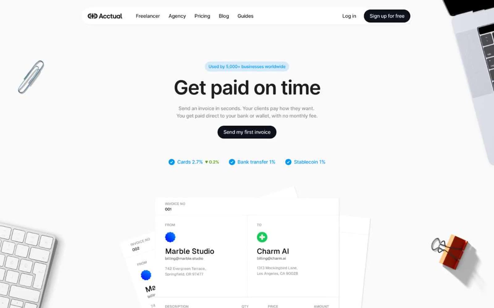
Acctual
Finance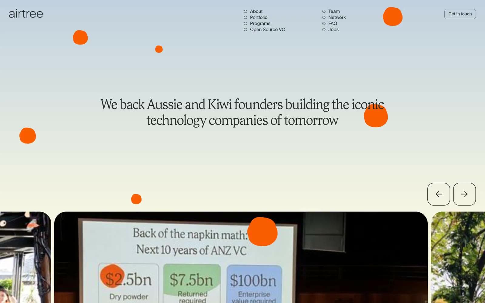
Airtree
Finance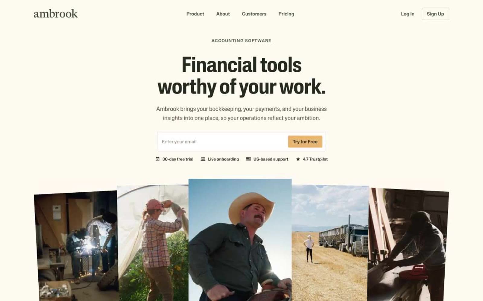
Ambrook
Finance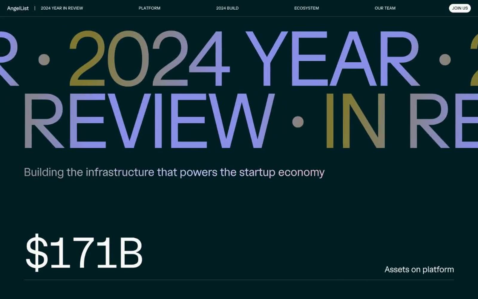
Angellist 2024
Finance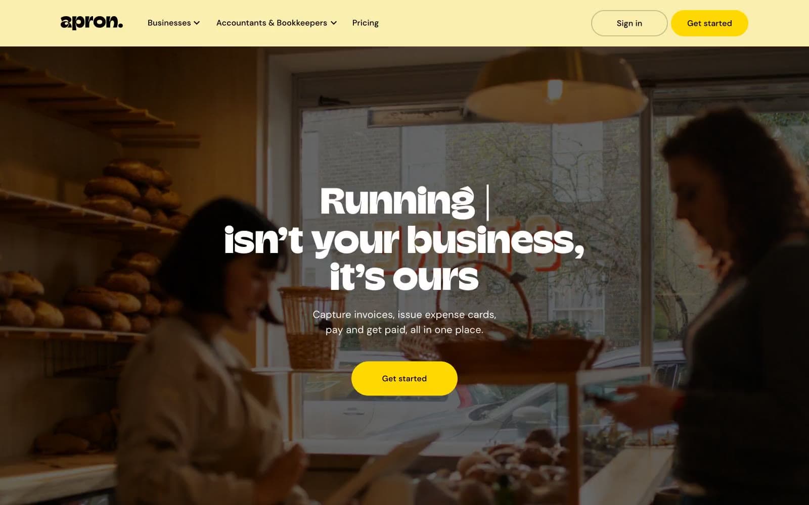
Apron
Finance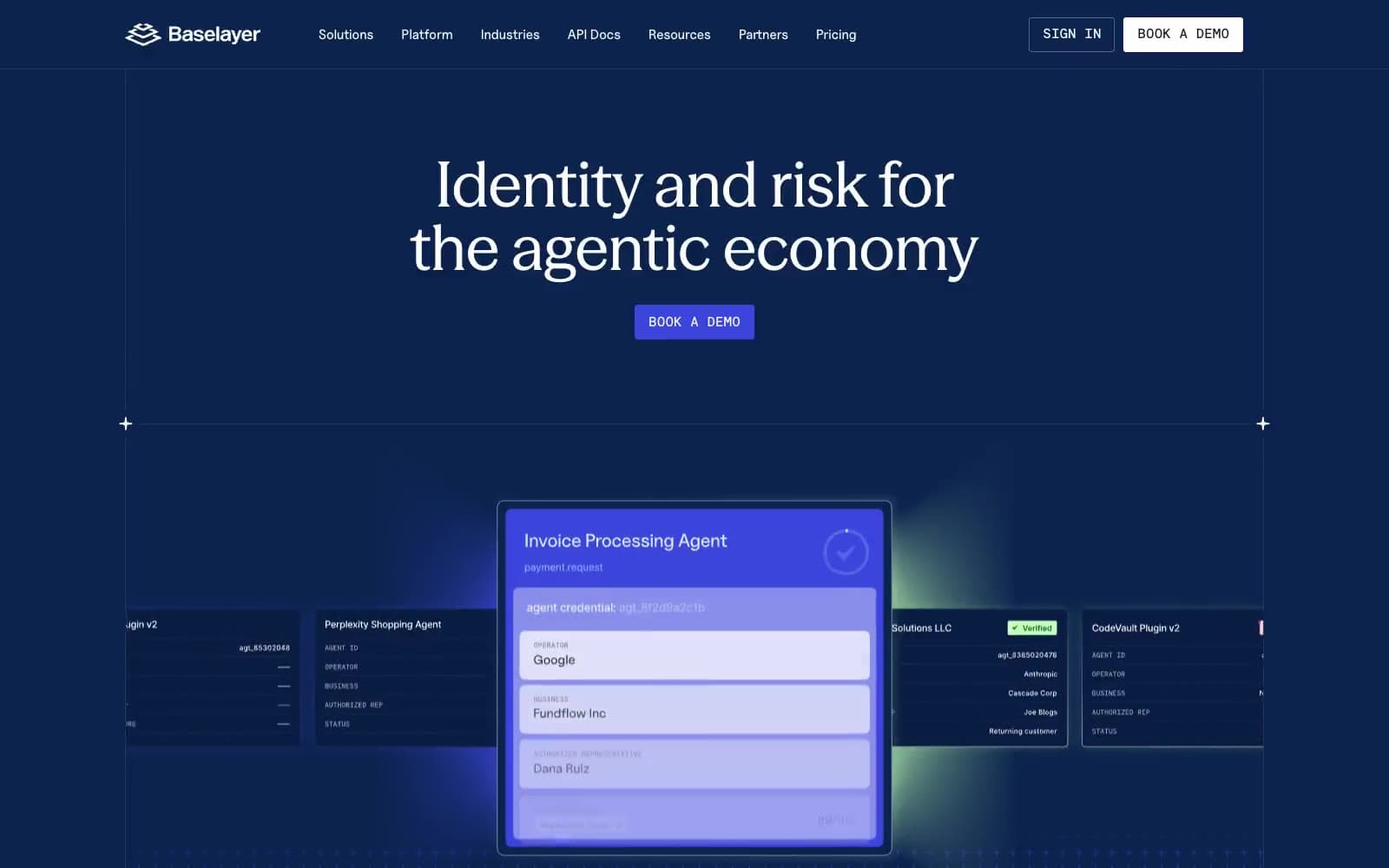
Baselayer
Finance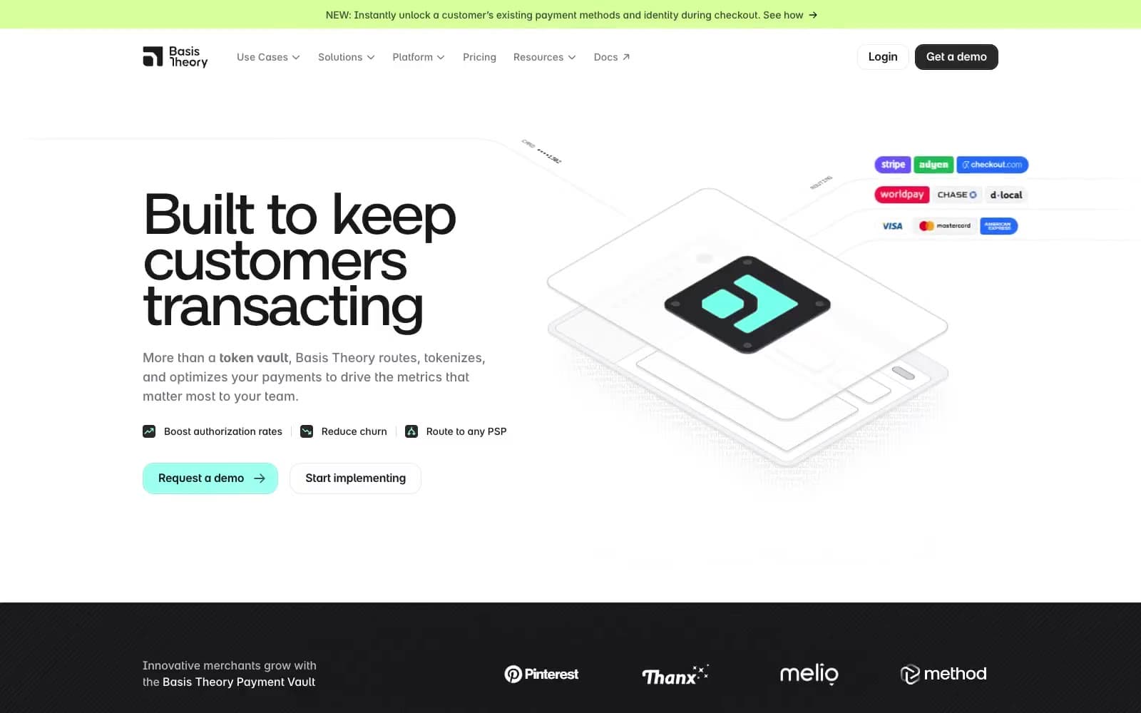
Basis Theory
Finance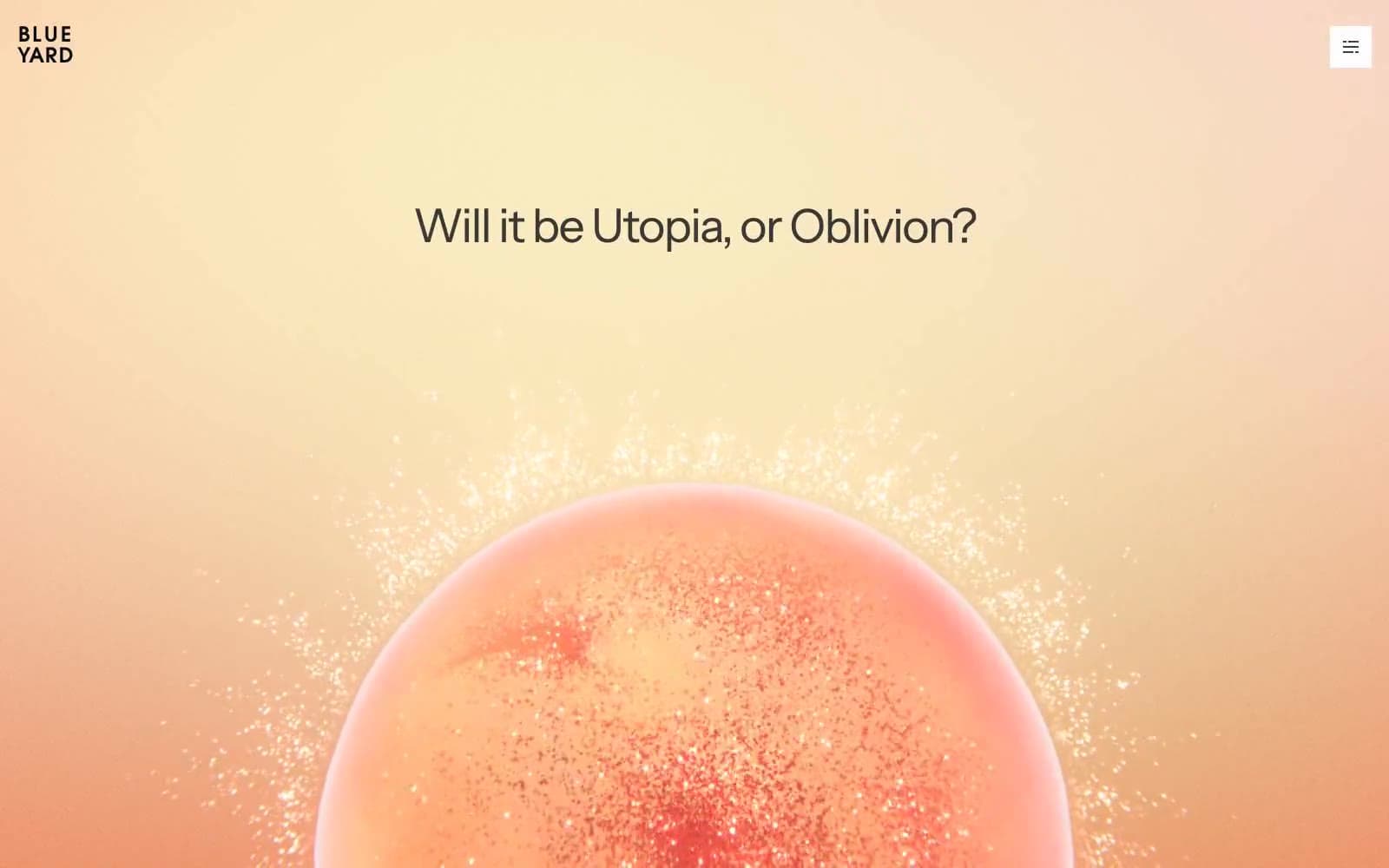
BlueYard Capital
Finance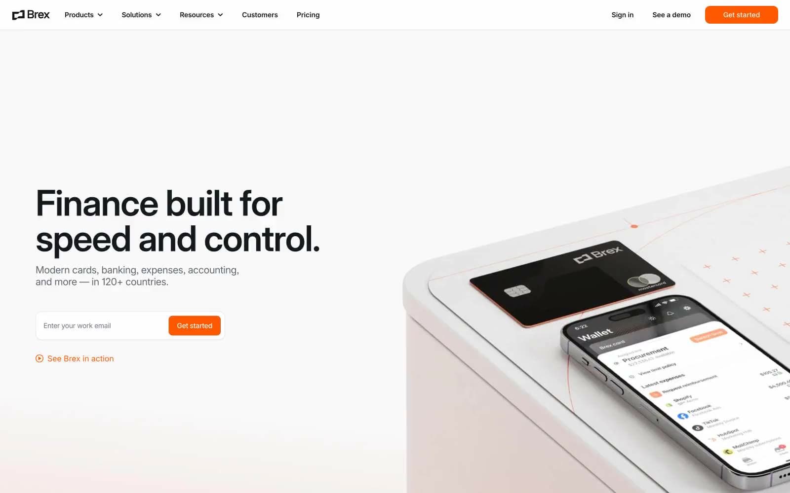
Brex
Finance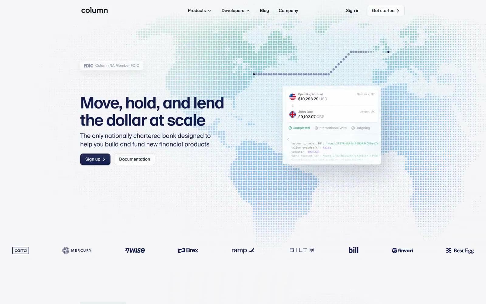
Column
Finance


