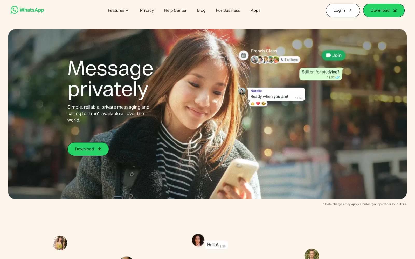
WhatsApp.com. Sunlit coffee shop conversation.
- Brand
- Light theme
- 8 colors
- 1 typeface
WhatsApp's site reads like a warm, human messaging app brought to a marketing canvas: a soft cream backdrop (#fcf5eb) carries the entire page, letting large full-bleed photography and oversized typography do the talking while a single vivid green (#25d366) punctuates every action. The type system is deliberately dramatic — a custom display face scales to 80px hero headlines — balanced by a quiet 16px body that stays out of the way. Components are generous and soft: pill-shaped buttons at 50px radius, generously rounded image cards at 25px, and minimal use of borders or shadows. The color palette is ruthlessly restrained — one chromatic brand color, one link blue, and a near-black text color over cream — making every green CTA feel like a deliberate act of invitation rather than noise. The overall feel is less 'SaaS product page' and more 'sunlit conversation' — warm tones, organic photo crops, chat bubbles floating freely, and nothing chrome-like or angular.
WhatsApp.com design system
Brand1
Primary CTA buttons, active state highlights, and the singular chromatic accent across the entire system — used sparingly to make every action feel like a deliberate invitation rather than a recurring brand color
Accent1
Blue accent for outlined action borders, linked labels, and lightweight interactive emphasis.
Neutrals6
Deepest text and icon color, input borders, icon strokes — slightly darker than Charcoal for elements that need maximum weight or definition
High-contrast neutral action fill for primary buttons on light surfaces.
Secondary/muted body text and subtle borders — used for helper text, disclaimers, and de-emphasized labels
Hairline borders, dividers, input outlines, and card edges on light surfaces. Do not promote it to the primary CTA color
Page background across all sections — warm off-white that gives the entire site its sunlit, approachable atmosphere instead of stark pure white
Card surfaces, button fills for outlined variants, nav background, and chat-bubble fills — the elevated surface layer sitting on the cream canvas
Try a pairing
Pick any two colors from the palette to check whether text stays readable on top.
Aa
Ink Black on WhatsApp Green
8.80 : 1 contrast
- Body textPasses AA 4.5
- Large textPasses AA 3
- StrictPasses AAA 7
More DESIGN.md files. Same web, different personalities.

Airbnb
Brand
Aker
Brand
Alison Roman
Brand
Alpine Bio
Brand
Alveos One
Brand
Amrit Palace
Brand
André Cândido
Brand
Anna Jóna
Brand
Apollo
Brand
Apple
Brand
Arva
Brand
Ashton Bespoke
Brand


