
Warp Code. Moonlit terminal behind amber glass.
- Developer tools
- Dark theme
- 13 colors
- 6 typefaces
Warp operates as a dimmed control room: warm near-black canvases, terminal-derived product surfaces, and tight geometric typography that reads like a command line rendered in print. The palette is almost entirely achromatic with a warm undertone — no cool blues or sterile grays — giving every screen the amber cast of a late-night coding session. Accent color is rationed ruthlessly: a single muted gold and a single blue-gray appear only where the terminal needs syntax punctuation or a link must surface. Components are flat, dense, and weightless — no decorative shadows, no skeuomorphic depth, no rounded pillowy buttons. Every element earns its place through typographic precision and generous negative tracking at display sizes.
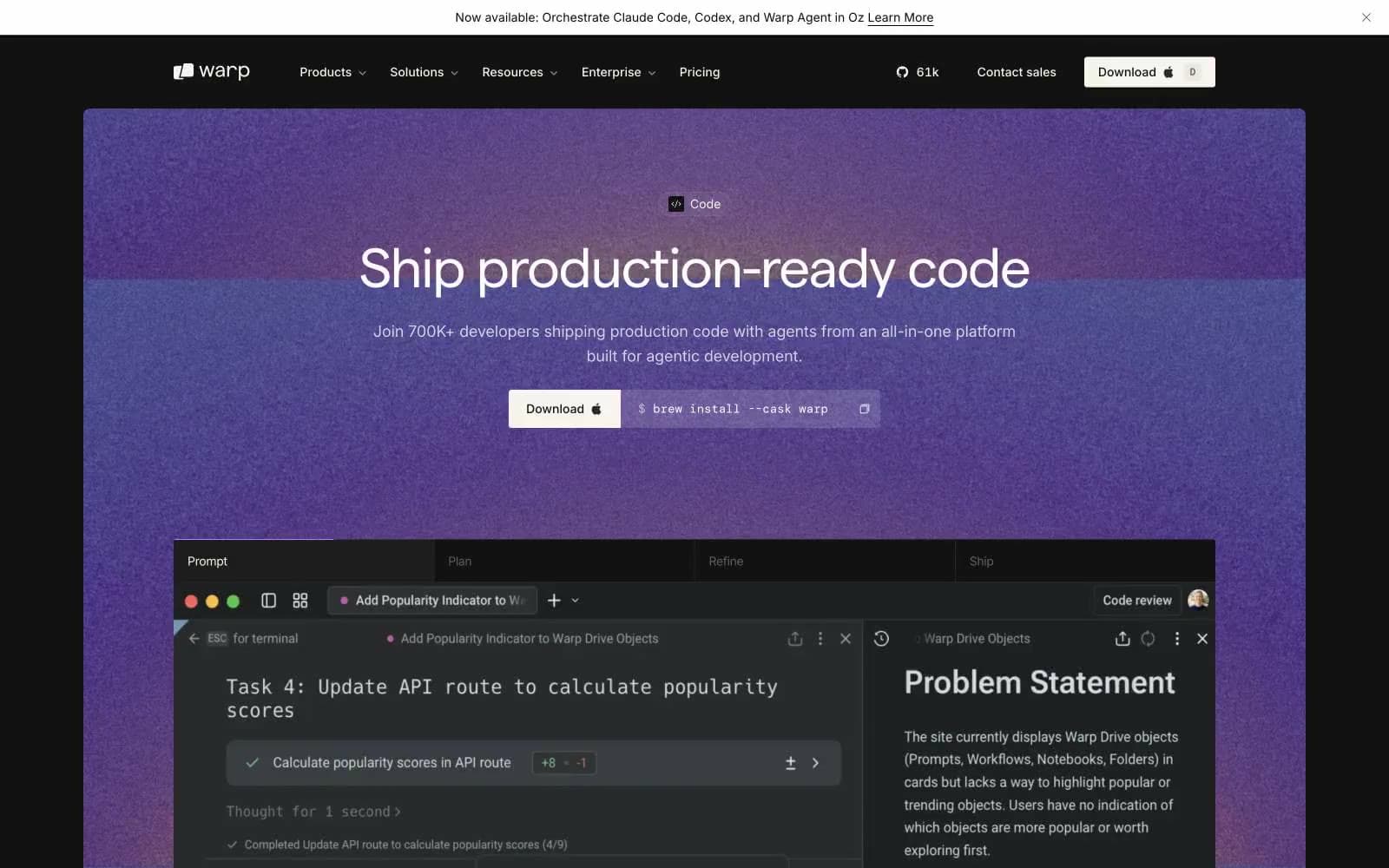
Warp Code design system

Accent2
Code syntax strings, keyword highlights, inline emphasis — appears only inside terminal content, never as a UI button
Code syntax identifiers, secondary link text, tag accents — the cool counterpoint to the warm gold
Neutrals11
Deepest dark, nav text, icon strokes, image masks
Deep text, hairline borders that must disappear into the canvas
Page canvas, section backgrounds — the warm near-black that grounds the whole system
Footer, banded section backgrounds, subtle vertical shifts
Card surfaces, nested panels, terminal window backgrounds
Supporting neutral for secondary UI, dividers, and muted labels. Do not promote it to the primary CTA color
Highest surface elevation — modal overlays, floating panels
Secondary text, captions, muted labels — the midtone that separates from Off-White without losing warmth
Tertiary text, ghost button labels, low-emphasis copy
Hairline borders, subtle dividers, selected state outlines
Primary headlines, body text, nav links — the warm cream reads softer than pure white against the charcoal canvas
Try a pairing
Pick any two colors from the palette to check whether text stays readable on top.
Aa
Absolute on Gold Leaf
8.31 : 1 contrast
- Body textPasses AA 4.5
- Large textPasses AA 3
- StrictPasses AAA 7
More DESIGN.md files. Same web, different personalities.

Railway
Developer tools
Nuxt
Developer tools
Astro
Developer tools
Authkit
Developer tools
Axiom
Developer tools
BaseHub
Developer tools
Better Stack
Developer tools
Bun
Developer tools
Checkly
Developer tools
ClickHouse
Developer tools
Depot
Developer tools
dope.security
Developer tools


