
Depot. Dark server-rack terminal.
- Developer tools
- Dark theme
- 22 colors
- 3 typefaces
Depot uses a developer-console language: a near-black canvas, hairline green-tinted borders, and a single vivid green accent that lights up the only button on the page. The interface feels like a terminal that grew up into a marketing site — compact, monospace-adjacent, and confident in its restraint. Typography splits into three Red Hat families: Display for tight tracked-out headlines, Text for slightly letter-spaced body copy, and Mono for code and terminal-style labels, creating a tri-tonal typographic system. Surfaces stack in barely-perceptible lifts of near-black, separated by thin 1px hairline borders with subtle green ambient glows — no drop shadows, just inset top highlights. Color appears sparingly: green for actions and status, blue for inline links, and a soft violet for secondary decorative accents. The whole system reads as 'infrastructure you can trust' rather than 'consumer app you enjoy'.

Depot design system

Brand5
Green supporting accent for decorative details and low-frequency emphasis
Green supporting accent for decorative details and low-frequency emphasis. Do not promote it to the primary CTA color
Subtle green-tinted border accent for highlighted cards and notification states — keeps the green theme at low intensity
Tinted card background for highlighted/featured panels — dark green surface that sets apart spotlighted content
Supporting neutral for secondary UI, dividers, and muted labels. Do not promote it to the primary CTA color
Accent5
Blue supporting accent for decorative details and low-frequency emphasis. Do not promote it to the primary CTA color
Decorative icon accent and secondary highlight — soft violet for visual variety in feature icons and subtle UI flourishes
Muted violet border tint for tag/label outlines — secondary border color for grouped metadata
Mid-violet link and body accent — used for inline code links and grouped label borders
Pale lavender text accent for highlighted inline labels and decorative typography touches
Neutrals12
Page canvas — the base near-black that everything sits on
First surface lift — card backgrounds, nav header surface, elevated panels
Second surface lift — nested cards, secondary panels, footer surface
Supporting neutral for secondary UI, dividers, and muted labels. Do not promote it to the primary CTA color
Borders and dividers — the primary hairline color separating surfaces and defining card edges
Supporting neutral for secondary UI, dividers, and muted labels. Do not promote it to the primary CTA color
Supporting neutral for secondary UI, dividers, and muted labels. Do not promote it to the primary CTA color
Mid-gray borders and muted icon strokes — subtle structural lines
Muted body text, footer text, nav inactive items, secondary copy
Secondary text, placeholder text, button text on dark fills, icon outlines
Headings and primary headings — the brightest text for display type
Primary body text — high-contrast off-white for reading copy
Try a pairing
Pick any two colors from the palette to check whether text stays readable on top.
Aa
Carbon on Signal Green
10.76 : 1 contrast
- Body textPasses AA 4.5
- Large textPasses AA 3
- StrictPasses AAA 7
More DESIGN.md files. Same web, different personalities.

Railway
Developer tools
Nuxt
Developer tools
Astro
Developer tools
Authkit
Developer tools
Axiom
Developer tools
BaseHub
Developer tools
Better Stack
Developer tools
Bun
Developer tools
Checkly
Developer tools
ClickHouse
Developer tools
dope.security
Developer tools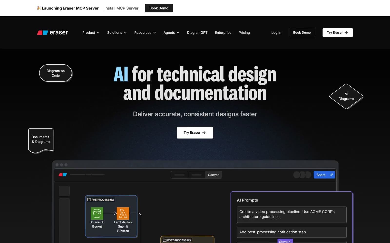
Eraser
Developer tools


