
BaseHub. Midnight canvas, molten filament.
- Developer tools
- Dark theme
- 14 colors
- 2 typefaces
BaseHub speaks a near-monochrome dialect: a near-black canvas, a grayscale text scale, and one molten orange accent that does the work of a full color system. The product is the hero — large borderless screenshots of the editor float in the dark rather than floating illustrations, and a thin vertical orange rule on the far left anchors every section like a margin note. Typography stays compressed and quiet: Geist at semibold for headlines, regular for body, with tight negative tracking at every size to make words feel machined rather than typeset. Surfaces are flat and hairline-bordered rather than shadowed, and a 12px card radius plus 4px button radius keep the geometry sharp and developer-tool familiar. The only warm note is the orange — used for CTAs, section tags, the glowing product frame, and hand-drawn annotations — and a cool blue (#55c2ff) reserved strictly for informational badges.

BaseHub design system

Brand2
Primary CTAs, section tags, active nav, the glowing product frame, hand-drawn annotations, and the single decorative rule on the left margin — the one warm voice in an otherwise cold palette
Gradient stop paired with Ember Orange for the rare gradient surface (e.g. template card accent bars)
Neutrals11
Deepest surface for footer and image fill where absolute black is needed
Page canvas — the dominant page background
Quote/testimonial card surface, link button background, the most common elevated surface
Card surface — one step above canvas, used for testimonial cards and elevated blocks
High-contrast neutral action fill for primary buttons on light surfaces.
Card borders, subtle frame edges, input field borders
Hairline dividers, code block borders, subtle list separators
Muted metadata text, timestamp labels, tertiary icon strokes
Medium-contrast borders, control outlines, and structural separators.
Secondary text and lighter icon strokes on dark surfaces
Neutral form states, badge text, and quiet UI feedback where color should stay understated. Do not promote it to the primary CTA color
semantic1
Blue state accent for badges, validation surfaces, and short status labels.
Try a pairing
Pick any two colors from the palette to check whether text stays readable on top.
Aa
Black on Ember Orange
7.40 : 1 contrast
- Body textPasses AA 4.5
- Large textPasses AA 3
- StrictPasses AAA 7
More DESIGN.md files. Same web, different personalities.

Railway
Developer tools
Nuxt
Developer tools
Astro
Developer tools
Authkit
Developer tools
Axiom
Developer tools
Better Stack
Developer tools
Bun
Developer tools
Checkly
Developer tools
ClickHouse
Developer tools
Depot
Developer tools
dope.security
Developer tools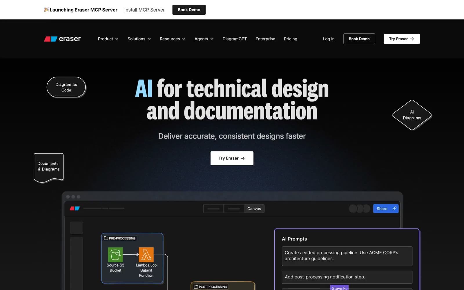
Eraser
Developer tools


