
Authkit. Frosted glass cathedral at midnight.
- Developer tools
- Dark theme
- 13 colors
- 3 typefaces
AuthKit renders a midnight product-launch aesthetic: a near-black canvas with frosted-glass surfaces, a grid of faint blueprint lines, and luminous text that appears lit from behind a glass layer. Type is almost entirely white-on-dark with one vivid violet as the single functional accent — every interactive surface wears a soft inset hairline of cool blue-white rather than a hard border. Components sit on translucent layers stacked above ambient glows, with cards that look like glass plates lit from below rather than paper panels. Spacing is generous and rhythmic; the hero is a single full-bleed illuminated wordmark surrounded by floating glass cards rather than a conventional split layout.

Authkit design system

Brand1
Primary CTA fill — the only chromatic accent, used exclusively for the Continue/Submit button inside auth forms; vivid violet against near-black creates focused urgency without breaking the monochromatic mood
Accent4
Decorative icon accent, soft highlight wash on feature illustrations
Secondary accent — appears in demo/showcase contexts (logo recoloring swatches) for brand-color customization display
Secondary accent — appears in customization swatch grids to demonstrate brand-color options
Secondary accent — appears in customization swatch grids
Neutrals8
Page background, deepest card surface, badge fills — the near-black base everything else floats on
Elevated surface, button fills for ghost/secondary actions, subtle panel backing
Shadow color for outer card drop-shadows — cool dark blue-grey gives elevation a tinted, on-brand feel rather than neutral black
Muted body copy, card text — readable but stepped back from headlines
Body text, secondary labels, muted helper copy
Primary text fill for body and links, badge text, icon fills — the default luminous foreground
Light text on dark surfaces, inverse labels, and high-contrast captions. Do not promote it to the primary CTA color; Headline gradient — top-to-bottom fade from Ice Highlight to soft blue, used on the AuthKit wordmark and key headings
Button text, input text, maximum-emphasis foreground
Try a pairing
Pick any two colors from the palette to check whether text stays readable on top.
Aa
Pure White on Void Violet
6.06 : 1 contrast
- Body textPasses AA 4.5
- Large textPasses AA 3
- StrictFails AAA 7
More DESIGN.md files. Same web, different personalities.

Railway
Developer tools
Nuxt
Developer tools
Astro
Developer tools
Axiom
Developer tools
BaseHub
Developer tools
Better Stack
Developer tools
Bun
Developer tools
Checkly
Developer tools
ClickHouse
Developer tools
Depot
Developer tools
dope.security
Developer tools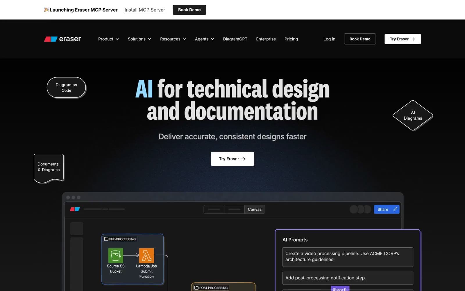
Eraser
Developer tools


