
Checkly. Mission control at deep orbit.
- Developer tools
- Dark theme
- 14 colors
- 4 typefaces
Checkly lives in deep midnight-navy — a near-black cosmic canvas where white type floats like HUD readouts and one vivid electric blue acts as the signal accent. The system is deliberately sparse: hairline light-gray borders define structure instead of heavy shadows, product UI is shown as floating light-themed cards suspended on the dark void, and code blocks are treated as first-class content in JetBrains Mono. Inter at weight 300 gives headlines a whisper-quiet authority that lets the technical subject matter do the talking, while weight 500–600 carries operational UI. The overall feel is mission control at altitude — minimal chrome, maximal legibility, one accent doing all the semantic work.

Checkly design system

Brand3
Page background, hero canvas, section bands — the deep-space base on which all other UI floats
Blue text accent for links, tags, and emphasized short phrases. Do not promote it to the primary CTA color
Secondary surface tint, logo wordmark — a slightly lighter shade of the void used for depth
Accent2
Hover/active accent variant for buttons and interactive states
Green text accent for links, tags, and emphasized short phrases. Use as a supporting accent, not as a status color
Neutrals9
Card surfaces, inset panels, terminal block backgrounds — the next level up from the void
Elevated card surfaces, nested panel backgrounds — sits above Orbit Slate for layered depth
Borders on dark surfaces, section dividers within dark bands
Borders and dividers on cards and panels — the most common structural border
Secondary body text, muted labels, icon fills — readable on dark without competing with white headings
Helper text, captions, tertiary metadata — drops information below the primary read
De-emphasized text, disabled labels, low-priority inline content
Hairline borders on dark surfaces, subtle dividers, the dominant structural line color
Primary text, filled button background, logo fills — maximum contrast against the void
Try a pairing
Pick any two colors from the palette to check whether text stays readable on top.
Aa
Pure White on Void Navy
17.84 : 1 contrast
- Body textPasses AA 4.5
- Large textPasses AA 3
- StrictPasses AAA 7
More DESIGN.md files. Same web, different personalities.

Railway
Developer tools
Nuxt
Developer tools
Astro
Developer tools
Authkit
Developer tools
Axiom
Developer tools
BaseHub
Developer tools
Better Stack
Developer tools
Bun
Developer tools
ClickHouse
Developer tools
Depot
Developer tools
dope.security
Developer tools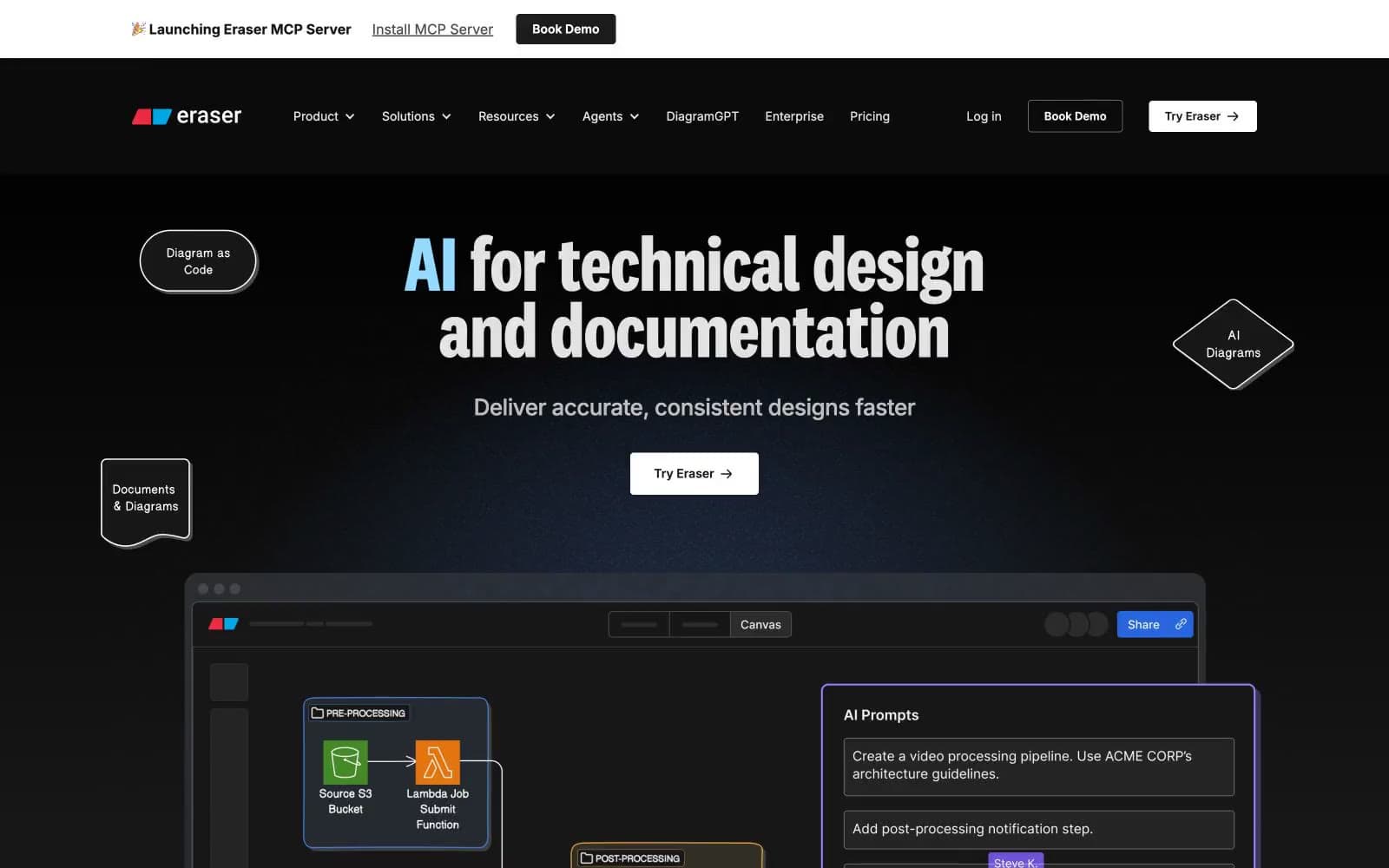
Eraser
Developer tools


