
Bun. Every interface element is either prose or code, and the pink tells you what to click.
- Developer tools
- Dark theme
- 25 colors
- 2 typefaces
Bun's design language is a dark, developer-first aesthetic that treats the terminal as a design surface. The interface lives in near-black depths (#0d0e11) with elevated cards floating at #14151a and #1e2028, creating subtle depth without shadows. A single hot pink accent (#f472b6) cuts through the monochrome like a syntax highlighter cursor — it marks every primary action, highlights the fast word in headlines, and outlines code blocks, making interactive elements instantly scannable against the quiet background. Typography is utilitarian: system-ui for everything readable, JetBrains Mono for everything executable. Headlines are large and tight-tracked, body copy is generous and unembellished, and the visual rhythm alternates between prose sections and terminal-style code blocks. The overall feel is developer-tool meets brutalist poster — confident, slightly irreverent, and obsessed with speed.

Bun design system

Brand2
Red supporting accent for decorative details and low-frequency emphasis. Do not promote it to the primary CTA color
Hover states on pink CTAs, gradient endpoint for headlines, emphasis text
Accent11
Light pink backgrounds for tags, soft highlights, gradient midpoint
Softest pink for background washes, subtle pink tints
Pink-tinted borders for highlighted sections, badge outlines
Deep pink-tinted backgrounds for active states or featured panels
Decorative accent, gradient endpoint, illustration highlights
Headline gradient, icon accents, link hover states
Soft violet text, gradient midpoint, subtle highlights
Code syntax highlighting, tool accent for Postgres/data features
Code syntax highlighting, tool accent for runtime features, warm contrast
Code syntax highlighting, test runner badge accent, attention markers
Green supporting accent for decorative details and low-frequency emphasis. Use as a supporting accent, not as a status color
Neutrals12
Page canvas, hero backgrounds, deepest surface layer
Card surfaces, elevated panels, code block backgrounds
Secondary card surfaces, hover states, nested panels
Borders, dividers, subtle separators, table lines
Stronger borders, input outlines, card edges
Icon strokes, secondary borders, button outlines
Muted text, inactive labels, tertiary content
Secondary text, descriptions, helper text
Tertiary text, captions, metadata
Light secondary text, subtle emphasis
Near-white text, icon fills, high-contrast labels
Primary text, logo marks, maximum contrast headings
Try a pairing
Pick any two colors from the palette to check whether text stays readable on top.
Aa
Void on Bun Pink
7.29 : 1 contrast
- Body textPasses AA 4.5
- Large textPasses AA 3
- StrictPasses AAA 7
More DESIGN.md files. Same web, different personalities.

Railway
Developer tools
Nuxt
Developer tools
Astro
Developer tools
Authkit
Developer tools
Axiom
Developer tools
BaseHub
Developer tools
Better Stack
Developer tools
Checkly
Developer tools
ClickHouse
Developer tools
Depot
Developer tools
dope.security
Developer tools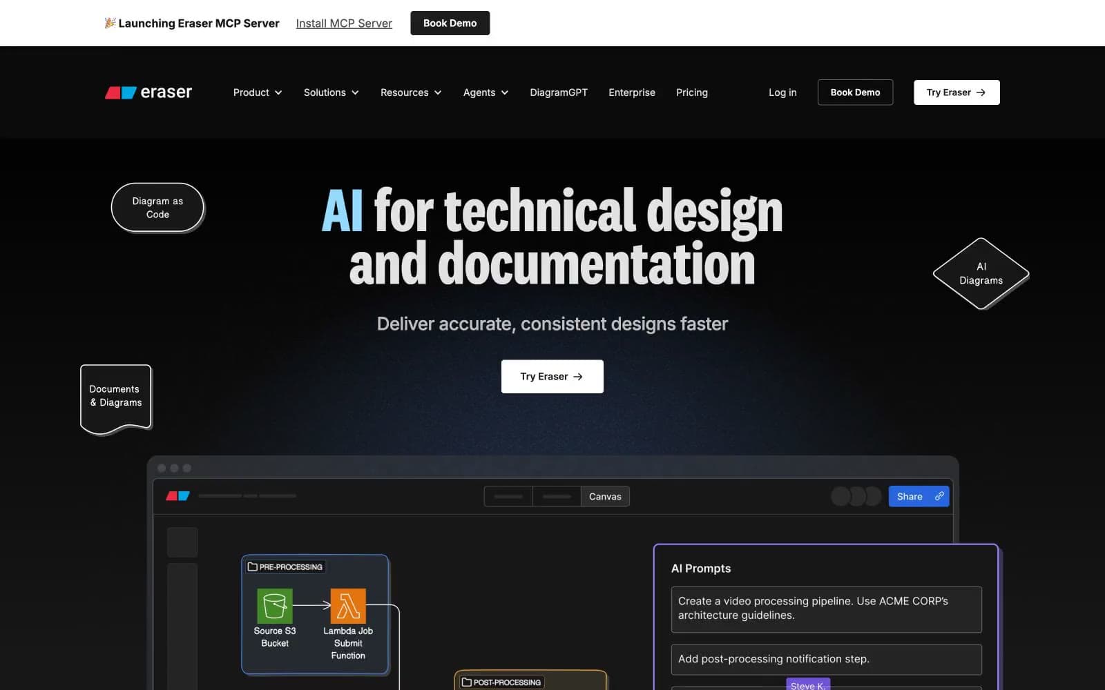
Eraser
Developer tools


