
Astro. Deep space mission control with a single purple nebula glow.
- Developer tools
- Dark theme
- 17 colors
- 5 typefaces
Astro speaks in the language of a cosmic command bridge: near-black canvas, a single signature purple-magenta nebula gradient that blooms from the hero, and white display type that reads like mission copy. The system is overwhelmingly achromatic — 4% colorfulness — so every chromatic pixel is doing real work: a mint-aqua syntax highlight, a violet link, a sky-blue inline chip. Components are geometric and confident: pill-shaped interactive controls at 9999px radius, 16px cards, 8px chips, and thin hairline borders at 8% opacity rather than colored dividers. The custom display face 'Obviously' does the heavy lifting with its wide, open apertures and quirky alternates (salt, ss06, ss11) that give headlines a friendly, slightly retrofuturist swagger against the dark void.

Astro design system

Brand2
Primary brand gradient stop — the blue origin of the hero nebula and the color of highlighted CTAs and accent rings
Secondary gradient (red-to-magenta) used sparingly for illustration accents and decorative energy bands
Accent6
Teal supporting accent for decorative details and low-frequency emphasis
Blue supporting accent for decorative details and low-frequency emphasis
Code keywords, violet link variant, and decorative highlight. A desaturated violet that complements the nebula gradient without competing
Secondary syntax token — reserved for specific code contexts and rare accent strokes
Yellow supporting accent for decorative details and low-frequency emphasis
Decorative dot and badge accent — used for version pills and notification indicators
Neutrals9
Darkest surface for terminal windows, CLI boxes, and high-contrast containers. Almost pure black with a blue whisper
Deeper surface level for elevated cards, code blocks, and inset wells. One step darker than the canvas to create depth without using shadows
Mid-elevation card surface, sitting between canvas and abyss. Used for theme preview tiles and nested cards
Primary page background — the base layer for hero, sections, and footer. Slight cool-blue undertone, never pure black, so colored elements feel like they're floating in space rather than printed on paper
Hairline borders and dividers on the dark canvas. Low contrast on purpose — structural, not decorative
Muted body text and subdued descriptions. The default for paragraphs that should recede behind headlines
Supporting neutral for secondary UI, dividers, and muted labels. Do not promote it to the primary CTA color
Secondary text, icon strokes, and light dividers. Most-used achromatic token for hairline borders and muted foregrounds
Primary text and high-contrast foreground. The slightly cool tint keeps it from feeling clinical against the dark canvas
Try a pairing
Pick any two colors from the palette to check whether text stays readable on top.
Aa
Singularity on Aurora Mint
14.16 : 1 contrast
- Body textPasses AA 4.5
- Large textPasses AA 3
- StrictPasses AAA 7
More DESIGN.md files. Same web, different personalities.

Railway
Developer tools
Nuxt
Developer tools
Authkit
Developer tools
Axiom
Developer tools
BaseHub
Developer tools
Better Stack
Developer tools
Bun
Developer tools
Checkly
Developer tools
ClickHouse
Developer tools
Depot
Developer tools
dope.security
Developer tools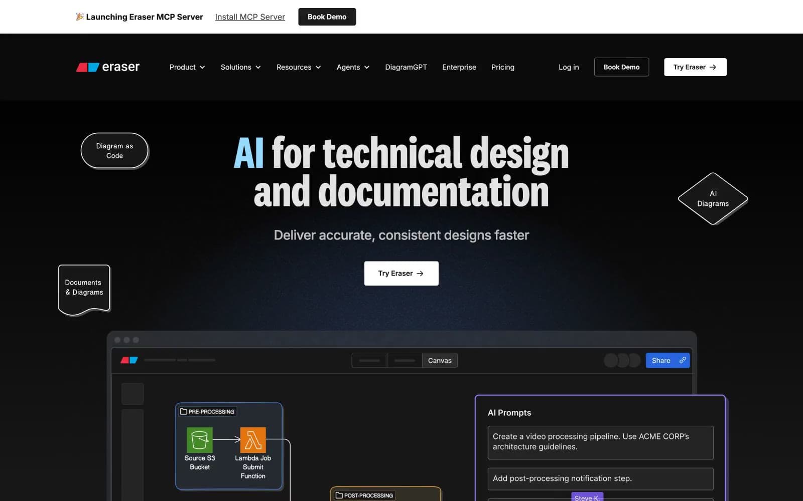
Eraser
Developer tools


