
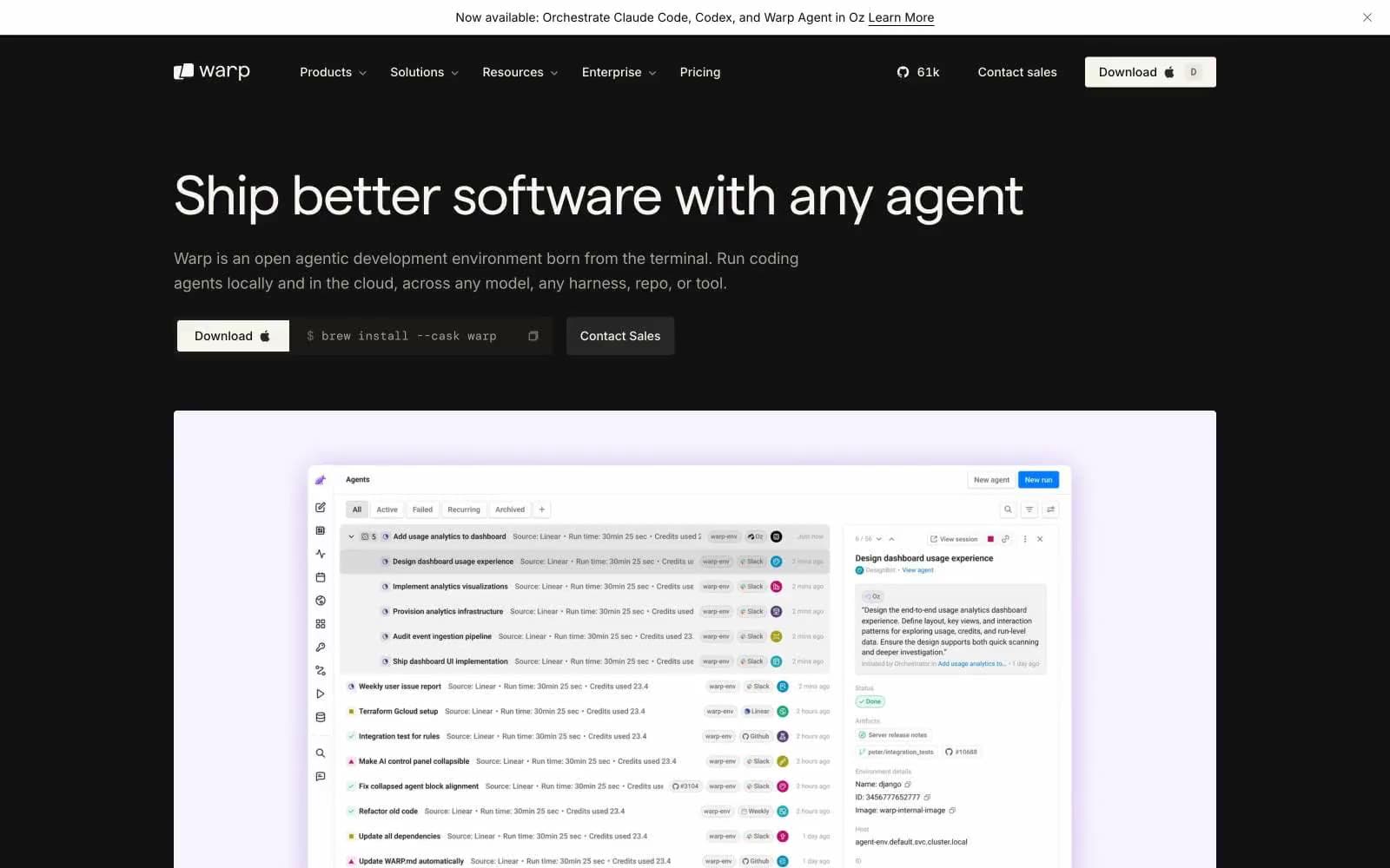
Warp. A developer's IDE cockpit where the only glow is a single violet phosphor on matte black, and typography carries every signal.
- Developer tools
- Dark theme
- 14 colors
- 6 typefaces
Warp speaks in the language of a high-end terminal: an obsidian-black canvas where nearly every surface stays achromatic, typography does the heavy lifting, and a single whisper of violet (#cbb0f7) functions as quiet functional punctuation rather than decoration. The system is built for compact density — tight tracking, small body sizes, and narrow gaps create an IDE-like confidence that respects the reader's time and screen real estate. Custom Matter typeface with extreme negative tracking at display sizes (up to -0.04em at 56px) creates headlines that feel engineered rather than designed, while a warm off-white (#faf9f6) instead of pure white text keeps the dark surface from feeling clinical. The button language is defined by pill shapes (33-50px radius) on neutral fills — there is no chromatic CTA, so action hierarchy emerges from filled vs ghost contrast alone. Surfaces rise through subtle gray steps (#121212 → #1e1e1d → #333333) rather than dramatic shadows, giving the impression of flat panels stacking in negative space.
Warp design system

Accent1
The only chromatic color in the system — decorative icon strokes, code accents, product mark highlights, and subtle borders. Never used for filled CTAs; it is a whisper, not a shout
Neutrals13
Primary page canvas, nav background, terminal preview windows — the void that every other surface floats on
Near-black for fine borders, deep text on light fills, separator strokes
Secondary page surface, body backgrounds behind hero sections, footer base
Elevated card and panel surfaces — first step up from the canvas for product cards and testimonials
Mid-level surface for nested UI, secondary buttons, and tag/badge backgrounds
Highest neutral surface — hover states, elevated modals, and pill chip backgrounds
Lowest-priority text, disabled labels, nav metadata
Tertiary text, captions, nav links at rest, metadata, timestamps
Sub-heading emphasis, medium-muted text where Ash feels too dim
Body copy, secondary text, button text on dark fills, muted descriptions
Secondary heading text, soft dividers, subtle borders on elevated cards
Primary text and headline color — warm off-white avoids the clinical feel of pure white on black
Light supporting surface for subtle backgrounds and section separation. Do not promote it to the primary CTA color
Try a pairing
Pick any two colors from the palette to check whether text stays readable on top.
Aa
Obsidian on Phosphor Violet
11.09 : 1 contrast
- Body textPasses AA 4.5
- Large textPasses AA 3
- StrictPasses AAA 7
More DESIGN.md files. Same web, different personalities.

Railway
Developer tools
Nuxt
Developer tools
Astro
Developer tools
Authkit
Developer tools
Axiom
Developer tools
BaseHub
Developer tools
Better Stack
Developer tools
Bun
Developer tools
Checkly
Developer tools
ClickHouse
Developer tools
Depot
Developer tools
dope.security
Developer tools


