
WalletConnect. Saturated blue monoliths floating above a warm white desert, with rounded edges that soften the tech seriousness.
- Crypto
- Light theme
- 17 colors
- 3 typefaces
WalletConnect Pay is an electric-blue crypto payments brand wrapped in a clean, light canvas: warm off-white surfaces, indigo-black typography, and oversized rounded cards that feel more like consumer fintech than infrastructure tooling. The signature move is a vivid cobalt hero panel (40px radius) sitting on a near-white page, anchoring a layout that alternates between full-bleed product photography and generous whitespace. Typography is set in KHTeka, a geometric humanist that carries a technical-but-friendly voice across weights 400-700, with deep navy #1b2045 replacing pure black for a slightly warmer read. Components are confidently minimal — pill-shaped buttons, ghost CTAs, hairline borders, and almost no shadow, letting the saturated blue do all the emotional work.
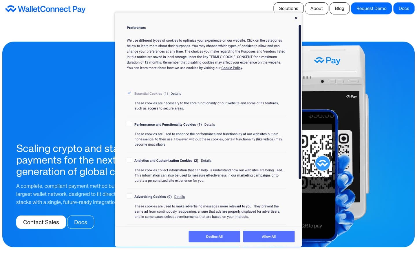
WalletConnect design system

Brand4
Hero panels, filled buttons, active nav indicators, link accents — the primary brand signal, used as a full-bleed surface rather than a small button color to dominate the page
Primary filled action buttons and their borders — a slightly lighter, more violet-shifted blue for interactive surfaces that need to feel pressed and clickable
Primary text, headings, and dark button borders — replaces pure black with a warm navy that reads as authoritative without the harshness of #000
Radial gradient highlight accent — used sparingly as a luminous spot inside blue panels to create depth
Accent2
Hover states, subtle outlined button borders, secondary navigation accents — a desaturated companion to Electric Cobalt for non-dominant blue moments
Pale blue tinted backgrounds, soft highlight washes, tag fills, and light section dividers — bridges the white canvas to the blue brand without harsh contrast
Neutrals11
Dark footer background, dark section panels, card borders on light surfaces — the system's dark surface color, used as a deliberate band rather than scattered
Dark section borders, footer dividers
Mid-tier body text, descriptions, helper copy that needs to recede behind headings
Link text in their resting state, secondary body copy
Input placeholder text, tertiary captions, subtle icon strokes
Muted body text, secondary metadata, inactive form labels
Shadow base color and muted icon tints
Secondary surface fills, placeholder backgrounds, disabled states
Hairline borders, input outlines, subtle dividers between sections — the quietest structural line color
Page background canvas — a warm near-white that softens the starkness of pure white and reduces eye strain across long scrolling pages
Card surfaces, input fields, button text, elevated panels — the brightest surface layer sitting atop Parchment
Try a pairing
Pick any two colors from the palette to check whether text stays readable on top.
Aa
Pure White on Electric Cobalt
4.58 : 1 contrast
- Body textPasses AA 4.5
- Large textPasses AA 3
- StrictFails AAA 7
More DESIGN.md files. Same web, different personalities.
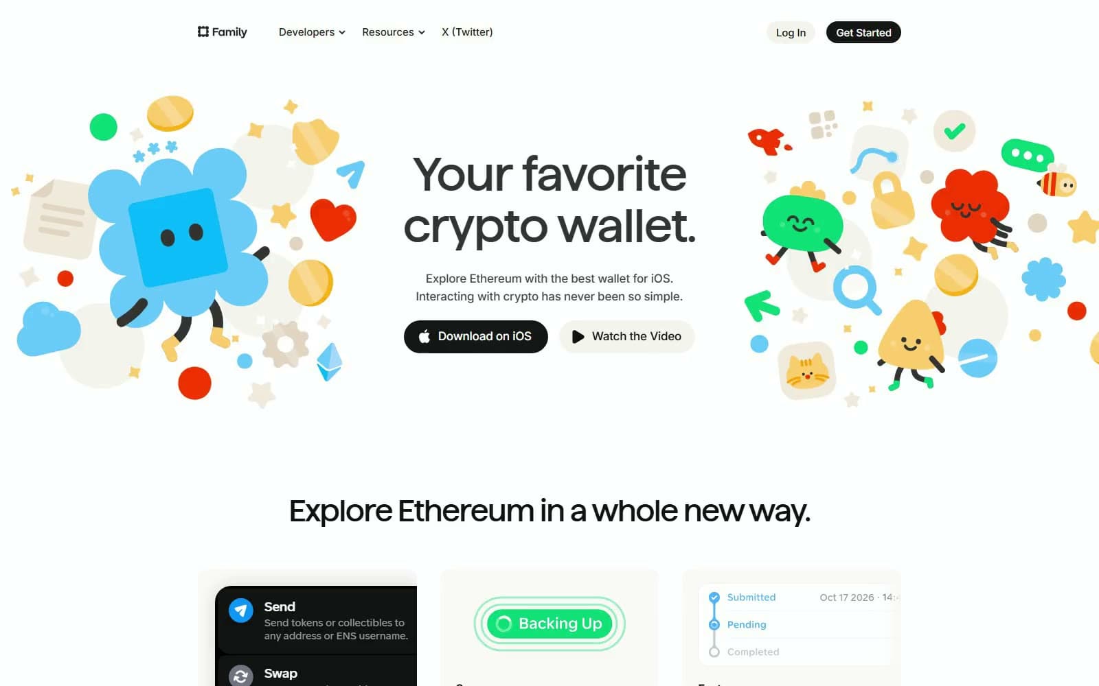
Family
Crypto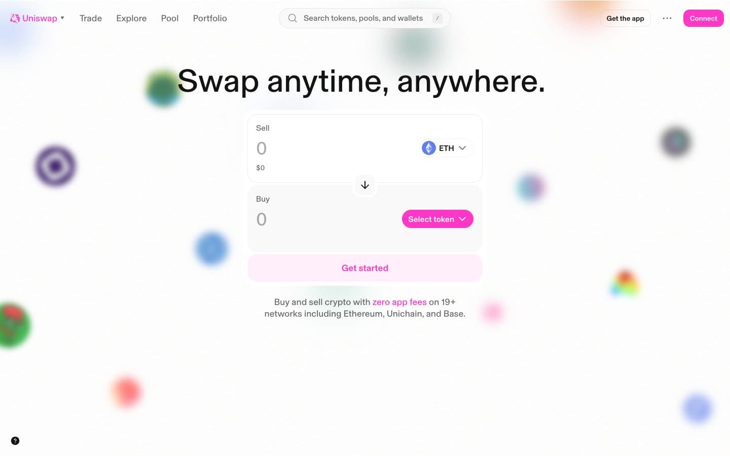
Uniswap
Crypto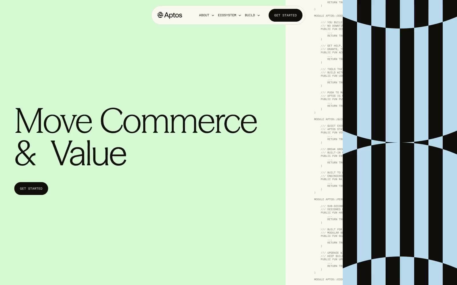
Aptos Network
Crypto
Base
Crypto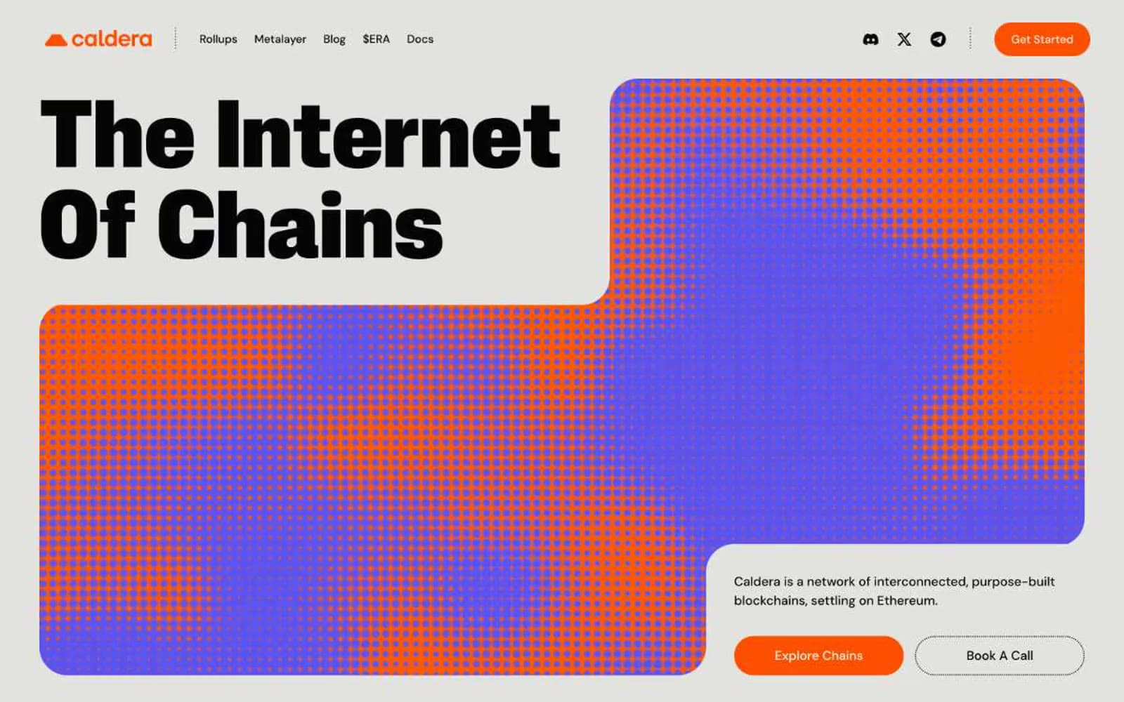
Caldera
Crypto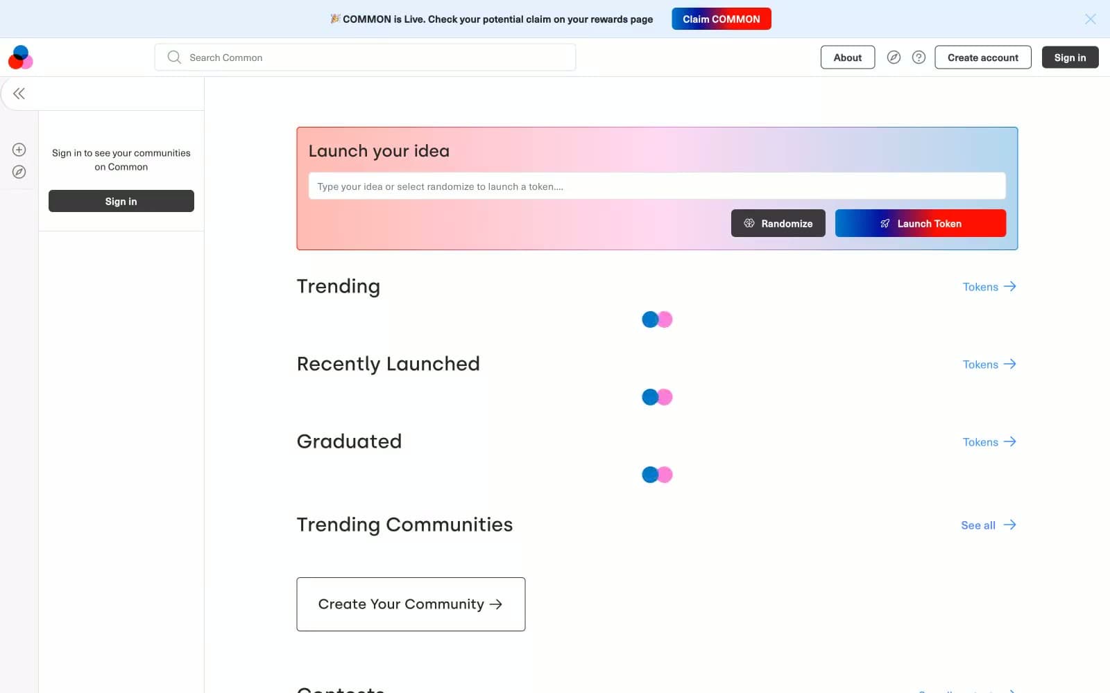
Common
Crypto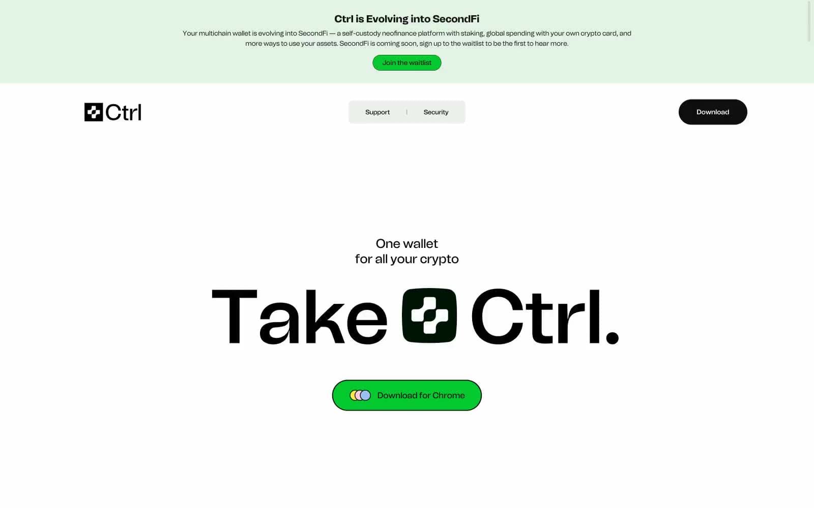
Ctrl Wallet
Crypto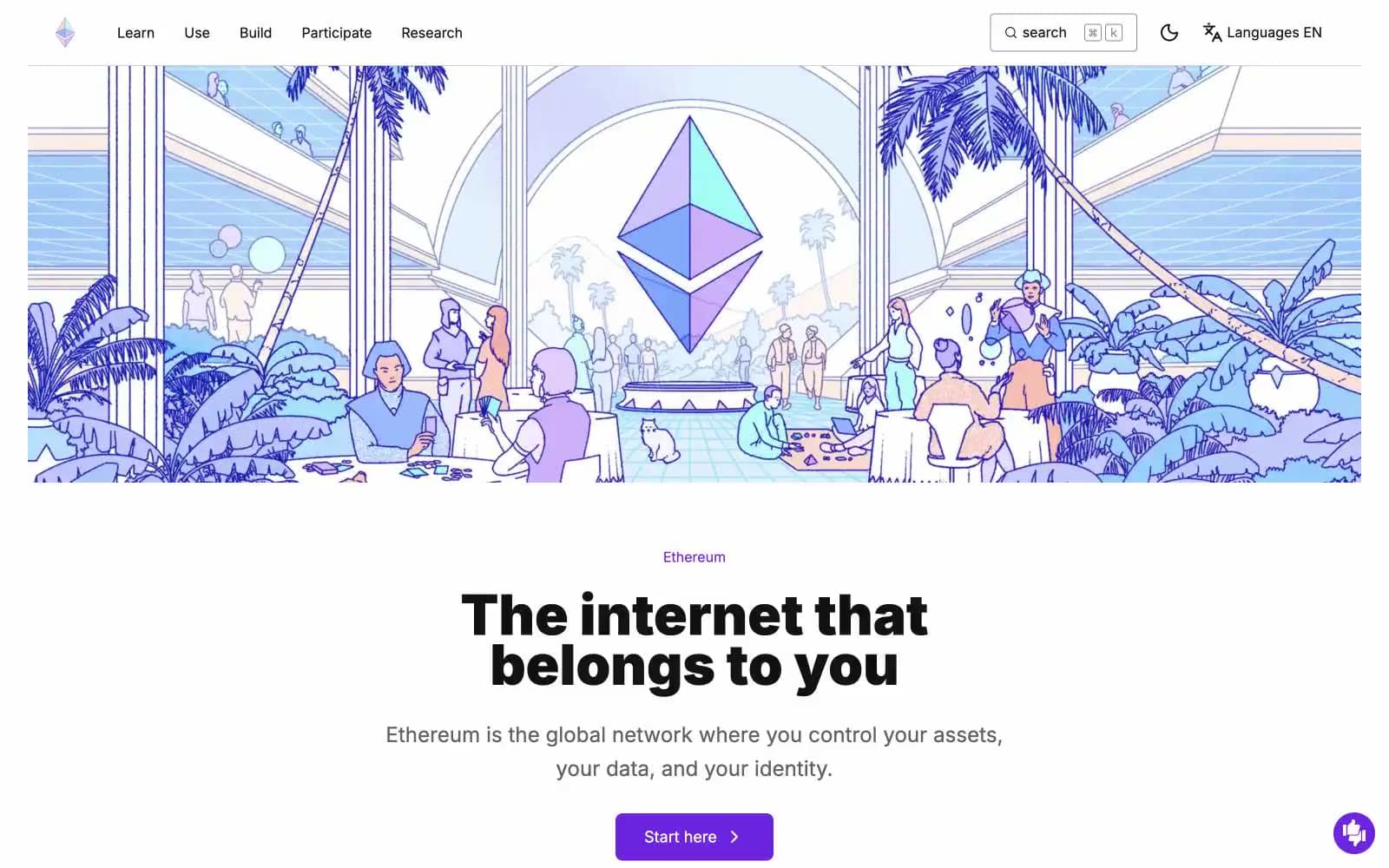
ethereum.org
Crypto
Gamma
Crypto
Glow
Crypto
Kraken
Crypto
Lens
Crypto


