
Common. Graph paper under neon streaks.
- Crypto
- Light theme
- 13 colors
- 2 typefaces
Common operates on a graphite-and-paper economy: the canvas is near-white, structure is near-black, and everything meaningful is signalled by one of two narrow chromatic accents or a single full-spectrum gradient. Type is compact and uniform (NeueHaasUnica, tabular figures, whisper-wide tracking) so the page reads as a ledger rather than a brochure. The 6px radius is the system's only bend — nothing is fully pill, nothing is sharp. Color is rationed: blue and violet appear as thin borders, link strokes, and icon dots; the vivid spectrum is reserved for the launch card and the launch button, which together form a single ceremonial moment on an otherwise quiet page. Elevation is barely there (a 1px/5% shadow) — depth is created by hairline borders on a stacked gray surface, not by floating cards.
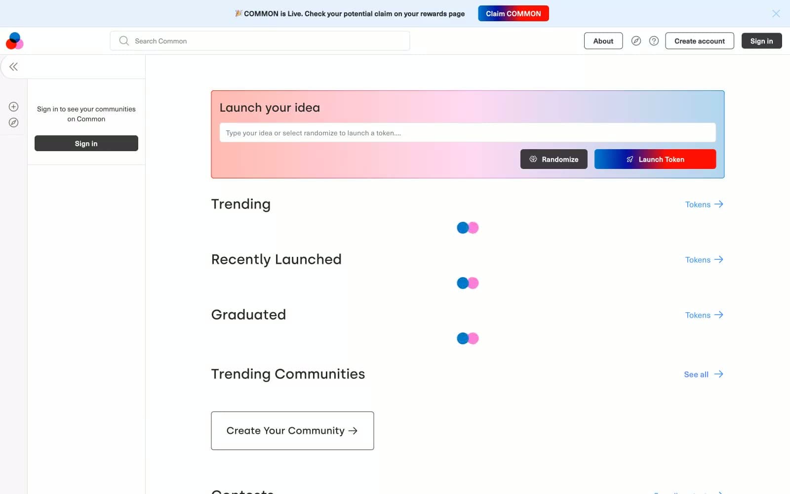
Common design system

Brand3
Link text, icon dots, chromatic borders — the blue half of the system, used to mark tokens, active links, and the start of gradients
Outlined action border, secondary link accent — appears as a stroke on ghost controls and as the mid-stop in gradient transitions
Blue wash for highlight backgrounds, decorative bands, and soft emphasis behind content. Do not promote it to the primary CTA color
Accent1
Hero card gradient — soft translucent wash from ember through pink to cobalt, a 30% opacity field that sits behind the launch prompt
Neutrals9
Body text, structural hairlines, dark icon strokes — the universal ink that defines every other element on the page
Deepest text tier for high-emphasis labels over light surfaces
Heavy icon borders, strong dividers, secondary structural lines that need more weight than #000 hairline
Primary action button fill — the dark solid button (Sign in, Randomize); slightly lifted from pure black to read as a surface, not absence
Muted icon strokes, inactive nav borders, secondary metadata
Card borders — a half-step lighter than the structural hairline, used to separate stacked cards from the canvas
Input borders, subtle dividers between content bands
Body background wash, second surface tier below cards
Page canvas, card surfaces, input fields, button text on dark fills
Try a pairing
Pick any two colors from the palette to check whether text stays readable on top.
Aa
Carbon on Cobalt Pulse
6.51 : 1 contrast
- Body textPasses AA 4.5
- Large textPasses AA 3
- StrictFails AAA 7
More DESIGN.md files. Same web, different personalities.
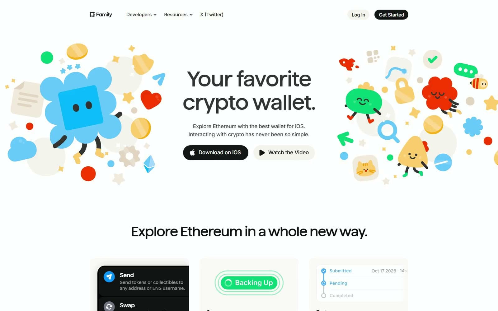
Family
Crypto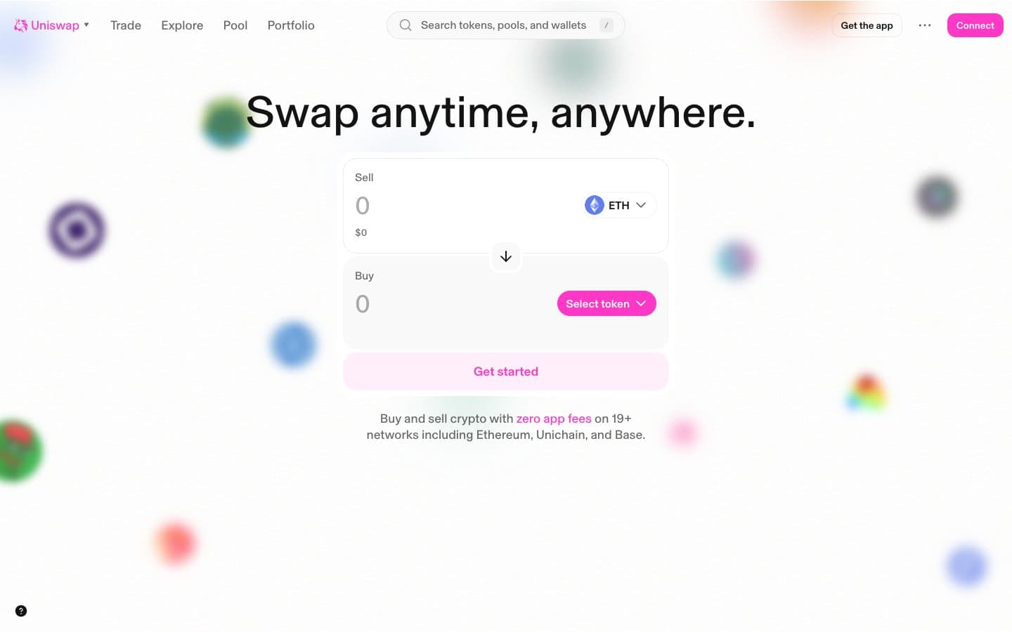
Uniswap
Crypto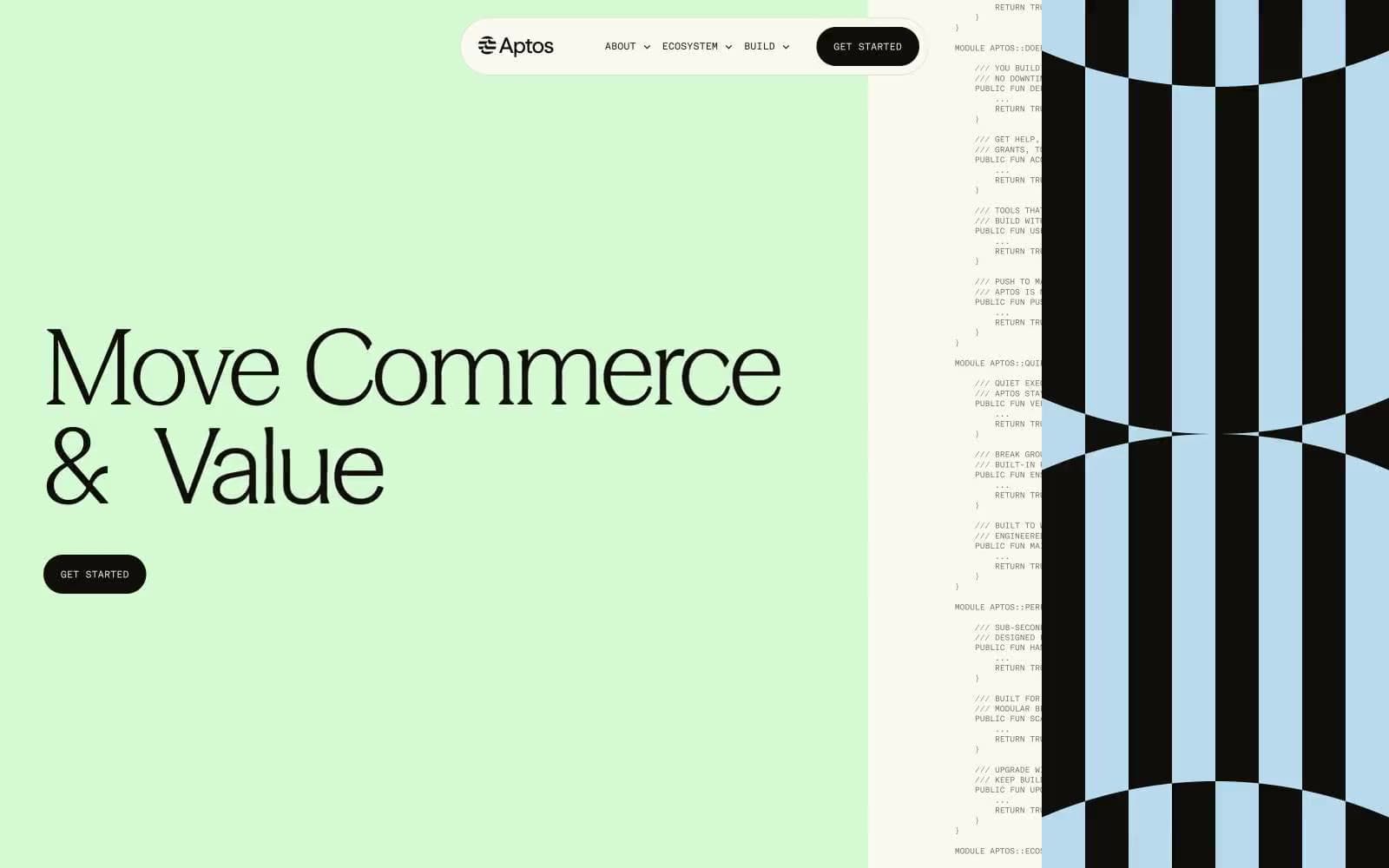
Aptos Network
Crypto
Base
Crypto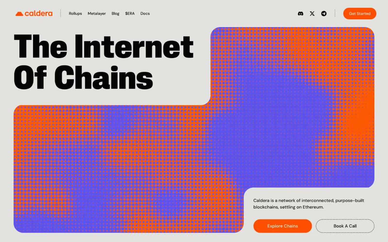
Caldera
Crypto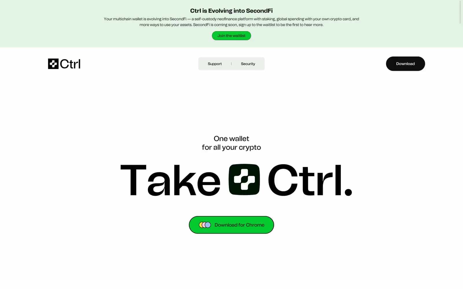
Ctrl Wallet
Crypto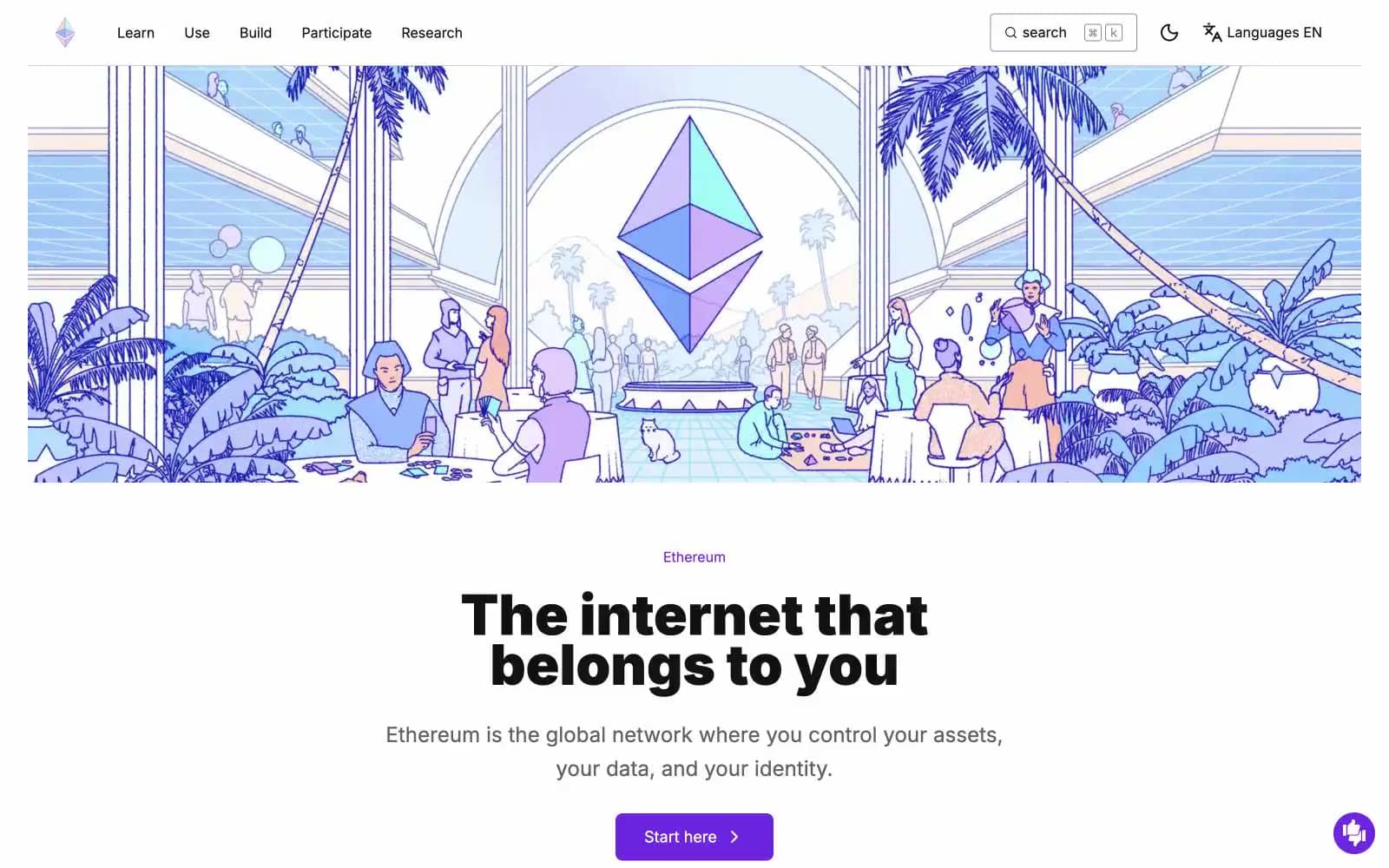
ethereum.org
Crypto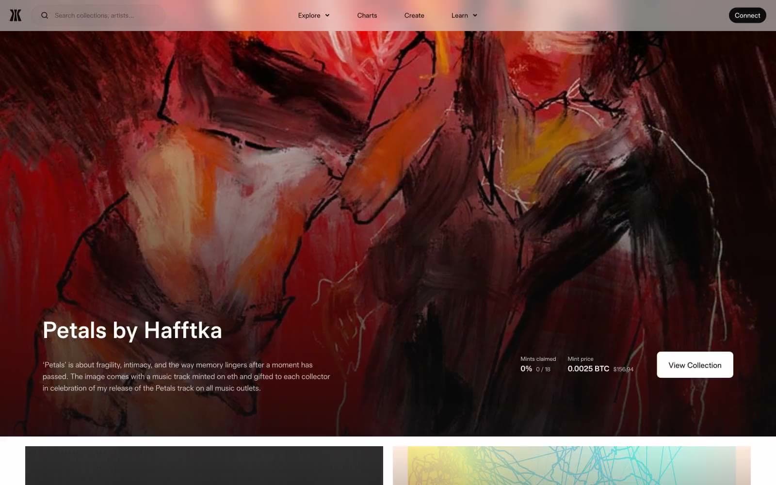
Gamma
Crypto
Glow
Crypto
Kraken
Crypto
Lens
Crypto
Sequence
Crypto


