
Kraken. A precise financial document where one electric purple ink does all the talking.
- Crypto
- Light theme
- 15 colors
- 3 typefaces
Kraken is a light-mode crypto exchange interface that reads like a precise financial ledger: a near-white canvas (#ffffff, #f6f5f9), near-black typography (#101114) at very high contrast, and one signature violet (#7132f5) that appears sparingly as brand punctuation on headlines, icons, links, and the primary action. Surfaces stay almost weightless — cards float on a barely-there 3% black shadow with 4px/24px blur rather than hard borders, so the whole UI feels printed rather than boxed. The system uses two custom typefaces: Kraken-Product (400/500) for all UI and body text from 10–16px, and Kraken-Brand (400/700) for 20–48px display with tight negative tracking (-0.0210em to -0.0140em) that compresses headlines into a confident, compact block. Information density is high and deliberately so: nav bars, asset tickers, stat grids, and news cards pack together with 12px gutters, letting the white space between sections do the breathing.
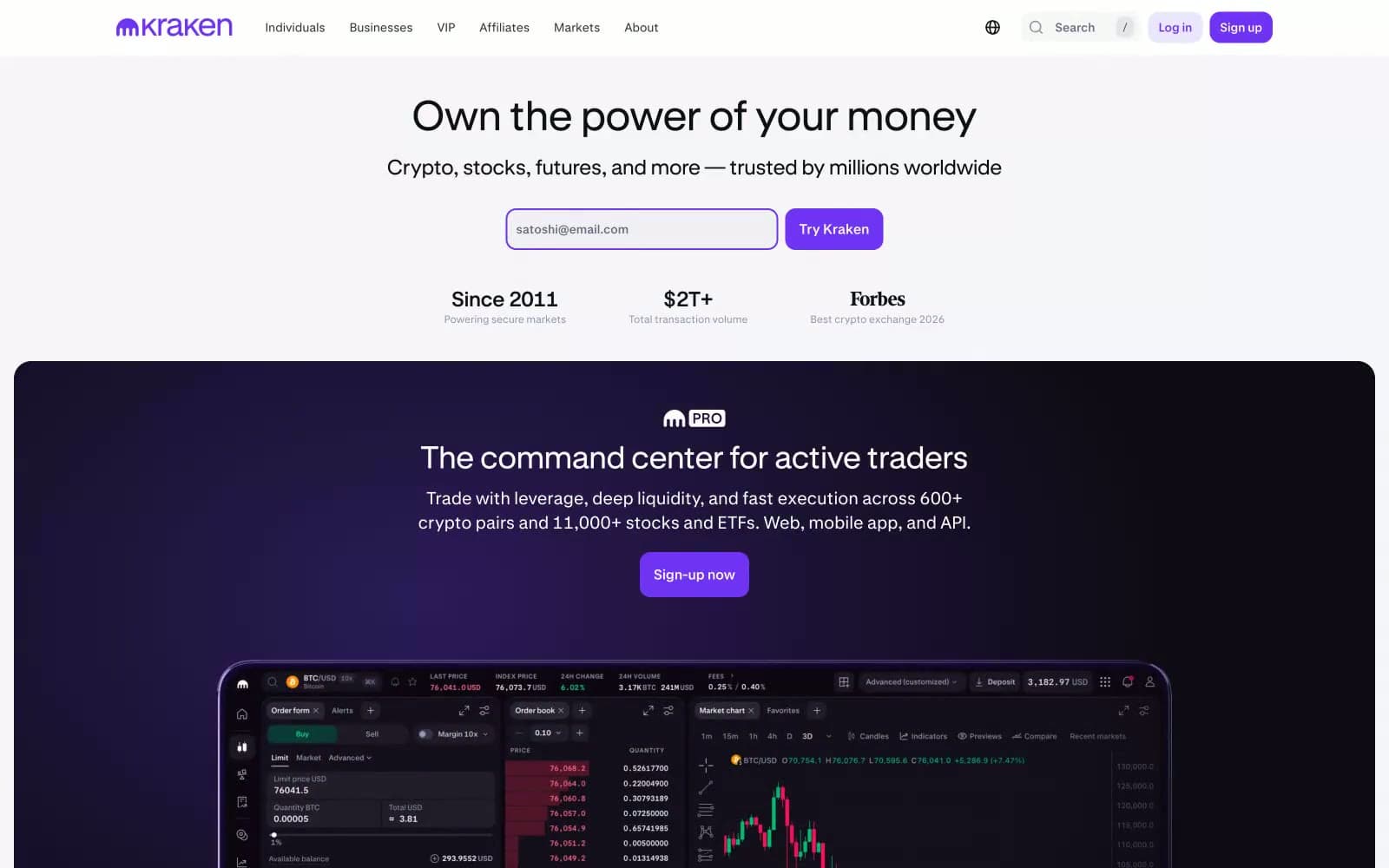
Kraken design system

Brand3
Violet supporting accent for decorative details and low-frequency emphasis. Do not promote it to the primary CTA color
Dark surface backing for the brand radial gradient and darker brand moments
Dark surface backing paired with violet gradients, section-level dark accents
Accent5
Soft violet-tinted background for ghost buttons and tag highlights
Green supporting accent for decorative details and low-frequency emphasis. Use as a supporting accent, not as a status color
Light supporting surface for subtle backgrounds and section separation. Use as a supporting accent, not as a status color
Red supporting accent for decorative details and low-frequency emphasis. Use as a supporting accent, not as a status color
Green supporting accent for decorative details and low-frequency emphasis. Use as a supporting accent, not as a status color
Neutrals7
Primary text, headlines, icon strokes, and input borders — the dominant ink at 18,000+ occurrences
Hover and active states on dark elements, deep nav accents
Secondary body text, icon tints, muted nav labels, secondary button text
Tertiary text and low-emphasis icon strokes
Hairline dividers and disabled button borders
Subtle off-white for alternating section bands and the hero background tint
Page canvas, card surfaces, input fills, and button text
Try a pairing
Pick any two colors from the palette to check whether text stays readable on top.
Aa
Pure White on Kraken Violet
6.04 : 1 contrast
- Body textPasses AA 4.5
- Large textPasses AA 3
- StrictFails AAA 7
More DESIGN.md files. Same web, different personalities.
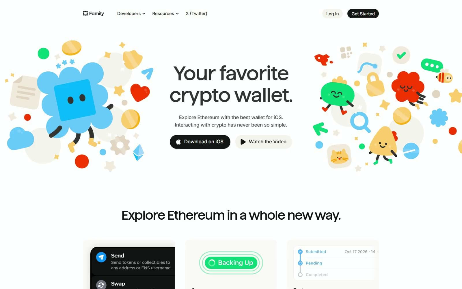
Family
Crypto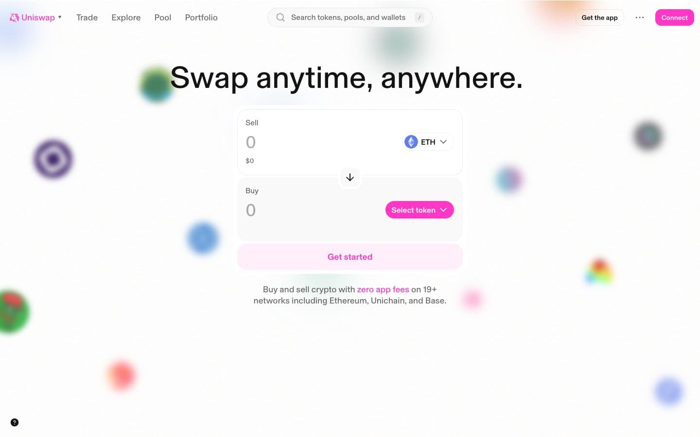
Uniswap
Crypto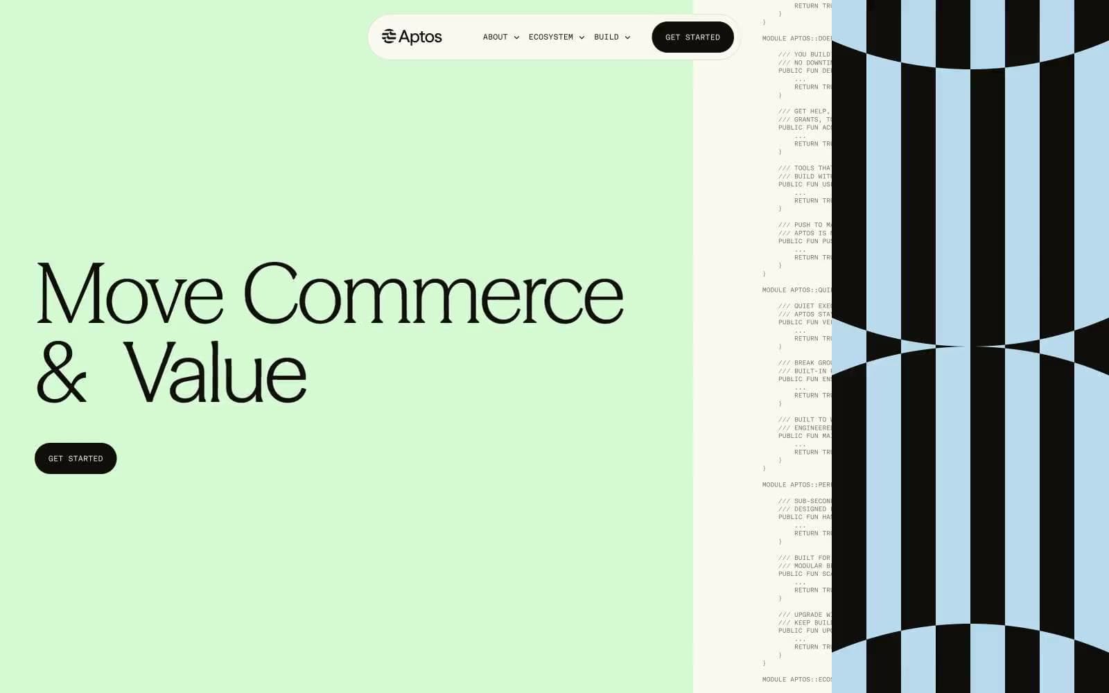
Aptos Network
Crypto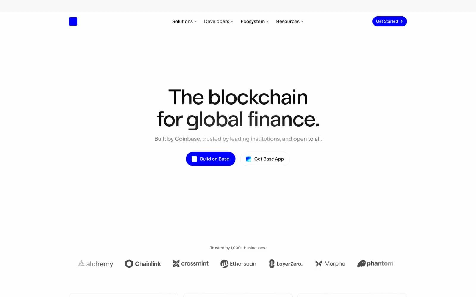
Base
Crypto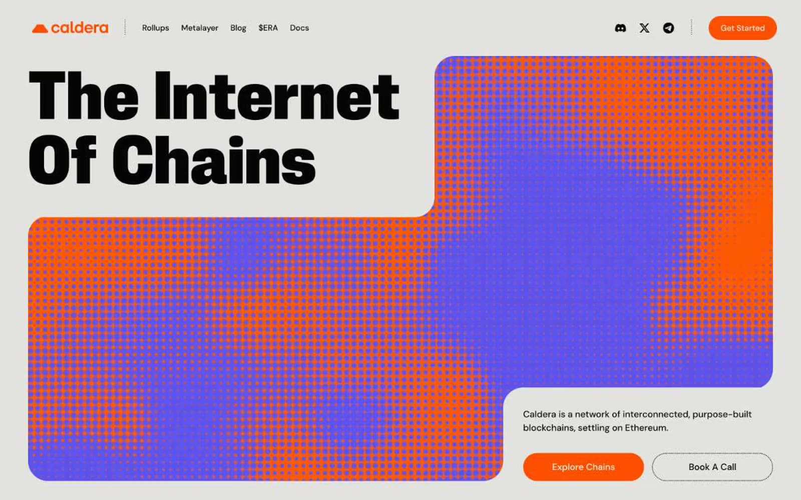
Caldera
Crypto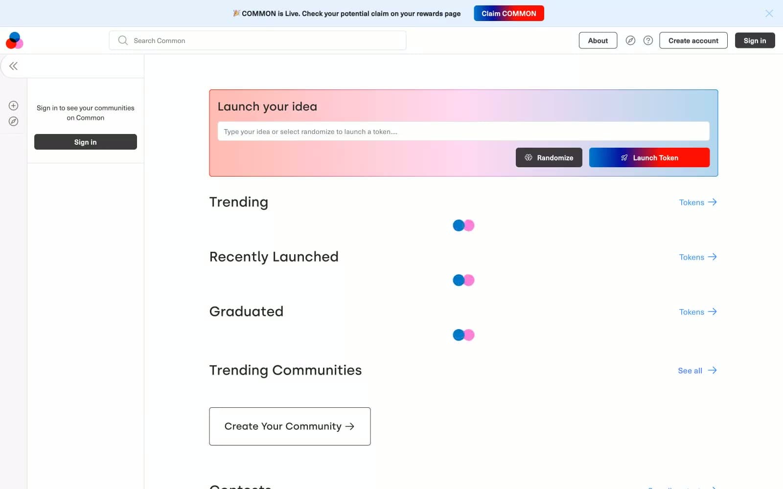
Common
Crypto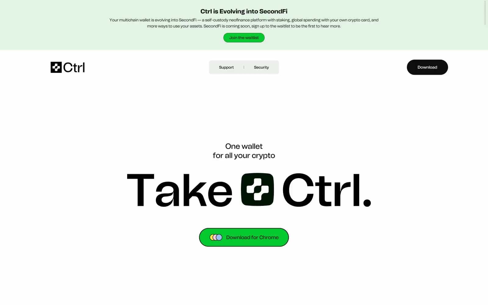
Ctrl Wallet
Crypto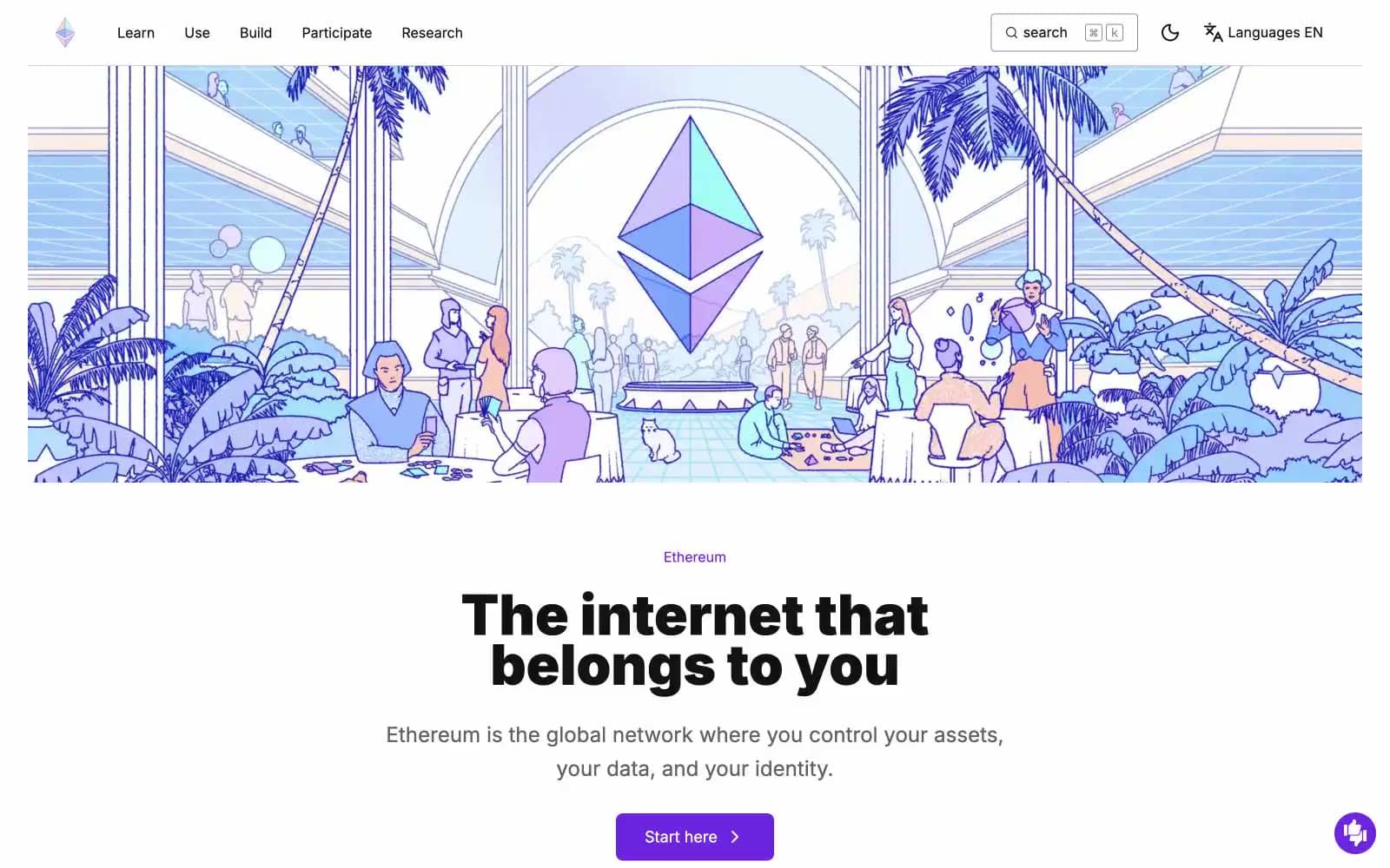
ethereum.org
Crypto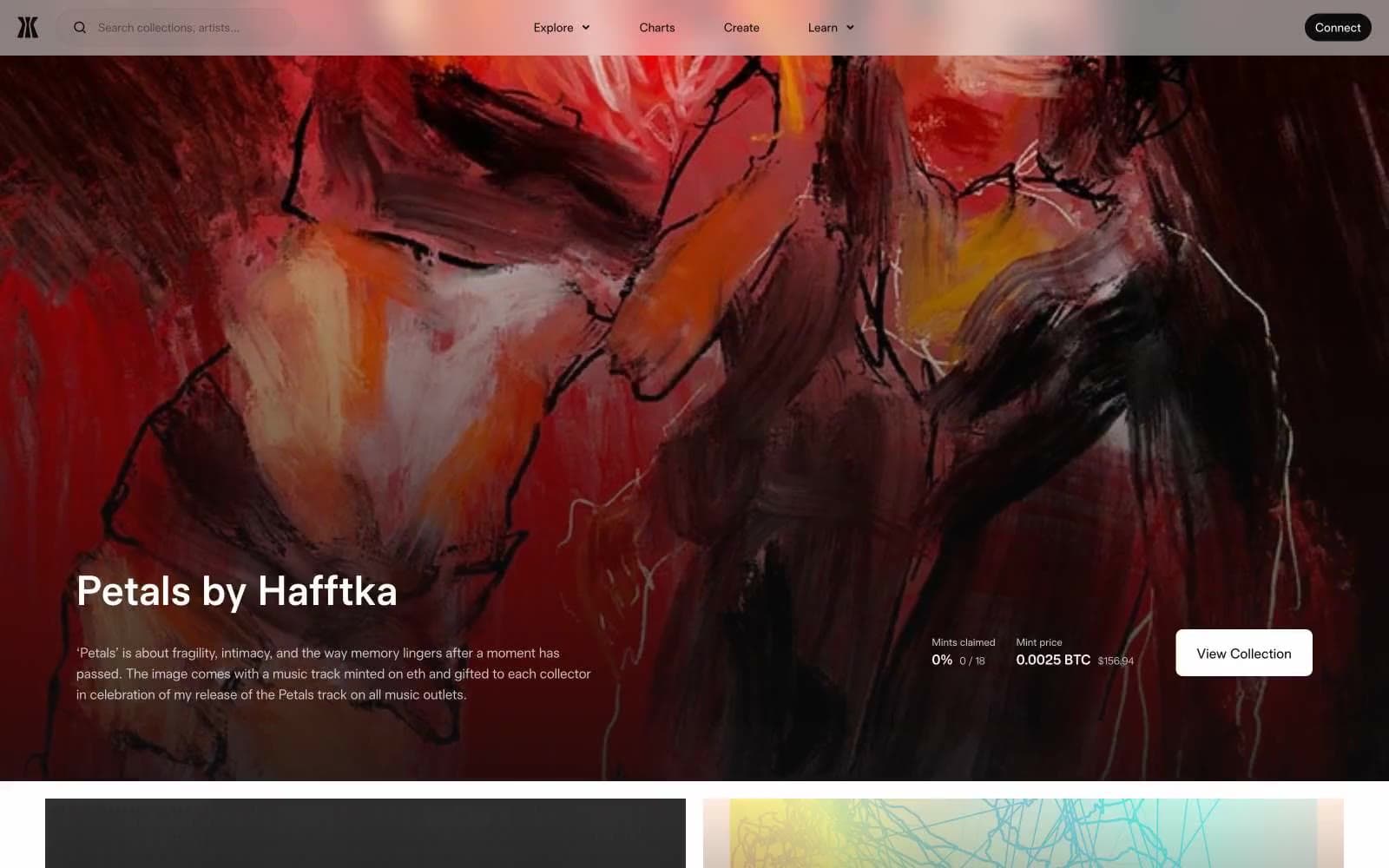
Gamma
Crypto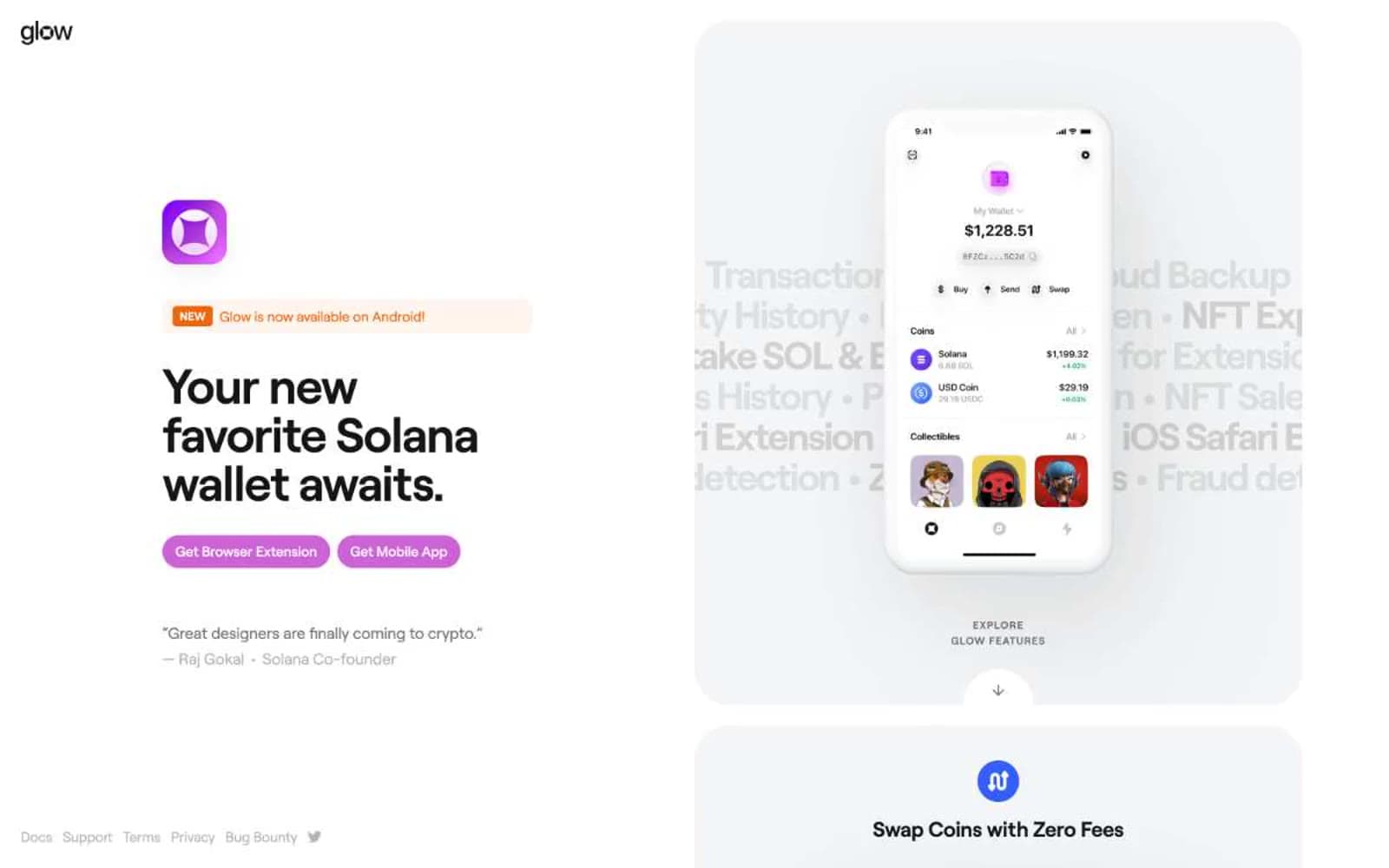
Glow
Crypto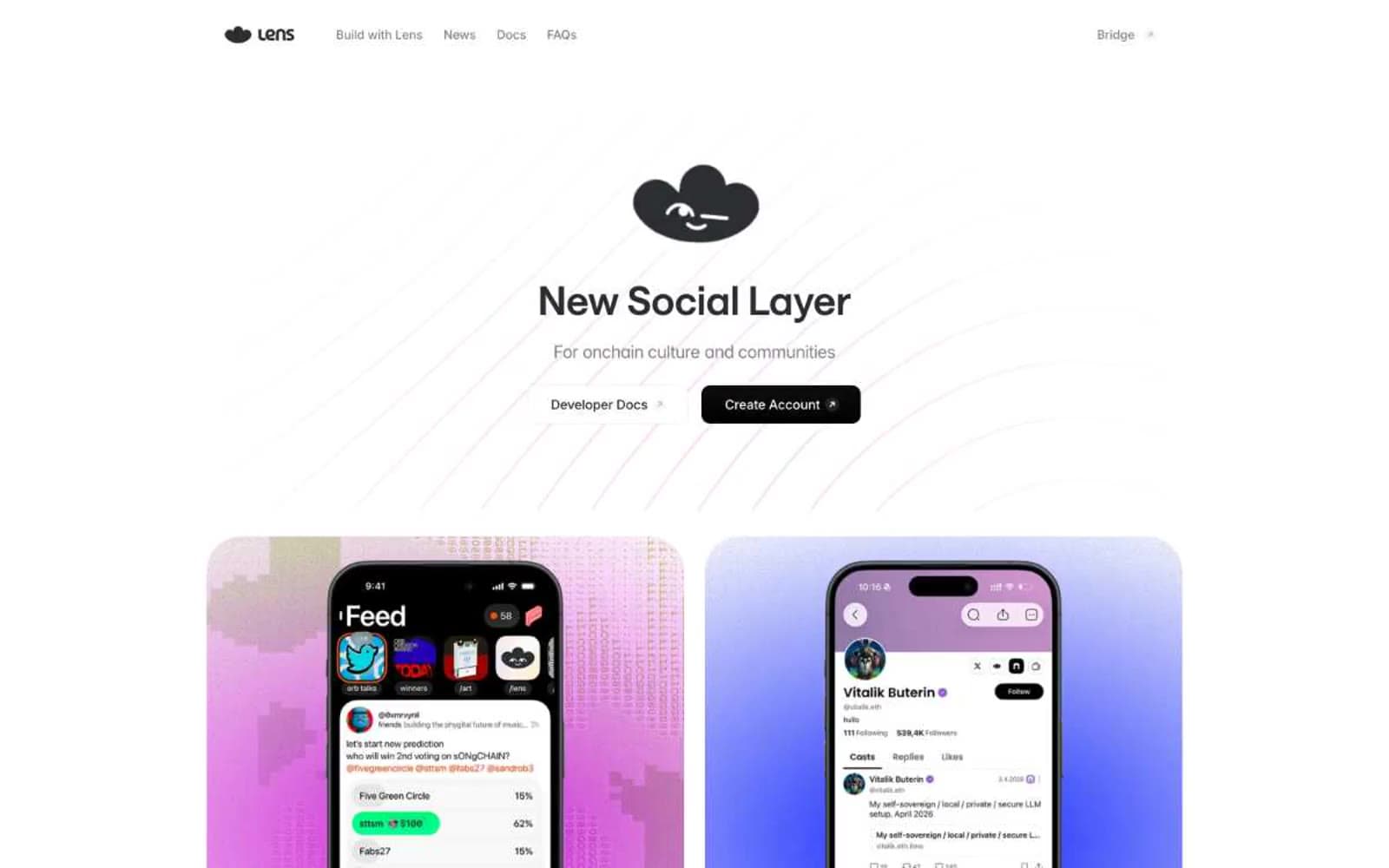
Lens
Crypto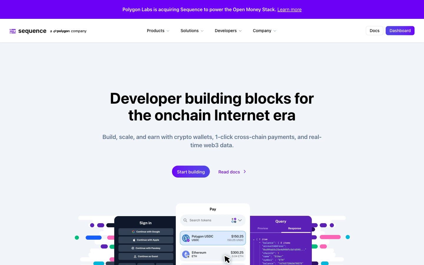
Sequence
Crypto


