
Uniswap. Pink confetti over a clean white trading desk.
- Crypto
- Light theme
- 16 colors
- 1 typeface
Uniswap's interface is a bright, mostly flat white canvas interrupted by one saturated hot-pink accent and scattered colorful decorative orbs that give the experience a playful, confetti-like atmosphere. The system deliberately rejects the dark-mode crypto convention in favor of an airy, almost editorial feel where the swap widget sits front-and-center as a quiet white card and the pink (#ff37c7) does all the expressive work — marking the primary action, the brand mark, and the only chromatic decision an interface designer needs to make. Typography is handled by a single custom face (Basel) at unusual mid-weights (485, 535) with tight tracking across all sizes, producing a geometric, slightly clinical tone that keeps the product feeling like a serious financial tool despite the candy-colored hero. Surfaces are nearly shadowless — the only elevation in the system is a barely-visible 10% black blur — and everything is separated by hairline borders and generous whitespace rather than stacked panels. The rainbow of secondary hues (#ff4d00, #2abdff, #00c3a0, #8251fb, etc.) functions as a token/asset taxonomy rather than a UI accent system, meaning most new screens should stay achromatic with pink as the sole chromatic verb.
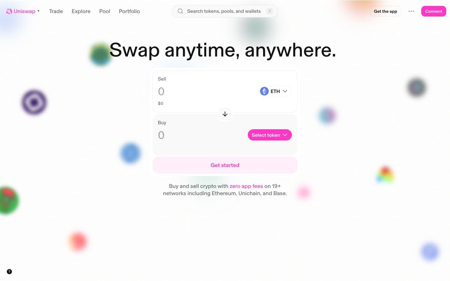
Uniswap design system

Brand1
Primary brand mark, filled CTA buttons, active nav indicator, and the only chromatic color an interface should use — saturated hot-pink against a white canvas creates instant focal hierarchy without darkening the page
Accent8
Primary page canvas and white card surfaces. Do not promote it to the primary CTA color
Orange decorative accent for icons, marks, and small graphic details
Token/asset category color for violet-branded assets and decorative purple orbs
Token/asset category color for pink-branded assets and decorative orbs (a slightly different pink from the brand)
Token/asset category color for blue-branded assets and decorative orbs
Token/asset category color for teal-branded assets and decorative orbs
Red decorative accent for icons, marks, and small graphic details. Use as a supporting accent, not as a status color
Green decorative accent for icons, marks, and small graphic details. Use as a supporting accent, not as a status color
Neutrals7
Dark borders and separators for elevated surfaces and inverted UI. Do not promote it to the primary CTA color
Dark borders and separators for elevated surfaces and inverted UI.
Secondary structural border and text variant used in nav and button outlines where slightly softer than Midnight Ink is desired
Dark borders and separators for elevated surfaces and inverted UI.
Disabled states, placeholder text, hairline icon borders, and the lightest visible UI elements
Disabled button borders and the faintest possible surface separation
Page canvas, card surfaces, input fields, and text on pink buttons — the structural base everything sits on
Try a pairing
Pick any two colors from the palette to check whether text stays readable on top.
Aa
True Black on Uniswap Pink
6.62 : 1 contrast
- Body textPasses AA 4.5
- Large textPasses AA 3
- StrictFails AAA 7
More DESIGN.md files. Same web, different personalities.
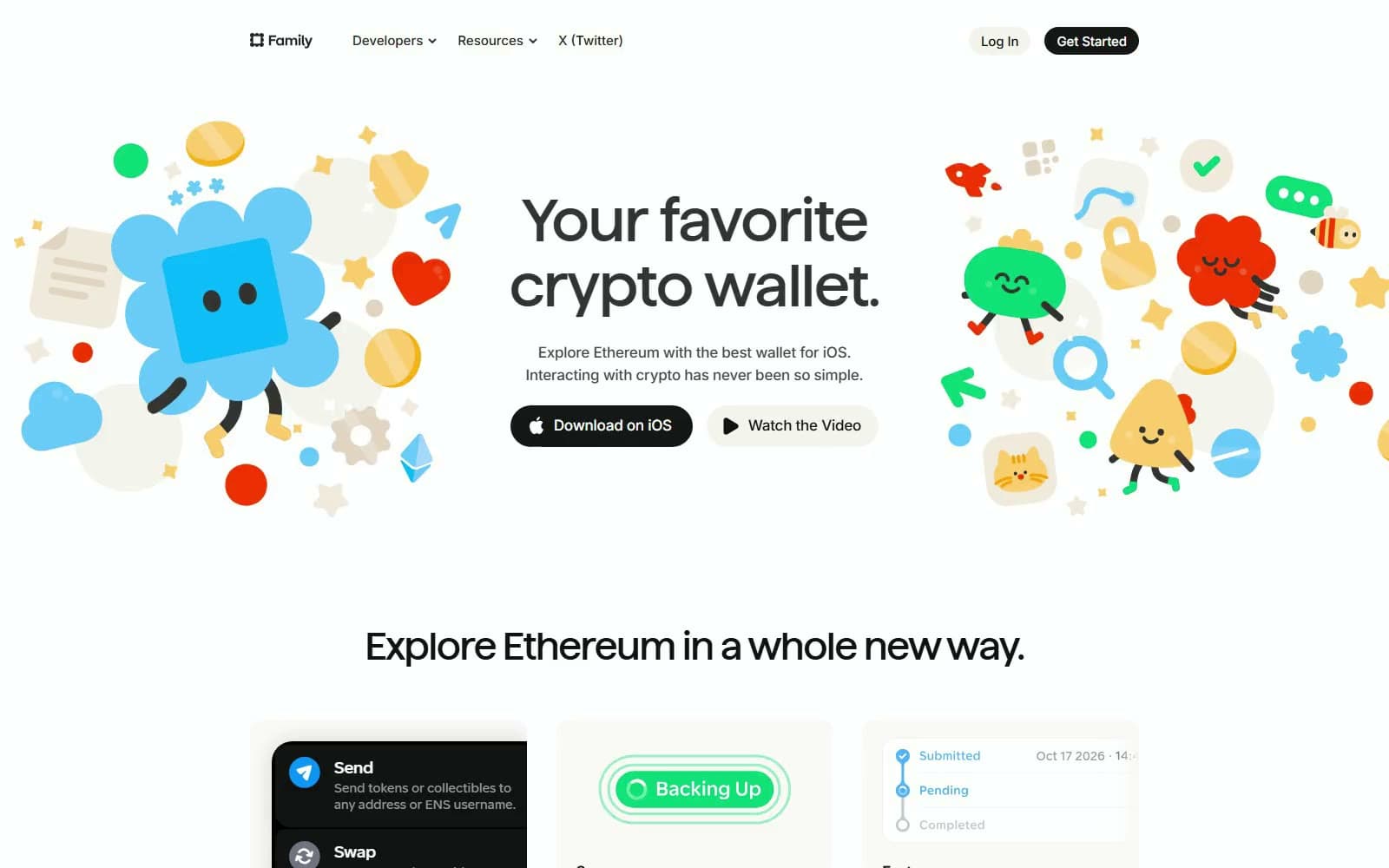
Family
Crypto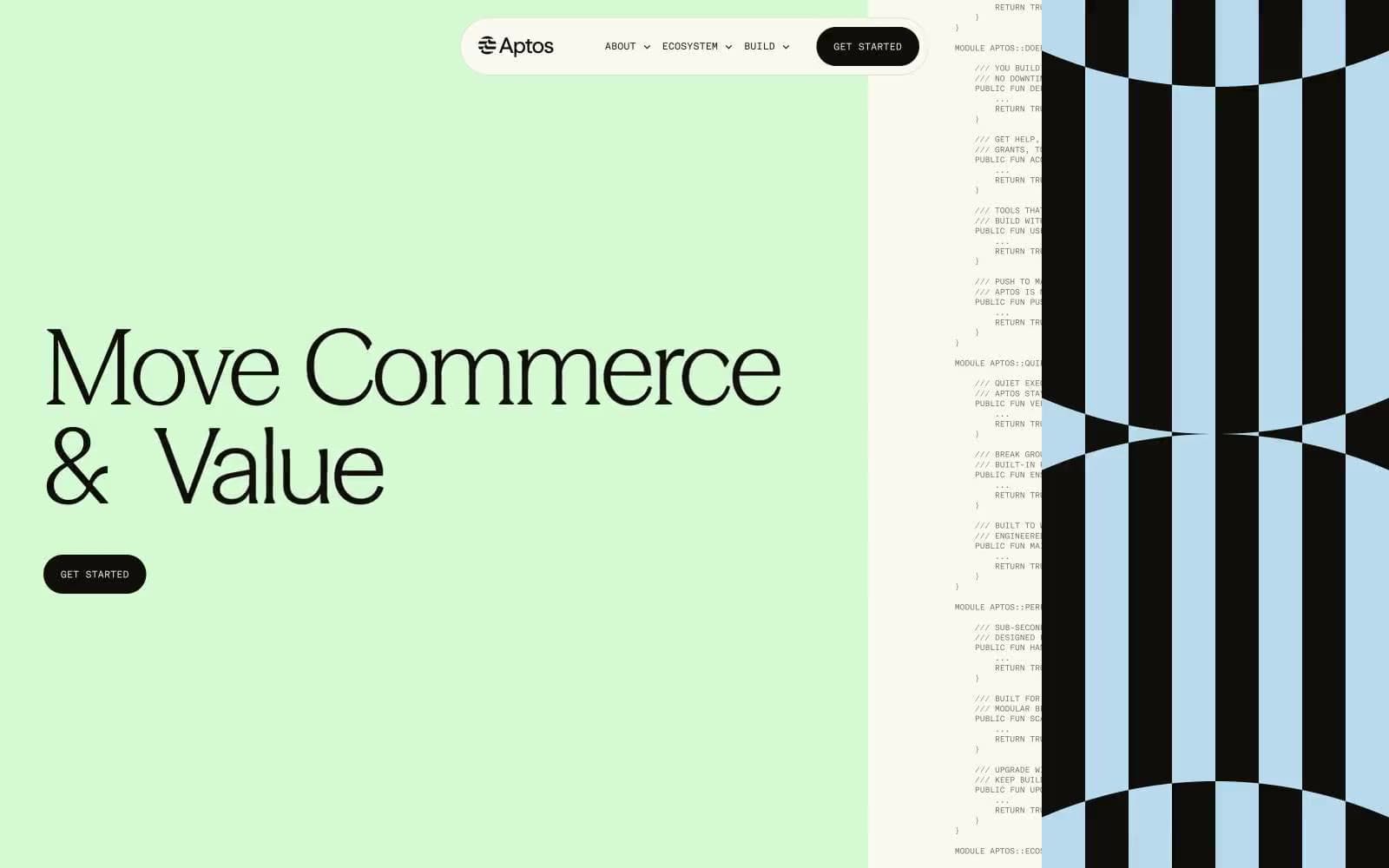
Aptos Network
Crypto
Base
Crypto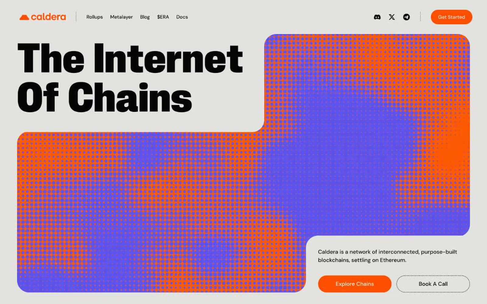
Caldera
Crypto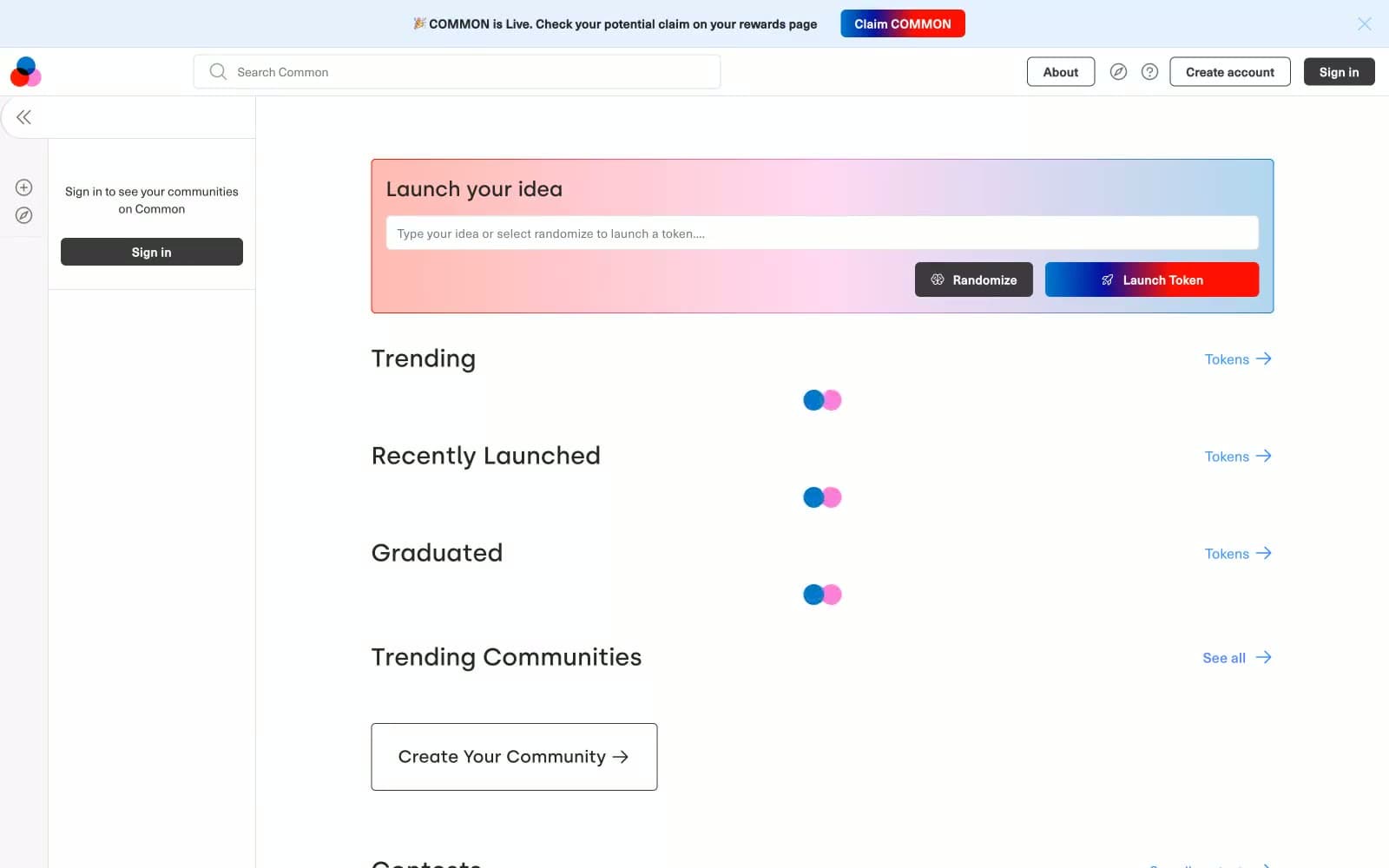
Common
Crypto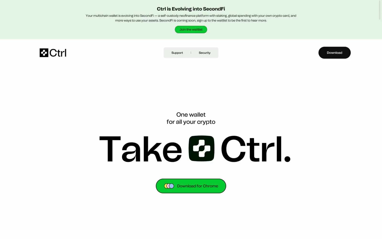
Ctrl Wallet
Crypto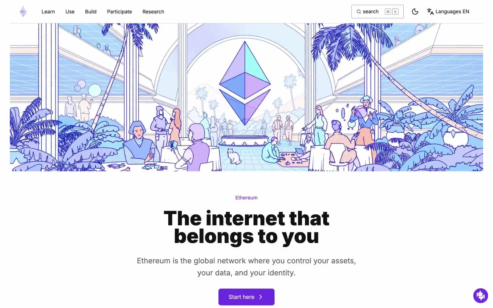
ethereum.org
Crypto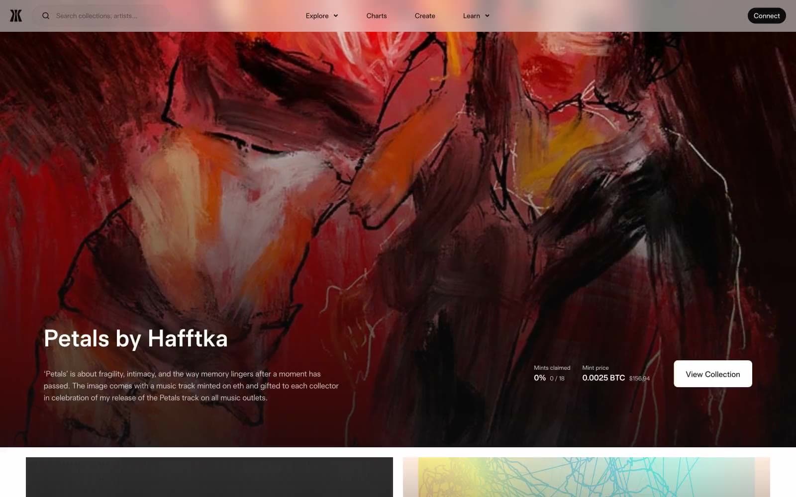
Gamma
Crypto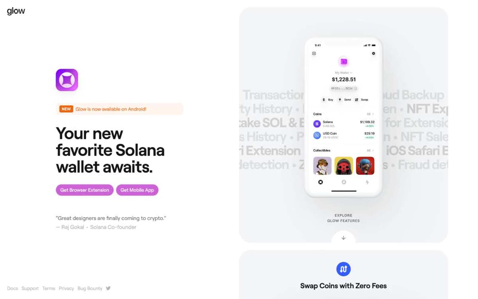
Glow
Crypto
Kraken
Crypto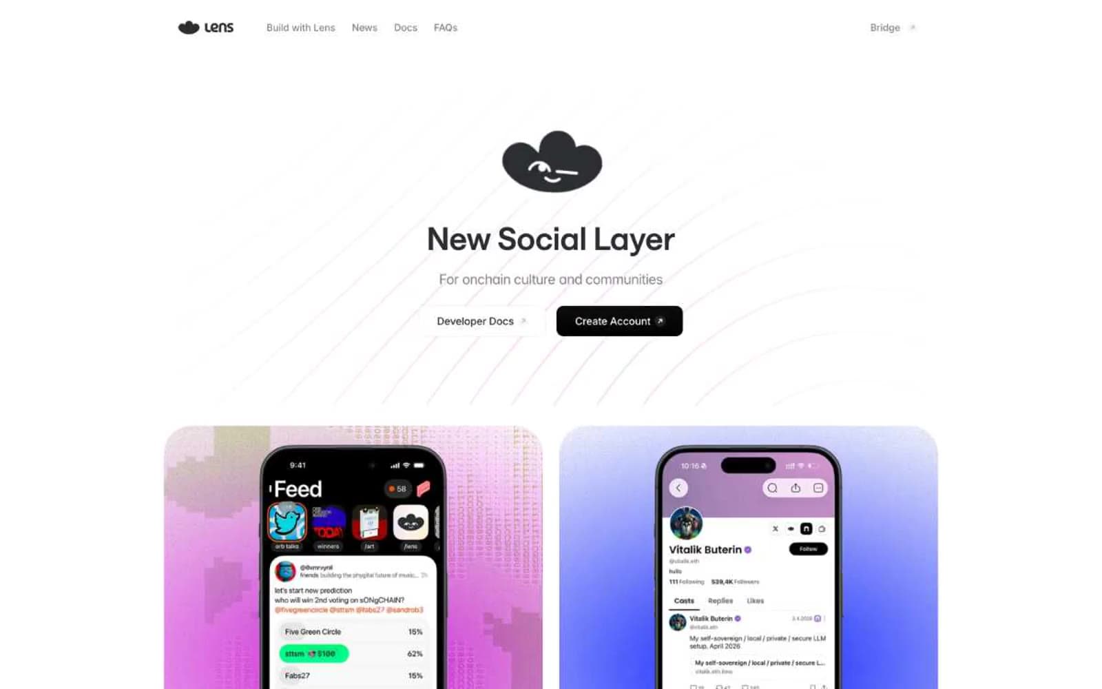
Lens
Crypto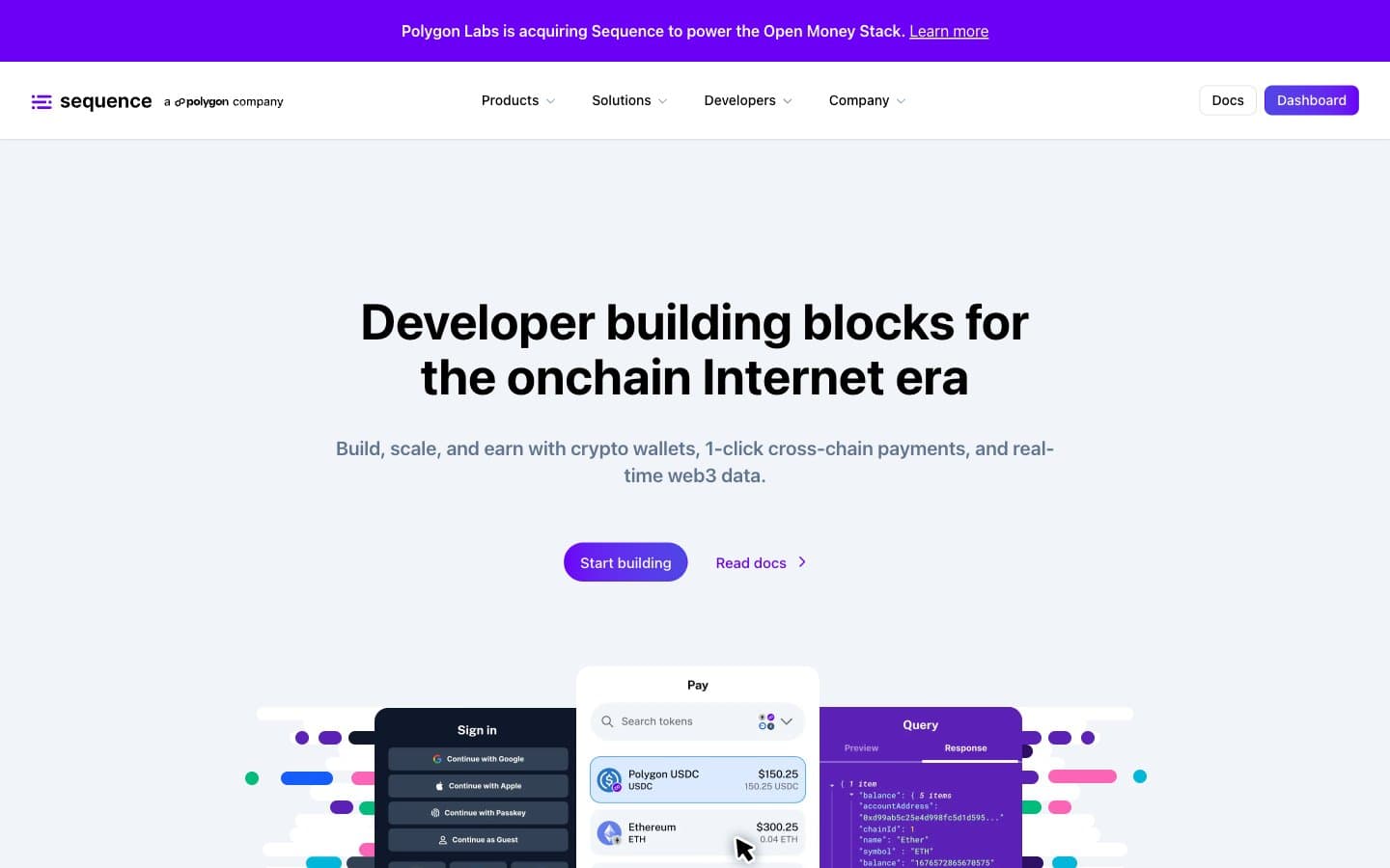
Sequence
Crypto


