
Lens. A single teal CTA floating in a sea of quiet graphite and pale gray.
- Crypto
- Light theme
- 10 colors
- 2 typefaces
Lens Protocol reads as a quiet developer platform: white paper background, a single cloud-black logo mark, and one mint-teal accent that powers every interactive surface. The system is overwhelmingly achromatic — graphite type on white with a pale neutral mid-gray border palette — so the teal CTA feels switched on rather than decorative. Pill-shaped controls (50px radius) dominate over square cards (16px), creating a soft, rounded interaction language. Feature cards use faint pastels (peach, mint, lavender, periwinkle) as backdrops for small monochrome icons, giving each capability its own colored tile without ever breaking the achromatic system. Typography pairs Saans (a humanist display sans with ss01 alternates) for headings and Inter for utility text, with both using tight negative tracking that makes the type feel engineered rather than editorial.
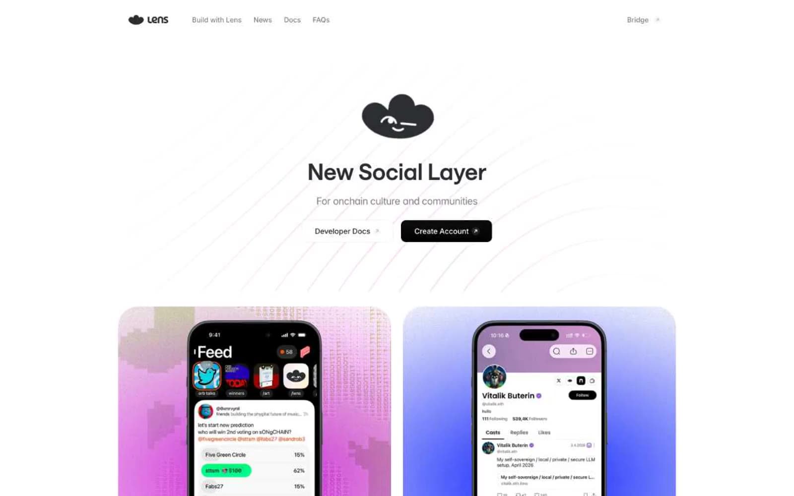
Lens design system

Brand1
Primary CTA fill, active nav indicator, link accent on dark — vivid teal against white creates the only chromatic punctuation in the system
Accent4
Supporting palette color for small decorative accents when the core palette needs contrast.
Supporting palette color for small decorative accents when the core palette needs contrast.
Supporting palette color for small decorative accents when the core palette needs contrast.
Supporting palette color for small decorative accents when the core palette needs contrast.
Neutrals5
Body text at high contrast, deep surface text — warmer alternative to Graphite for long-form copy
Primary text, heading strokes, icon fills, button borders — the near-black workhorse, kept slightly warm to avoid a cold digital feel
Secondary text, helper copy, muted borders — sits between Graphite and Silver for tertiary hierarchy
Hairline borders, dividers, disabled states, icon outlines — the workhorse neutral border, freq=808 makes it the most-used color in the system
Page canvas, card surface, input field, filled-on-accent button text
Try a pairing
Pick any two colors from the palette to check whether text stays readable on top.
Aa
Carbon Black on Mint Signal
7.91 : 1 contrast
- Body textPasses AA 4.5
- Large textPasses AA 3
- StrictPasses AAA 7
More DESIGN.md files. Same web, different personalities.
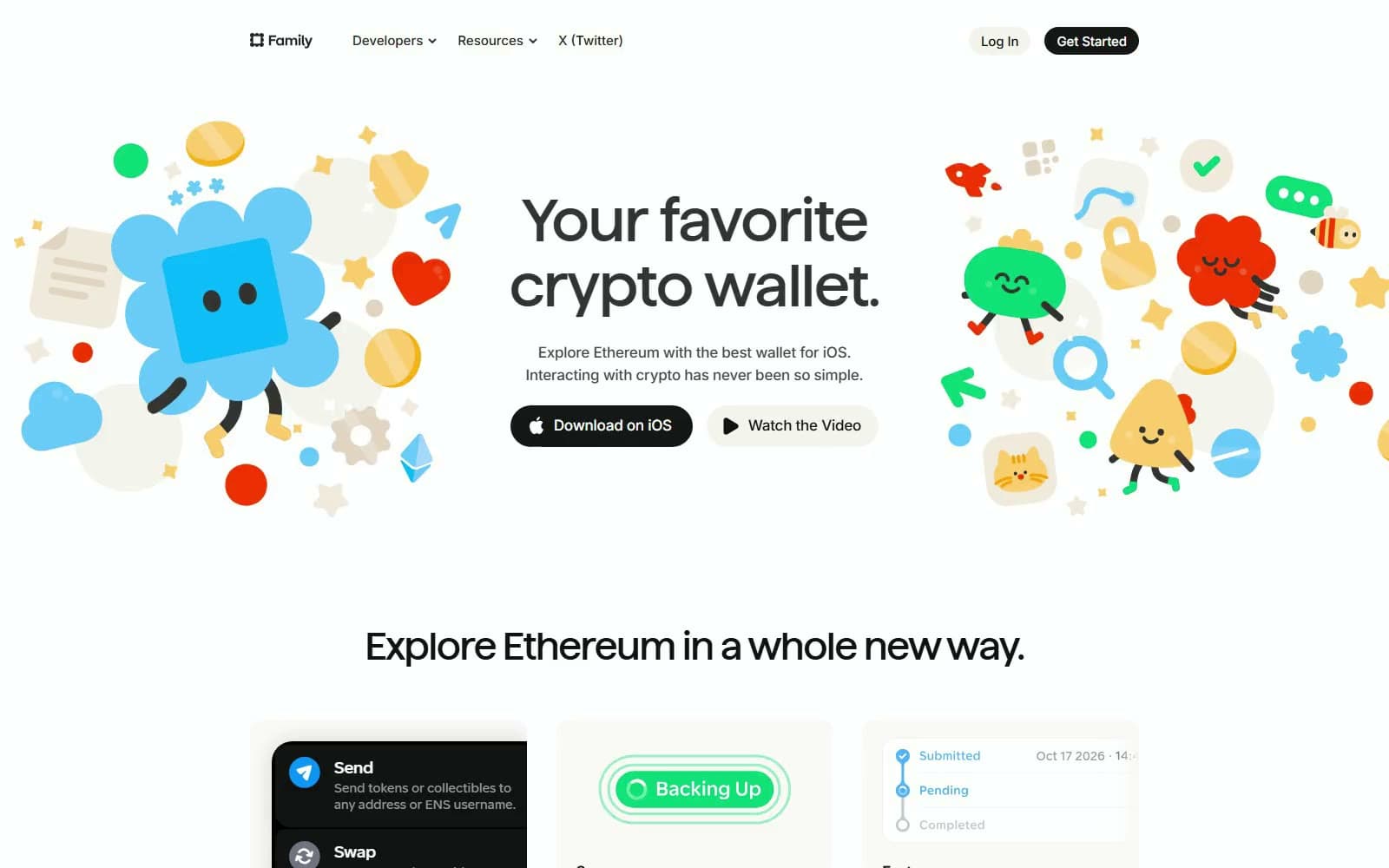
Family
Crypto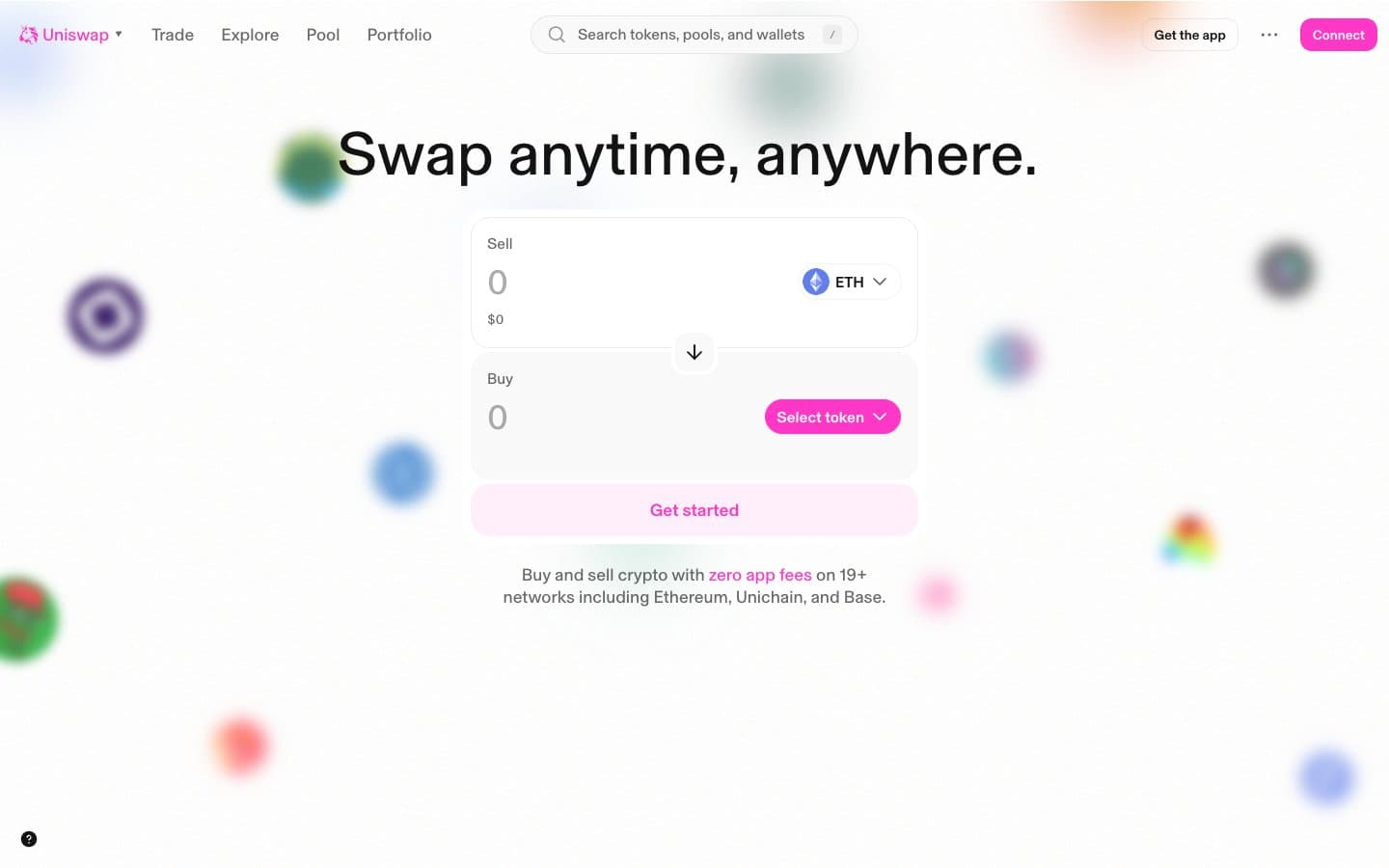
Uniswap
Crypto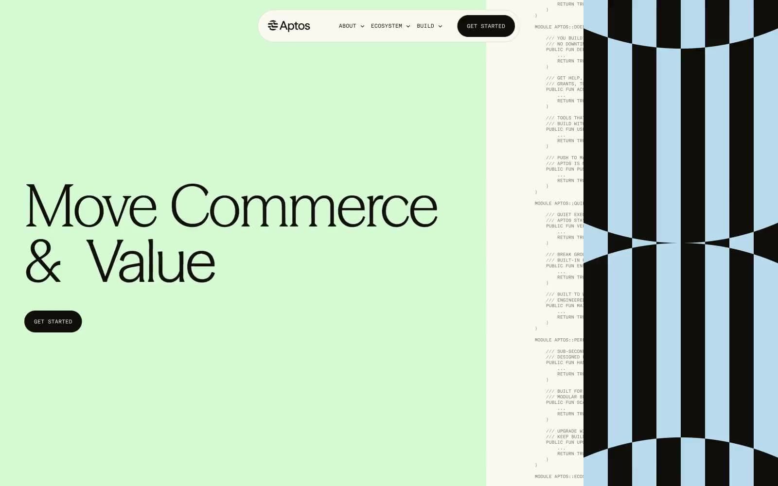
Aptos Network
Crypto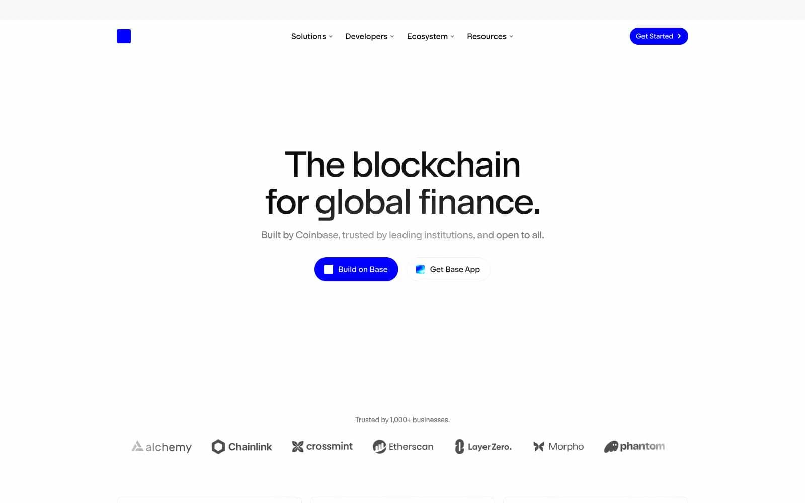
Base
Crypto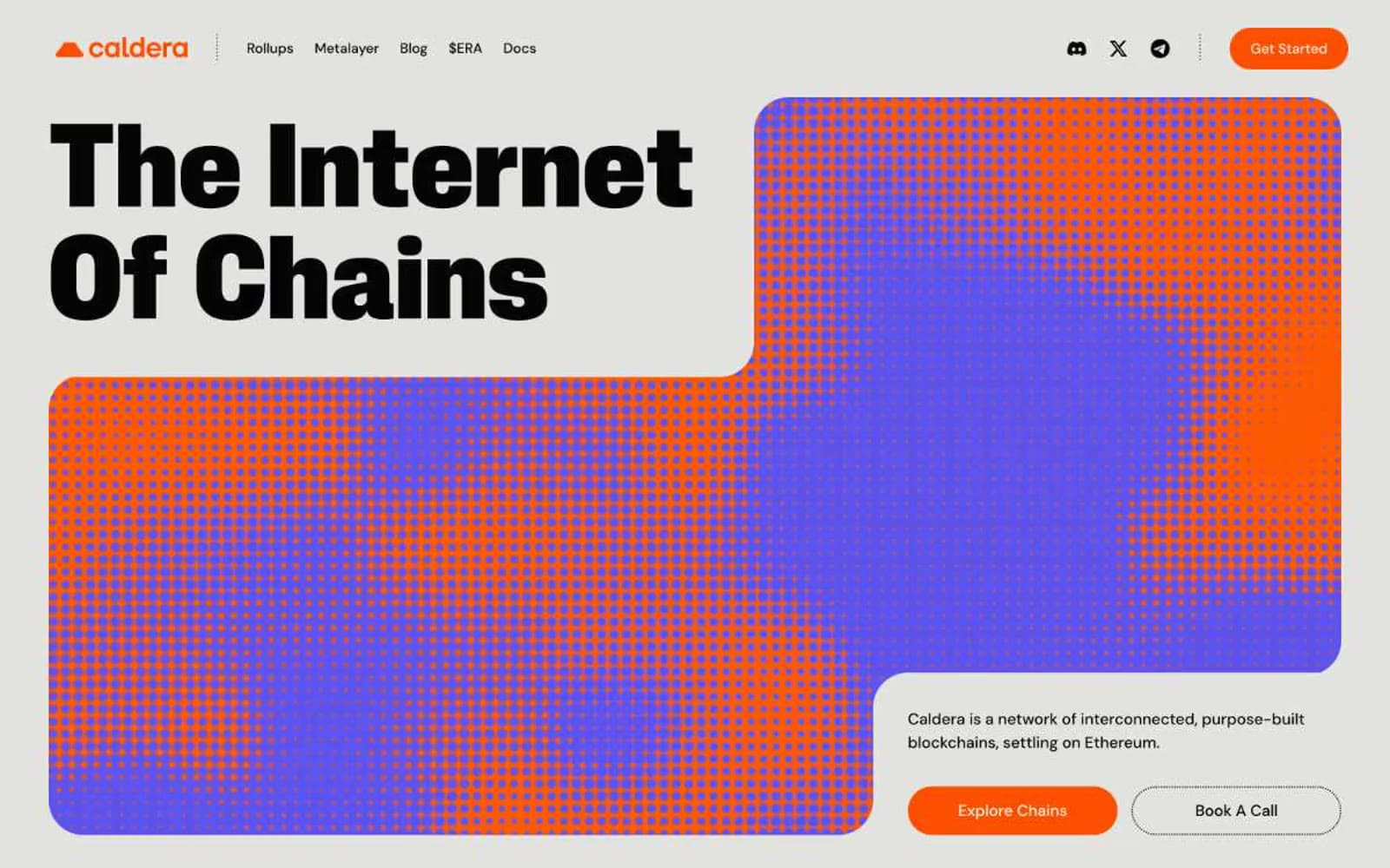
Caldera
Crypto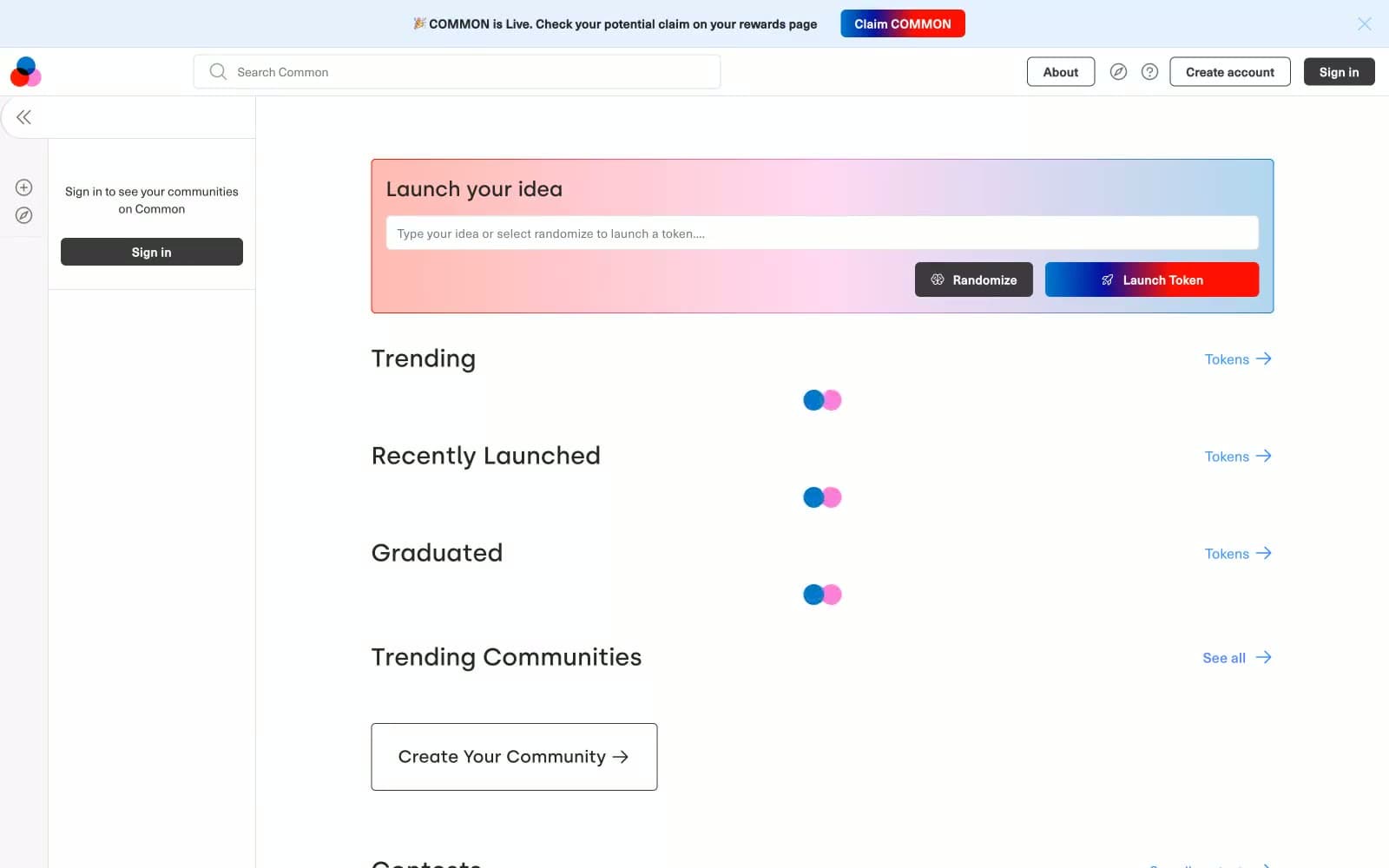
Common
Crypto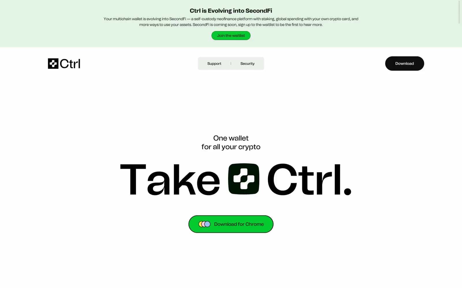
Ctrl Wallet
Crypto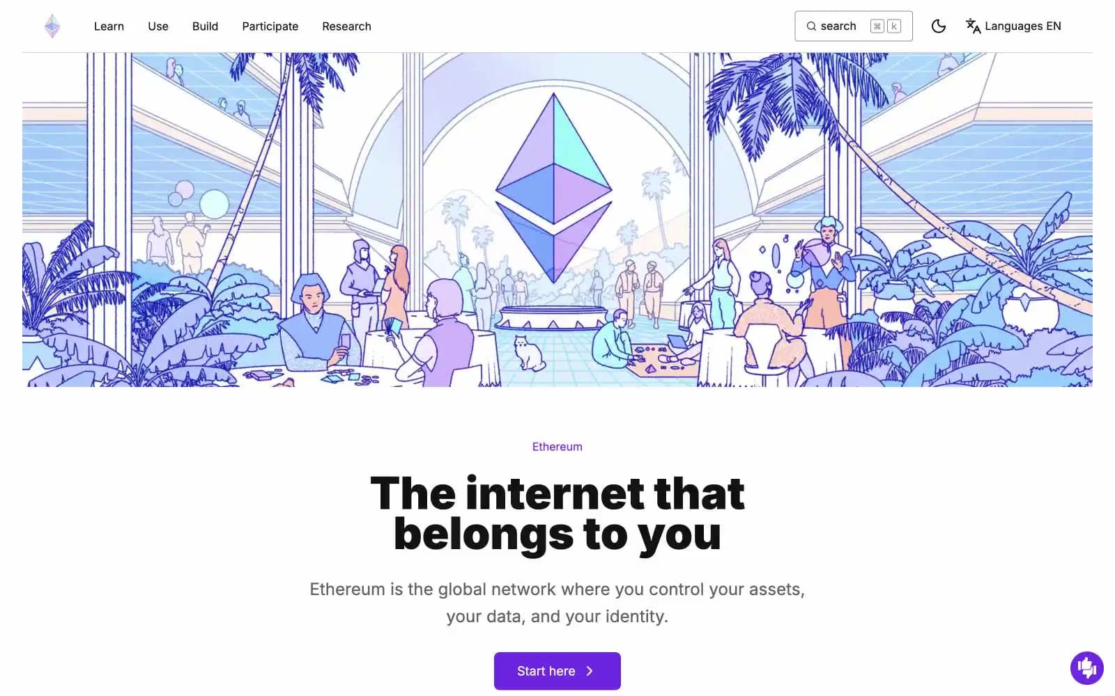
ethereum.org
Crypto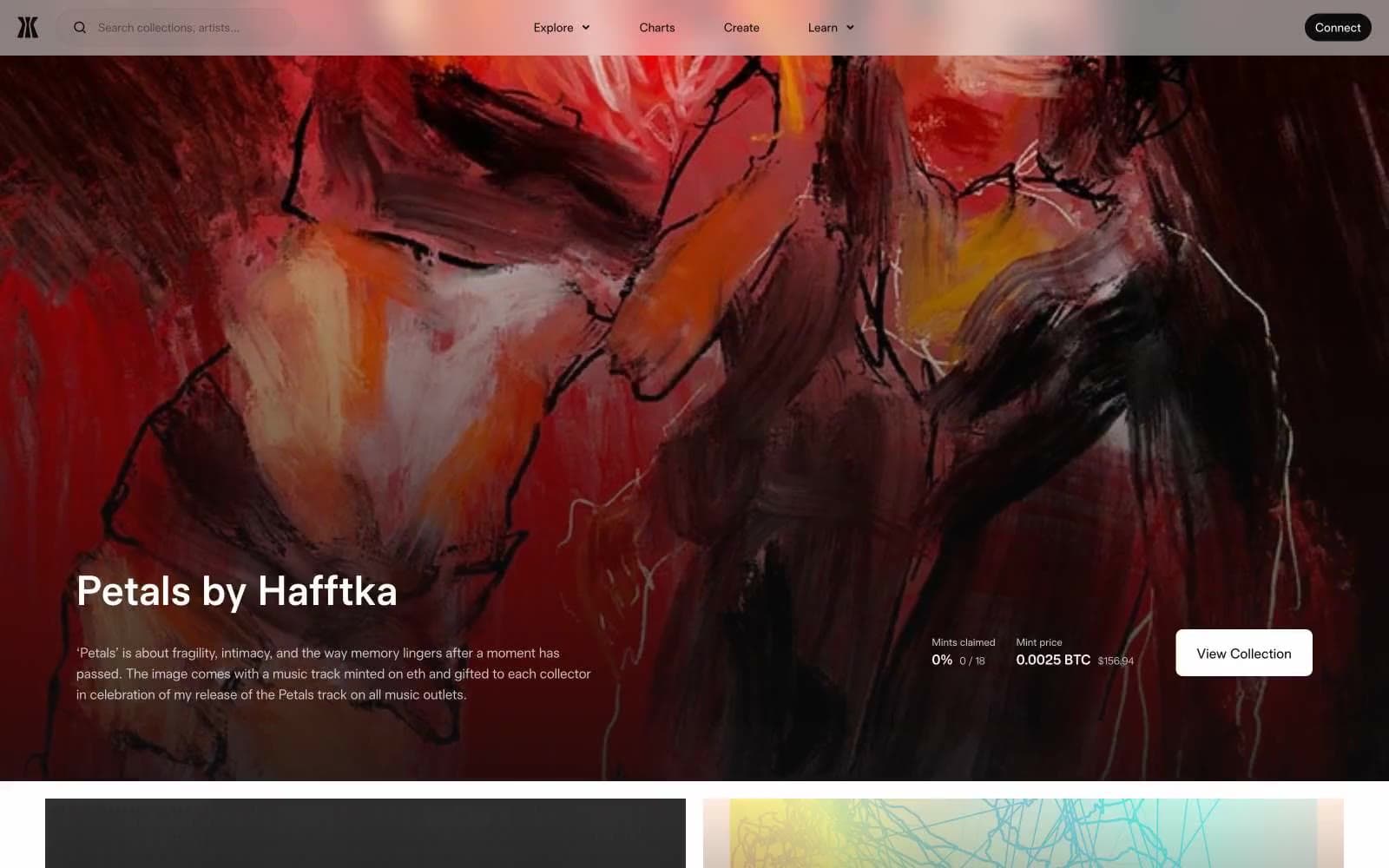
Gamma
Crypto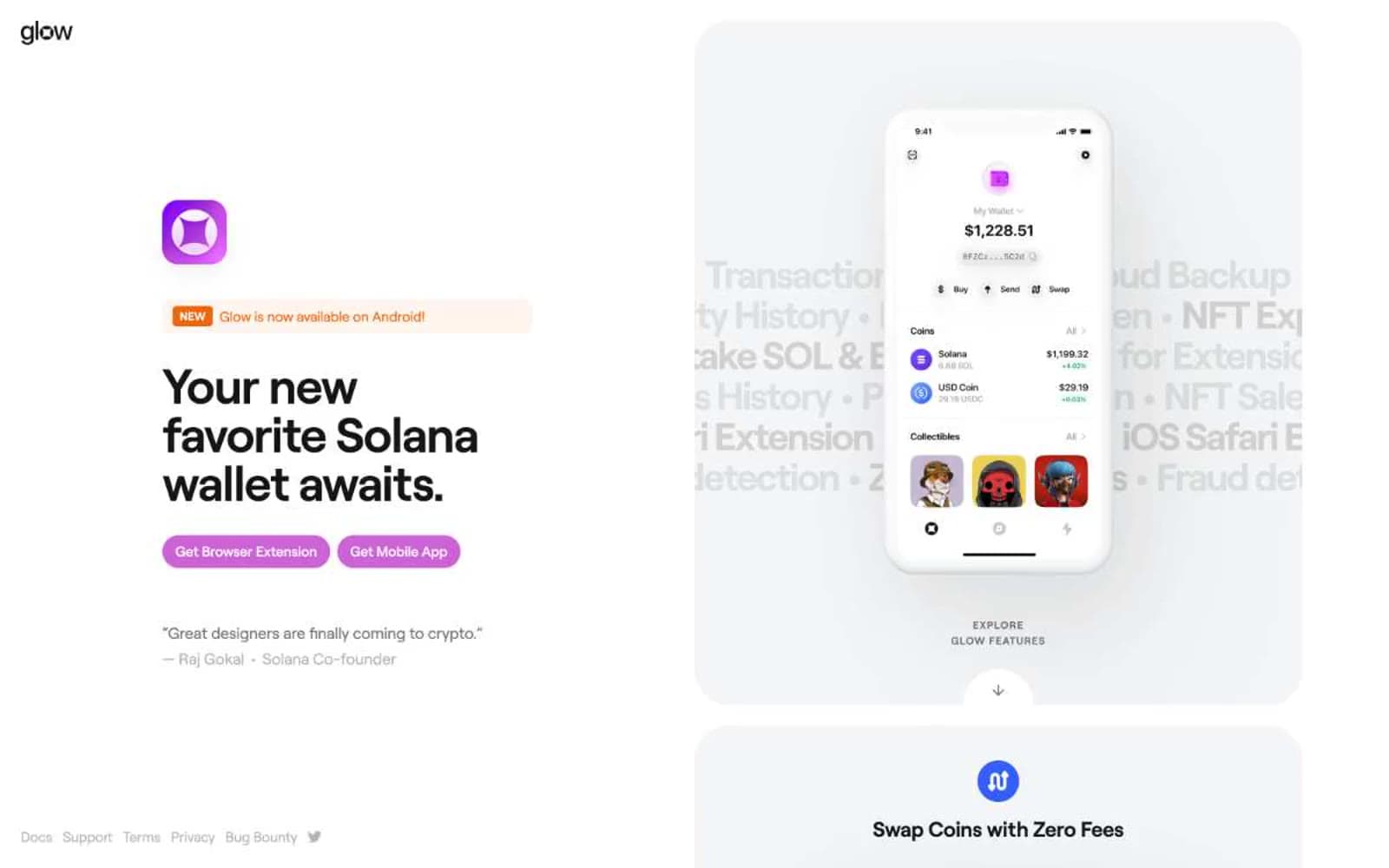
Glow
Crypto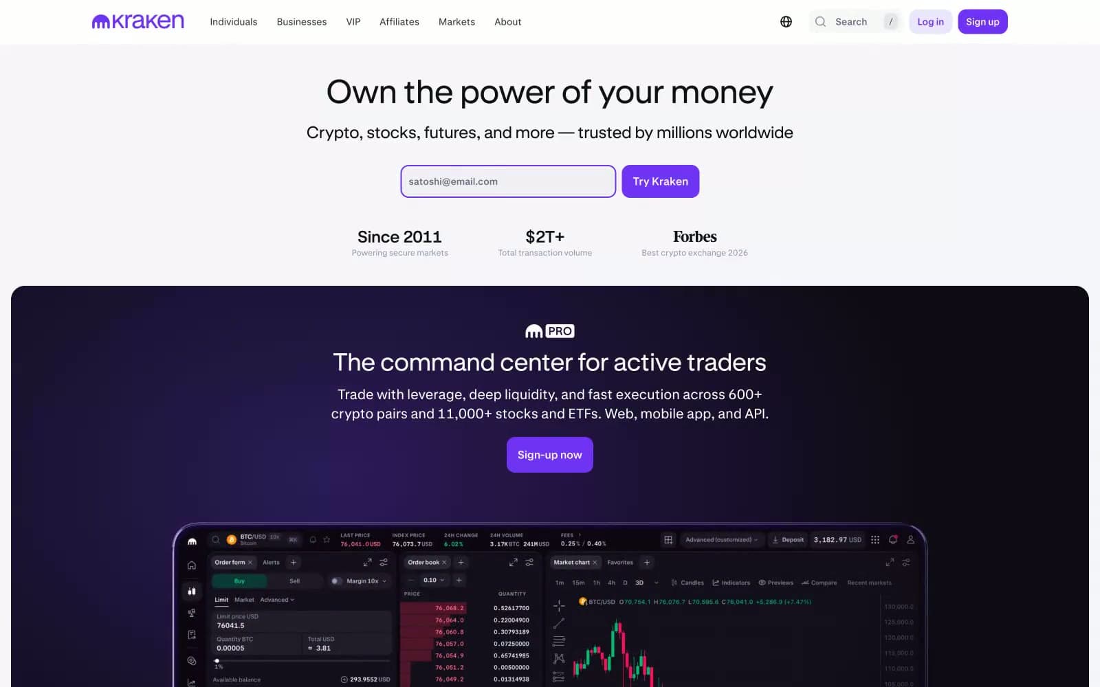
Kraken
Crypto
Sequence
Crypto


