Aptos Network. A sage-walled observatory where terracotta, sand, and powder-blue panels hold monospaced code beside serif prose, framed by 1px ink hairlines.
- Crypto
- Light theme
- 11 colors
- 1 typeface
Aptos presents a warm, editorial take on blockchain infrastructure — full-bleed color sections in muted sage, khaki, sand, and powder blue replace the typical dark-and-neon crypto visual language. A single custom serif (Season Serif) with fractional weights from 335–444 carries the entire voice, from 120px display headlines to 9px captions, with negative tracking on display and positive tracking on micro type. Layout is split-composition: left-aligned text, right-side decorative geometry. Components are flat, borderless, and weightless — 1px hairlines drawn as inset shadows do the work of dividers, and pill-shaped buttons (9999px) are the only rounded form. The aesthetic reads like a terracotta-tinted monograph about distributed systems, not a dashboard.
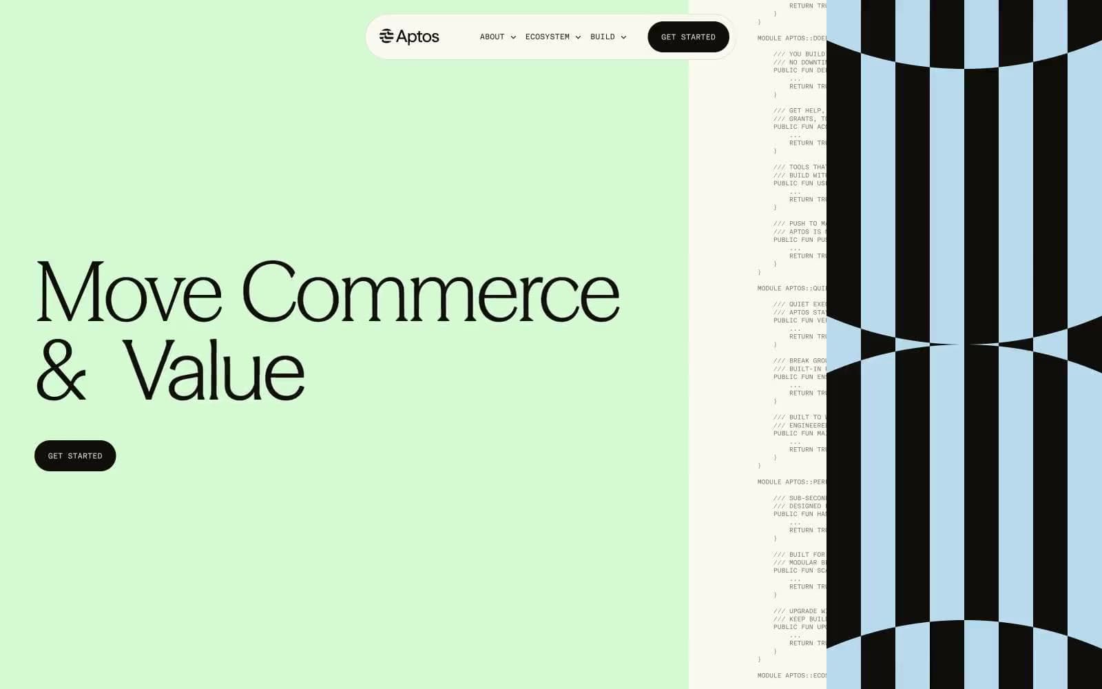
Aptos Network design system

Accent2
Hero section background, signature accent — a desaturated mint that signals freshness without being loud; the only color bold enough to hold a 120px headline
Code-panel background, striped-pattern accent, 1px blue hairlines — the cool counterweight to all the warm earth tones; appears wherever monospace code or technical data lives
Neutrals9
Primary text, hairline borders, icon strokes, nav outlines — the near-black that carries 90% of all foreground weight. Not pure black: a warm brown-black that feels printed, not screened
Filled CTA buttons, active markers — slightly warmer than Ink; the button fill that reads as a dense matte stamp rather than a flat black
Alternate surface for code-adjacent panels and inset blocks — a warm dark that bridges Ink and the mid neutrals
Tertiary text, low-emphasis borders — for labels and helper text that should recede further than Ash
Secondary text, subtle borders, muted metadata — a mid neutral that sits between Ink and the page; used when primary text would be too heavy
Heading borders, de-emphasized dividers — the lightest neutral that still registers as a line on Bone
Khaki section background, tonal counterpoint to Sage — the muted olive-khaki that fills body-text sections and grounds the palette's middle register
Secondary section background, 1px sand-colored hairline dividers, striped-pattern accent — the warm neutral that lives between the chromatic sections and true gray
Page canvas, card surfaces, nav-pill fill, button text on dark — a warm off-white with the faintest yellow-green cast that matches the sage and sand sections without competing
Try a pairing
Pick any two colors from the palette to check whether text stays readable on top.
Aa
Ink on Sage
16.95 : 1 contrast
- Body textPasses AA 4.5
- Large textPasses AA 3
- StrictPasses AAA 7