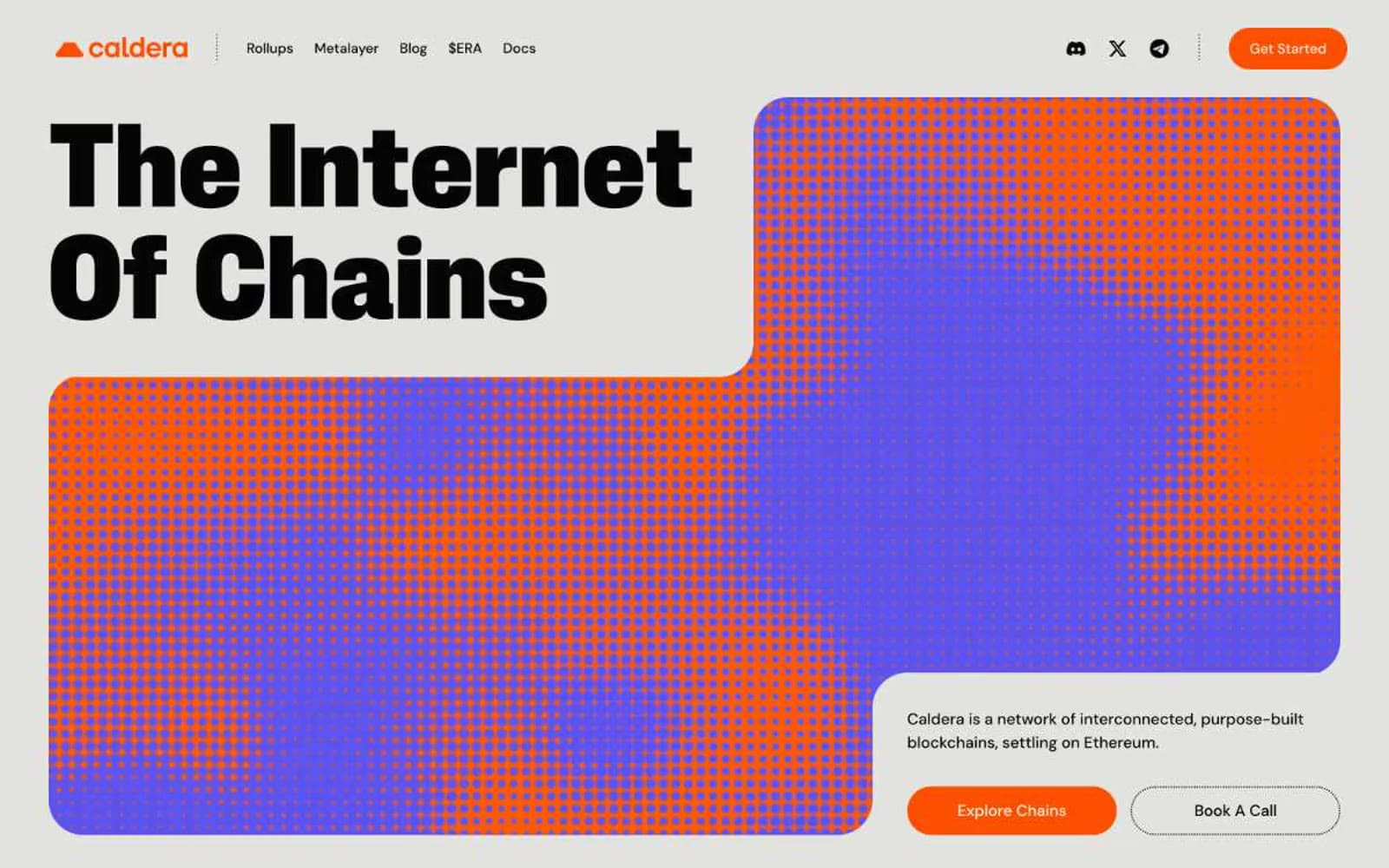
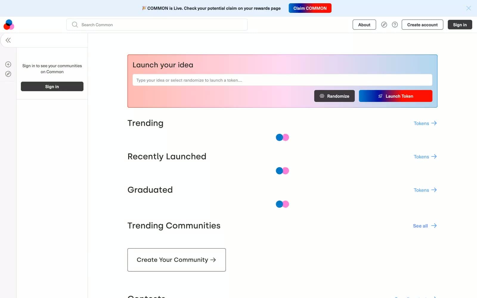
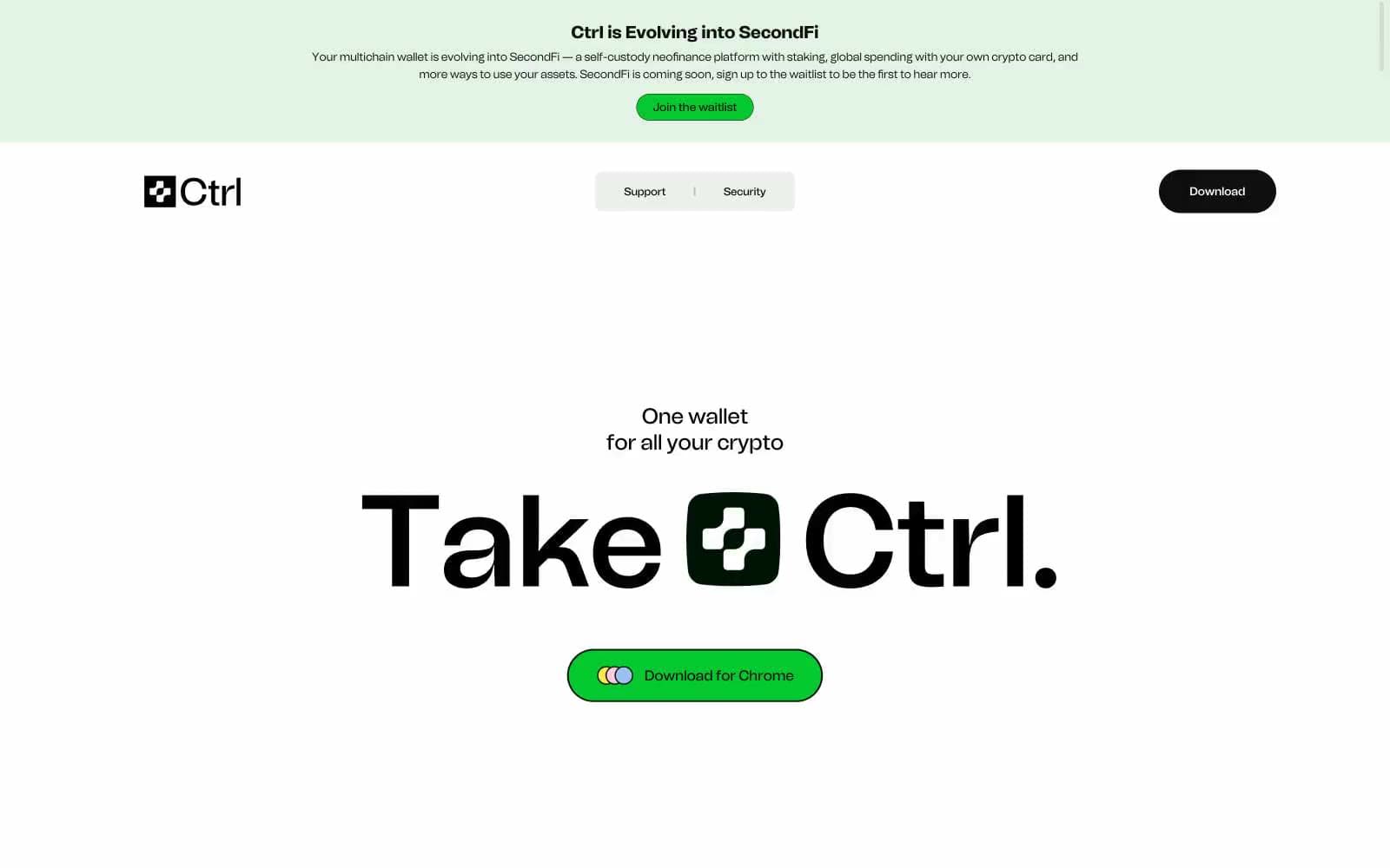
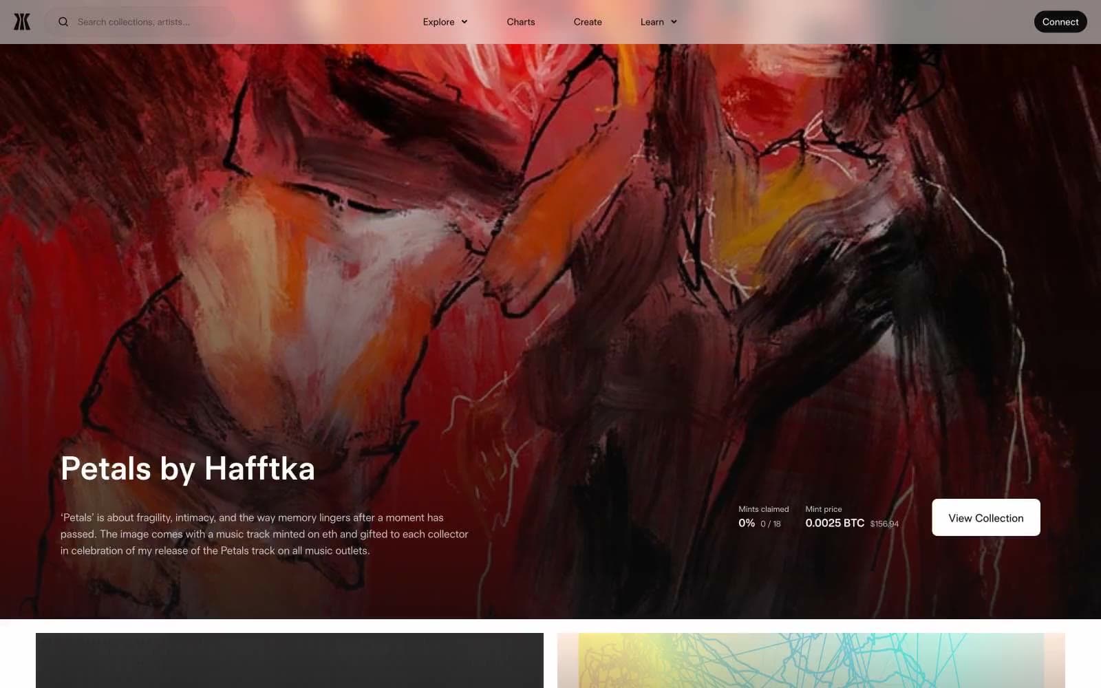
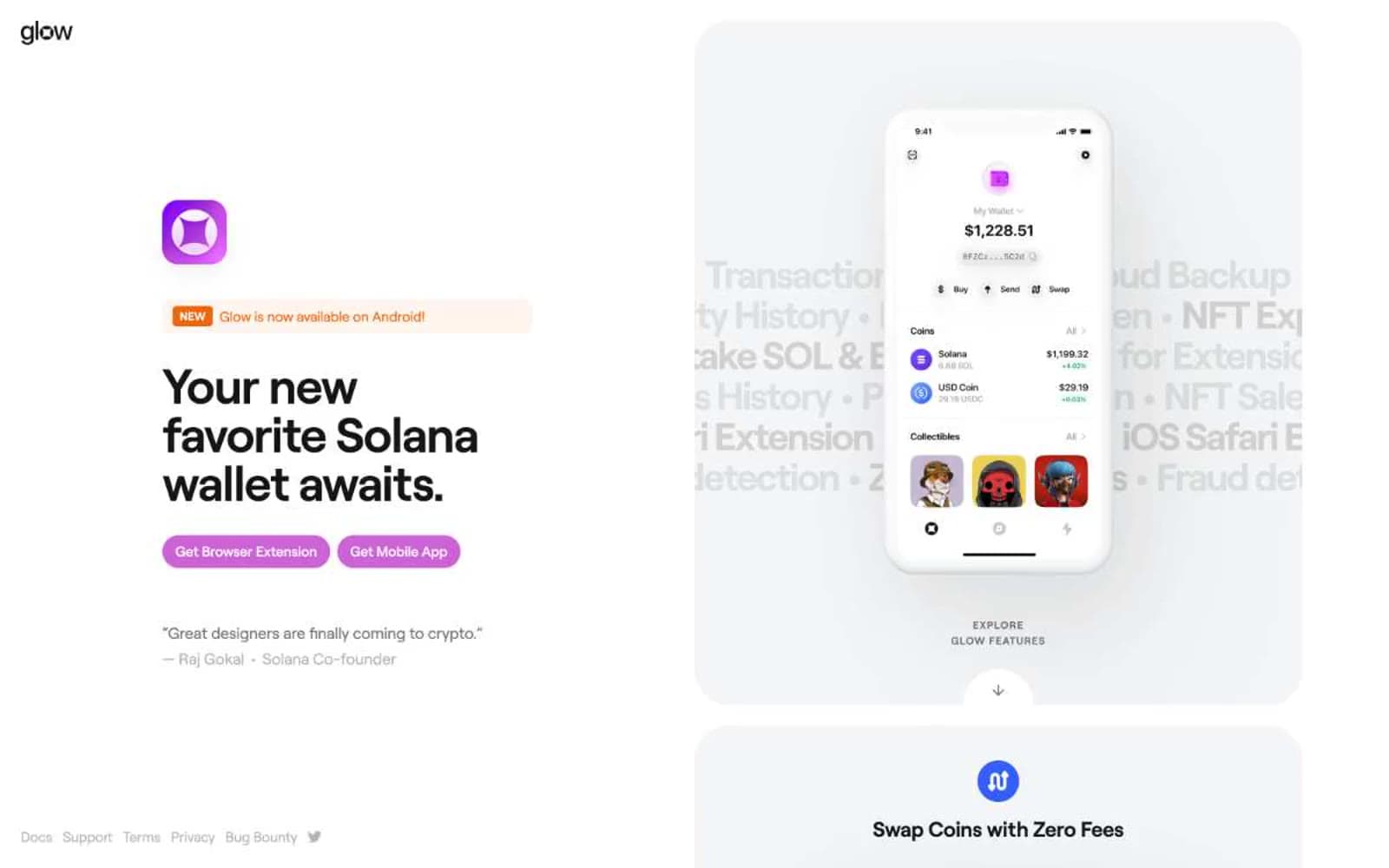
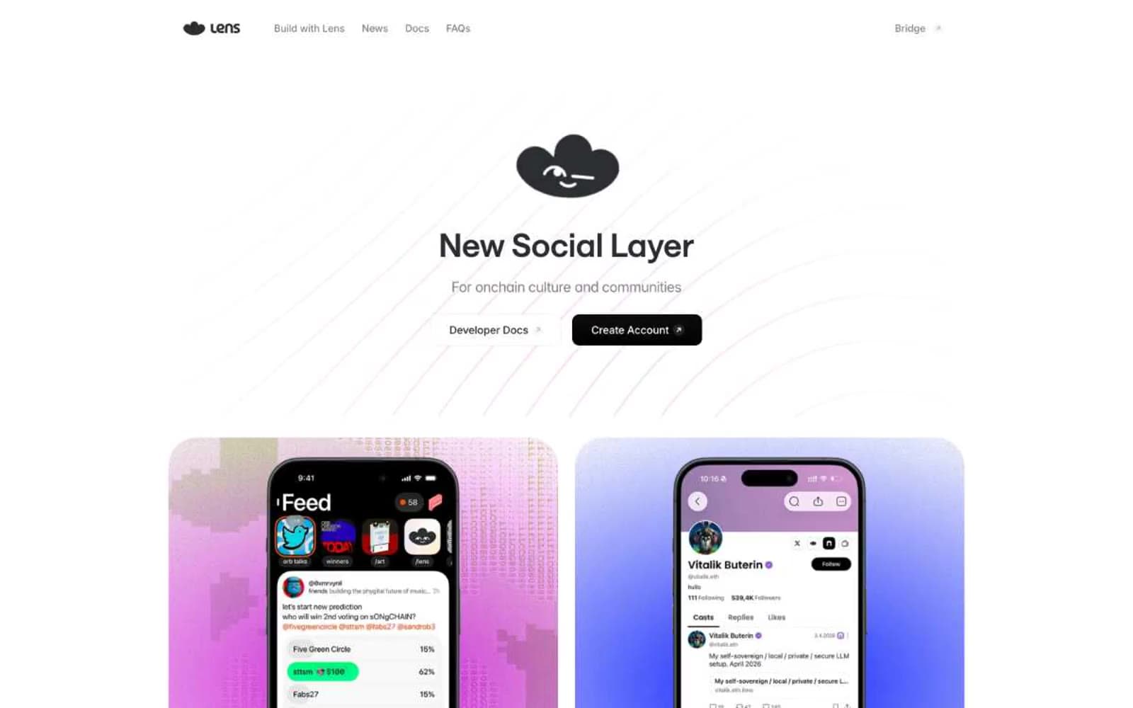
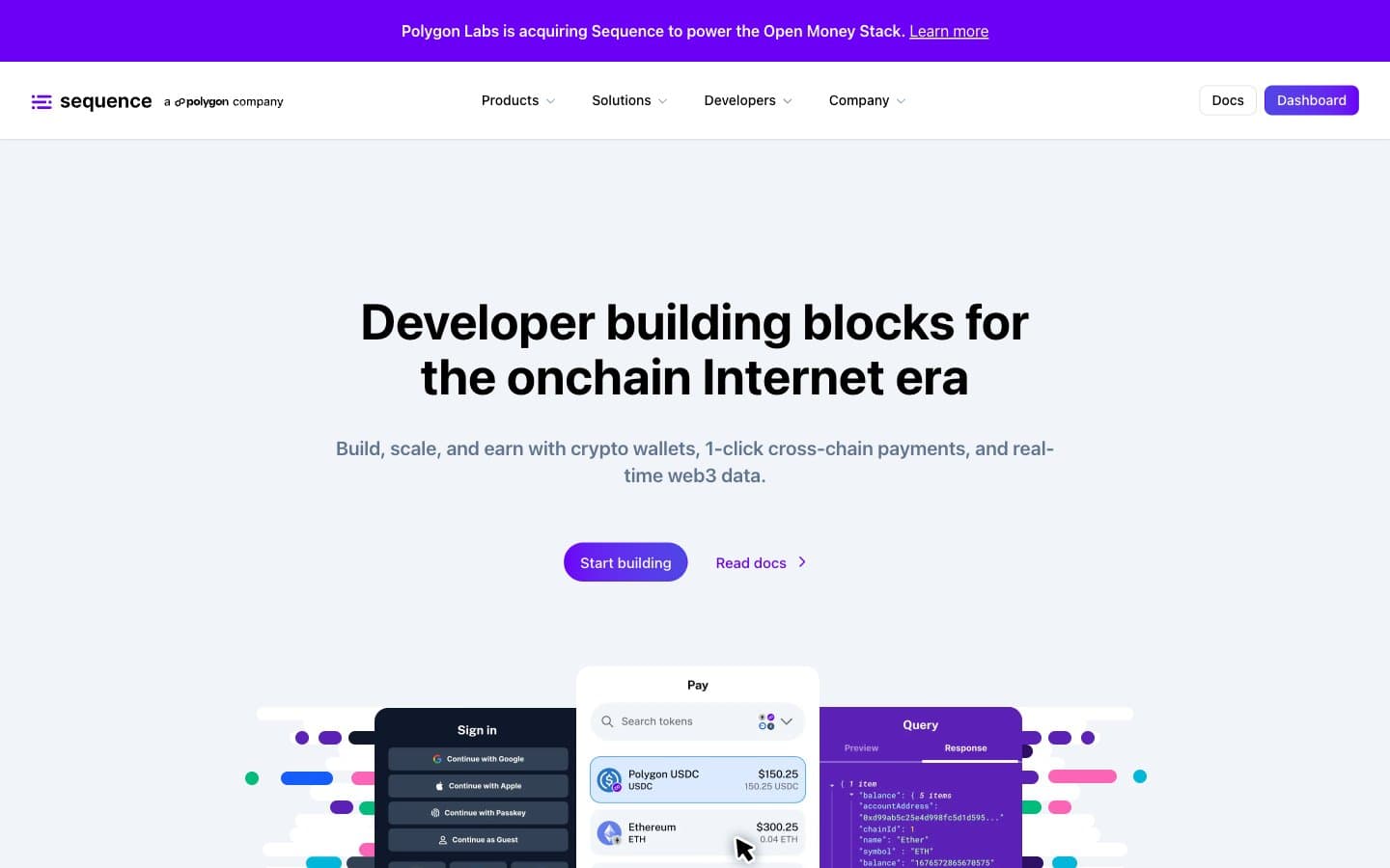
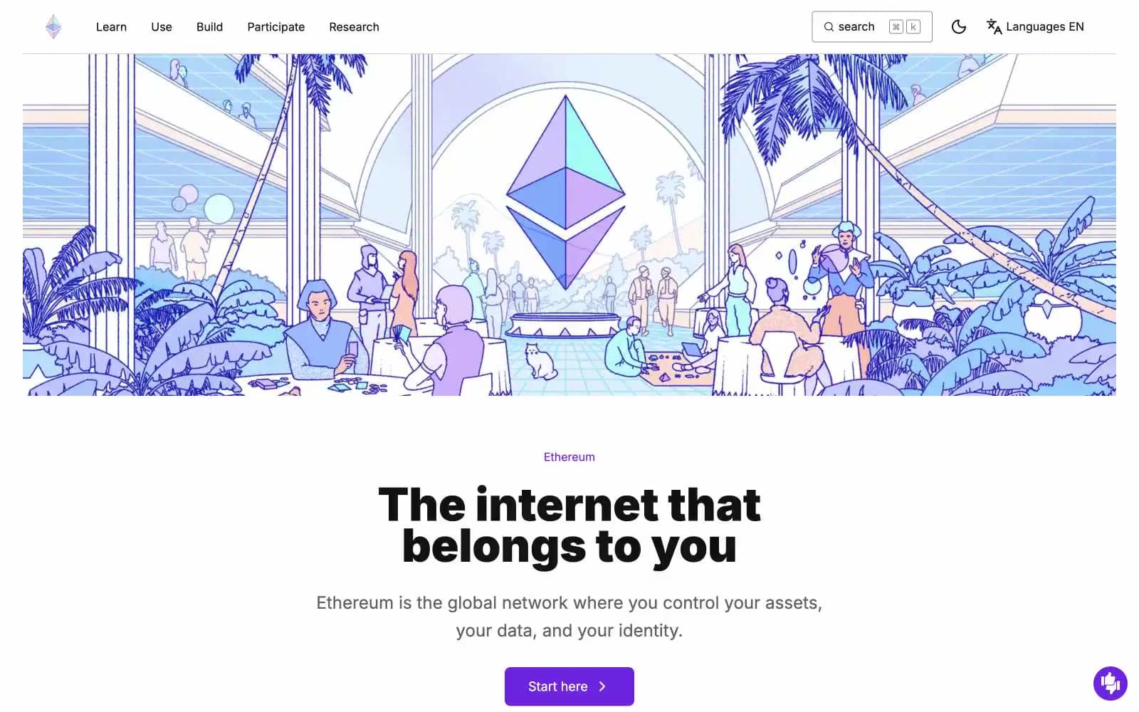
ethereum.org. A printed open-source almanac where the Ethereum diamond floats above duotone crowds of people.
- Crypto
- Light theme
- 12 colors
- 2 typefaces
Ethereum.org is a bright, illustration-driven editorial site for a decentralized ecosystem: white-and-lilac surfaces, bold Inter 900 display type, and full-bleed duotone line-art scenes that make the brand feel like a printed almanac rather than a product dashboard. Color is rationed — the dominant lavender wash (#ece0ff) reads as paper, while a single vivid violet (#6c24e0) owns every primary action, eyebrow label, and link, keeping the interface calm between dense content blocks. Feature content sits on flat pastel cards (lavender, mint, peach, pink) with 16px corners, no shadows — elevation is expressed through surface tint, not depth. Components are square-shouldered (4–8px button radius) and lightweight, the Ethereum diamond octahedron recurs as the only consistent iconographic mark, and the visual rhythm alternates between wide illustrated bands and tight typographic grids.
ethereum.org design system

Brand2
Violet supporting accent for decorative details and low-frequency emphasis. Do not promote it to the primary CTA color
Hover state on violet, dark accent surface, gradient origin — the violet pushed to its shadow end
Accent4
Secondary accent for inline links inside feature cards, tag pills, illustration accent
Tertiary accent for links, icon variants, illustration cool-tone accents
Green supporting accent for decorative details and low-frequency emphasis. Use as a supporting accent, not as a status color
Gradient origin for the hero radial glow and card overlays — never used as a flat fill
Neutrals6
Primary text, heading fill, dark icon strokes — the only body-color the UI commits to
Secondary body text, muted helper copy, nav subtext
Tertiary text, disabled nav items, low-priority borders
Hairline dividers, card borders, input borders, separator rules — the dominant border tone at 2484 occurrences
Page canvas, soft card surfaces, hero wash — near-gray violet that reads as neutral paper across the entire site
Card surface above canvas, icon strokes, inverse text on violet buttons, nav background
Try a pairing
Pick any two colors from the palette to check whether text stays readable on top.
Aa
Pure White on Ethereum Violet
7.08 : 1 contrast
- Body textPasses AA 4.5
- Large textPasses AA 3
- StrictPasses AAA 7