
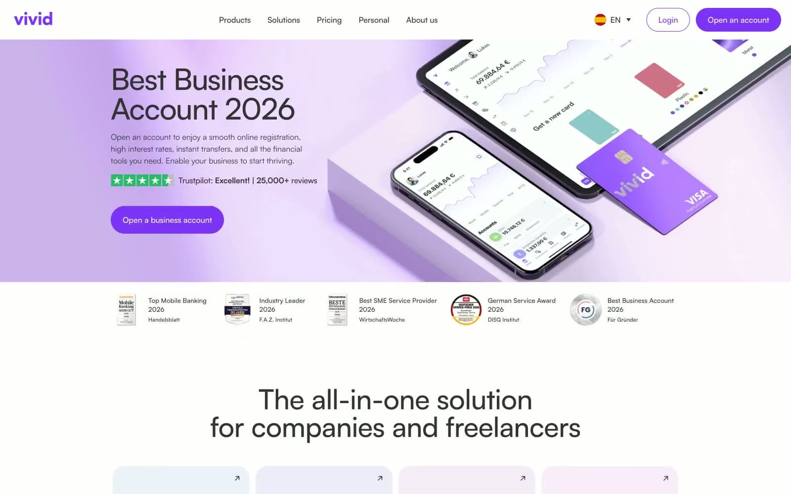
Vivid Spain. A soft violet wash on a clean white surface, where one vivid purple accent does all the work.
- Finance
- Light theme
- 14 colors
- 1 typeface
Vivid is a lavender-lit fintech canvas: a white marble surface washed in soft violet gradients, where the only chromatic decision a designer makes is how much purple to pour on. The system is radically monochromatic — a single vivid violet (#7d33f6) carries every interactive moment, from logo to CTA to active toggle, while the rest of the interface stays in a disciplined gray-on-white scale. Components breathe through soft pastel card backgrounds (#f4edff, #e9d4fb) and pill-shaped controls (100px radius) that feel like rounded candy, never corporate. Typography is geometric Satoshi at every weight, with aggressive negative letter-spacing on display sizes pulling the headlines tight, and generous positive tracking on small uppercase labels. The visual signature is restraint: no shadows, no borders on hero surfaces, no decorative noise — just purple light, white space, and confident type.
Vivid Spain design system

Brand1
Primary CTAs, logo, active nav, toggle thumb, link emphasis — the single chromatic decision that powers all interactivity. Deeply saturated against white to command attention without the corporate-blue cliche
Accent5
Light supporting surface for subtle backgrounds and section separation. Do not promote it to the primary CTA color
Muted violet wash for feature card backgrounds and decorative fills. Sits between Lilac Veil and Vivid Violet to create tonal depth in card grids
Violet supporting accent for decorative details and low-frequency emphasis. Do not promote it to the primary CTA color
Hero gradient warm stop, Pro pricing card background gradient — soft peach-to-lavender atmospheric wash
Radial gradient deep stop for the Pro card hero glow — concentrated violet at the corner anchor point
Neutrals8
Icon fills, deep contrast elements where absolute black is needed
Headings, high-emphasis text, dark icons, dark button text — the near-black that carries all type hierarchy. Cool-tinted, not pure black, matching the violet system
Body text, paragraph copy, default icon strokes. The workhorse text color for all reading content
Muted/secondary text, helper labels, inactive nav, subtle icon fills. Carries supporting copy without competing with primary type
Disabled states, very light icon fills, de-emphasized borders
Hairline borders, input borders, divider lines, neutral card surfaces. The most common structural separator
Alternate page background tint, body section backgrounds — used when a section needs to step away from pure white without introducing color
Primary page canvas, card surfaces, button text, input fills. The dominant surface that lets violet accents pop
Try a pairing
Pick any two colors from the palette to check whether text stays readable on top.
Aa
Pure White on Vivid Violet
5.71 : 1 contrast
- Body textPasses AA 4.5
- Large textPasses AA 3
- StrictFails AAA 7
More DESIGN.md files. Same web, different personalities.

Mollie
Finance
a16z speedrun
Finance
Acctual
Finance
Airtree
Finance
Ambrook
Finance
Angellist 2024
Finance
Apron
Finance
Baselayer
Finance
Basis Theory
Finance
BlueYard Capital
Finance
Brex
Finance
Coda
Finance


