
Vivid+Co. Prismatic light through obsidian.
- Studio
- Dark theme
- 9 colors
- 1 typeface
Vivid+Co operates in a cinematic dark void: near-black canvas at #101010–#495764, punctuated by a single near-white off-white (#fffdf9) used for nearly all type and UI chrome. Typography is overwhelmingly Neue Montreal weight 400 — a deliberate refusal of bold, where authority comes from sheer scale (136px and 105px display) rather than weight. The signature device is the chromatic-prism hero rendering: RGB-split blocks of saturated red/green/blue light bleeding through glass cubes, breaking an otherwise monochrome surface. Layout is centered and roomy; nav, body, and links all wear the same #fffdf9 color with no separate accent button, no fills, and zero shadows — differentiation happens through spacing, scale, and the rainbow artifact that acts as the brand's only chromatic voice.
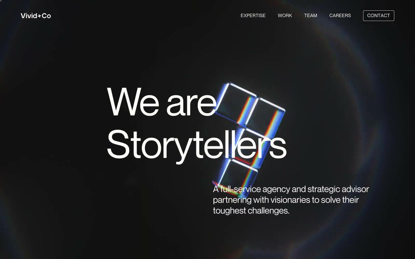
Vivid+Co design system

Accent3
Chromatic dispersion accent — one channel of the RGB-split prism hero artifact; appears only inside the brand illustration, not as a UI token
Chromatic dispersion accent — blue channel of the RGB-split prism, paired with red and green to create the signature caustics effect
Chromatic dispersion accent — green channel of the RGB-split prism artifact
Neutrals6
Decorative SVG icon and illustration fill — used in the prism artwork and icon glyphs; not a background
Page canvas, background fill for hero and section bands — the deep black the prism artifact sits inside
Hairline divider and card outline — barely visible, used at 1px to separate rows without competing with type
Dominant surface behind headings and content blocks — a cool dark slate that gives the canvas depth without flat black
Muted secondary text and ghost-button labels (3.7:1 contrast) — service-category labels like Strategy, Creative, Communications + marketing read as de-emphasized metadata
Primary text, nav labels, link color, heading fill — the near-white that occupies every typographic surface across the dark canvas
Try a pairing
Pick any two colors from the palette to check whether text stays readable on top.
Aa
Pure Black on Prism Red
5.62 : 1 contrast
- Body textPasses AA 4.5
- Large textPasses AA 3
- StrictFails AAA 7
More DESIGN.md files. Same web, different personalities.
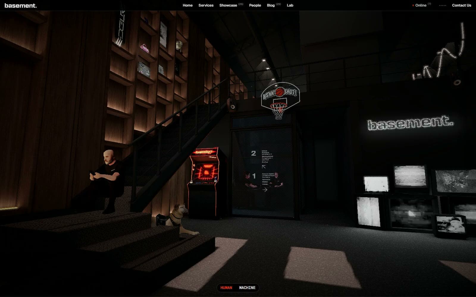
Basement Studio
Studio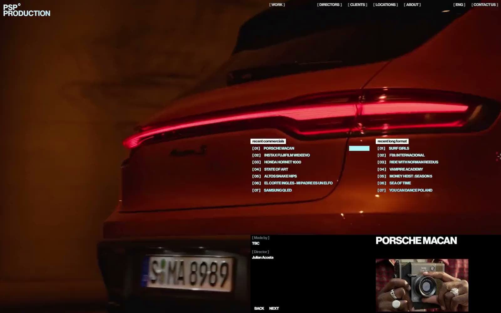
Production Portugal
Studio
Active Theory
Studio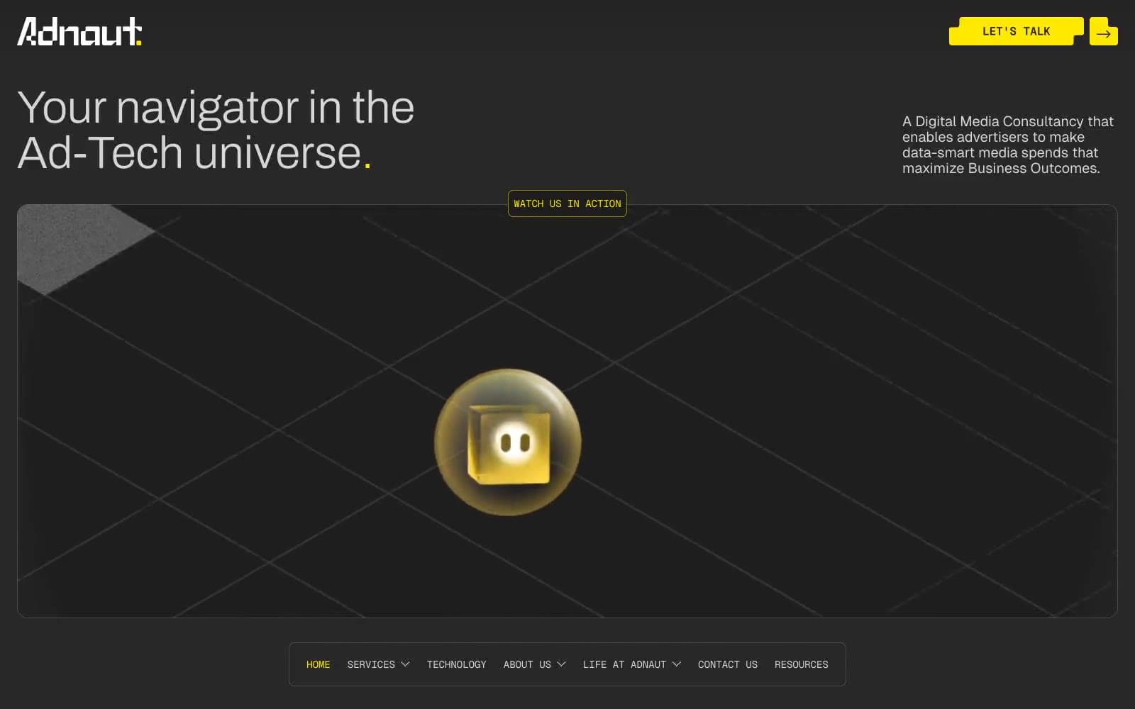
Adnaut
Studio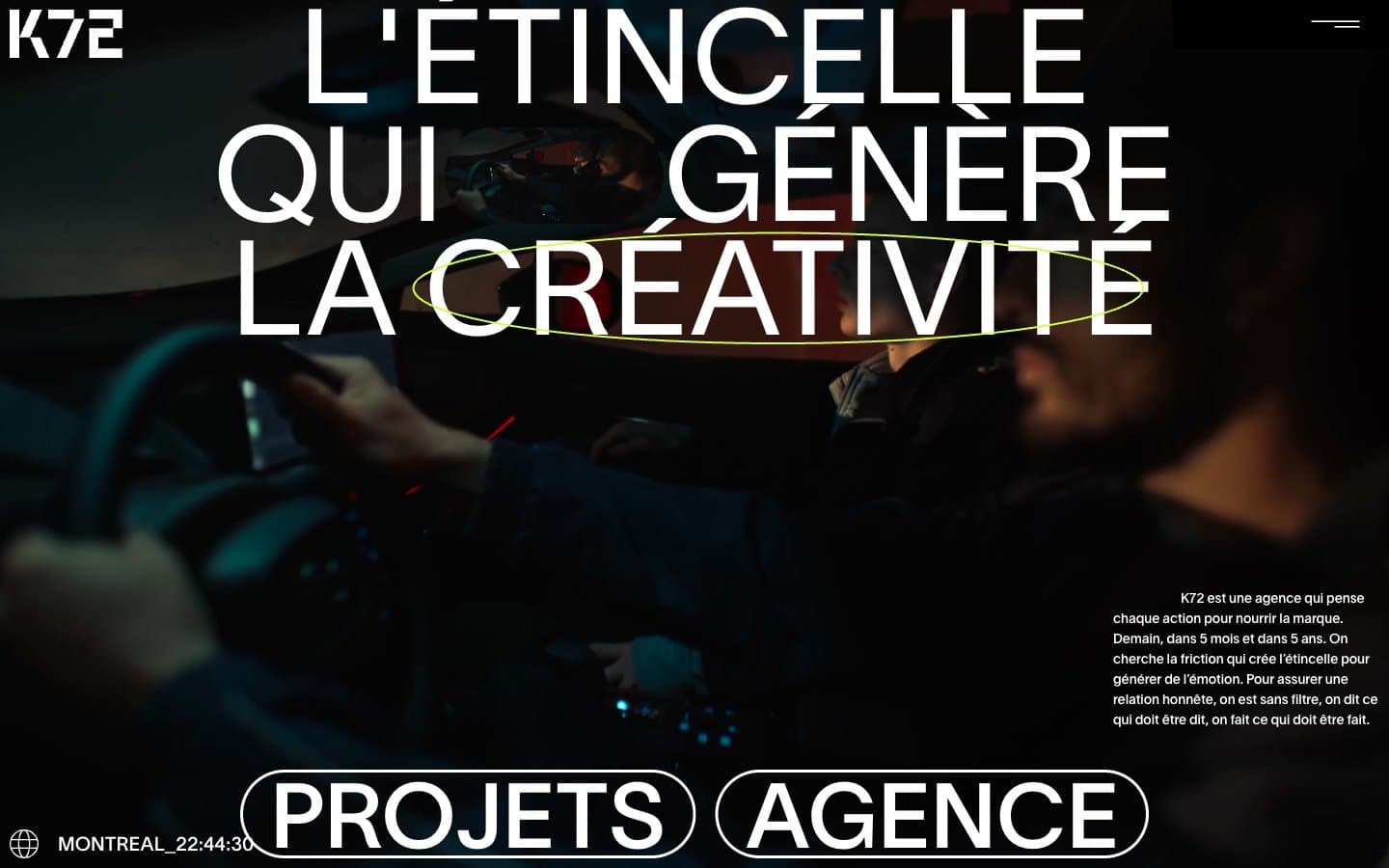
Agence K72
Studio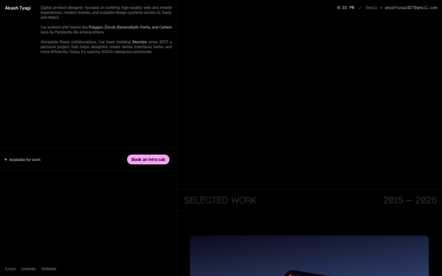
Akash Tyagi
Studio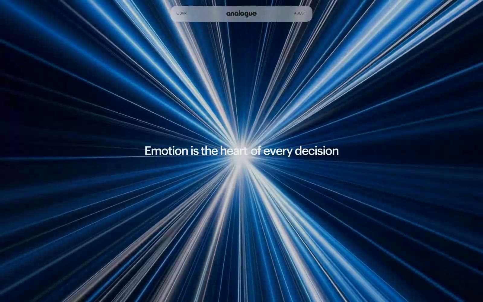
Analogue
Studio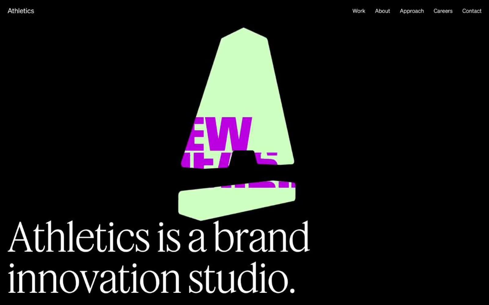
Athletics
Studio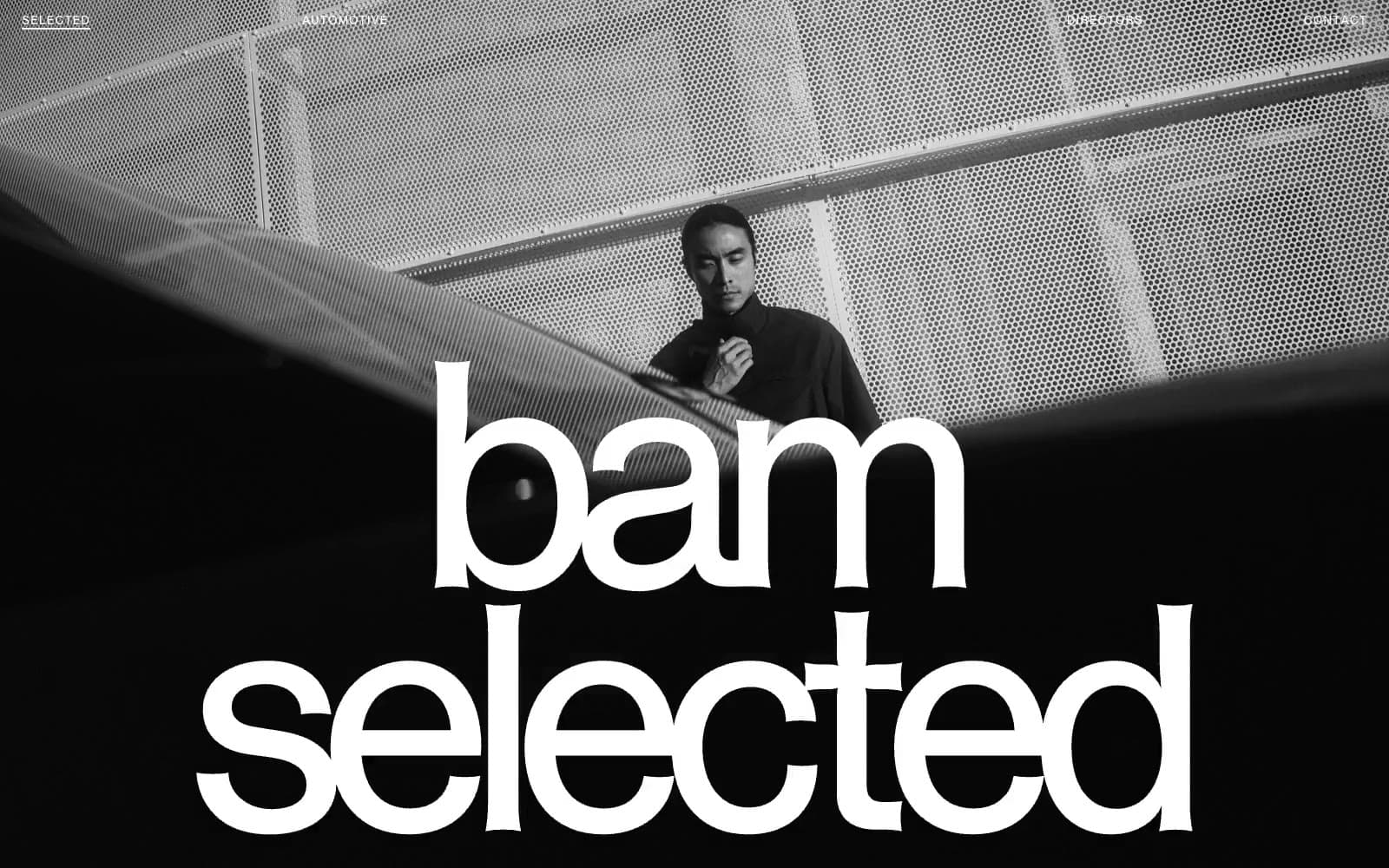
BAM Photographers
Studio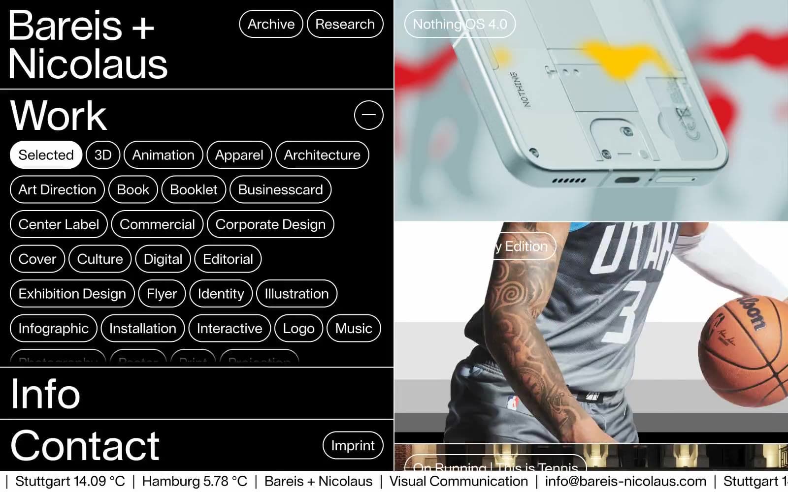
Bareis + Nicolaus
Studio
Becklyn
Studio
Branding
Studio


